Study Monet's masterpiece in this tutorial that turns a famous painting into a personal watercolor painting experiment. Here, award-winning artist William "Bill" Dunn shows how to analyze and paint the work that sparked Impressionism. Want to watch the video version? This tutorial is also available to members of our Beeblys WatercolorPainting.com.
Materials Used In This Watercolor Class:
- Reference picture of Claude Monet's Impression, Sunrise
- A block of Fluid 100 cold press watercolor paper (140lb, size 16″ x 12″)
- Pentel Graphgear 1000 automatic drafting pencil, 0.7mm lead size with 2B lead
- ¾" Artist's or masking tape
- Painting palette for watercolor paints
- Auxiliary plate or palette
- A container of water
- Paper towels or a rag
- A tabletop easel or a box to prop your painting on
- A spray bottle with clean water
Paints (Holbein Artists' Watercolors)
- Lemon Yellow
- Cadmium Yellow Deep
- Brilliant Orange
- Cadmium Red Purple
- Cobalt Violet Light (a.k.a. "Lavender")
- Mineral Violet (a.k.a. "Deep purple")
- Cerulean Blue
- Cobalt Blue Hue
- Yellow Ochre
- Payne's Gray
- Neutral Tint
- Ivory Black
- Chinese White
Winsor & Newton's Professional Watercolors
- Permanent Carmine
- Permanent Mauve (or Sennelier's Cobalt Violet Deep Hue watercolor paint)
- French Ultramarine
Brushes
- Escoda Perla Joseph Zbukvic Series: Round brush (no. 8)
- Escoda Perla Joseph Zbukvic Series: Round brush (no. 12)
- Escoda Perla Joseph Zbukvic Series: Round brush (no. 20)
- Winsor & Newton Artists' Watercolor Sable Brush: Round brush (no. 4)
- Winsor & Newton Sceptre Gold II Series 303: Short handle lettering/rigger brush (no. 1)
Step 1: Imitation As The Sincerest Form Of Studying
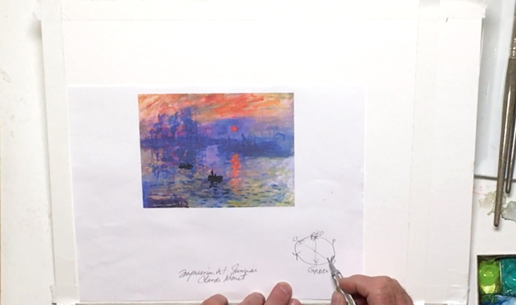 For watercolor newcomers and enthusiasts alike, Bill suggests copying a famous painting to better understand what makes a good composition. He picks Monet's Impression, Sunrise, and breaks it down into its basic components. This includes color balance, composition, and value. First, Bill prepares his paints by spraying them with water to make them easier to pick up while mixing. He also tapes the edges of his paper block with artist's tape, which will create a white border for any future framing purposes. There's a neat trick to keeping the painting to scale as well: line up the bottom left corner of the reference picture to your paper block, then draw an imaginary diagonal line through. The scaled-up version will have its top right corner on the far end of this line, so mark off the new size with tape. Here, you can make the painting a little narrower so you have a 2" strip for testing colors. Bill analyzes the colors of this famous painting next. He notes the dominance of blue and orange, which are complementary colors that help add interest to the painting. This leads to an explanation of Color Theory, which shows why orange complements blue. This is a powerful tool used in Monet's painting, and Bill shows how the balance of warm (i.e. reds to yellows) vs cool colors (i.e. purples to greens) makes it a prime example of a good composition. Like Monet, he recommends using a ratio of 70:30 to 80:20, and avoid splitting it 50:50. Whether a painting is primarily cool or warm depends on its subject, but for this exercise, Bill recommends following Monet's famous painting.
Step 2: A Good Sketch For Good Guidelines
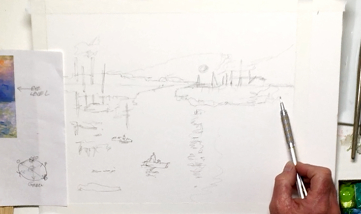 For the sketch, start at the painting's eye level first, which in this case is the horizon line. Again, make sure you're not going right down the middle for a more interesting composition! You can follow Monet's example here, and draw cleanly to get good guidelines for your paint later. Add a sun that's also off-center, then pencil in the skyline of the port and buildings. Study the shape and heights of these buildings, and don't worry too much about getting an exact replica of this famous painting. While you want to make a good copy, it's fine to tweak things here and there so your painting isn't too constrained. You shouldn't use an eraser either, as this may damage the surface of your paper. Continue working from big to small shapes, keeping in mind that you can draw in details with a paintbrush later. Add the reflections of the buildings, land mass, and sun in the water, but make them more vague and ripply. Draw in the shape of the clouds, and finally the silhouette of the two boats and people on top. Below is a close-up of Bill's sketch:
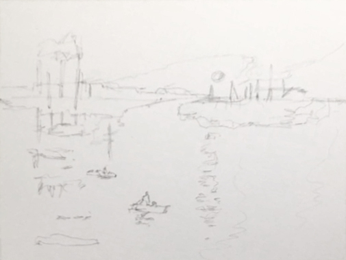
Step 3: Using 2 Common Techniques To Paint A Sky
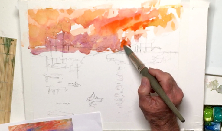 Because of its transparent nature, painting with watercolors is almost always done from light to dark. So with the no. 20 Escoda round brush, prep some Brilliant Orange on your palette, then paint the sky. It's okay to be a bit messy for this first background layer, as you will build other colors on top. Painting "wet-on-dry" (i.e. wet paint on a dry surface) also means you have to work quickly to prevent the paint from streaking. While the orange layer is wet, drop in some Cadmium Red Purple to darken and get soft blends via this "wet-on-wet" technique. Paint the sun as well, then switch to Yellow Ochre and paint next to some of the orange clouds. Add more Brilliant Orange for vibrancy, and keep checking the reference picture to see where to place your colors. For contrast, use Cobalt Violet Light and a touch of the orange to help the transition from orange to blue. Be careful when painting around the sun, as you don't want it to bleed into your sky. Also, try not to mix too much water with your paints to prevent puddles from forming on your paper. If it does, you can lift the puddles out by wiping your brush on a rag and touching the tip to the puddles. This will soak up the extra liquid like a sponge without messing up your painting!
Step 4: Layering Without Muddying Colors
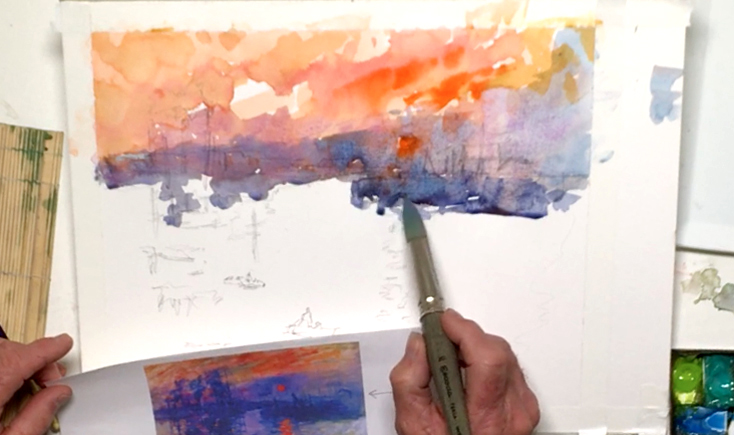 Mix Cobalt Blue Hue with a touch of Permanent Mauve and Mineral Violet, then paint the skyline along the horizon. You'll notice both soft and hard edges forming depending on whether the paper is wet or dry, which is fine. It's easier to work while the paint is still wet though. Use more Cobalt Violet Light for the right side of the sky, and try to plan ahead while copying this famous painting. With more practice, you'll get a better idea of what the painting will look like with different layers, and what it will look like when dry. This means that even if your initial layer looks too light, you can always add more layers on top to saturate your colors more. Also, continuously test your color mixtures on the extra strip of paper to the side so you get a better idea of what they will look like. Use pure Cerulean Blue for the top right corner of the sky and the area around the sun. Take care not to mix the colors on paper too much as it may muddy your colors. In addition, soften any glaring white spots with diluted Cobalt Violet Light to keep the focus on the sun.
Step 5: Painting A Colorful Body Of Water
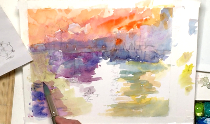 With more Cobalt Violet Light, start painting the left side of the water, then tone it down with some Lemon Yellow. Run this color into the yellowish areas as seen in Monet's famous painting. Next, use some Yellow Ochre for the right side, and add Cadmium Yellow Deep for the bottom right area. To keep the painting primarily cool, use pure Cerulean Blue around the yellows, trying not to overlap the colors too much or you'll get too much green. Paint around the sun's reflection for now, as this will help the orange show through more clearly. In addition, remember to lay your brushstrokes in horizontally to mimic the water's movement. Go back to the Cobalt Violet Light, and paint the opening of the water channel that's barely visible in the painting's center. You can paint over the boats and people on the water, as you can always add a darker color on top. Blend in some Cerulean Blue into the lavender mix for a color variation, then mix Cobalt Blue Hue with the lavender to intensify the water channel. You can also touch in Permanent Carmine and Cadmium Red Purple to build up the darker areas as well. Using a more saturated version of a color like Cobalt Blue can also be layered on top of your shadows, and remember to be bold! Watercolor always dries about 20% lighter, so it's fine if your colors look darker when they're wet.
Step 6: An Impressionistic Skyline
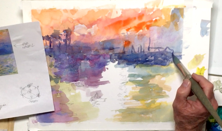 With a saturated Cobalt Blue, add a second layer for the skyline, this time including details like the chimneys in the distance. Dilute the paint a little for the smoke coming out, and for the reflections in the water. Use the pointed tip of your paintbrush for the thinnest lines, and remember that capturing the impression of the buildings and reflections is enough. This is, after all, an exercise based on an impressionist painting!
Step 7: Painting Ripples And Fixing Backwashes
 Go back to your purple mix, dilute it, then cover more of the water area. Try to paint the rippling effect of the water's surface by thinking about the way the waves move. Streak in Cerulean Blue, then more Cobalt Violet Light. Use the Yellow Ochre mix for the area around the sun's reflection, and French Ultramarine for the right side of the water. If you see any dry backwashed areas (i.e. areas where too much liquid has flooded the paper and made a watermark), you can soften them with water, or cover them with a layer of paint.
Step 8: Color Harmony And Stepping Back
 Switch to the no. 12 Escoda round brush, then add more Cobalt Violet Light in the water area for a more vibrant color. This will help tie the whole painting together and create a harmony and a consistency throughout your study of Monet's famous painting. Throughout your process, remember to keep studying the reference picture, and step back once in a while to keep an eye on the overall feel of your painting. These little breaks also give you time to reflect on what's working and what can be improved, so make sure not to rush your process. In addition, remember that because watercolor is more difficult to control, it's fine to let it run free once in a while. Who knows - maybe you'll get a few "happy accidents" along the way!
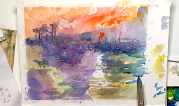
Step 9: Separating Land From Water From Sky
 With Mineral Violet, darken a few of the buildings and land even more for more depth and contrast. The paper should be damp at this point, so your paint edges should be a little soft, but not spreading too far. Use the same color for the reflections of the buildings, rippling your brushstrokes again so there's a difference between the actual buildings and the reflections. It will also help separate the land from the sky and water. Keep the reflection of the sun white for now, and continue using the wet-on-dry technique for the extra control over your watery effect. Hopefully, you'll eventually see the different layers coming together to add more depth, so that lighter buildings will fade to the back while buildings painted with several layers are brought to the front.
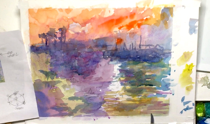
Step 10: Painting Silhouettes And Adding More Depth
 Ultimately, the sun should still be the focal point, like it is in Monet's famous painting. To help facilitate this, add more Cobalt Violet Light to the right side of the sky and around the sun. It's also fine to have a mix of soft and hard edges in the sky, but try not to oversaturate the paper while doing so. Next, switch to the round sable brush (no. 4) and pure Neutral Tint to paint the boats and people. Be careful here, as they make up your foreground and your flourishes, a.k.a. "calligraphy touches"! You can mix in some Payne's Gray and Ivory Black for an even darker silhouette to make them stand out more. Keep the figures small but detailed, and try to tell a story with your paint.
Step 11: Here Comes The Sun
 Bringing the focus back to the sun, use the no. 8 round brush to lift out some paint in the sun. You can do this by wetting it, letting the water soak into the paint, then dabbing the wet area with a rag or paper towel. Repeat the process to get the sun as light as you need, and if the paint isn't coming out very well, you can try using a scrubber brush or sponge instead. Just be careful when scrubbing as you don't want to damage your paper!
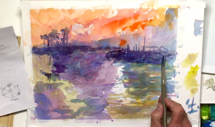
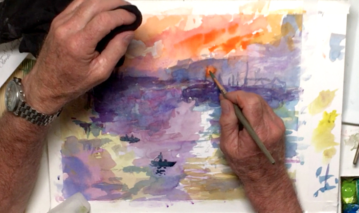
Step 12: The Reflection Of A Sunrise
 Going back to the no. 12 round brush, use Brilliant Orange to paint the sun's reflection. Start near the horizon line, then work your way downwards so the paint naturally fades towards the end for an added depth effect. Keep your horizontal brushstrokes together but not too even, and try not to leave any white spots behind. After the sun has dried a little, dilute some Lemon Yellow, and brighten it a touch.
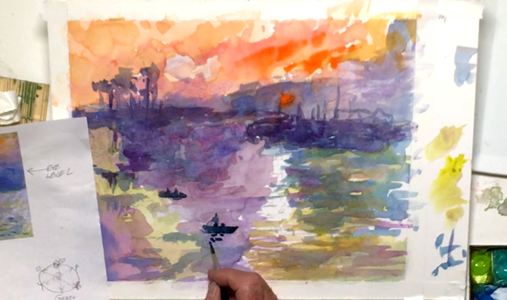
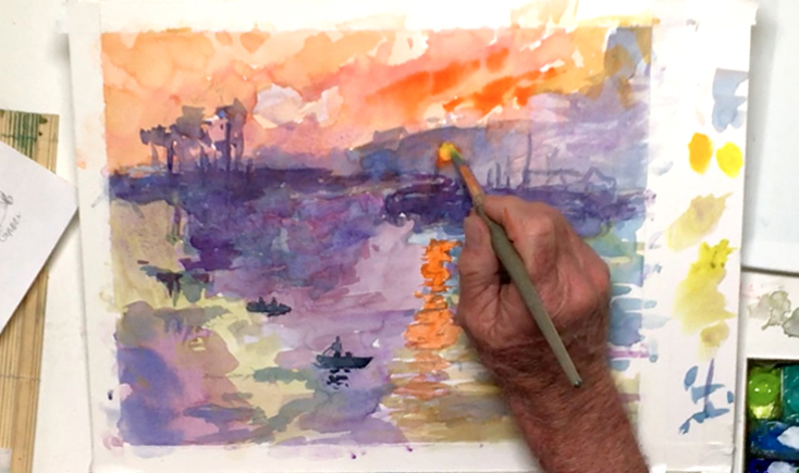
Step 13: Painting Waves Without Overdoing It
 You're now entering the final stages of this famous painting study! So with your dark blue mix (that has Neutral Tint in it), add Permanent Mauve, Indigo, and Cobalt Blue Hue. The resulting mixture shouldn't be too purple or dark, so make sure to test your color on the extra strip of paper to the side of your painting. If it's too dark, you can dilute the color with a little water. Dash in some small waves using this color via the wet-on-dry technique, being careful as you only get one shot at this. Focus mainly on the foreground of the water, i.e. the bottom third of your painting, for more depth. Avoid overdoing this or adding too many waves though, as it could hinder the overall effect. Lastly, use the same color to add some shadows and reflections under the boats and people.
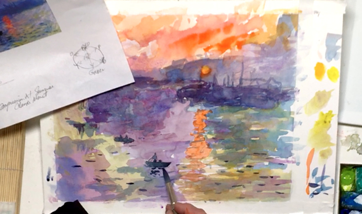
Step 14: Final Analysis And White Touches In A Famous Painting
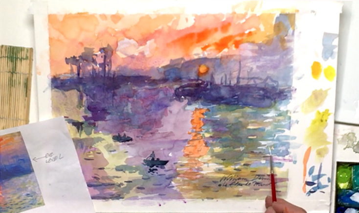 A key indication that you may be finished is when you can't think of what else to add or improve. So perform a final analysis of the painting, looking over the color balance, the values, and the overall feel of your painting. Bill sees that Monet used some white in the right side of the water in his famous painting, so he mimics this by using Chinese White watercolor paint and a tiny lettering/rigger brush. He opts for a transparent white paint here, as gouache paint will be too strong. But again, this will add to the watery illusion, and don't overdo this for a good impressionistic piece. Finally, you can sign your painting if you want. Just make sure to credit the original artist too! Make sure to sign in one go as well, and use the dark blue mix so the signature stands out without stealing the show. And when you're done, gently peel off the tape to reveal a crisp white border that frames your famous painting study in style.