Get inspired by painting ideas from an award-winning painter, William "Bill" Dunn, as he demonstrates city painting featuring the crowded streets of Chinatown. This city landscape is perfect for those who want to paint something a little more challenging while still applying all the usual watercolor techniques. Want to watch the video version? The full tutorial is available to members of our Beeblys WatercolorPainting.com.
Materials Used In This City Landscape Watercolor Class:
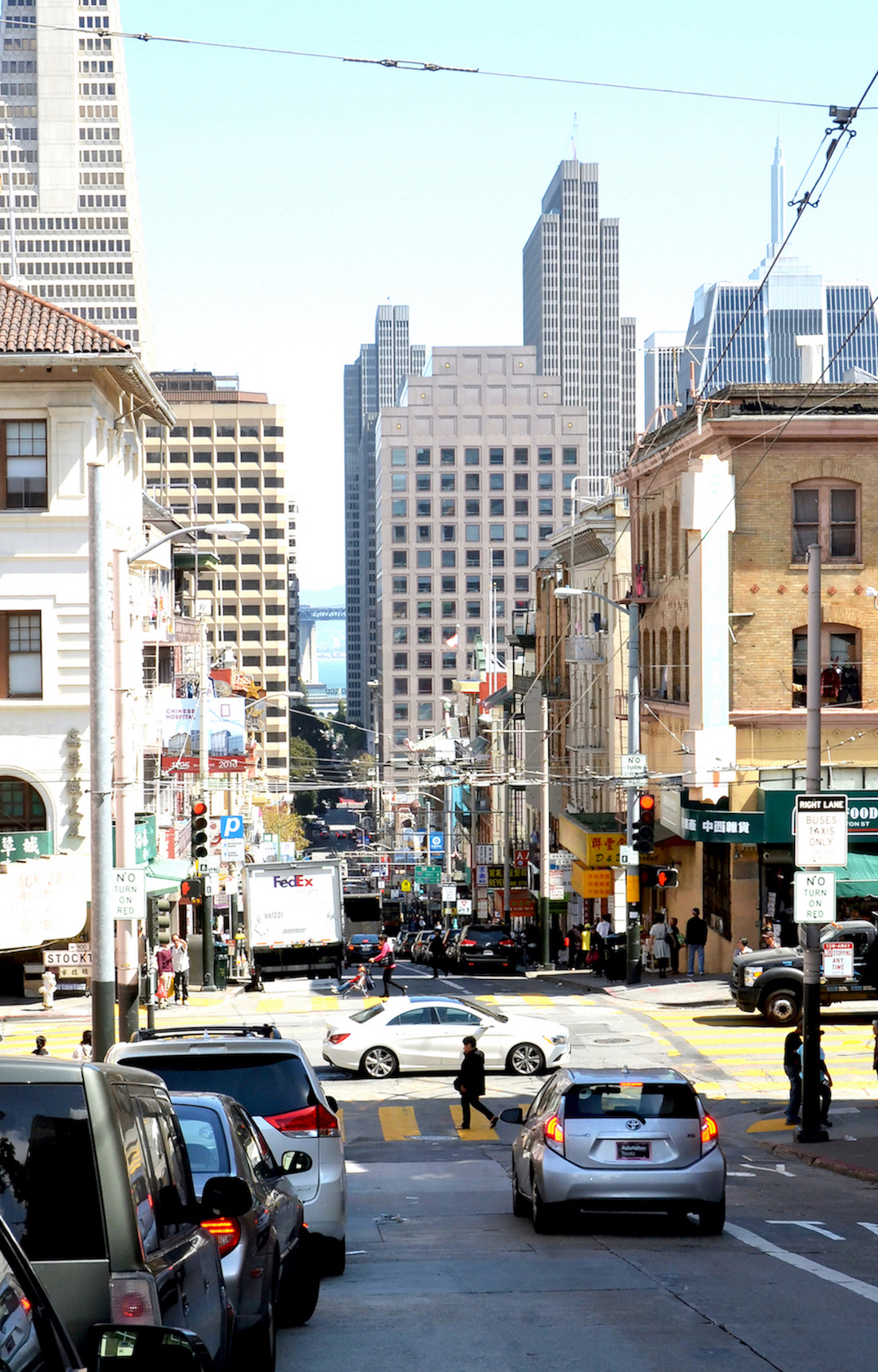
- Reference picture of Clay Street, Chinatown (click here for Bill's picture)
- A sheet of Arches cold press watercolor paper (140lb, size 12″ x 16″)
- Lamy pencil with 3.2mm HB or 2B lead (slightly sharpened)
- Kneaded eraser
- ½" Artist's tape
- Painting palette for watercolor paints
- Auxiliary plate or palette for gouache paint
- A container of water
- A towel or rag
- Tissue or paper towels
- Spray bottle with clean water
- Tilted wooden board
Paints (Holbein Artists' Watercolors)
- Permanent Yellow Lemon
- Cadmium Yellow Deep
- Brilliant Orange
- Cadmium Red Purple
- Cobalt Violet Light (or Lavender)
- Olive Green
- Sap Green
- Viridian
- Cobalt Green (or Turquoise)
- Permanent Green #1
- Peacock Blue
- Prussian Blue
- Indigo
- Yellow Ochre
- Burnt Sienna
- Burnt Umber
- Payne's Gray
- Neutral Tint
- Ivory Black
Winsor & Newton's Designers' Gouache
- Zinc White
Brushes
- Neef Rigger Supreme Taklon Series: Long handle rigger brush (no. 6)
- Neef Rigger Supreme Taklon Series: Long handle rigger brush (no. 8)
- Neef Rigger Supreme Taklon Series: Long handle rigger brush (no. 12)
- Winsor & Newton Series 7: Kolinsky Sable round brush (size 1)
- Princeton Artist Brush Co.: Flat brush (¼")
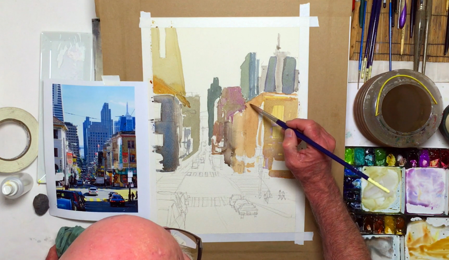
Step 1: Start With A Good Ol' Sketch Of A City Landscape
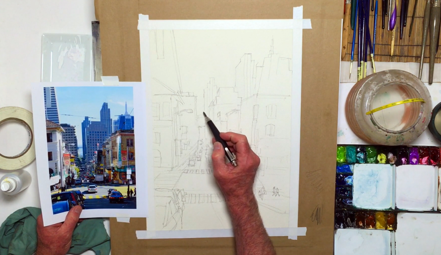 Even the most complicated painting must start somewhere, and for this city landscape, instructor William “Bill” Dunn begins with the basics: how to get a good sketch without over-cluttering the composition, and how to simplify this busy scene without accidentally taking out the "busy" atmosphere. To start, he has a picture of Clay Street (in the Chinatown district) he himself photographed, so already he has full control over exactly what kind of composition he wants to paint. He also plans on using an impressionistic style, so stresses on the importance of a hand-drawn sketch rather than getting a photorealistic tracing via using a ruler or projector. To begin, prepare the paper by cutting it to size so its dimensions are scaled proportionally to the picture. This will make the measuring process easier. Use artists' tape to tape the edges down for a clean edge afterwards, and to minimize the effects of the paper from warping (you can pre-stretch the paper, but this is optional). With the pencil, start your sketch of the city landscape by lightly outlining the road, beginning from the vanishing point (i.e. the point where the background is the furthest away, which creates a "tunneling effect") and widening the vertical street as you near the foreground for this tunneled perspective. Next, draw the intersection and horizontal streets. With these street lines in place, you have a visual reference for which buildings go where. Lay in the skyline of the buildings on the upper-right side, using one-point perspective as a visual reminder of how the buildings should be drawn to follow the reference photo. Work from large to small details, outlining the buildings before adding smaller details like building signs, windows, and corners to give the buildings more dimension. Continue downward, drawing the big sage building (in the reference photo) as a corner point, then rounding it off with a sidewalk on the right side of the street. Remember that not all details have to be included, as this will be more impressionistic than realistic. Try to be selective and only draw in enough detail to give the object a place in your painting. Continue sketching signs, posts, and people along the pavement to capture the atmosphere of a busy Chinatown. Move to the left-side of the painting, sketching the buildings in the same way as before. Add signage and even Chinese characters where necessary, slowly making your way towards the foreground details to include a variety of vehicles for the atmosphere. Part of getting the design and composition right is to pick and choose the necessary details to include, which makes this planning process so important. Make sure to keep stepping back to check the overall proportions and composition, exaggerating perspective of the area around the vanishing point if necessary. Also, keep thinking ahead on what colors to use, which will help speed up the painting process. Finish off the city landscape sketch by drawing cars in the lower corners of the composition and zebra crossings for the crossroad, and add any further details on the buildings you feel would become necessary guidelines. Below is a close-up of Bill's compositional sketch:
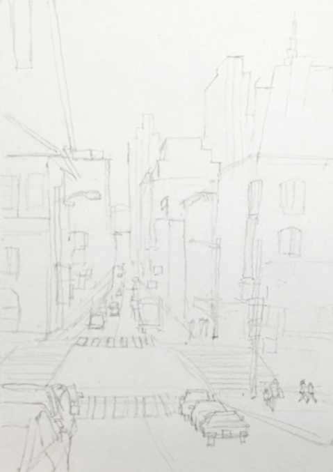
Step 2: Adding The "Building Blocks" Using Shades Of Gray
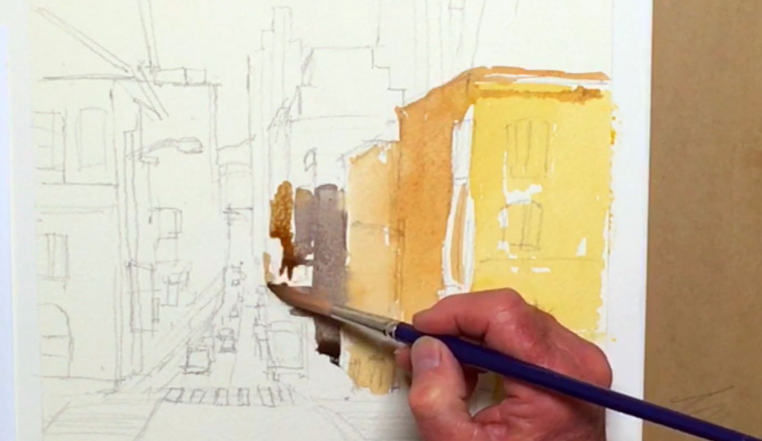 With a good clean sketch, it's time to start painting. Spray the paints on your palette with some clean water to pre-soften the paints, then with the Neef rigger brush (no. 12), dilute some Yellow Ochre paint on your palette before applying a light wash on the building on the rightmost side. Leave thin unpainted edges for highlights on the buildings, and unpainted rectangles for signs to add in later. Mix Burnt Umber to the Yellow Ochre for a darker layer to the left of the rightmost building, allowing the colors to bleed together to create more interest in your painting. While this first layer is still wet, work your way towards the vanishing point, darkening your brown mix with Neutral Tint and painting the next building over. Next, add Burnt Sienna to the mix, and paint the building on the right side of the vanishing point to establish a sense of perspective. If the paint begins to puddle on the paper, you can lift out the excess with a dry, clean brush. Remember that you're capturing the feeling; the impression of these buildings rather than getting a photorealistic city landscape!
Step 3: Upper Right Base Layer Of Buildings
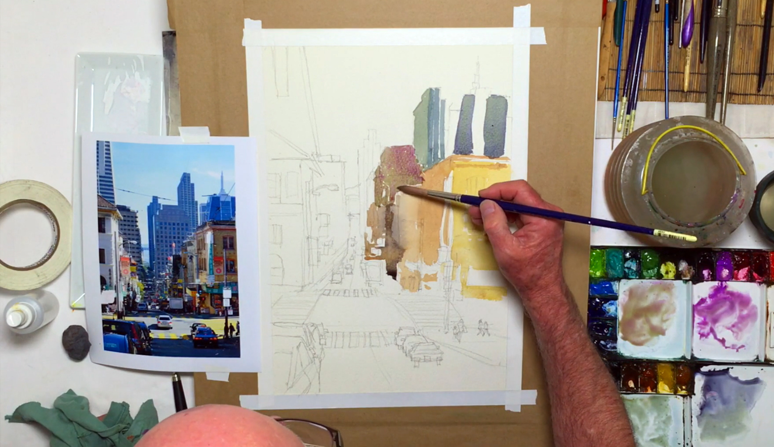 Staying on the right side, move upwards towards the taller buildings. Mix in Prussian Blue to your brown-gray mix and paint the buildings on top. Don't be afraid to leave white lines in between paint strokes for highlights, or to paint outside the lines! This helps brighten the overall look and atmosphere of your painting while adding your personal artistic flair. Continue applying the dark gray mix to the top of the buildings, adding Sap Green for a new shade. You can drop in wet paint in wet paint, which will create a variegated wash (a type of wet-in-wet technique) and bring an extra dimension to your city landscape painting. Next, mix Yellow Ochre and Cobalt Violet Light (i.e. Lavender) for a warmer gray tone, and use it for the buildings in the distance. Again, don't worry about trying to fill in all the white spaces or fixing the wash when they bleed into one another, as trying to correct it can make it look worse. Use more Cobalt Violet Light and paint wet-in-wet on the warm gray, letting gravity pull down and mix the paint in unexpected ways. Lastly, mix Neutral Tint, Burnt Sienna, and Prussian Blue, and apply this mixture to the building furthest away on the right-side of the street. And if you ever mix the wrong color on your palette, simply take your rag or a paper towel and wipe the paint off.
Step 4: The Left Side, Layering, And Adding Contrast
 Shifting to the other side, begin by preparing Yellow Ochre with Neutral Tint on your palette, then paint the main building near the left side of the vanishing point. The Transamerica Pyramid (i.e. the slanted structure above) can be painted as well after adding more Yellow Ochre for a lighter color. Next, mix Neutral Tint, Yellow Ochre, Cadmium Yellow Deep, and a touch of Burnt Sienna, using this color for the rooftop of the leftmost building. Add Burnt Umber into the blue-gray mixture on your palette for the shadowed side of the same building, then dilute this color with more water and use this light gray to paint the lighter areas, giving more contrast and depth to the overall painting. While this base layer of paint dries, prep Cobalt Violet Light with Peacock Blue, and use the wet-in-wet technique to blend it into the still-wet shadowed side of the leftmost building as an additional layer. Continue back to the right-side of the painting, applying the many different varieties of grays to either lighten or darken areas that need more contrasting value and structural details. This will add depth to your city landscape like nothing else. Using the Cobalt Violet/Peacock mix, fix the color of the rightmost building, glazing over the first layer for a stronger color. For the side of this same building, add a little Cadmium Yellow Deep to make it lighter.
Step 5: Texturing The Road Using The Dry-On-Dry Technique
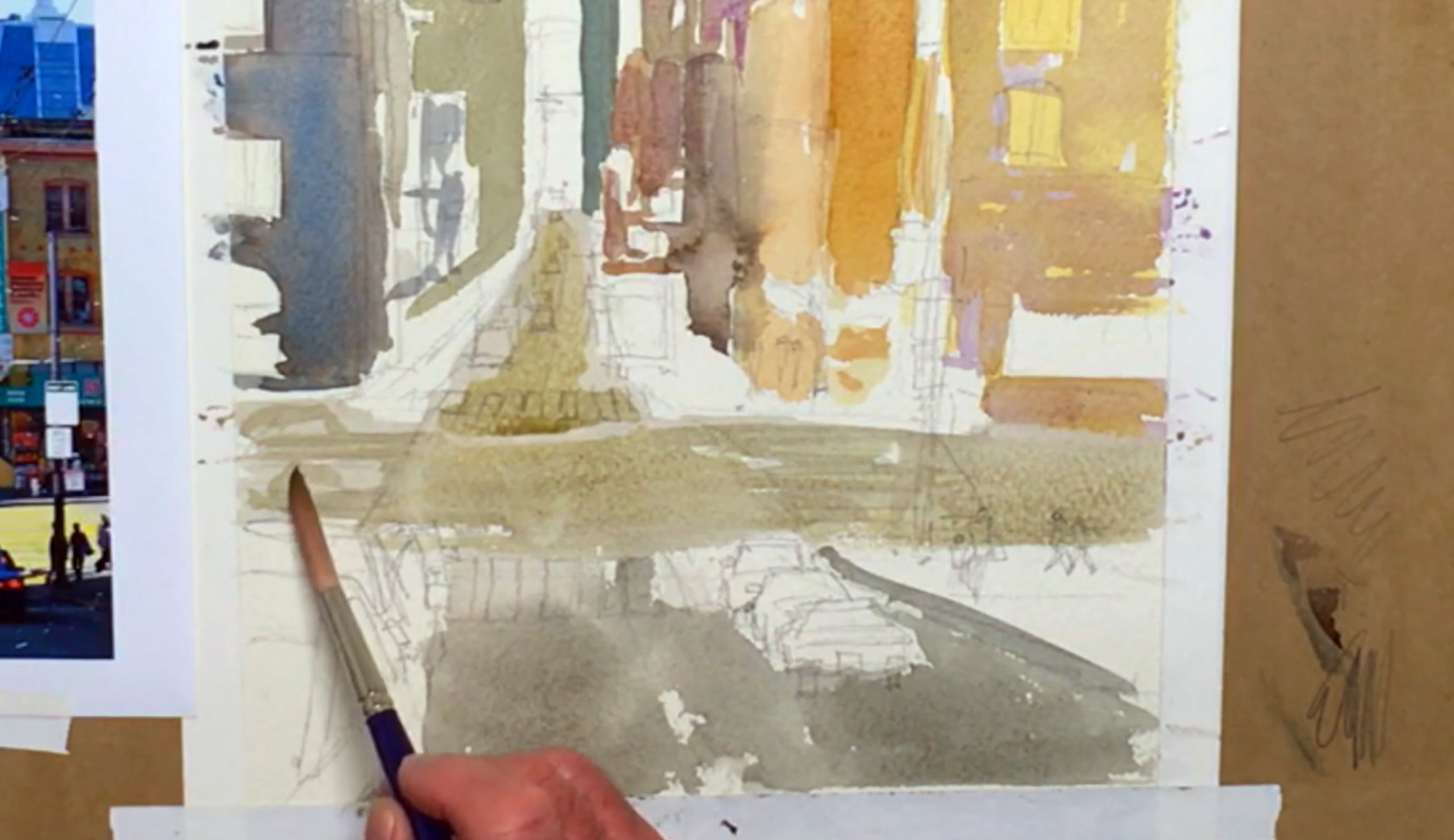 While the layers on the buildings dry, you can start painting the streets and roads. Mix more of the same light-gray tone used in some of your buildings, and fill in the horizontal and vertical roads, making sure to paint from the vanishing point all the way to the bottom. You can paint over the cars in the distance, but try to leave a white space for the cars in the foreground (details will be added later). You can make your brushstrokes rough by continuing to paint even when there's not enough paint on your brush (i.e. the "dry-on-dry" technique) to imitate the rugged texture of the road. Add another layer of Neutral Tint for the roads to deepen the color, and remember to use horizontal strokes to mimic the way asphalt is laid on the ground.
Step 6: Fleshing Out Some Painting Ideas With Details And Layers
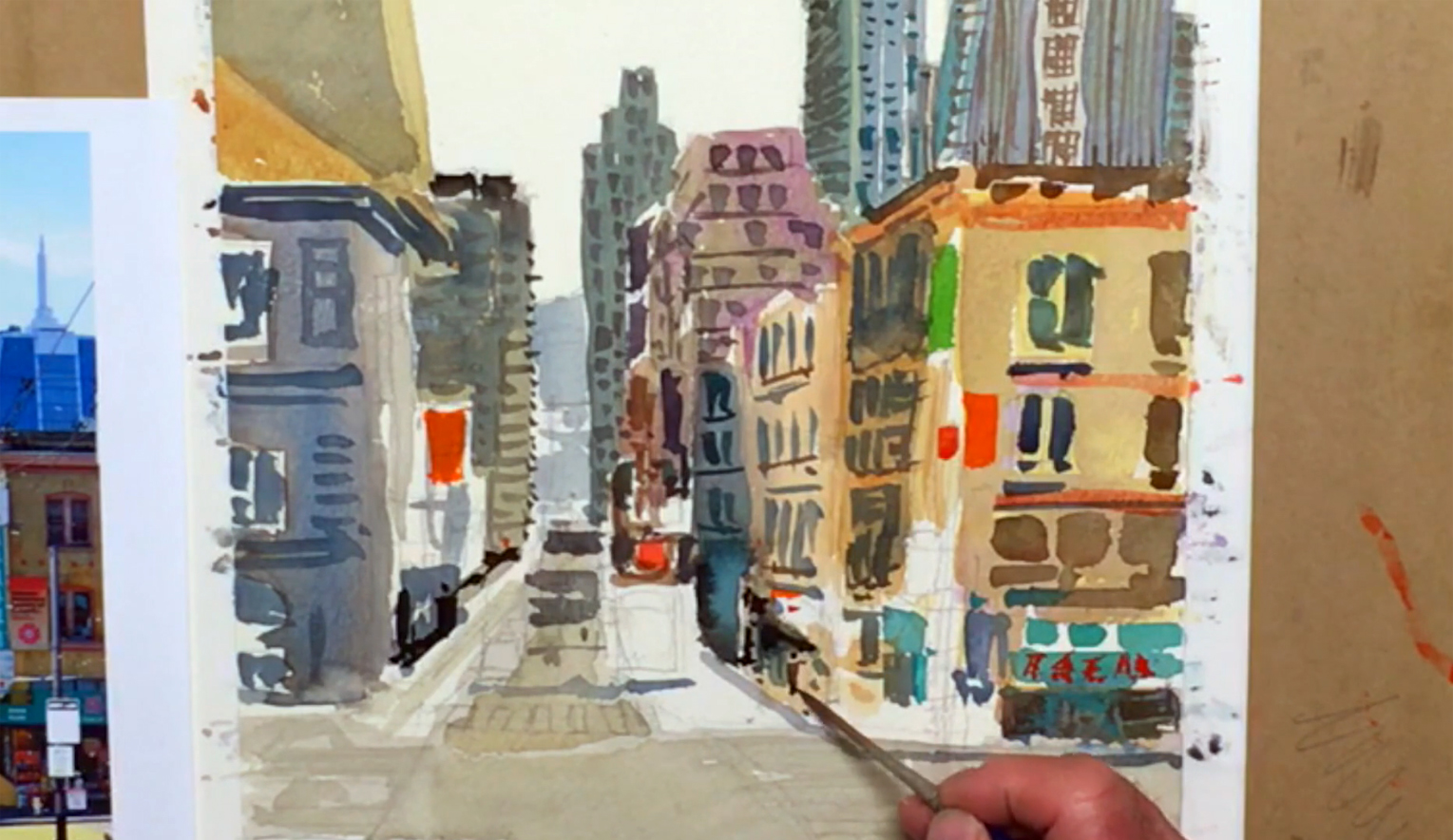
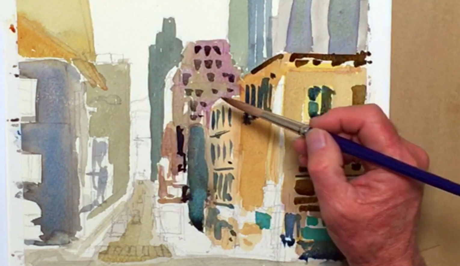 Prep Payne's Gray and Indigo to add as a darker layer for the shadows on the buildings that face the street, and also for any window or sign details. A touch of Cobalt Green can be used to paint the awnings on the storefront of the rightmost building, while a Neutral Tint and Burnt Sienna mixture can be used for rooftop lines, window frames, and other details to the closest right-side building. Remember to keep your brushstrokes loose for that impressionistic feel! Add Prussian Blue and Cobalt Green to the brown-gray mix, then use this dark blue color for the windows on the left side. Vary your lines and stripes for a larger variety of windows and details, remembering to follow the rules of tunneled perspective in you're painting the side of a building as opposed to its front. If your colors bleed here, it means your paper is still too damp, so make sure the previous layer is mostly dry before attempting to paint these details.
Step 7: Adding Some Style To The City Landscape
 Next, switch over to the no. 6 rigger brush, and use Burnt Umber to add some smaller building details, leaving white spaces for signs. Go upwards to the furthest buildings, and add some long thin stripes where appropriate, changing the direction when the lines become too regular or too similar to another building's details. Continue applying paint to the street-side of the buildings, adding small marks to serve as windows and other random structural details to give the impression of a bustling city landscape. Use pure Neutral Tint to change up the color, or mix in Viridian and Cobalt Green for a different pattern for the last building on the right. Tiny dots can be added to the last building in the very back, and a gray glaze can be added to the areas in shadow to darken certain parts.
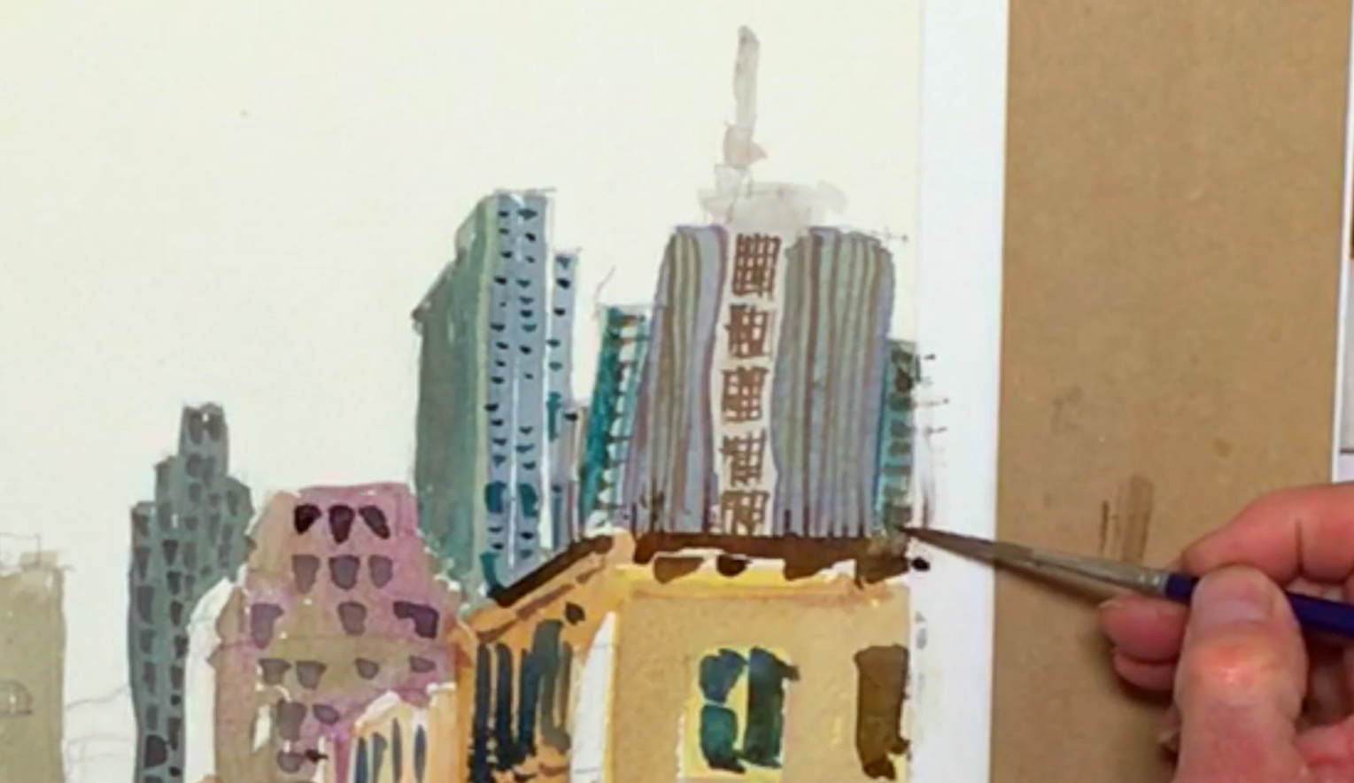
Step 8: Architectural Details And Adding Darker Tones
 Use a rag or paper towel to clean your palette of the Neutral Tint mixes, and start again with pure Neutral Tint. Add lines and details to the buildings on the left, then use some Ivory Black to paint very small touches of windows jutting out from the building to the left of the vanishing point. Use the black sparingly though, as it's easy to go overboard and dull the colors of your painting. Keep adding architectural details, shadows, and layers using new or different mixtures of paint, making sure that you check each time you apply a different color; that this introduction enhances the overall feel rather than mess up the balance. Moving to the Transamerica Pyramid, switch back to the no. 12 rigger brush and use Neutral Tint to glaze (i.e. paint on top) the Yellow Ochre layer, leaving some white highlights where needed. While it dries, focus on another building. Pick up some Payne's Gray and add some windows and shadows under the roof of the leftmost building, darkening any areas if needed and making "architectural marks" like before. One tip Bill gives is to work from top to bottom to minimize the chances of accidentally smudging any wet paint, and to carefully lift out mistakes with a rag or paper towel when necessary.
Step 9: Painting The Perspective And Creating Contrast
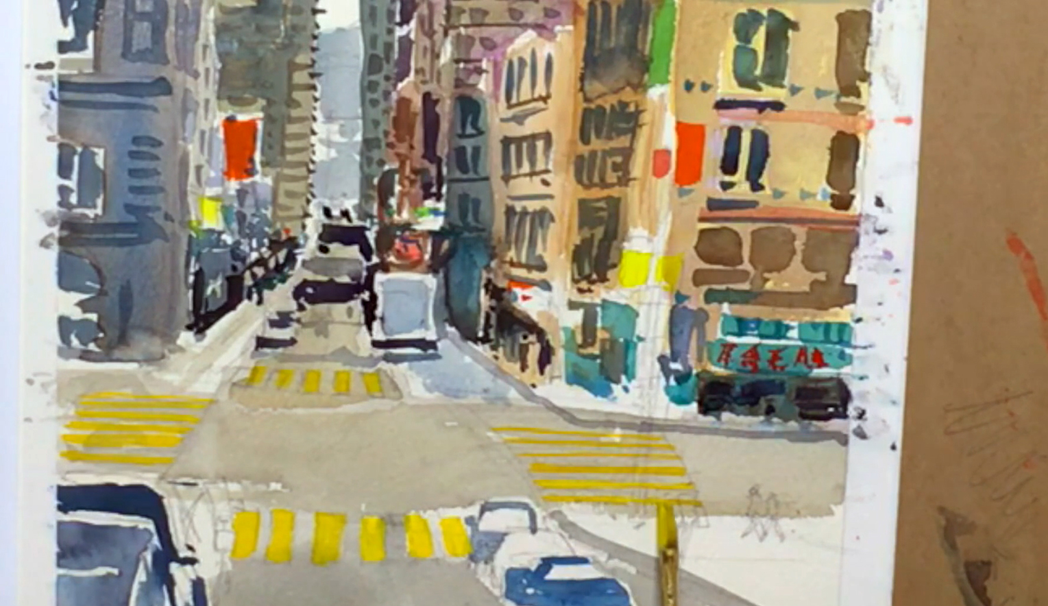
 Dilute Neutral Tint and Payne's Gray for a light blue-gray, and paint the very distant mountains that encompass the vanishing point. This adds a greater sense of depth, establishing the perspective of the entire city landscape. Going back to the roads, mix a stronger version of Neutral Tint and Payne's Gray to darken the road underneath the vanishing point, making sure to leave some lighter areas for the side streets. Switch back to the no. 6 rigger brush and mix Burnt Umber and Neutral Tint for the sidewalks and details, while Cobalt Green can be used for more shop awnings and other small details. Brilliant Orange, Cadmium Red Purple, or Cobalt Green and Permanent Green #1 can be used for the signs, lights, and rooftops on the buildings and streets, alternating between the colors for a striking combination. Chinese lettering can be done in red as well, but be selective on where to add these vibrant colors. Changing back to the Neutral Tint and Payne's Gray mix, add bold lines along the sidewalk for cast shadows, doorways, and silhouettes of people on the streets. These dark parts go a long way in adding contrast and bringing out the busy atmosphere.
Step 10: Painting Ideas For Creating Car-Like Cars
 Switch to a no. 10 rigger brush and prep Neutral Tint, Payne's Gray, and Indigo before working on the cars along the side of the road. Due to the main light source coming from above, the topmost surfaces of a car are always a lighter shade than the sides. With that in mind, apply the dark blue mix to the shadowed areas in the leftmost cars in the bottom left corner. Dilute the dark blue mix and paint the roof of the car, then dilute the color further for the car's windows. Don't forget to paint the side mirrors and windshield even if they're not visible in the reference picture, as these are the details necessary to make a car look like a car. You don't have to get too fussy either, and keep moving around the painting to allow previous layers to dry. Use the same painting principles for the cars on the right side of the street, leave room in between each car. Then, start working on the truck and other vehicles in the distance, using strong Neutral Tint to paint the cast shadows underneath each one.
Step 11: Brightening And Livening A City Landscape
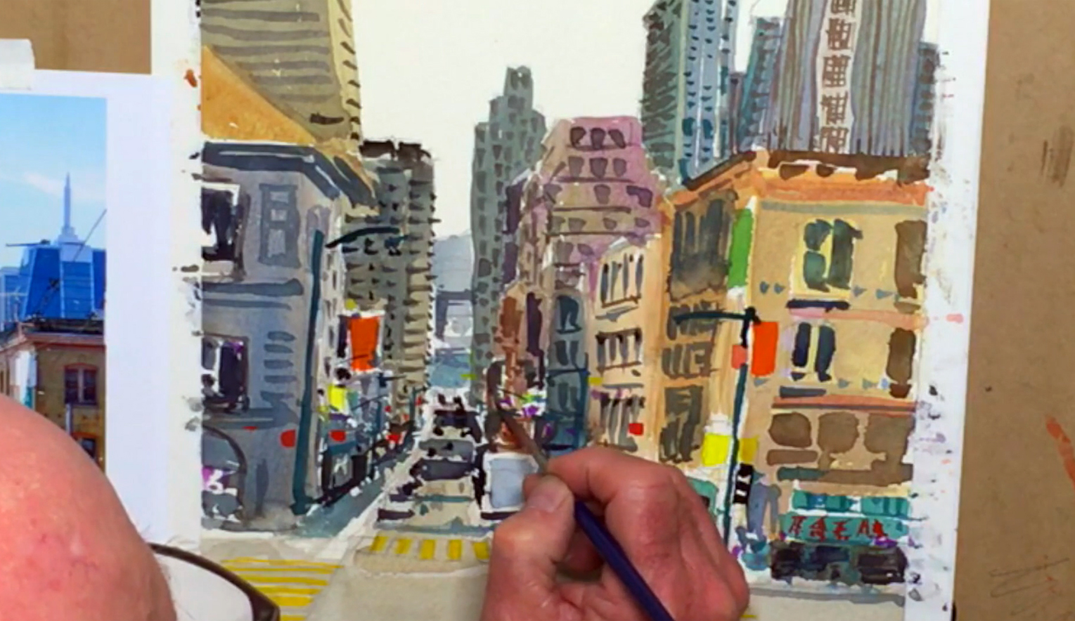
 With the no. 6 rigger brush and dark blue-gray mix, add darker strokes to the sidewalks and paint more architectural elements like vertical stripes to the left-side buildings. Brighter colors like Viridian or Cobalt Green can also be used for extra variety, while Permanent Yellow Lemon or Peacock Blue can be used for signs and little touches near the sidewalk areas (although try painting in lighter areas as the color may be too light to cover the layers underneath). Paint in the back of the truck using the same light gray as the car windows. Switch to the Princeton flat brush (¼"), and prepare pure Permanent Yellow Lemon for the crosswalks in the intersection. Keep the paint quite thick so it can be seen on top of the gray roads, and remember to apply the rules of a single-point perspective, which means the lines should be narrower towards the vanishing point. You can add a second layer of yellow to strengthen the color, and for painting other small signs and lights throughout the rest of the painting. You can also change to the Cadmium Red Purple for smaller signs, lights, and banners scattered among the buildings. Remember to leave some white dots and lines to give an extra "sparkle" to the city landscape!
Step 12: Painting Ideas For Building A Busy Atmosphere
 For the smallest of details, use the Winsor & Newton Series 7 round brush (size 1). Add more sidewalk details with a dark blue-gray or a blue-green mix. Feel free to jump around and add any smaller details you wish to add to some of the buildings, whether it is a darker tone or glazing with an extra layer of color. Don't let the busyness of the city landscape intimidate you! For the traffic lights, use pure Neutral Tint for the frame and post, and add Viridian to paint several slightly different-colored lampposts. Add a few more in the distance as well. While those are drying, go back to the dark blue-gray mixture and finish painting the cars at the bottom, working on the back windows, wheels, shadows under the car, and side mirrors. Dot a few cars in the far distance as well, making sure to anchor them in place by adding a cast shadow underneath each car. You can also add the Bay Bridge in the very back area above the vanishing point, and use the same color to paint some flagpoles, building antennas, and stripes on the Transamerica Pyramid.
Step 13: Touching Up The City Landscape And Adding Tiny Details
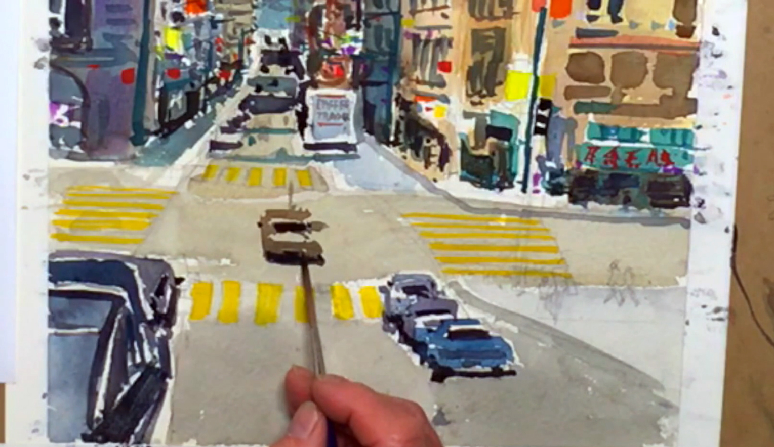 With most of the details in place, it is time to touch up the overall look of the painting. Use Neutral Tint to paint any extra marks to bring out shadows or add structural detail, and when you're done use the no. 12 rigger brush and mix the Neutral Tint with Burnt Sienna to paint a car in the middle of the intersection. This helps to focus the painting towards the center while adding to the "busy" atmosphere. You can lift out excess paint with a rag and/or a dry brush, which actually adds some shine to the surface of the car. Heavily dilute the blue-gray mix, then paint the pavement on the lower right-hand corner. You can also add a sign to the back of the truck using the no. 6 rigger brush and a dark brown-gray mix for extra detail. For even tinier details, go back to the Winsor & Newton round brush (size 1) and use Cadmium Red Purple to paint the flags handing off the flagpoles. Use the no. 8 rigger brush and the blue-gray mix to paint the rear-view mirrors in the cars, and for the finishing touches, add road lines and other marks you may have missed. For some trees along the sidewalks, mix Viridian and Olive Green and dab them in between all your architectural marks.
Step 14: Scrubbing In The Sky Behind The City Landscape
 To capture the feeling of clouds piling above the city, use the no. 12 rigger brush to heavily dilute the Neutral Tint and Payne's Gray mixture. Scrub in the sky, leaving white areas for the clouds. Add a touch of Peacock Blue using the wet-in-wet technique for a different color within the sky.
Step 15: Various Painting Ideas For The Finishing Touches
 Next, mix the Zinc White gouache paint with the Cadmium Red Purple to create an opaque red, then dot in the taillights of the cars. You can use this color to paint in any red signs that seem to be fading into the background, as the white will help it stand out. Lastly, after all the layers are relatively dry, add the final touches using Neutral Tint to paint things such as a tall street pole, telephone wires, and people for that extra hustle and bustle. Step back to check on the overall atmosphere, and when all is done to your satisfaction, make sure to sign your painting with great pride like Bill does!
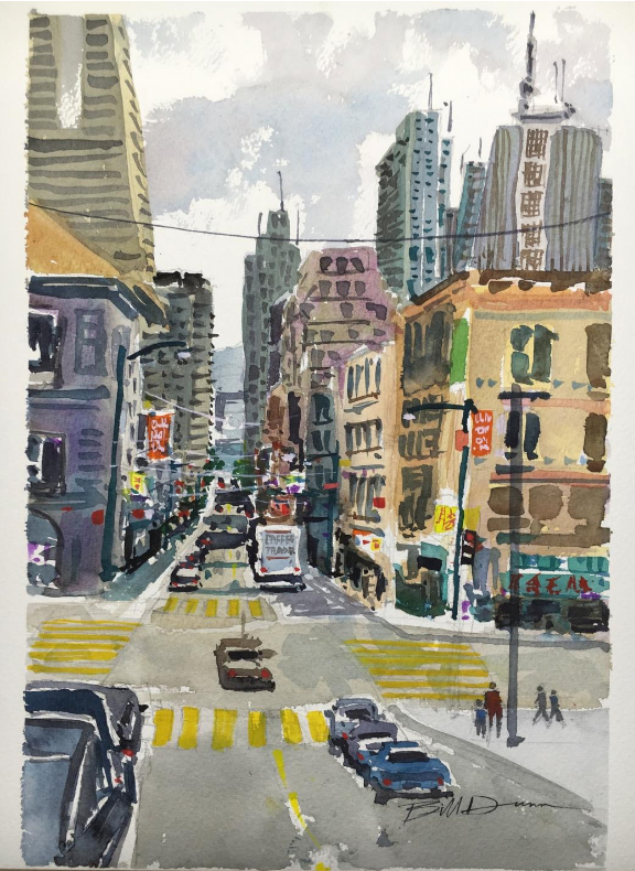


