Learn from Steve Curl on how to paint a seascape and a lighthouse through careful planning and determining different values before moving to more advanced watercolor techniques, including the variegated wash ("wet-on-wet") technique and the scumbling ("dry-on-dry") technique. Want to watch the video version? This tutorial is also available to members of our Beeblys WatercolorPainting.com.
Materials used:
- Reference picture of a seascape with a lighthouse in the background. You can print one out here.
- A book of Arches cold press watercolor paper (140lb, size 16" x 12")
- Scrap paper or a sketchbook
- Two L-shaped "angle bands" made from paper or cardboard (as a viewfinder)
- Masking tape (width 1")
- HB pencil
- Kneaded eraser
- Painting palette for watercolor paints
- A container of water
- A towel or rag to rest brushes on
- Tissue or paper towel
Paints (Holbein Artist's Watercolors)
- Cadmium Yellow Deep
- Cadmium Yellow Orange
- Cadmium Red Deep
- Permanent Alizarin Crimson
- Permanent Violet
- Ultramarine Deep
- Cobalt Blue
- Cerulean Blue
- Peacock Blue
- Sap Green
- Hooker’s Green
- Yellow Ochre
- Burnt Sienna
- Burnt Umber
- Sepia
- Payne’s Gray
Brushes
- Mop brush (1" flat)
- Fibonacci Kolinsky-Sable: Round brush (size 14)
- Synthetic round brush (size 8)
- Synthetic round brush (size 4)
- Synthetic round brush (size 2)
- Synthetic round brush (size 1)
- Cotman synthetic round brush (size 2)
Step 1: Framing A Sketch
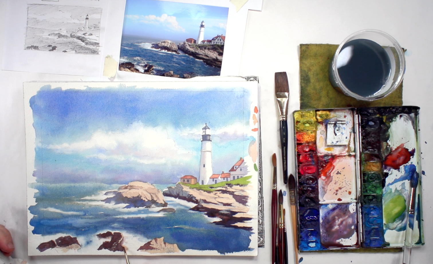
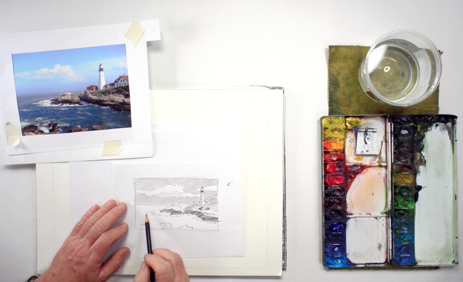 If you don't have one already, make a viewfinder by cutting two L-shaped strips of paper (called "angle bands" by Steve). Their length and width should be large enough to frame your reference picture. Place it on the reference picture so that it frames what you want to paint and cuts out what you don't need, then tape the frame to the picture using masking tape. Think about the final painting's composition and the best way to present the lighthouse in the picture. After that, do a quick value sketch of your composition on a piece of scrap paper or in your sketchbook, which means deciding where each value goes and shading your sketch accordingly. For example, light values should be the clouds, the water spray, and the highlights on the lighthouse, whereas mid-values go to the sky and rocks, while dark values go to the shadows and deepest parts of the ocean. Keep checking your reference as a guide. This overall sketch should not take too long to complete. Below is a close-up of Steve's value sketch:
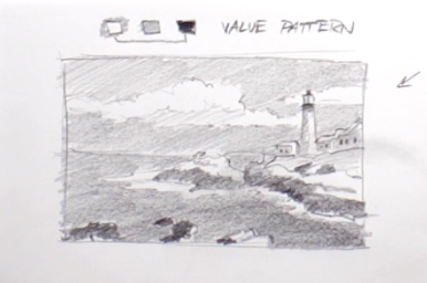
Step 2: Transferring The Sketch
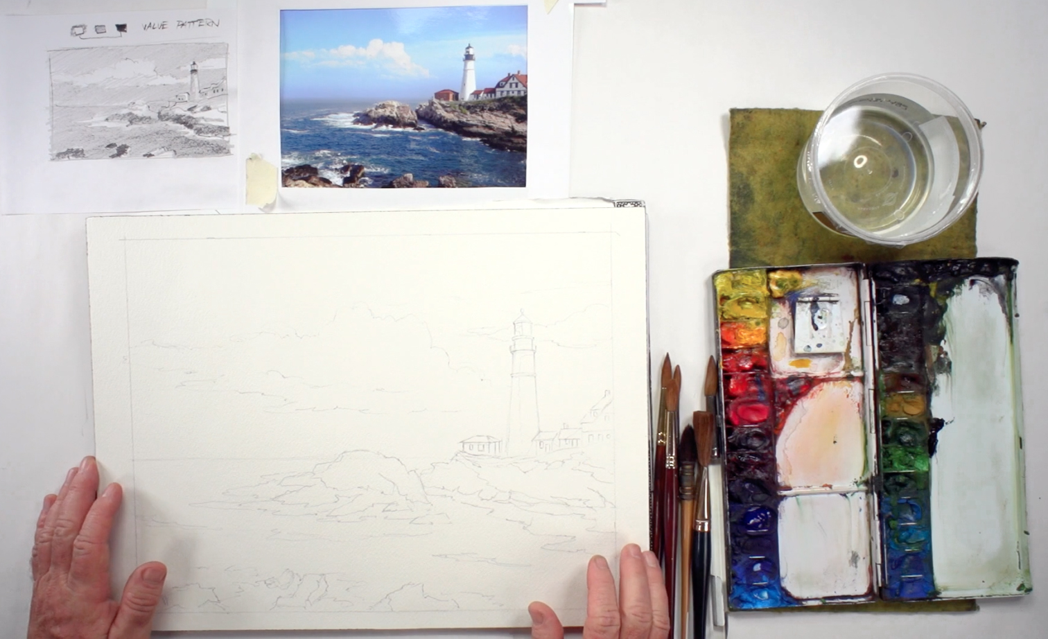 When you've planned everything, transfer the compositional sketch to the Arches cold press watercolor paper, but make sure not to include the values - you just want a line drawing of the basic shapes needed to guide your painting. Draw lightly so the pencil lines can be erased easily. The final sketch should be slightly smaller than the size of your paper; about 14" x 11". You can draw a border around your composition for framing purposes (use a ruler for this). You can see a close-up version below:
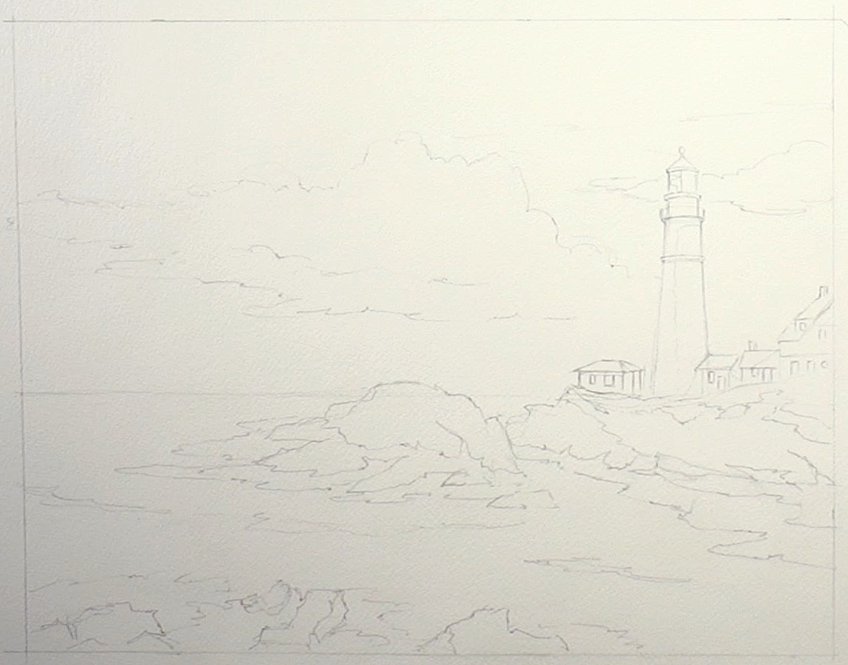
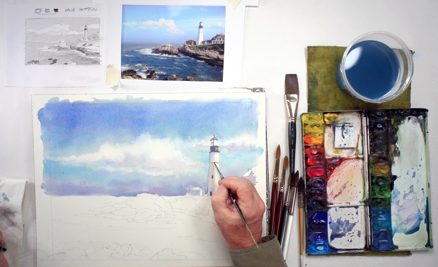
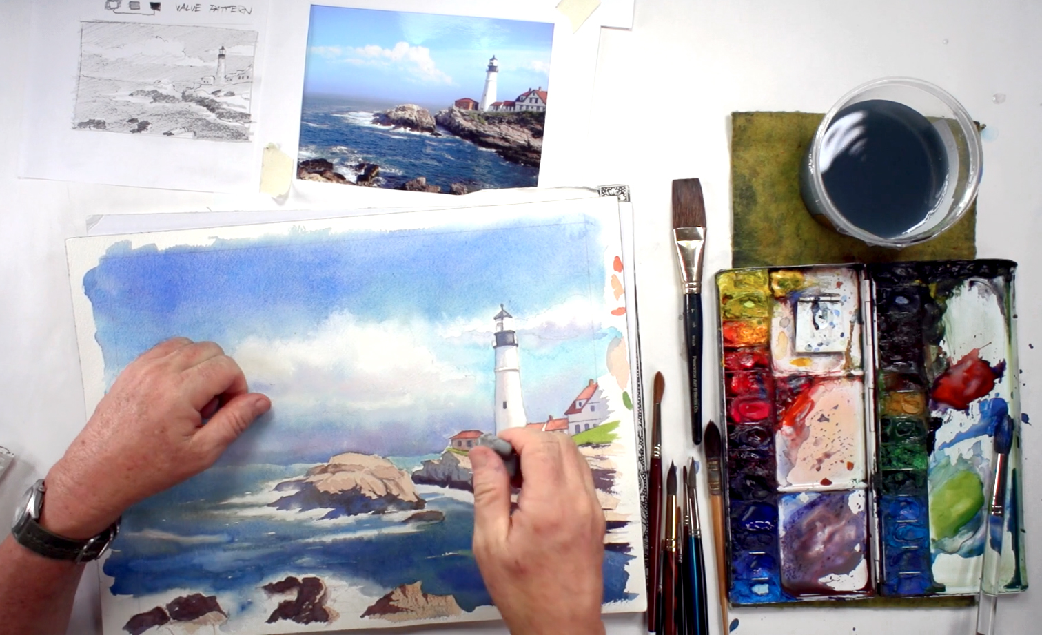
Step 3: A "Wet-In-Wet" Sky
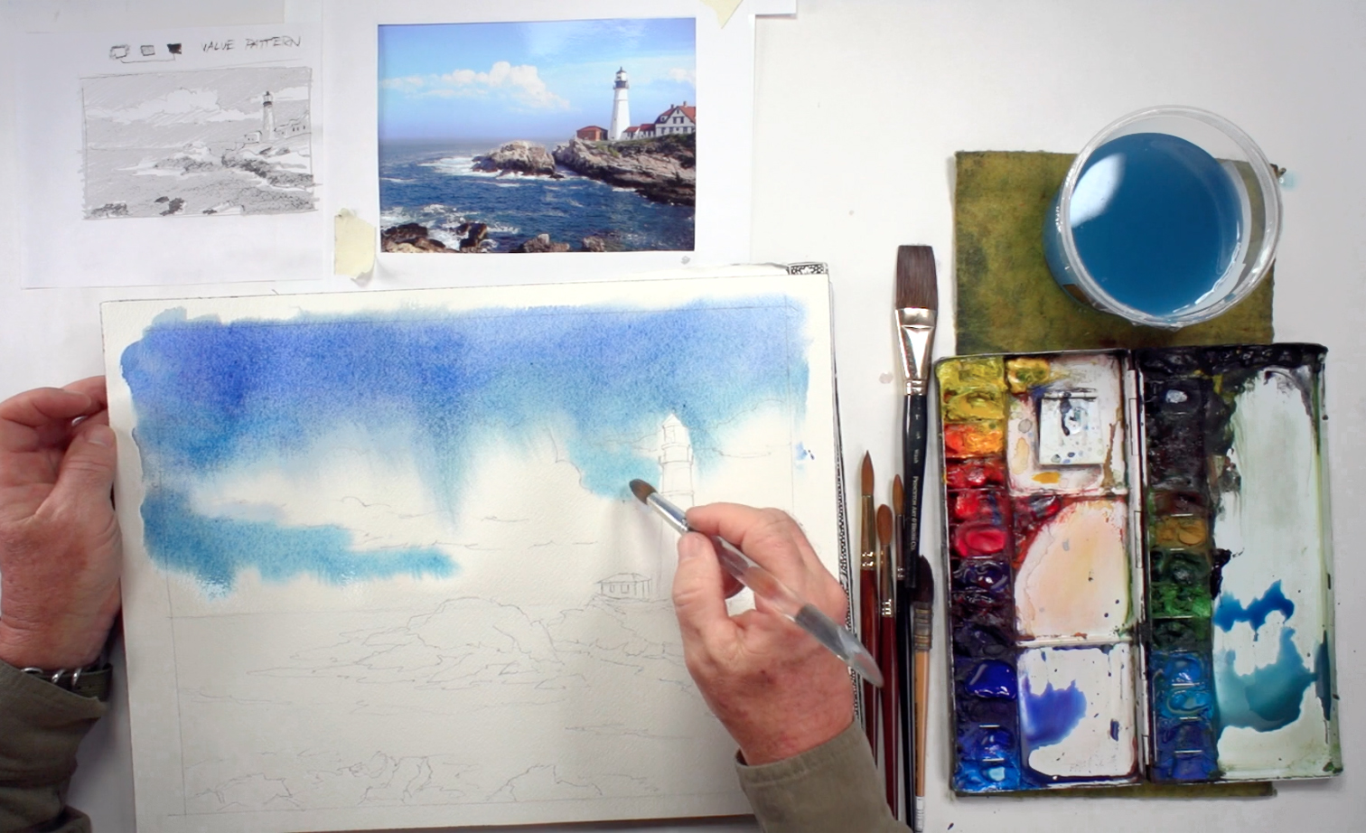 Prep the colors on your palette with the size 14 round Sable brush: mix Ultramarine, Cerulean, and Peacock Blue with a touch of Alizarin Crimson. Then, with the mop brush, wet the sky with clean water, including the clouds. Be careful when painting around the lighthouse and surrounding buildings, as you want them to have a crisp edge. While the paper is still wet, use the wet-on-wet technique to drop in the colors of the sky, starting from the top of your painting and working your way towards the horizon. The top has a darker value, so it can contain a little more Alizarin Crimson, then blend in more Cerulean and Peacock Blue as you get towards the clouds. Make sure to paint around the clouds, and soften any hard edges with a clean, wet brush. You can also use the paper towel to blot out the paint around the clouds so the paint isn't bleeding into them too much (but don't overdo it).
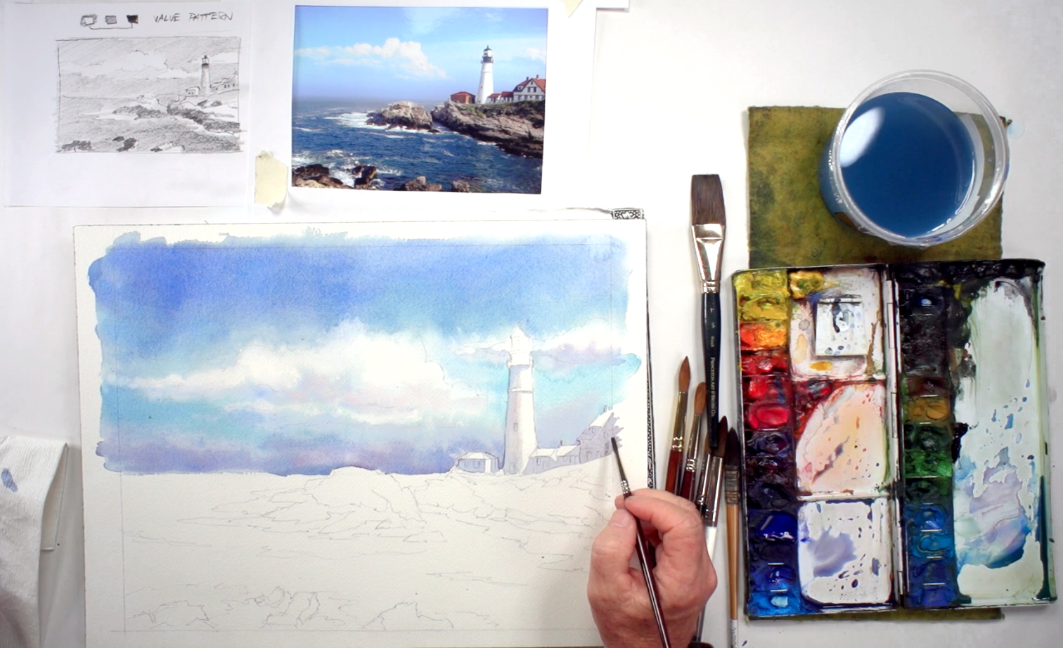
Step 4: Shadows And Clouds
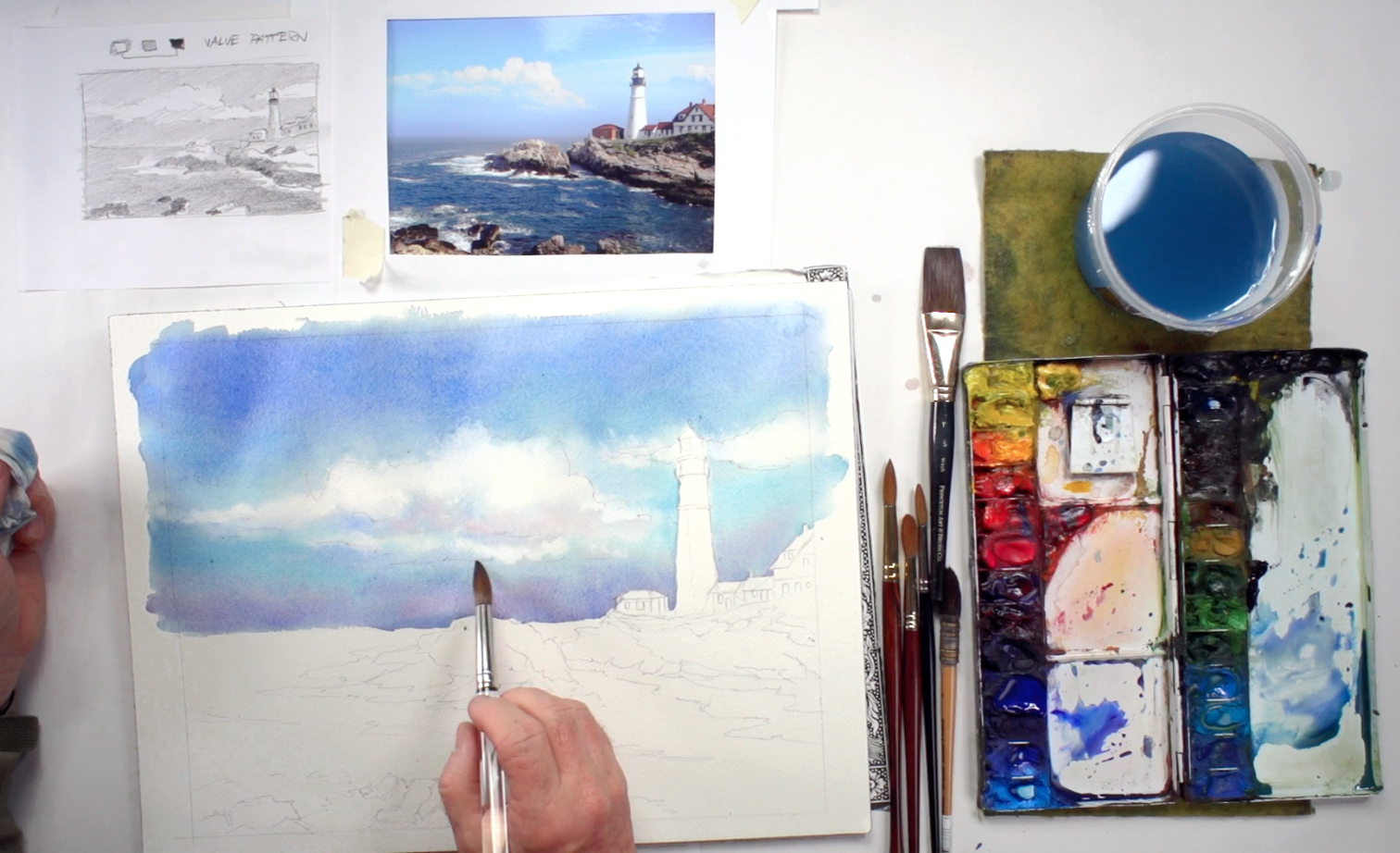 Add a little Cobalt Blue to the sky's color on your palette and paint the shadows underneath the clouds, then add some darker blue for a hazy effect near the horizon line by mixing in Ultramarine Blue and Alizarin Crimson. Keep softening the edges of the clouds with a clean, wet brush and paper towel. You can also add darker shadows under the clouds by mixing Ultramarine Blue, Cerulean Blue, and a touch of Payne's Gray. It helps give the clouds more structure and volume. When you're done, let the painting dry completely before moving on to the next step.
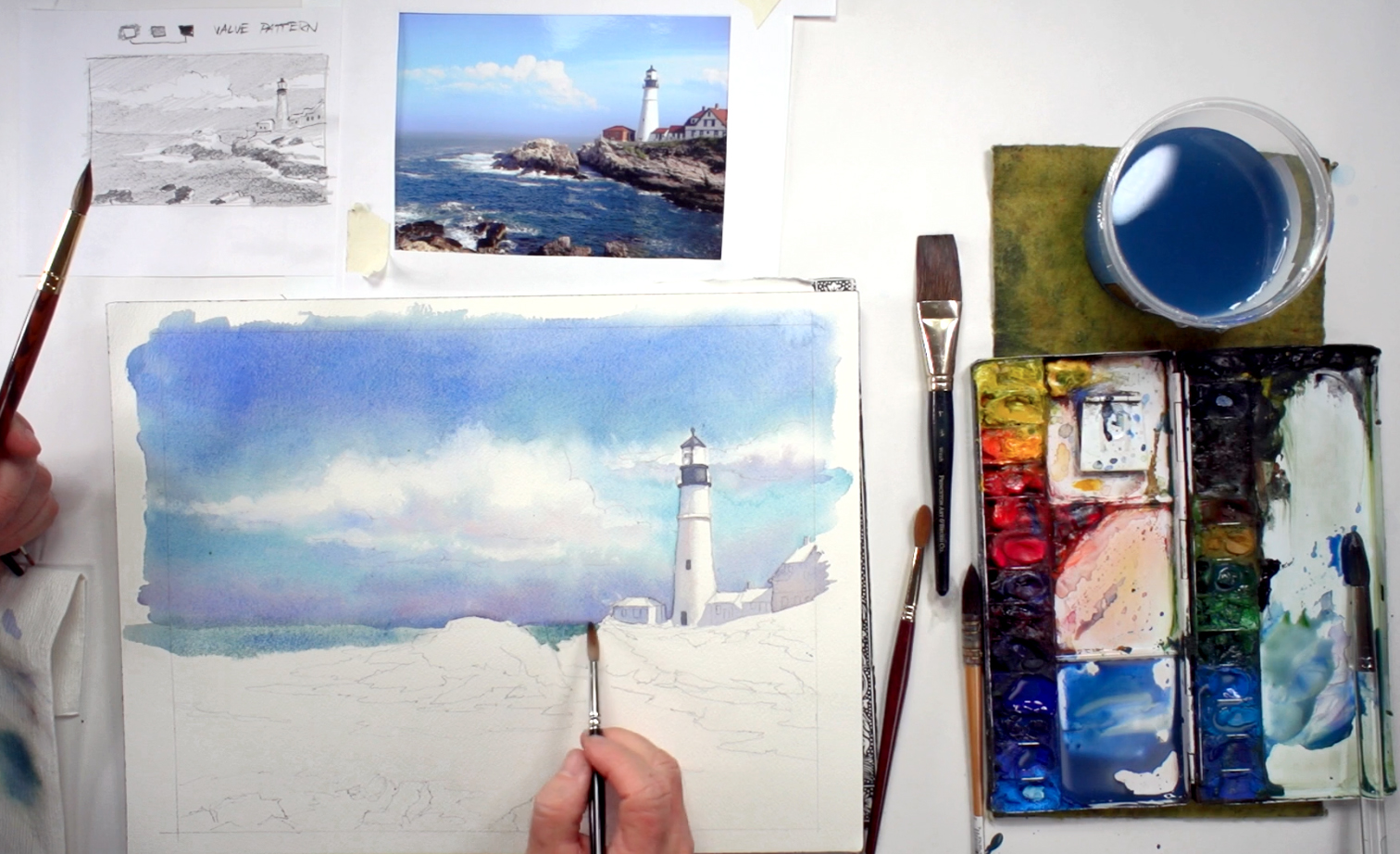
Step 5: Round Vs Flat Shadows On Buildings
 Determine the values for the buildings and lighthouse, then prep the colors you need for the shadowed areas: Ultramarine Blue, Alizarin Crimson, and a little Payne's Gray. It should be similar to the darker areas of the sky, as shadows reflect their surrounding colors. For this part, use the round size 2 brush and switch to the size 0 brush when you're painting a smaller area. With the same color, paint the shadowed area on the lighthouse as well. Since the lighthouse is round, make sure you paint a turning edge on the shadow, which means softening the side of the shadow that is near the light so there's a gradation from dark to light. You can even add a touch of Cadmium Yellow Orange or Yellow Ochre to the mix to break up the monochrome, or where there is reflected light within the shadows. Lastly, don't forget to paint the cast shadows caused by the lighthouse.
Step 6: The Light In A Lighthouse
 Leave the shadows to dry, and continue painting the details of the lighthouse and buildings. Mix more Payne's Gray to the blue/purple mix, then paint the lighthouse's balcony, roof, and windows (make sure the shadow is dry before painting the windows). Check the paint with the back of your hand; if the paper is still cool to the touch, then the paint isn't dry enough yet. But when it is, you can add the details to the other buildings too, excluding the roofs and windows.
Step 7: Distant Sea
 While you're waiting for the buildings and lighthouse to dry, move on to painting the ocean. Mix a lot of paint for this as you are covering a large area. You will need: Ultramarine, Cerulean, and Peacock Blue, with Cobalt Blue and some Hooker's and Sap Green, and a touch of Payne's Gray. The mixture should resemble the colors of the sky, as water reflects the colors of its surroundings. With the Sable brush (size 14), soften the horizon line with clean water, then switch to the size 8 round brush. Add a little more Payne's Gray and Hooker's Green into the color you mixed for the ocean, then start painting the water, starting from the horizon line and working your way down. Try to blend the ocean's color into the sky; soften the transition with a little water if necessary.
Step 8: Deeper Sea
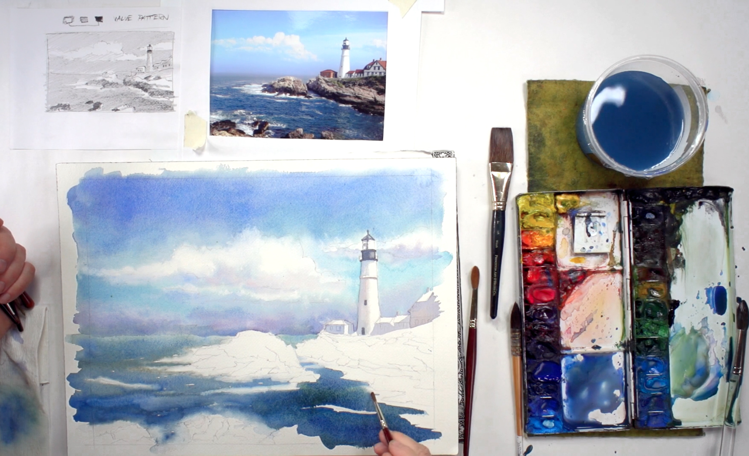 As you work your way down, go behind the rocks and around the foamy areas, adding deeper colors (more blues and/or greens) as you get closer to the foreground, and in areas that need to be darkened. You can add in Burnt Sienna and a touch of Alizarin Crimson to dull down the color. Try to paint the way the water moves, and leave some white areas for waves or surf. For the areas where water turns into foam, soften the edges with a size 0 brush and clean water before the paint dries. Keep alternating between painting the ocean and softening edges until you finish.
Step 9: Raising The Roofs
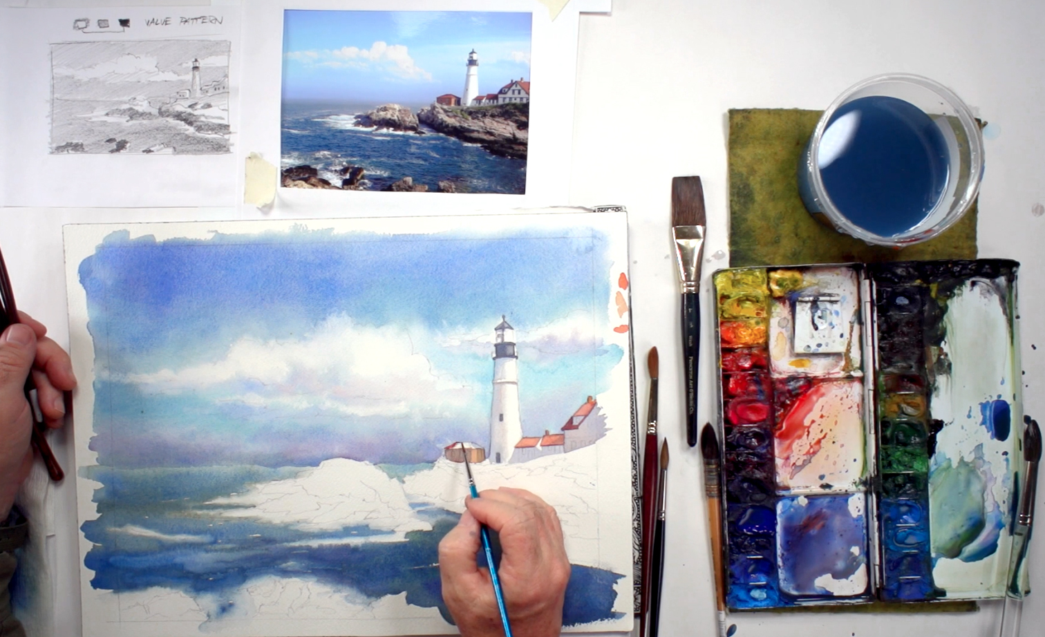 While the paint for the ocean is drying, you can paint the buildings' roofs. Mix Yellow Ochre and Cadmium Yellow Orange with the Cotman size 2 brush, then fill in the roof area. As watercolor paint is quite transparent, you can even layer it on top of shadows if necessary. This adds to the harmony and depth of the painting. Add Cadmium Red Deep, more Cadmium Yellow Orange, and some Burnt Sienna for roof tiles and rusty areas, using a size 1 round brush for the smaller details. To paint the value of a roof in shadow, you can add Alizarin Crimson and Ultramarine blue for a deep violet color. Use this color to paint the underside of the roofs as well (i.e. the slight shadow cast by the roof). Mix in some Payne's Gray and more blue to paint the remaining details of the building, such as the windows or to touch up any areas that you need. Make sure not to oversaturate them - use paper towel to wipe off any excess paint or water on your brush. Keep checking your reference picture and value sketch to guide you in your decisions.
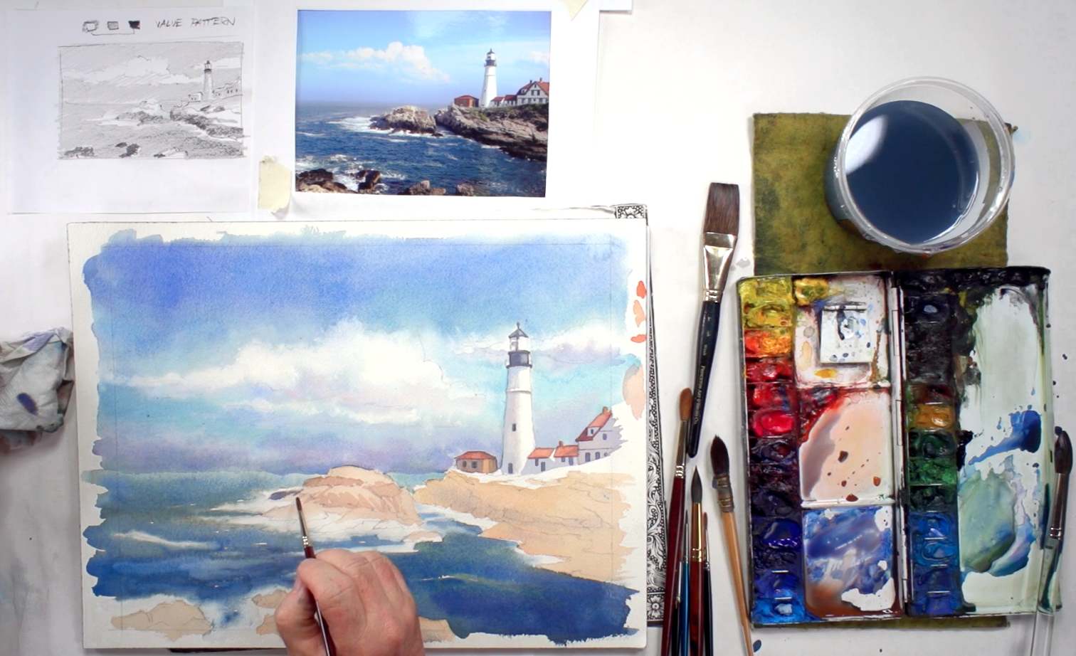
Step 10: Rocky Cliff And Layering
 Clean your palette a bit with a wet sheet of paper towel, then determine the value and local color for the rocks next. Mix Yellow Ochre, Cadmium Red Deep, and a little Permanent Violet, adding quite a lot of water to lighten the color (instead of using white paint, use water as a substitute). Start blocking in this color for all the rocky areas, leaving the water foam and splashes white. Soften the edges where the rock meets water with a clean brush and water. Use the local color of the rock to form the base layer, so that even the shadowed and highlighted areas contain this color. You can mix in more Cadmium Yellow Orange or Cadmium Red Deep in several places to make the rocks in the foreground more interesting, and give more depth to your painting.
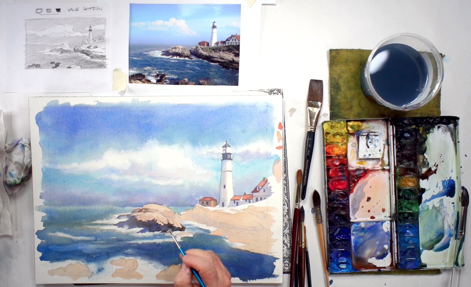
Step 11: Rocky Textures And Mid-Tones
 When the base layer of the rocks is relatively dry, add more Burnt Sienna and some of the blue mix to your orange mix to paint in the mid-values of the rocks in the middle of your painting. You can add a few crevices and other textural details, but don't overdo this as you want the rocks to frame your main subject, rather than being the main subject. For darker areas of the rock (where it's darker because it's wet from the waves), add Burnt Umber, Ultramarine Blue, Permanent Violet, and Payne's Gray to your rock color mixture, and use a size 1 brush to paint them in. Again, avoid the foam and surf as they should remain white.
Step 12: Splashes And Craggy Shadows
 To paint splashes of water where the waves crash into the rocks, use the Cotman size 2 brush, wet it with clean water, and lift out a little paint from the base of the rocks where you want a splash to appear. The soft negative space created should look like a spray of water. If it's still too dark, you can use the paper towel to help blot out more paint. Keep adding splashes here and there as you paint along the base of the rocks, but don't repeat it too much or it may start to look too forced. Add more Burnt Umber and Sienna where needed to tie in the rock with its shadow, and use this same color to paint cracks or other textural details on the rocks. Be selective - details should be more defined towards the foreground, so don't add them to rocks that aren't important.
Step 13: A Grassy Surface
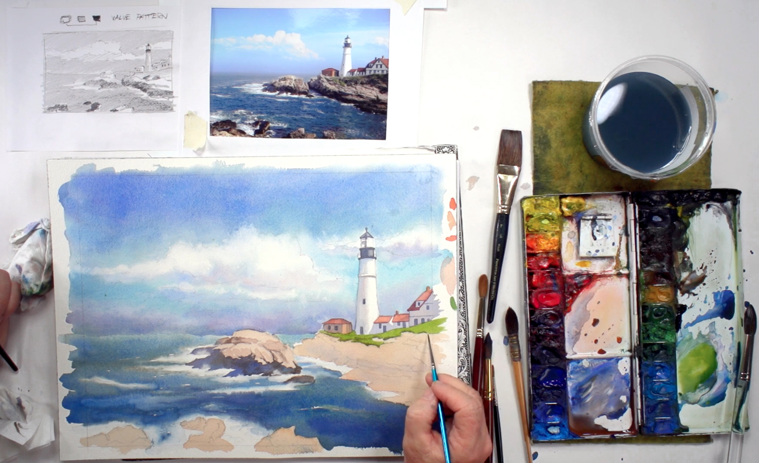 Mix the color for the meadow next, using the size 1 brush to mix Sap Green and Cadmium Yellow Deep to suggest a sunlit area. Apply on the surface of the rocky island, underneath the buildings and lighthouse. Pay close attention to the shape the grass forms on top of the rock, and the way it clings to the surface. When you're done, add some Burnt Sienna to paint the shadow and underside of the grass to add some volume to the meadow.
Step 14: Adding Contrast, Depth, And Aerial Perspective
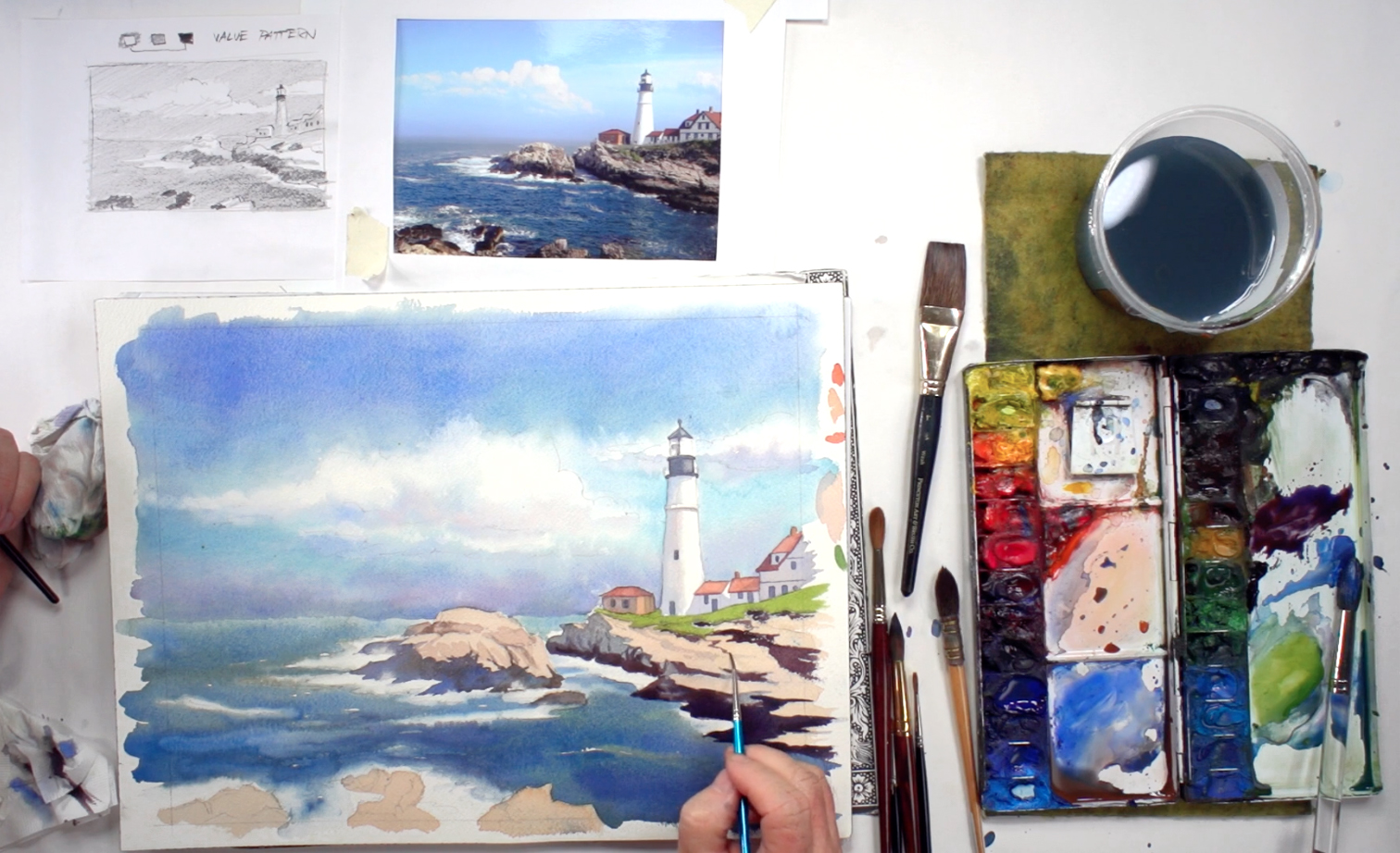 Next, work on the area beneath the meadow, on the coastline where the rocky foundation is exposed to the waves. Add the shadows to these rocks using the same color as you did for the other rocks, and paint the craggy effect with uneven strokes of the brush. Keep checking the values and using your picture for reference. You can also add crevices towards the foreground, but again, getting the shapes of the shadows in the right place is more important than adding too many details. Add more Cerulean Blue to the mix towards the base of the rocky island, where it meets the sea. For the darkest areas where the rocks are always wet, mix in Burnt Umber and Permanent Violet, especially as you get towards the foreground of the painting. This is the best way to add an aerial perspective to your painting, i.e. where objects closer to you appear darker in color than objects in the distance. Also, avoid using black at all costs, as this will dull down the brightness and life of your painting.
Step 15: Lifting Out More Surf And Adding Details
 Occasionally, you can add a little Cadmium Red Deep into the shadow, and make sure to soften the base, where the rock meets water. Use the same lifting technique mentioned before to create splashes of water crashing against the rock, and as you get to the darkest areas, add even more Permanent Violet, Burnt Umber, and Sepia, and paint in more cracks and details. To reproduce the rough texture of the rock, you can use the scumble technique, a type of dry brush technique where you wipe off most of the paint from your brush before brushing over the paper. The roughness of the paper should pick up a little paint in certain places to give a rough, craggy texture. You can test this on a scrap piece of watercolor paper before adding this effect to the rocks in the foreground.
Step 16: Finishing Touches To A Seascape
 Finally, add any finishing touches to your painting, such as more surf, splashes, etc. Try not to overwork your painting, as this might drown out any signs of your unique art style and the painting's own individuality. However, if you've planned well, you shouldn't need to spend too much time adding finishing touches or fixing mistakes. As a final step, wait for the painting to dry completely before using a kneaded eraser to clean up any pencil lines that detract from your painting, especially for the white or lighter areas. They should come off easily as long as there aren't too many layers of paint on top. And when you're done, feel free to sign it, date it, and frame it for all to see!