If you’re a beginner and have just started your watercolour journey, setting up your watercolor palette can seem a little daunting. Organizing your painting colors may seem trivial, but it comes with a lot of benefits.
Setting up your color palette not only makes your painting experience easier but also saves you a lot of time. This article discusses how to set up a new watercolor palette to arrange your colors effectively. So, let’s get started.
Setting Up a Watercolor Palette
You can set up a watercolor palette for all types of watercolor paints. There are a few important considerations that you need to take into account before organizing your watercolors to set up your palette efficiently and effectively.
Important Points to Consider Before Setting up a Palette
The biggest mistake that most beginners make is that they start with too many colors. I recommend you limit your color options to make the process easier. Over time, you can make a bigger watercolor palette as your preference evolves.
Ideally, you should select colors for your palette that work well with other pigments so that you can have a range of mixing possibilities. Select primary warm and cool colors to lay the foundation for all the other colors.
Theoretically, the primary colors, blue, red, and yellow, allow you to mix all the other colors, and adding both cool and warm versions of the primary colors will allow you to mix intense and bright secondary colors including green, purple, and orange.
Note: The palette with a combination of cool and warm primary colors is known as “Split Primary Palette”.
Incorporating single pigment paints and strongly saturated colors will allow you to have a vast range of mixing spaces. If you have colors in your palette with dull pigments, you won’t be able to mix bright colors.
However, it certainly doesn’t mean that you should not include your favorite colors to set up your watercolor palettes. You can include ready-to-go secondary colors along with the colors that you use the most. You can also create multiple palettes to manage more paint colors if you want.
Another important factor to keep in mind is to select pigments instead of colors. You’ll need to read your watercolor labels to find out the pigments used. Keep in mind that different manufacturers use the same name for colors having different pigments. For instance, the Hooker’s Green color from Daniel Smith doesn’t have the same pigments as the Hooker’s Green from Winsor & Newton.
Four Color Palette: Starting Out
As mentioned, you should always start with a limited number of pigments, especially if you’re planning to start your watercolour journey. A limited palette will allow you to learn about your colors and how you can mix them. You can start with a simple four-color palette with the following pigments.
-
Cobalt
-
Quinacridone Rose
-
Hansa Yellow Light/Lemon Yellow
-
Burnt Sienna
Seven-Color Palette: Incorporating Warm and Cool Colors
The above four-color pigment doesn’t include warm and cool colors. You can use the following seven-color palette to incorporate the two versions of the same color.
-
Ultramarine Blue: Cool
-
Phthalo Blue GS/Prussian Blue: Warm
-
Quinacridone Rose: Cool
-
Pyrrol Scarlet: Warm
-
Hansa Yellow Light: Cool
-
New Gamboge: Warm
-
Burnt Sienna
This seven-color watercolor palette will allow you to create a vast range of mixes including blacks, browns, grays, and secondaries.
12-Color Palette: Stepping Up the Color Arrangement
I used the following 12-color palette all the time because it allows you to create almost any color I want. You won’t need to refer back to the color wheel using this palette. While you can start your watercolor-palette setting up the journey with this version, I recommend you use a four- or seven-color palette first to understand your colors better.
-
Raw Sienna: Earth (Yellow)
-
Indian Yellow: Warm Yellow
-
Aureolin Yellow: Cool Yellow
-
Vermilion: Warm Red
-
Cadmium Red: Red
-
Alizarin Crimson: Cool Red
-
Burnt Sienna: Warm Earth Orange
-
Raw Umber: Cool Earth Brown
-
Cobalt Blue Violet: Warm Blue Purple
-
Ultramarine Blue: Warm Blue
-
Cobalt Blue: Warm Blue
-
Cerulean: Cool Blue
You might have noticed that the above palette doesn’t include any green color. That’s the beauty of this palette because it includes three yellows and three blues. You can mix those colors to create nine different green shades.
Creating a watercolor palette like this will allow you to create a wide range of new colors using the primary and secondary ones. I recommend you create a mixing chart and store it safely using the colors mentioned above.
It’ll come in handy while painting because it’ll allow you to instantly figure out what color will be generated by mixing the two different ones.
How to Create the Mixing Chart?
You can use the 12 colors mentioned above to create a 12 x 12 color chart, which means you’ll have 144 different shades in total. Use the following instructions to create the 12 x 12 mixing chart.
-
Grab a blank paper and create a simple 12 x 12 graph.
-
Place the 12 colors in the first row of the graph starting from left to right and in the first column starting from top to bottom.
-
Start mixing the colors and place them in the respective boxes.
-
You’ll have “Cerulean” by mixing the first left side “Cerulean” with the first top “Cerulean”.
-
Then mix the second left side “Cobalt Blue” with the first top “Cerulean” to make a new color that you’ll add to the second place of the second row.
-
Continue the process to complete the 12 x 12 mixing chart.
It’s a time-consuming process but it’ll help you a great deal while working on any type of painting project afterward. You’ll be able to make informed decisions while mixing different colors because you’ll know the results beforehand.
Not only will you be able to mix the right two colors to create the one you need, but it’ll also help you to save a considerable amount of time to make the most out of your painting session. You can create a similar graph for any watercolor palette regardless of the number of colors.
If you want even a bigger watercolor palette than the 12-color version, you can use the following color arrangements. You can use 24-color half-pan palettes by Daniel Smith, which is great for painting, to arrange your colors. This watercolor palette will include the following colors:
-
Jane’s Gray
-
Raw Umber
-
Burnt Umber
-
Burnt Sienna
-
Quinacridone Burnt Orange
-
Indian Red
-
Goethite
-
Yellow Ochre
-
Raw Sienna Light
-
Undersea Green
-
Perylene Green
-
Sap Green
-
Phthalo Green Blue Shade
-
Cobalt Turquoise
-
Phthalo Blue Green Shade
-
Cerulean Chromium
-
Ultramarine
-
Quinacridone Rose
-
Permanent Alizarin Crimson
-
Pyrrol Scarlet
-
Hansa Yellow Deep
-
Quinacridone Gold
-
Hansa Yellow Light
-
Buff Titanium
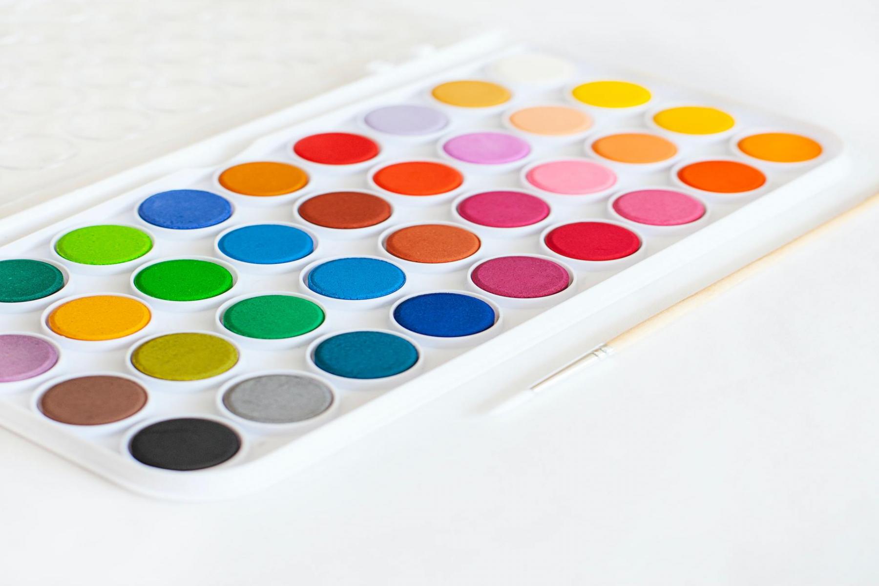
What Type of Palette Should You Use?
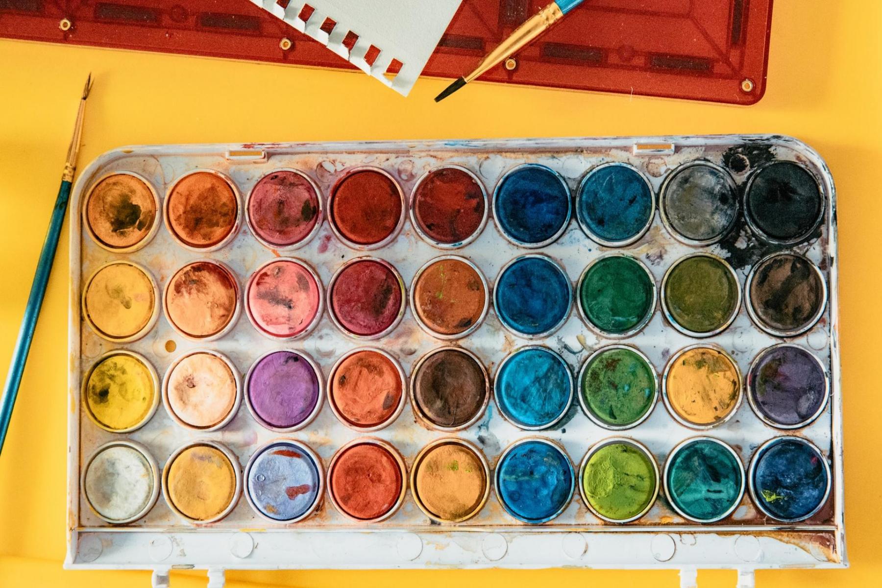
The market is filled with all types of palettes and you can buy a ceramic, metal, and plastic palette depending upon your preferences. You can even turn an ice cube tray into a paint box if you want by squeezing out all the colours. Whatever you do, keep the following points in mind while making your decision.
-
Use a palette that comes with a white surface for better visibility.
-
Buy a palette that has an easy-to-clean surface.
-
Consider a new palette with a compact form factor if you need to move around with your painting gear.
-
A palette should also offer a separate and good-sized mixing space and the required number of paint wells.
-
Go for a palette that offers a covering lid to keep your paints safe. The lid can also be used as a separate mixing area if you want.
Use a waterproof pen to label all the paint wells by writing the right color names. You’ll need to perform this step before filling the paint wells. It’ll save you from confusion while refilling the wells.
Important Tips for Setting up Your Watercolor Palette
Keep What Works for You
You can use the exact colors that I mentioned in the different palettes discussed above. However, it’s not necessary to use exactly those colors. You can replace one or more of those colors with similar shades that work the best for you depending upon your painting needs.
remember one of the first watercolor palettes that I made using someone else’s guide. It had a couple of greens including the Olive Green by Winsor & Newton along with some other colours that I never used.
Later on, I had to make changes to that palette and exclude the greens because I can make 9 different shades of green using my 12-color palette. So, make sure to choose colors that you use the most in your painting projects.
If you’re just starting out, you can follow the same colors and over time you’ll be able to make appropriate changes based on your preferences.
Focus on Pigments and Ignore Color Names
As mentioned, you can have different colors with the same name. Unfortunately, even the most common colors such as Indian yellow, Van Dyke Brown, and Sap Green aren’t consistent between different manufacturers. Some of the colors offered by different companies with the same name don’t even appear close to one another.
However, the artist-grade watercolors some with a unique series of numbers and letters like PBr7, PO48, and so on. These serial numbers represent a unique pigment and you’ll also see colors that have more than one pigment.
For example, the SAP Green color by M. Graham contains a couple of pigments including PY110 and PG7. On the other hand, the SAP Green offered by Daniel Smith comes with three different pigments including PY150, PO48, and PG7.
Both colors contain PG7, which is a very common pigment. It’s also known as Phthalo Green BS or Phthalocyanine Green. But the other pigments are different which leads to different shades even though the two products have the same name.
That’s why organizing your colors in your watercolor palette based on the “color name” is not recommended. Instead, you should use pigment numbers to avoid color duplication and confusion.
Choose the Right balance Between Warm and Cool Shades
Finding the right balance between warm and cool colors to fill your palette is an excellent way to increase your range of mixing possibilities. When it comes to watercolor painting, warm colors appear closer and the cool colors tend to visually recede.
For instance, if you use Azo Yellow PY151(cool yellow) frequently, consider balancing it with a warm yellow like Yellow Ochre PY43. The same is true for greens, reds, blues, and so on.
Choose Mix of Darks and Lights
Choosing the mix of darks and lights is yet another great way to set up your watercolor palette. For example, if you like to use Cerulean which is a cooler and lighter color, balance it by using a medium warmish blue like Ultramarine blue.
Advantages of a Good Watercolour Palette Layout
Regardless of the type of paints you’re using, setting up a watercolor palette comes with a lot of practical advantages. It provides you with a wide range of mixing possibilities to come up with new shades and colors on the go.
It also makes it easier to navigate through the mixing palette and if you have a mixing chart at hand, you’ll also be able to save a lot of time. Over time you also get used to your palette and mix darker and bright colors more efficiently.
Keeping similar colors side by side also minimizes the color contamination problem. The worst that can happen is that you’ll end up with analogous color mixing even if you accidentally mix the two adjacent colors.
Final Words
A watercolor palette is your perfect partner if you’re fond of painting and want to maximize your creativity with a limited number of colors. Use this guide to make your first practical water colour palette and don’t forget to make a mixing chart as well. It’ll help you save time and start painting what you love with confidence and efficiency.