Get ready for another round of basics with artist Isabella Kung, this time with a focus on Color Theory! You'll learn about the color wheel, and how to use color to its greatest advantage. Want to watch the video version? The full tutorial is available to members of our Beeblys WatercolorPainting.com.
Materials Used In This Colorful Watercolor Class:
- A block of Arches cold press watercolor paper (140lb, size 16″ x 12″)
- Mijello Silver Nano painting palette for watercolor paints
- A container of water
- Paper towels or a rag
- Color chart (print one out here)
Paints (Winsor & Newton's Professional Watercolors)
Brushes
- Utrecht: Synthetic round brush (size 2)
- Escoda Primera Series: Synthetic round brush (size 6)
Step 1: Color Wheel Basics - Primary, Secondary, And Tertiary Colors
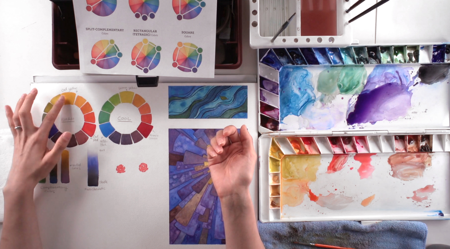 Color theory involves discussing the importance of each color in the color wheel, and to grasp their purpose and perks when being applied to any painting. They help create focal points, contrast, harmony, provoke emotion, enhance a certain mood, and portray the time and location of a piece. To start off, you have your basic primary colors: yellow, blue, and red. They are called "primaries" since they can't be created by mixing other colors. Next are secondary colors: green, orange, and violet. Mixing 2 primary colors will make a secondary color; for example, you make green by mixing yellow and blue. Tertiary colors are all the colors in between secondary and primary colors, such as teal or brick red.
Step 2: Temperature In Color Theory - Warm Vs Cool Colors
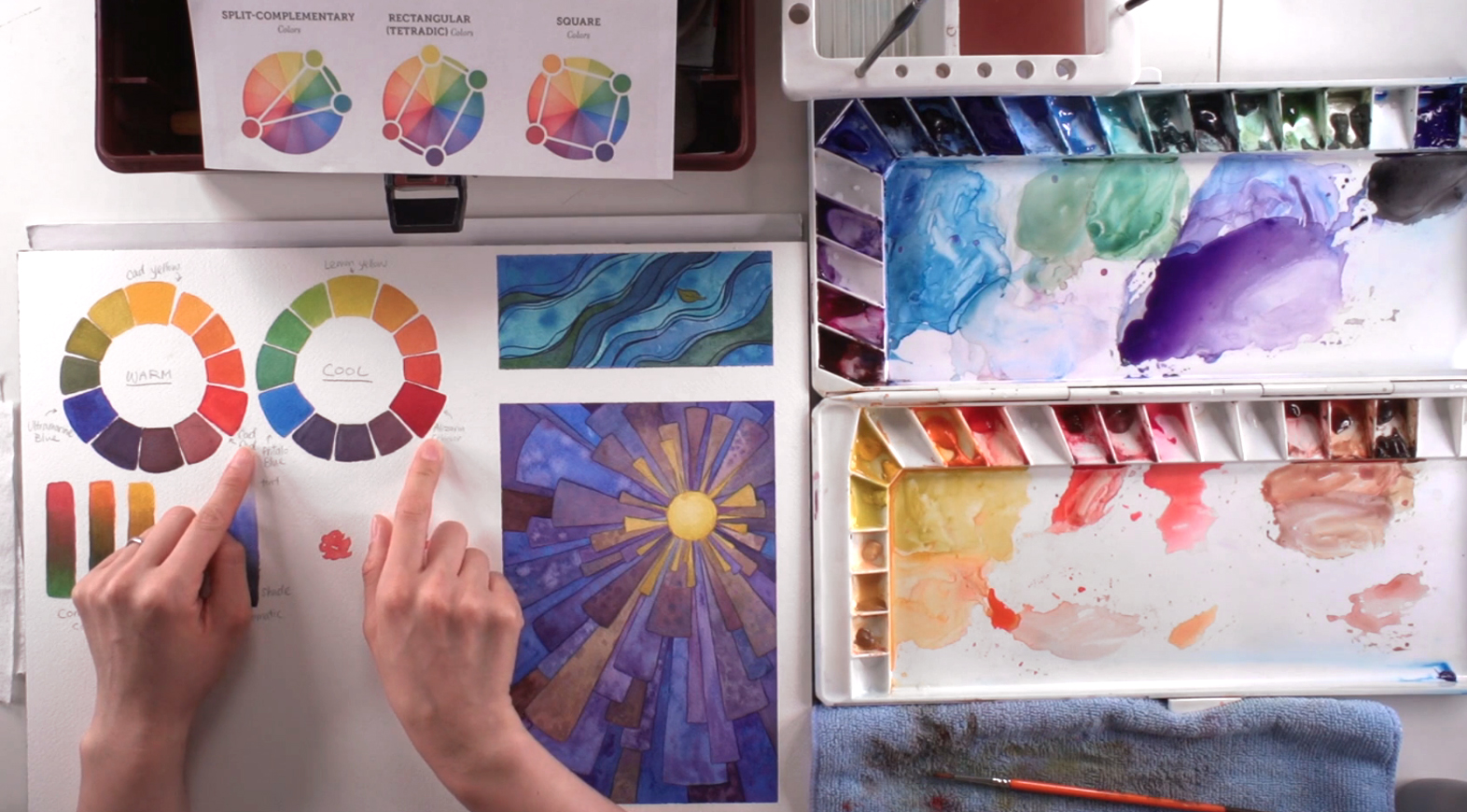 There are temperatures to consider in color theory: warm and cool. This depends on a color's "feeling", which means warm colors usually include reds, oranges, and yellows. Cool colors are often blues, greens, and violets. However, this is only a general rule of thumb, as each color also has a warm and a cool tone. You'll find cool reds (e.g. Alizarin Crimson) or warm blues (e.g. Ultramarine) in many paintings, which gives color a greater sense of depth and nuance. When mixing warm colors, they tend to be more translucent than transparent. This is because they're made out of organic minerals, which makes them chalkier than cool colors. Cool colors are often made from chemicals, which makes them look more transparent and clean-looking. There are no real rules when mixing together warm and cool colors. However, some colors are not meant to be mixed together since they can become pasty, muddy, or even distracting. This is why many artists choose to limit their palette in each painting, also known as using "color schemes".
Step 3: Limiting Your Palette To Create Color Schemes
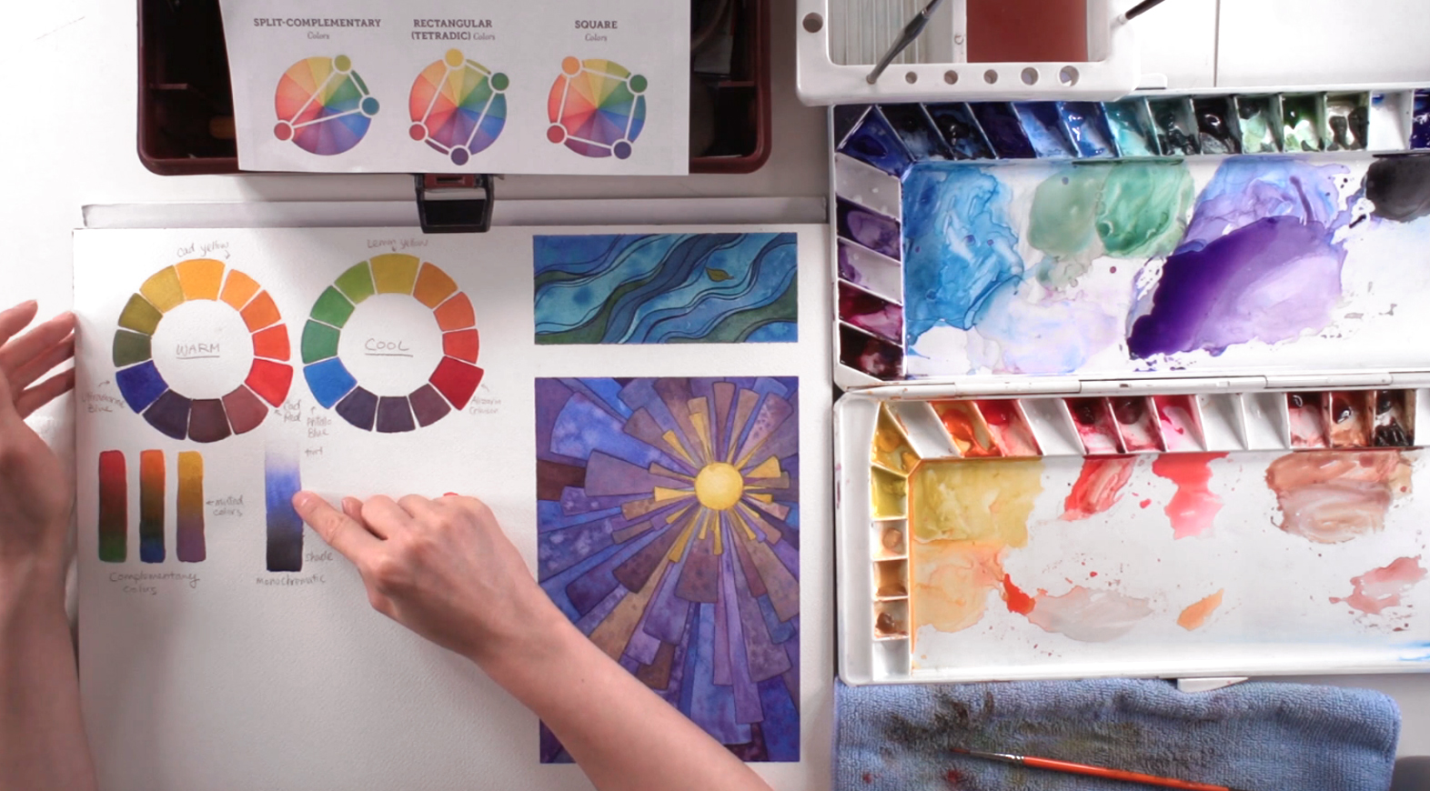 Color schemes, or using a limited palette, is good practice in terms of composition and design. Like baking a cake, you don't want to add every single color in a painting, as it will make the outcome look messy and distracting. One such color scheme is the monochromatic scheme. Here, you're using one color and adding black or white to get lighter or darker tones. In terms of watercolor, "white" would be adding water, while "black" is either adding black, or making the color more saturated.
Step 4: Complementary Colors For Contrast
 Another color scheme which is much more common is the complementary color scheme. Complementary colors are two different colors that are opposites on the color wheel, meaning they complement each other visually. Examples include: Yellow/Purple, Green/Red, and Blue/Orange. As pictured above, Isabella painted a red flower on her paper (you can follow along as well!). So what happens when you add a Cadmium Orange background? The flower will not stand out so much. However, if you add a Perylene Green background, the red complements that green, making the flower stand out beautifully. This is a perfect example of why complementary colors are visually appealing to the eye, which makes it a big part of color theory.
Step 5: Getting A Good Focal Point
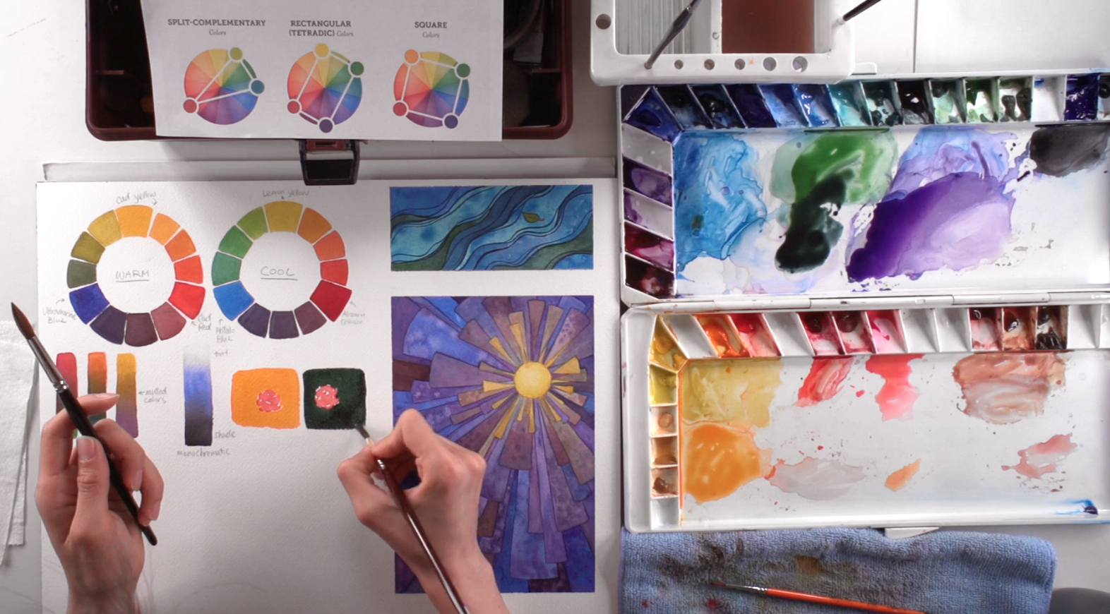
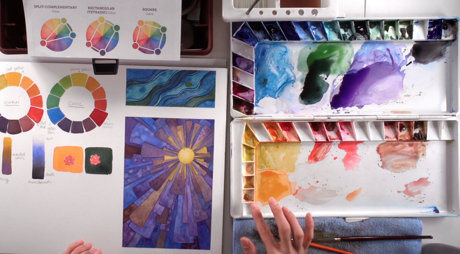
 In combination with the color chart, you can use the color wheel to help you determine what colors work well together. The split-complementary creates an isosceles triangle on the wheel, and shows how to find 2 colors that will more subtly complement your base color. In the temperature sense, you'll use a warmer and a cooler version of the complementary color to give a different variation in tone. For practice, you can create a painting by layering a simple shape, like Isabella's sun painting. She uses the power of a split-complementary color scheme here, painting the background in cool and warm violets while the focal point is yellow. You'll also notice that she created a transition from the yellow to violet by mixing these complementary colors. Whenever you do so, you'll get a mixture that is considered “neutral” - either gray or brownish in hue. You can make different shades and tones of these neutrals by varying your complementaries and the ratios of each color mix. This chart below shows the many possibilities:
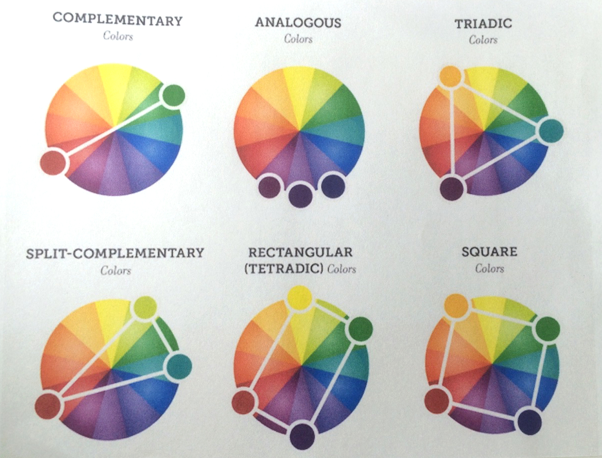
Step 6: The Best Color Scheme For Harmony And Moods
 The analogous color scheme uses 2-4 colors adjacent to each other on the color wheel. They feel more harmonious, and make focal points stand out less. This makes it useful when you're trying to create a certain mood or feeling within a painting. For example, blues and greens will create a tranquil scene, while reds and oranges will create a warmer scene. You can look at Isabella's sample painting, where she painted a red panda using a variety of reds, oranges, and yellows:
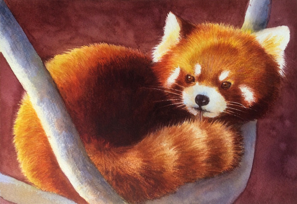
Step 7: Lesser Known Schemes For Something Different
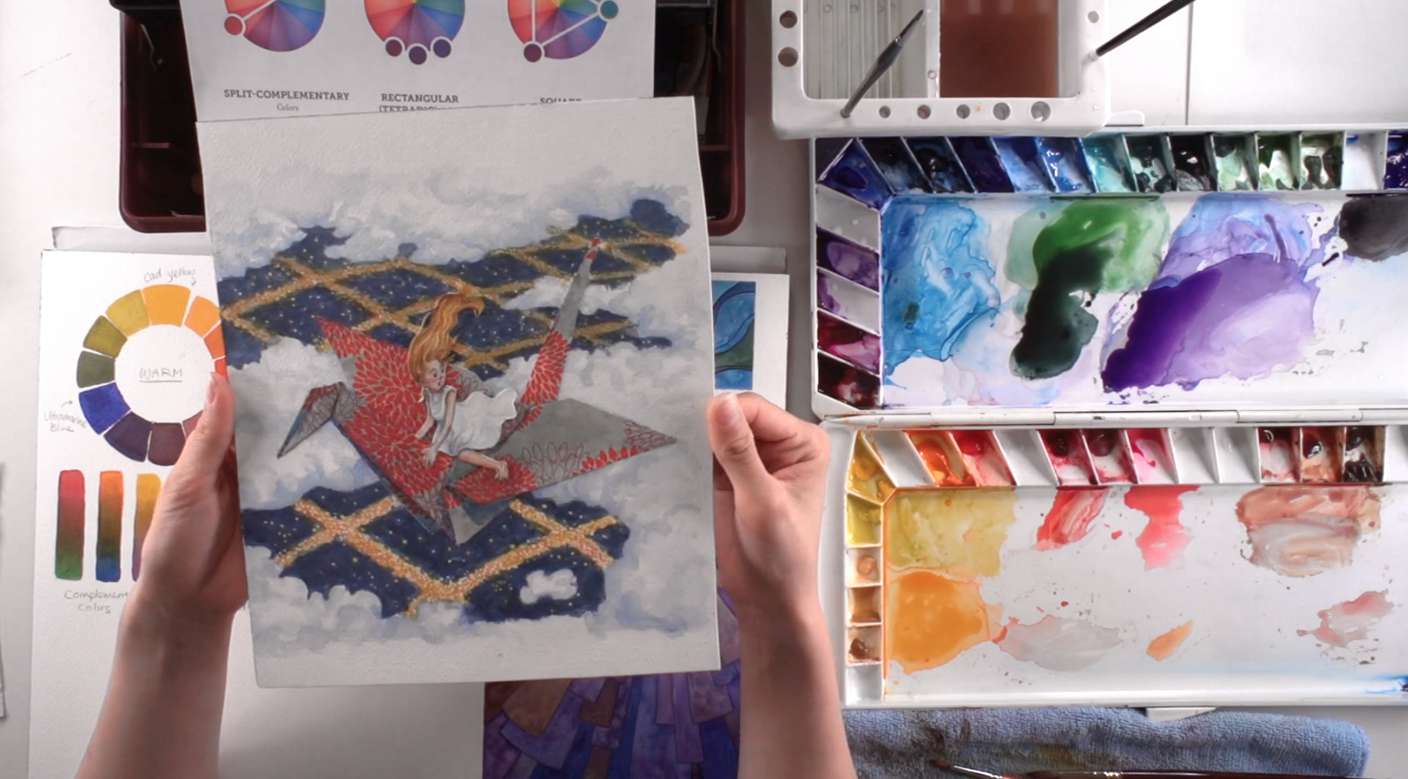 The triadic color scheme is tougher to work with, but it can produce some visually appealing imagery when painted with a clear goal in mind. They can generate good patterns with warm and cool colors. Isabella provides an example of this, where she painted a blonde girl (yellow) riding a paper crane (red - the focal point) in the night sky (blue). Below is a close-up:
 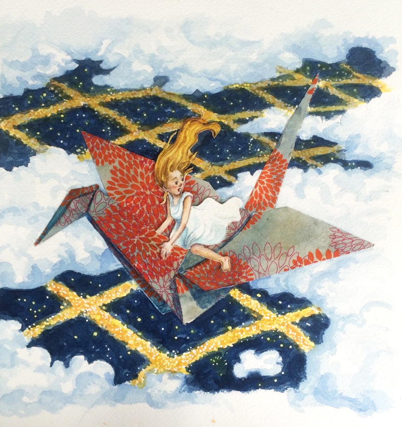 The rectangular (a.k.a. tetradic) and square color schemes are similar in the way they take 4 different colors across the color wheel, with the rectangular color scheme using colors of a higher contrast than the square color scheme. However, the color theory behind them is more difficult to understand, so they're not as commonly used.
Step 8: Arranging Paints On A Palette
 Now that you have a better understanding of color, Isabella shows the best way to arrange your colors on your palette. While it's up to you on how you'd like to order your colors, Isabella recommends following the color wheel, as this makes more sense to an artist. She organizes hers in a foldable palette that has wells in both sides of the interior. She uses one side for yellows, oranges, reds, and browns, and the other for purples, blues, and greens. To either side of their base counterparts are the warmer and cooler versions of each color, creating a natural transition along the palette.
Step 9: When To Use Black (Or Not)
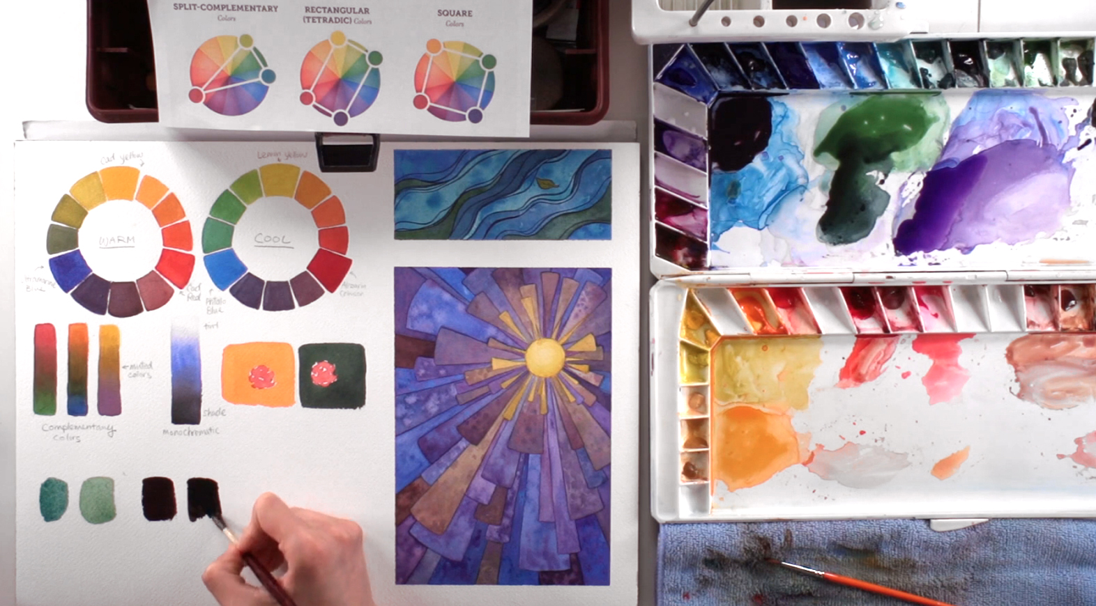 With all this talk about color theory, you might be wondering: where does black fit into all this? Well, its boldness and dulling tendencies means that black isn't used very often in a color painting. However, it's still needed to get certain colors, or to adjust a color's brightness. As an example, Isabella tones down Viridian with a touch of Ivory Black to get a mint green color. Should you decide to apply black to your painting, you can create it by mixing together very dark colors. Isabella mixes a very saturated Indigo, Vandyke Brown, and Alizarin Crimson to show how to do this. In contrast, Ivory Black is quite pigmented and tends to look flat. Isabella shows a side-by-side comparison, where the mixed black has much more depth, while the pure Ivory Black is very flat and can destroy the color harmony in a painting due to its black hole-like density. Of course, all we've talked about so far are just suggestions to limit yourself when coloring to produce color harmony. The fastest way to learn is to try them for yourself, and see what colors best express the content of your painting. Hopefully, this demonstration provides an insight to the realm of colors, and helps you in all your future painting endeavours.