In this tutorial, award-winning artist Steve Curl focuses on the basics of still-life design and composition. Though a bit different to landscape composition, still-life is much more flexible, so you want to get a good setup for your painting. Want to watch the video version? The full tutorial is available to members of our Beeblys WatercolorPainting.com.
Materials Referenced In This Watercolor Class:
- A block of Arches cold press watercolor paper (140lb, size 12″ x 16″)
- Mechanical pencil with HB 0.5mm lead
- Painting palette for watercolor paints (with 26 wells)
- A container of water
- Paper towels or a rag
- Banana, pinecone, and lemon (or any 3 still-life objects)
Step 1: Still-Life Design And Composition
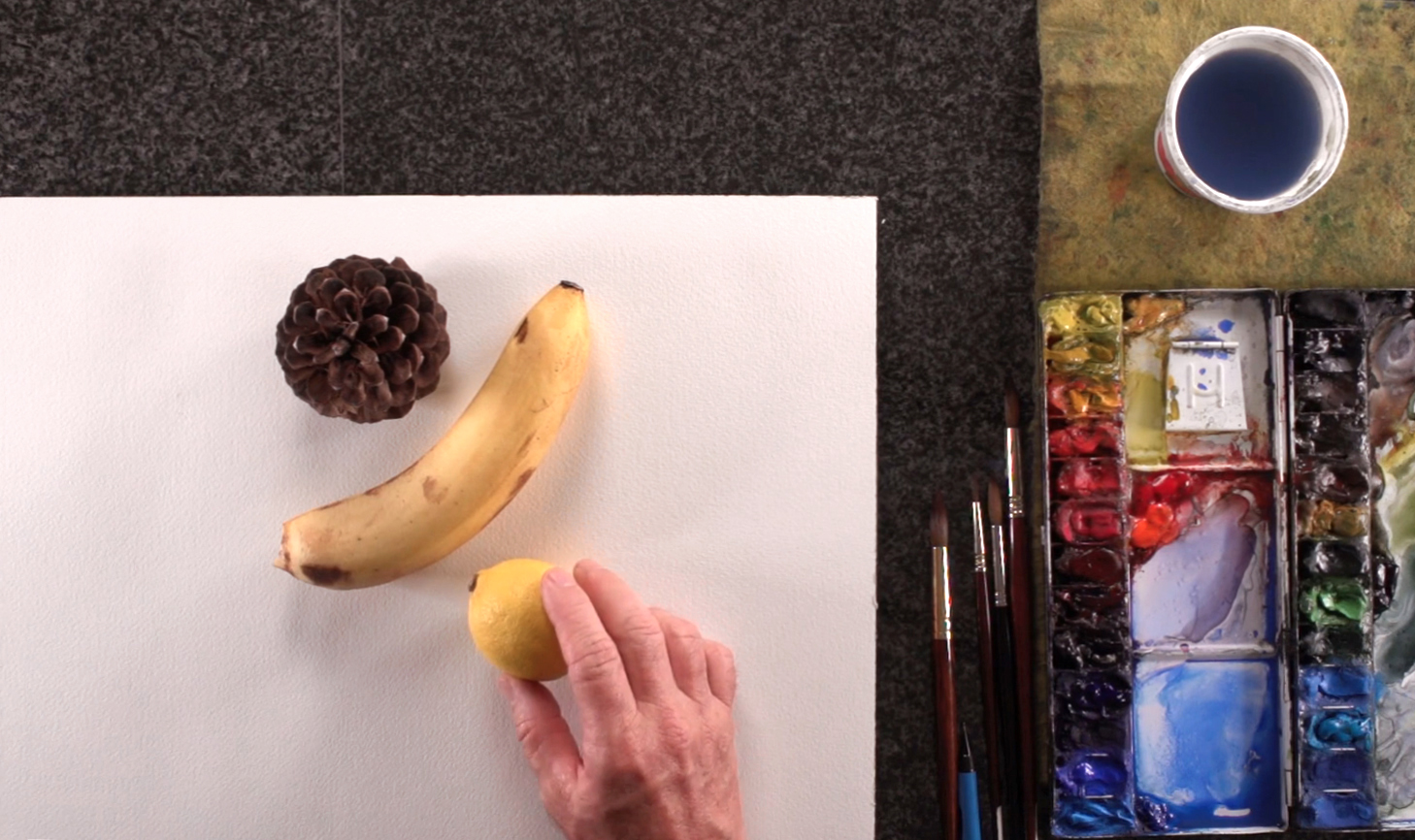
 This short lesson covers how to do still-life design and composition. Unlike landscape composition, still-life composition is controllable, since you can move your objects around and set them up however you like. Steve emphasizes the importance of taking a few minutes to plan ahead, as a painting with good design will draw the viewer's eye to the main subject rather than look messy and confusing. Steve shows how to arrange a pinecone, a lemon, and a banana to create an aesthetic arrangement of forms. Feel free to play around with different objects, and try to create depth by rearranging the objects so they overlap rather than lining them up in a row. You can also adjust the lighting to make the shadows clearer. As a general rule of thumb, use 1 light to make the shadows easier to see.
Step 2: Thumbnail Sketches For Still-Life
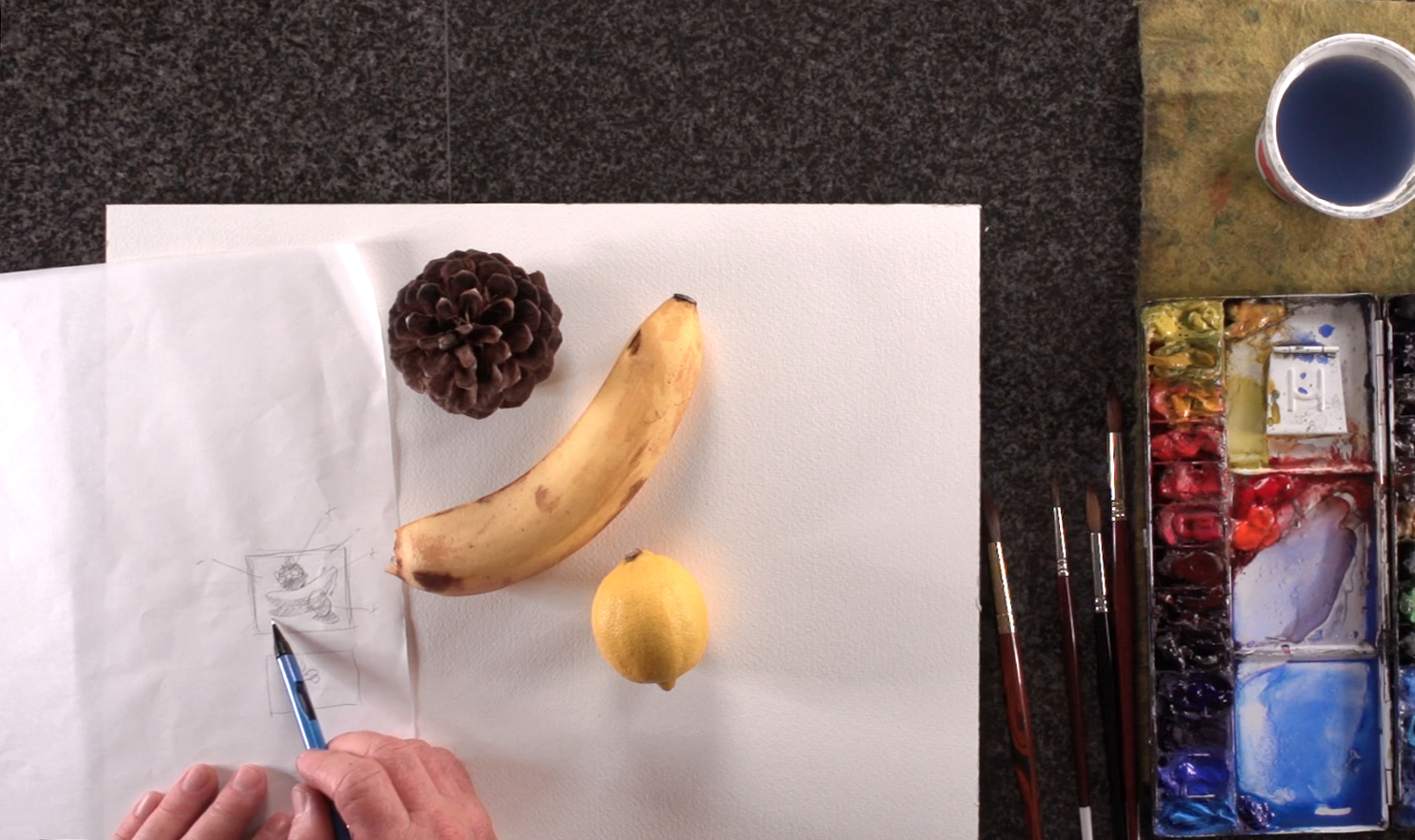
 Once you've determined your arrangement, make a few thumbnail sketches to finalize your composition. Whether it's in portrait or landscape, sketch quickly, and don't forget to pencil in the shape of the cast shadows. When your outlines are done, plan out where the shadows and highlights need to be by assigning values (i.e. light vs dark) to the different shapes and forms. In this way, you'll break up your painting space into positive and negative shapes, and find the best composition while saving yourself a lot of time later on. That concludes this quick crash course on still-life design. Feel free to grab some different objects, and practice until you can compose with ease!


