Follow along as watercolorist Steve Curl teaches landscape composition and design principles that can be applied to any painting. These basics work for other forms of art as well, making them useful in many situations. Want to watch the video version? The full tutorial is available to members of our Beeblys WatercolorPainting.com.
Materials Referenced In This Watercolor Class:
- A sheet of scrap or sketching paper
- Mechanical pencil with HB 0.5mm lead
- iPad or similar device
- The Color Wheel Artist's View Catcher, or any viewfinder
Step 1: Deciding What To Paint For A Landscape Composition
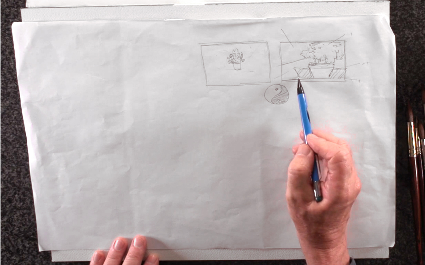 It may seem obvious, but before any painting, you have to make certain crucial decisions. This includes deciding what to paint, why you're painting it, and how you want to express this with watercolors. Steve also recommends knowing what's visually exciting to you, as this will affect your direction as an artist. The next step would be to form a composition based on your decisions. Steve sketches an example of a bad composition, where he frames a plant in the center of the composition. This leaves no room for the background to be planned in a way that complements the subject matter. He then sketches a better composition of the same plant by enlarging it, then shifting it to the right. He also adds a table in the background to give the plant a place in space. Composition is about knowing how to fill a blank space, and using the right balance of positive and negative space to do so. "Positive space" is the enclosed area that defines an object, while "negative space" is the empty area between two objects. Like light and darkness, you can't have one without the other. This forms the foundation of any composition, where you break down your subject matter into simple shapes and consider their relationship with each other. It's also about how you frame a subject in a way that your reason behind the painting comes through.
Step 2: The "Golden Mean", a.k.a The "Rule Of Thirds"
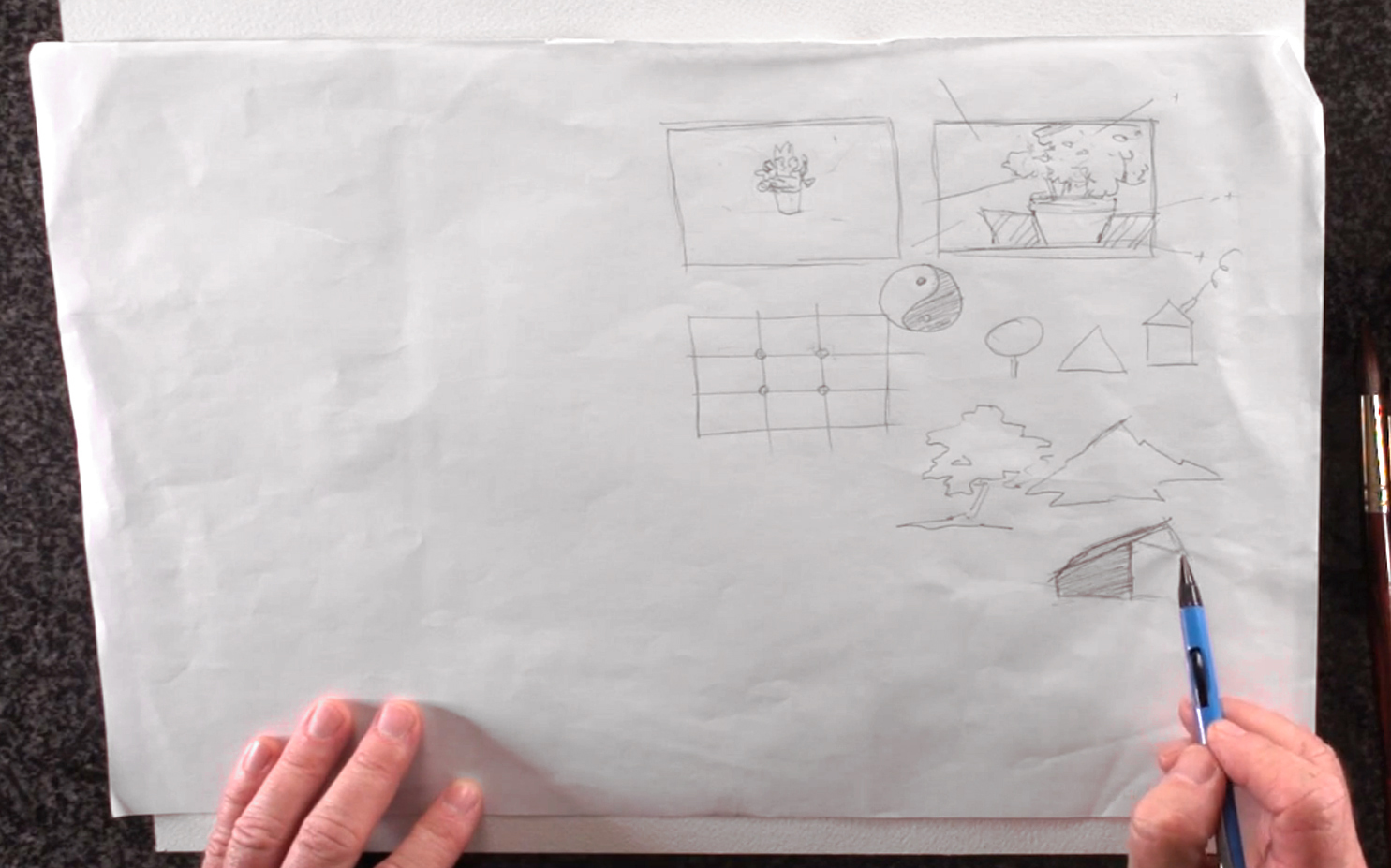 Next, Steve Curl introduces the "Golden Mean", also known as the "Rule of Thirds". He does this by drawing a rectangle and dividing it evenly into 9, then adding 4 focal points where the lines intersect. These points are good places to put your main subject matter, or for vanishing points in a perspective painting. Furthermore, Steve advises against using clichéd shapes - that is, perfectly shaped objects that look too cartoon-like or iconic. He suggests studying the subject matter more carefully and opting for more interesting shapes with good intersections.
Step 3: Using A Viewfinder To Compose A Landscape
 Composing a sketch is like looking at scattered puzzle pieces and figuring out the best way to fit them together. Practicing these basics will help build this artistic instinct, so you can learn to trust your decisions. Steve introduces a simple tool that facilitates this practice - the viewfinder. Similar to a camera's viewfinder, a physical viewfinder helps frame your subject matter before you start sketching. While he has a professional one that can adjust to different standard proportions, a handmade one works just as well. Just make sure that the viewfinder is to scale with the size of your final painting. And if all else fails, using your fingers to form a box works too. In short, after figuring out the "why" and "what" you're painting, the viewfinder shows how to best capture this in your composition, and determines the "how".
Step 4: The Advantages Of Electronic Viewfinders
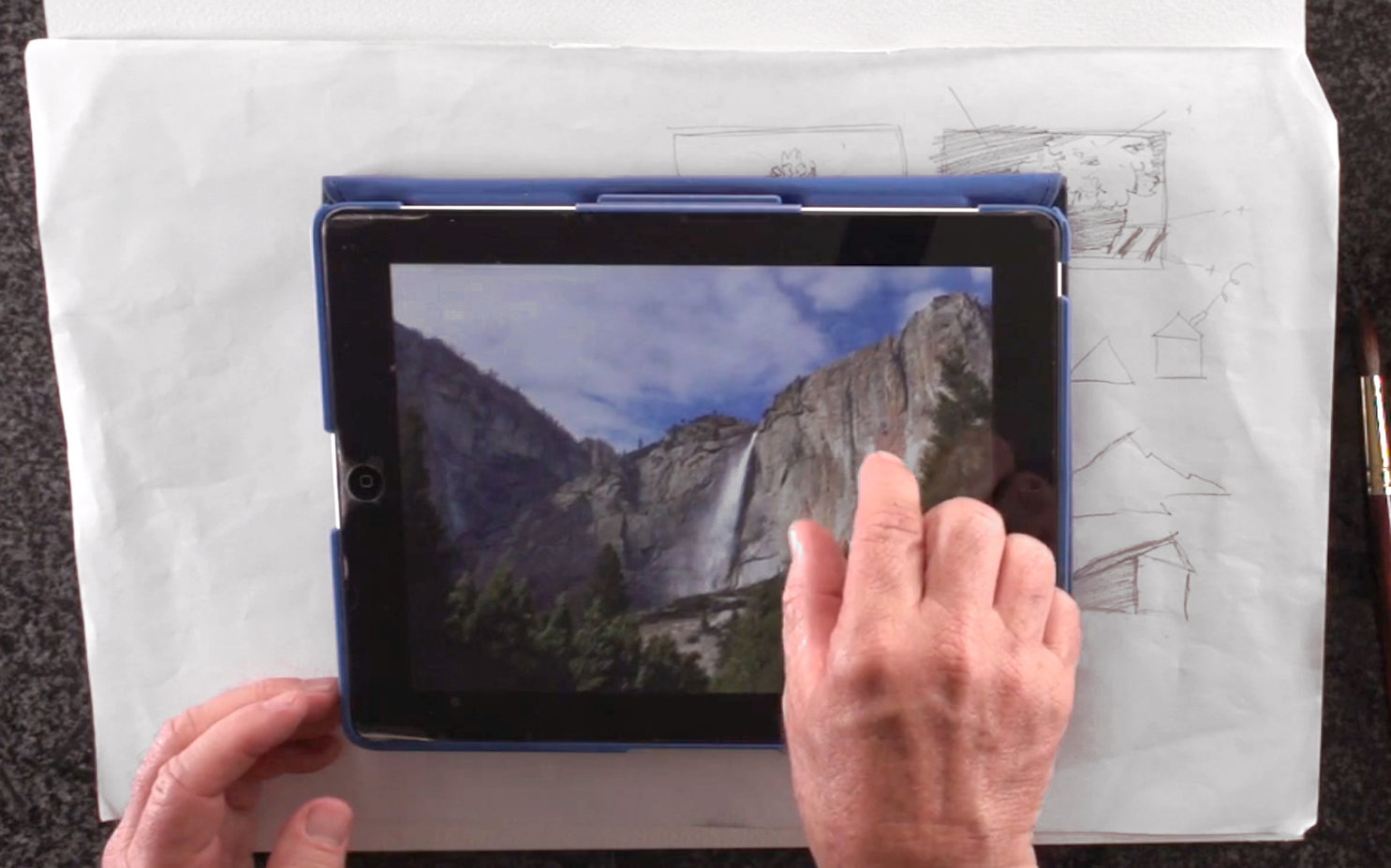 Using an iPad or a similar device is also helpful in taking and framing pictures with its built-in viewfinder. Even after taking the picture, you can always resize or change the composition using the zoom or crop tools. In the end, the important thing is to get a composition that includes interesting shadows, highlights, and textures. Additionally, make sure you take the time to plan and study your subject matter. With practice, compositions will come easier, which in turn will build more confidence in your art practice.
Step 5: Composing En Plein Air, Thumbnail Sketches, And Value Patterns
 Steve recommends painting or composing en plein air (literally, "in plain air") as often as possible. This means going outside and painting on location rather than from a photograph. The advantage of doing so is that you get to see nature fresh and live, and capturing a real experience will always lead to more impactful results. The next best option is to paint from an electronic device, as the backlighting helps brighten the overall effect of your subject matter. For plein air painters, you can use a viewfinder to frame your scene, then make a thumbnail sketch. To do this, draw a small rectangle with the same proportions as the watercolor paper you're using. Then, sketch in simplified designs of your subject matter and background while applying the principles of composition. If you're not satisfied with the results, you can easily do another thumbnail sketch and reframe your subject matter. Once you have a sketch you like, the next step is to decide on your value pattern. This means shading in the dark, middle, and light values to establish the structure of your painting or drawing. As this is still a draft, you can simplify value into 3 main tones: highlights (leave white), mid-tones (light shading), and shadows (heavy shading). In Steve's example sketch, he leaves the clouds and waterfall white as his lightest values. The sky is mid-tone, while the rocky area is lighter than the sky but not white. The darkest tones include the crevices in the rocks, shadows behind the waterfall, and the trees. In this way, plan your landscape composition and value pattern until you're ready to start painting for real.
Step 6: Final Tips On Landscape Composition And Design
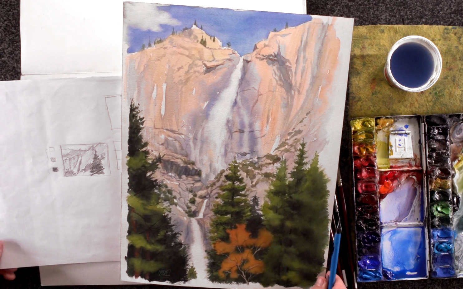 Finally, Steve breaks down the landscape composition and value pattern of a previous painting of a waterfall. The textures in the rocks, the bluish spray of the waterfall, the shadows of the trees, and the vibrant colors were all captured with the naked eye. He also chose a vertical (i.e. "portrait") composition instead of a horizontal (i.e. "landscape") one to focus on the length and majesty of the waterfall. In the same way, once you decide on your subject matter, it will be easier for you to compose your painting in a more efficient manner. There's no denying that landscape composition and design will eventually define the success of your watercolor painting. There are 3 ways to go about it: without any planning, with too much planning, or with a basic plan that allows for flexibility. Like preparing for a vacation, you want to go with the third option, where you have a basic structure but leave room for different possibilities. This means your landscape composition acts as the backbone of your painting, while aspects like lighting and what colors to use can be decided while you paint and experiment. You'll have more freedom, and get a more interesting painting without messing up the basic design. Once you've got these principles down, keep practicing, and apply to all your future painting endeavors!