Get your feet wet in this watercolor basics course with Steve Curl! This tutorial is perfect for beginners, starting with introducing the essential tools and ending with practicing different watercolor techniques. Want to watch the video version? The full tutorial is available to members of our Beeblys WatercolorPainting.com.
Materials Referenced In This Watercolor Class:
- A block of Arches cold press watercolor paper (140lb, size 12″ x 16″)
- Mechanical pencil with HB 0.5mm lead
- Painting palette for watercolor paints (with 26 wells)
- A container of water
- Paper towels or a rag
- Brush holder (optional)
Paints (Holbein Artists' Watercolors)
- Permanent Alizarin Crimson
- Cobalt Blue Hue
- Sap Green
- Yellow Ochre
Winsor & Newton's Professional Watercolors
- Perylene Green
- Ultramarine (Green Shade)
Brushes
- Stratford & York Warwick Series: Round sable brush (size 6)
- Stratford & York Warwick Series: Round sable brush (size 10)
Step 1: Introducing Watercolor Basics - A Unique Transparency
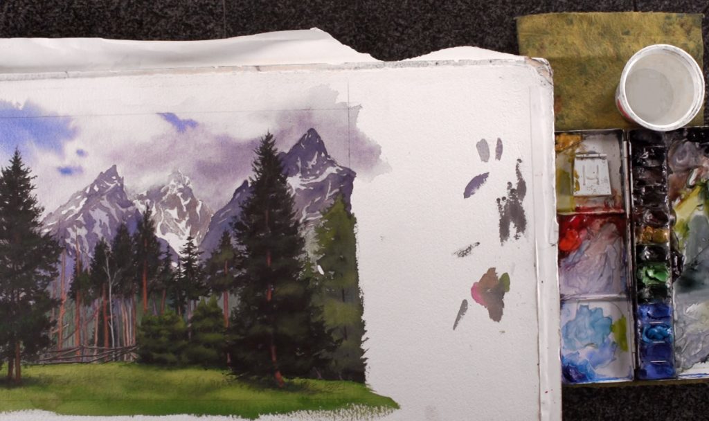 Steve gives a quick self-introduction and shows two paintings he's done. He explains the charm of the watercolor medium, which is in its transparency. This involves controlling water and its translucency to your advantage, and allowing light to pass through the paint to let the colors "glow". He also emphasizes the importance of planning out your composition and using the right colors, as mistakes can't be fixed simply by covering them up with paint. Although white paint is used to touch up areas or add opaque details, using too much will detract from watercolor's transparency. This means utilizing the white of the paper as much as possible, making the approach to watercolor slightly different from another art medium.
Step 2: Essential Tools And Paints
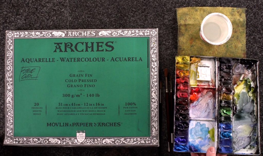 Moving onward, Steve introduces the basic tools for watercolor painting. This includes a palette filled with the watercolor paints of his choice, and a container of water. He explains how he organizes these colors, which he bases on color theory. Primary colors are the most abundant in variation, while secondary colors are placed between the primary colors. Tertiary colors are less important, so colors like browns and grays are kept together in the upper right side. They transition into the warmer greens, then end with the cooler greens, blues, and colors in between. On the left side, warm colors (yellows to warm reds) are kept together, then transition to the cooler reds, purples, and blues towards the bottom of the left side of the palette. For beginners, he advises against using black and white until you've learned how to mix the colors to get the desired results.
Step 3: Making A Material Purchase
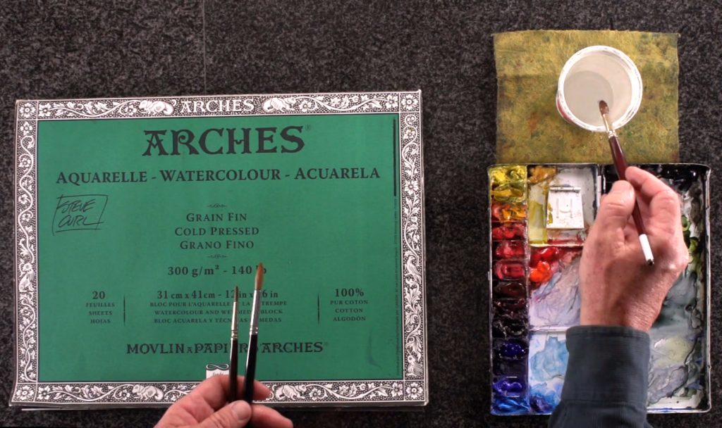 Next up in this watercolor basics course, Steve emphasizes the importance of buying good quality tools to get the best learning experience from watercolor painting. Watercolor brushes are designed to hold liquid, so higher quality brushes will have a larger "reservoir". While you don't have to buy the most expensive one, it's best to spend a little more on better quality brushes as they'll last longer and produce better results. You can save money on tools like the watercolor container or paper towels instead, as their quality isn't as important. The paper towels are to help control the "charge" in the brush; i.e. how much liquid is in the brush. NOTE: They can be substituted for an old T-shirt or rag if you want to help the environment!
Step 4: The Lowdown On Watercolor Paper
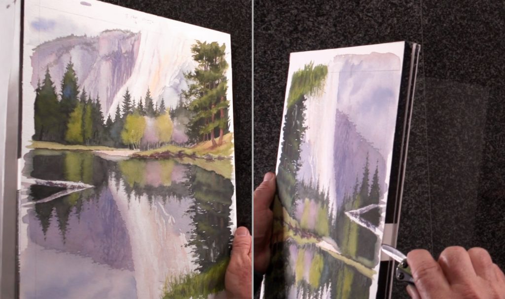 Another essential tool for practicing watercolor basics is the paper. Watercolor paper comes in 3 different forms: in pads, blocks, or single sheets. A pad is like a sketchbook made with watercolor paper, while a block is a high-quality pad and means the paper is sealed on 4 sides. This makes the paper less likely to buckle (i.e. warp), and is good for painting outside as the seals keep the paper stable. To remove a finished painting from the block, there's a notch in one edge where you can slip in a pocketknife and slice the painting free. Single sheets are self-explanatory, although Steve recommends taping the edges down with artist's tape to keep it flat. Watercolor paper is categorized according to 3 aspects: surface, size, and weight. The paper's surface is labelled according to how the paper's made. This is also called the “tooth”, which describes the texture of the paper. The more textured a surface is, the more liquid the paper can catch and absorb. This gives you more control over your paint, although some artists prefer a smooth surface for different reasons. There are 3 types of surfaces - hot press, cold press, and rough. Hot press is the smoothest, while rough has the most "tooth". Thus, Steve recommends cold press, as cold press paper sits right in the middle. The size of the paper is also important to consider, and depends on how big you need your painting to be. As for weight, this is measured by poundage, or grams per square meter. For paper that's thick enough to handle a good watercolor painting with little buckling, Steve recommends 140lb minimum. While he uses the Arches brand, you can always find something within your budget that meets the same requirements to go beyond watercolor basics.
Step 5: Watercolor Brushes - Natural Vs Synthetic
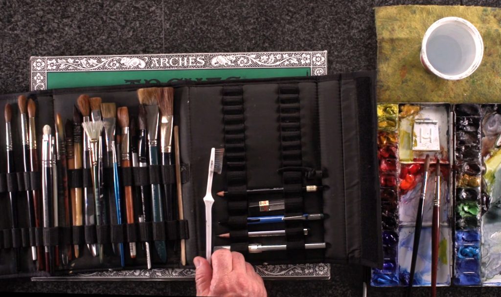 Returning to the subject of brushes, Steve discusses 2 main types: synthetic and natural. Natural brushes are usually handmade from sable hair, with kolinsky sable being the highest quality. They're softer and hold more liquid (i.e. "charge") than synthetic brushes, but are harder to come by due to how they're made. Synthetic brushes are usually made of nylon, and hold about half the charge compared to a sable brush. But they're cheaper and easier to find, so Steve recommends them for this watercolor basics course. Always take care of your brushes by cleaning the bristles properly and storing them upright in a pointed shape. When you have a lot of brushes or travel with them, you can get a brush holder to protect them. There are 3 things to look for in a brush: 1. The charge, the amount of water a brush can hold. 2. Resilience or “snap”, which is how well a brush returns to its original shape after you lift it off the paper. And 3. Its ability to come to a point. While a brush will eventually lose its pointedness, a good brush that's taken care of can be extremely durable and versatile.
Step 6: The Watercolor Basics On Setting Up And Using Your Tools
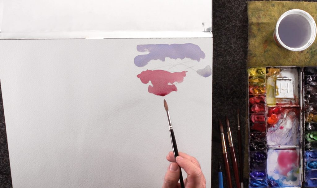 In part 2 of this watercolor basics course, Steve moves on to show how to use your tools and navigate a painting efficiently. As he's right-handed, he puts his palette to the right of his painting and the water container just above the palette. This is to prevent paint from dripping onto his paper as he moves from wetting his brush to mixing paint on his palette, then moving to paint on paper. He also has a paper towel in his other hand to absorb excess paint and control the charge in his brush. He begins with the simple exercise of painting a flat wash. To do this, wet your brush with water, then pick up some paint and mix it evenly with the brush on your palette. Steve uses Permanent Alizarin Crimson to demonstrate these watercolor basics. Using a no. 10 round brush, brush it on your paper and it will disperse the paint evenly. Use the tip of the brush to find the edge of the object or area you're painting. If you paint with your paper block tilted, the paint will gather at the bottom of the wash. This will allow you to drain it by first drying your brush with a paper towel so you're left with a "thirsty brush", then touching the tip of the brush to the pool of paint. It will guarantee a very even flat wash with watercolor's transparent nature in full display, especially when you add another wash on top after the first layer is dry.
Step 7: Color Swatches And Changing The Value
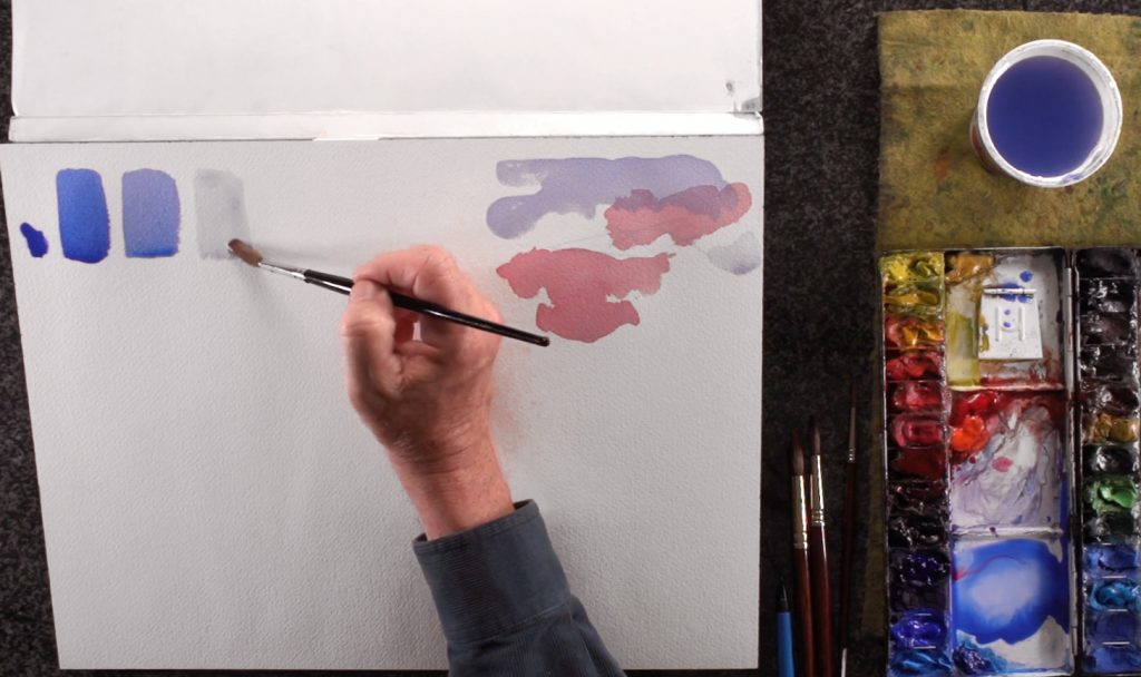 One exercise that's good for watercolor beginners is to paint 3 swatches of 1 color. Steve uses Cobalt Blue Hue to show how its tone can vary simply by controlling the amount of water mixed with the paint. To do this, pick up a lot of Cobalt Blue Hue until your brush is saturated with paint without being paste-like. Then, paint a 1" x 2" rectangle for your first swatch of blue. Repeat this twice, but each time with a little more water than the last. This should give you 3 swatches of the same color at different values (i.e. light vs dark), and show how these variations can affect each color of paint you have. You can paint a color chart this way; each color with 3 values: one as a pure color, one at medium opacity, and one diluted. Just think of water being your "white" paint to make it lighter. This exercise is called "changing the value", and is good practice for understanding each color's pigment and how it's affected by water. It also gives a good idea of what each color looks like on paper so you can familiarize yourself with their names.
Step 8: The Value Of Value
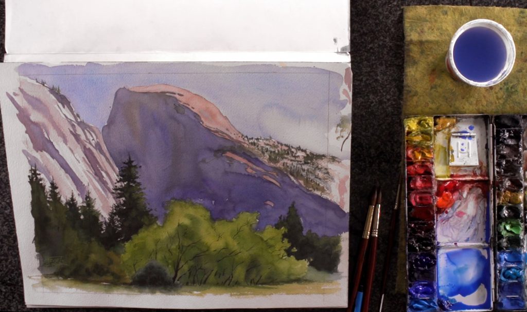 Steve then explains how paintings can be viewed in terms of dark shapes against light shapes, or somewhere in between. A painting's structure also depends more on value than its color, which he shows by bringing out a painting he did of Yosemite. He explains that its lighting and structure is reliant on the value pattern - light against dark, and vice versa. This makes value a powerful concept that needs to be practiced and applied to all forms of art. To do so, you can practice by painting monochromatically (i.e. using 1 color only), or doing a value sketch. Even taking pictures that have good lighting and composition will help with the process.
Step 9: Simple Study Exercises
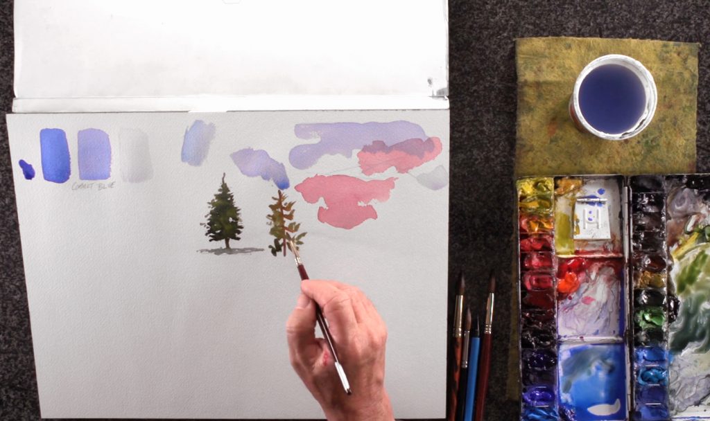 When you do paint exercises, start with simple shapes so you don't overwhelm yourself. Also, make sure to do a pencil sketch of the shape you see before painting it. Steve recommends sketching from real life, as you get good information from what you're looking at. Once you've studied and practiced enough, painting from memory isn't so far off! Steve demonstrates this by sketching a tree from his imagination, which you can also try. Then, use a round brush to mix Yellow Ochre with Sap and Perylene Green for a natural leafy color. Paint the light to mid-tone areas first, then add Aureolin for the lightest leaves, or more Perylene Green for the shadows. As the paint is still wet, these new colors will push away the previous one, but be careful not to "overload" your paper with paint! For the darkest shadows, mix in Ultramarine. Remember to leave white spots to create the illusion of light filtering through the leaves, and paint in a dark tree trunk for structural support. Lastly, mix in diluted Cobalt Blue Hue with the greens, then paint the tree's shadow to anchor it in space. Steve also shows what not to do by painting "with the left brain"; i.e. iconographically. It's a mindset that means painting from what you think you know, and will end up looking rigid and cartoon-like. To avoid this, take your time to observe real life subjects, which will help train your mind to remember what something really looks like. Finally, a quick tip: remember to change your water when it starts to affect your paint color. It also helps to start off with more water in your container, as it will take more time to get dirty.
Step 10: Painting A Cabin With The Flat Wash
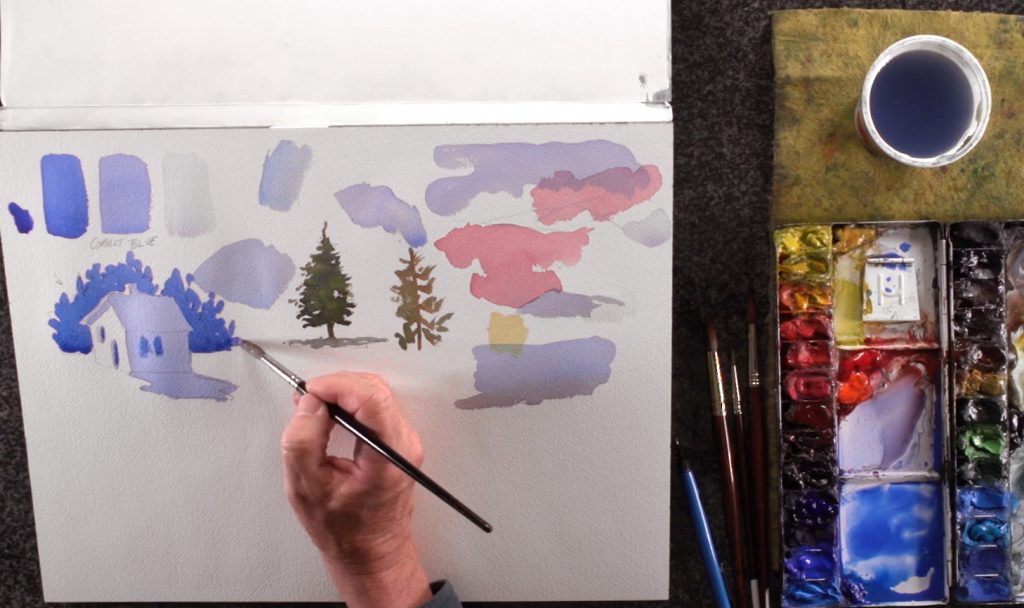 In the third and final part of this watercolor basics course, Steve shows how to use the most common technique in watercolor painting: the wash. He demonstrates 2 main types, the first being the flat wash. To practice, sketch a 3D cabin with a shadow along with a chimney, doors, windows, and background trees. Then, apply the principle of value learned previously, using the same Cobalt Blue Hue but with the 3 different tones. Light comes from behind the trees, so the shadowed side of the cabin and its shadow will be covered by a flat wash of mid-tone blue. Don't forget the roof, door, and windows. This will form your first layer of a flat wash, and you'll need to let it dry before continuing. This is to prevent paint from bleeding into one another, which should be avoided unless it's done intentionally. Check if the layer's dry by touching the paint with the back of your fingers. If the area is still slightly cool, it means the paint isn't completely dry yet. This is why you should use the back of your fingers as this will prevent fingerprints from forming. And be patient; watercolor painting is about water control. While waiting, Steve recommends working on a different section of your painting (if applicable), or planning your next step. For the next layer, use the darkest version of Cobalt Blue Hue for the trees in the background. You can also darken the inside of the windows to add more depth. With this layer, this simple exercise is complete - by using as few as 3 different values (white, mid-tone, and dark), you can create the illusion of dimension and perspective. Flat washes offer a clean and even coverage, so are perfect for painting objects with a flat surface. Just remember to leave the wash alone after painting it to avoid disrupting the evenness of the wash. Again, you can tilt the paper to a corner and drain any excess paint with the tip of a "thirsty brush".
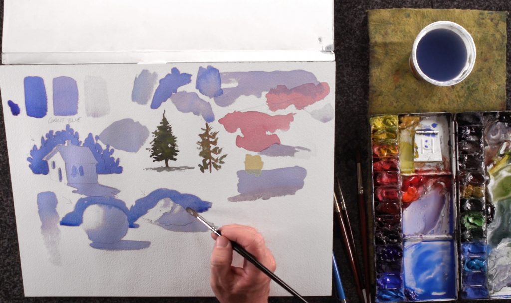
Step 11: The Graded Wash For Round Objects
 The next type of wash is the graded wash. For practice, paint what Steve calls a "tornado" (a.k.a. a "bead") by picking up a lot of Cobalt Blue Hue. Then, paint a large spot of the color until you can see paint collect at the bottom of the painted area. Wet your brush a little, then bring this "bead" of paint down. Keep repeating this, and you should get the same 3 values as you did when painting the color swatches but with a smooth transition in between each value. For watercolor beginners, you may get “bands” within the wash due to the transitions not being smooth enough, but you'll get better with practice. The graded wash is perfect for painting a cloudless sky or a "turning edge" (basically a round surface). It helps to think about shapes in terms of having different plane changes, and whether these changes create a sharp or a rounded edge. The graded wash is used for round edges, while the flat wash is used for sharp ones (like the cabin). Some objects even have a mix of these edges, like an irregularly-shaped rock. You can practice these techniques further by painting a sphere, curving your brushstrokes to follow the shape you're painting. Always keep in mind where the light is coming from, and paint the shadows accordingly. This works even when painting a rock, which Steve demonstrates. And at the end, he adds a dark background to both shapes in order to complete the 3D illusion. That’s it for this crash course on watercolor basics! Be sure to keep practicing these basics, and they’ll eventually become like second nature.


