In this tutorial, William "Bill" Dunn teaches you how to paint a soothing seascape of California's Santa Cruz using various watercolor techniques and tips. Want to watch the video version? The full tutorial is available to members of our Beebly's Watercolor Painting.
Materials Used:
- A reference picture of Santa Cruz's coastline (you can print one out here)
- 140lb Fabriano Rough watercolor paper (12" x 16")
- Graph Gear 9000 mechanical pencil w/0.7 lead (for sketching/tracing)
- Kneaded eraser
- Painting palette for watercolor paints
- Extra tray for any additional paints
- A cup of water
- A towel or rag to rest brushes on
- Tissue or paper towels
- Artist's tape (or masking tape)
- A flat or tilted board to tape your paper to
Paints (from Holbein Artist's Watercolors)
- Cadmium Yellow Orange
- Cadmium Red Light
- Quinacridone Magenta
- Cobalt Violet Light
- Permanent Violet
- Olive Green
- Sap Green
- Viridian
- Cobalt Green
- Leaf Green
- Cerulean Blue
- Cobalt Blue
- Phthalo Blue Red Shade
- Prussian Blue
- Neutral Tint
- Burnt Umber
- Burnt Sienna
- Yellow Ochre
- Ivory Black
Holbein Artist's Gouache:
- Zinc White (or Permanent White)
Brushes
- Joseph Zbukvic Signature Series: Round brush (size 8)
- Joseph Zbukvic Signature Series: Round brush (size 12)
- Joseph Zbukvic Signature Series: Round brush (size 20)
- Neef: rigger long handle brush (no. 6)
- Neef: rigger long handle brush (no. 8)
- Neef: rigger long handle brush (no. 12)
- Escoda Perla Series: Round pointed short brush (no. 8)
- Escoda Perla Series: Round pointed short brush (no. 20)
Step 1: Beginning Sketch
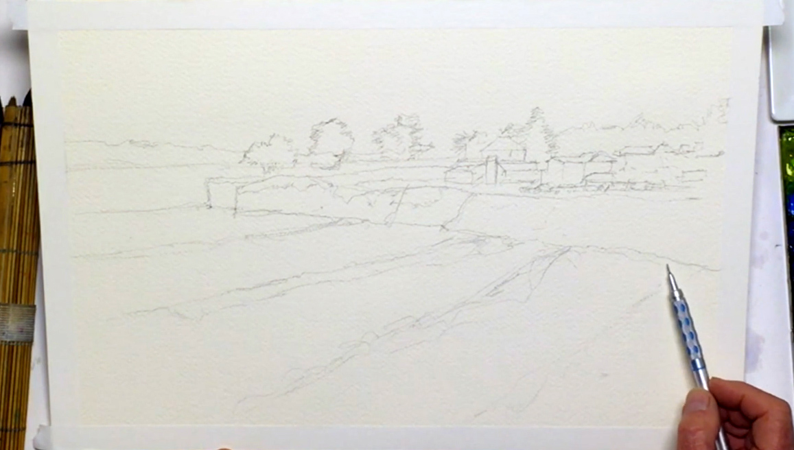 Prep your painting by taping the edges of your paper to a flat or tilted block. Next, use the reference photo and start sketching the initial composition with a pencil. Place the horizon line (the line that separates the sky from the earth and sea) about a third of the way down the paper, so that there's more space to paint the ocean and cliffs. When you first start sketching, hold the pencil in a relaxed and loose grip to ensure a smooth sketching motion, keeping the lines light and simple. Keep looking at the reference photo to get the right position and perspective of the cliff and the surrounding houses, trees, and cars. The drawing should be simple and loose, capturing the mood of the picture instead of focusing on every detail. However, try to find a balance, as drawing too loosely will cause your painting to lose its structure. As you draw the trees, do not try to be photorealistic. Trees come in all shapes and sizes, and you can allow yourself some creative freedom and draw them in a style you prefer. When you're satisfied with the cliff, move to the ocean. Sketch some surf on the water where the waves break to add textural detail and establish depth in the lower half of your composition, making sure to increase the size of the waves as you move towards the beach to capture the feeling of the depth and strength of the water current. Then, add a thin line above the horizon line for “atmospheric perspective”, which will be explained and emphasized later. Finally, in the lower right corner of the composition, draw a diagonal line where water meets sand. Great job! Now it’s time to start painting! Below is a close-up of Bill's sketch:
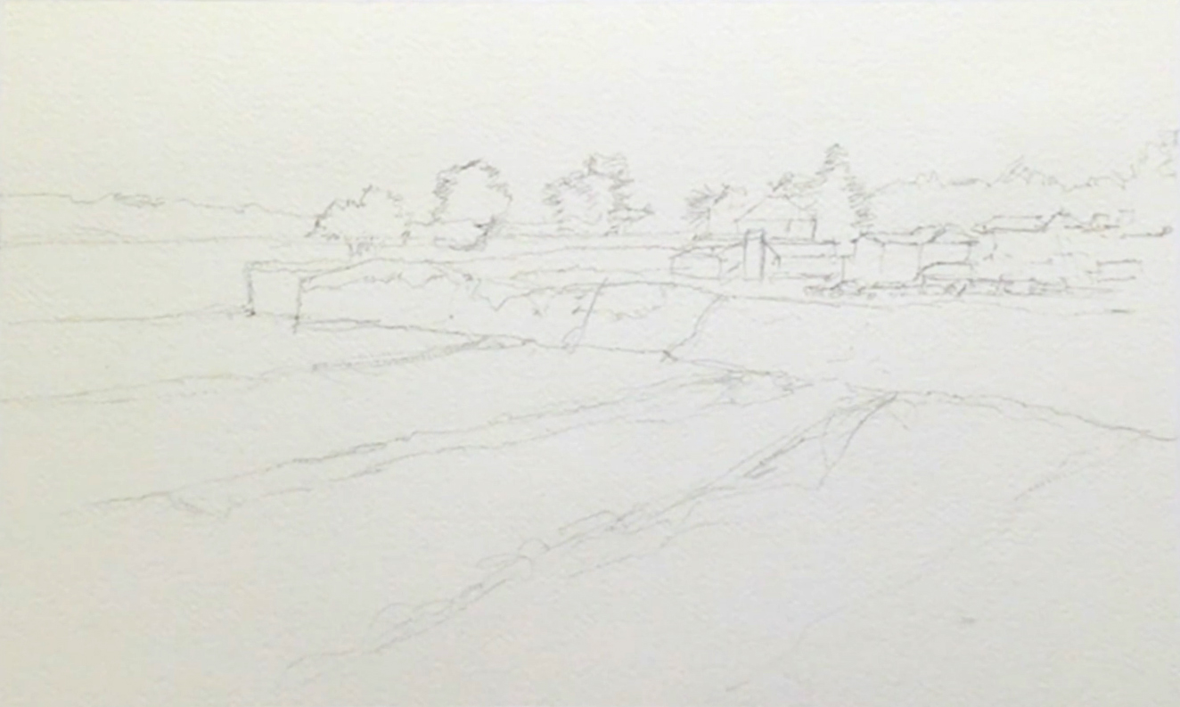
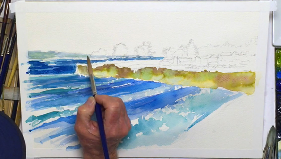
Step 2: Painting The Cliff Using The Wet-In-Wet Technique
 With your composition ready to go, take the Neef rigger brush (no. 12), wet it, then prep Yellow Ochre on your palette so that it's slightly diluted. Using a technique called "wet-on-dry", brush the Yellow Ochre throughout the vertical section of the cliff for its base layer of paint. Next, mix Olive Green with a touch of Permanent Violet on the palette, and apply on top of the upper part of yellow (called the "wet-in-wet" technique). While this layer is still wet, drop in other colors such as Cobalt Violet Light, Cobalt Green, and Cerulean Blue into the same cliff area to break up the monotony of colors, allowing the wet paint to naturally blend on the paper instead of on the palette. Make sure to paint from light to dark, and allow the different colors to show on the cliff. This adds to the level of detail, and prevents your colors from becoming too muddy. As you put wet paint on top of wet paper, colors will run a little due to the wet-in-wet technique, which is fine as it adds character to your painting while creating a randomness that's found in nature. Any mistakes you might have made can be lifted out by tapping a small rag or paper towel over still-wet areas. You can also use it to dry your brush if it gets too wet. When you're done, leave the cliff section to dry.
Step 3: The Ocean And Waves
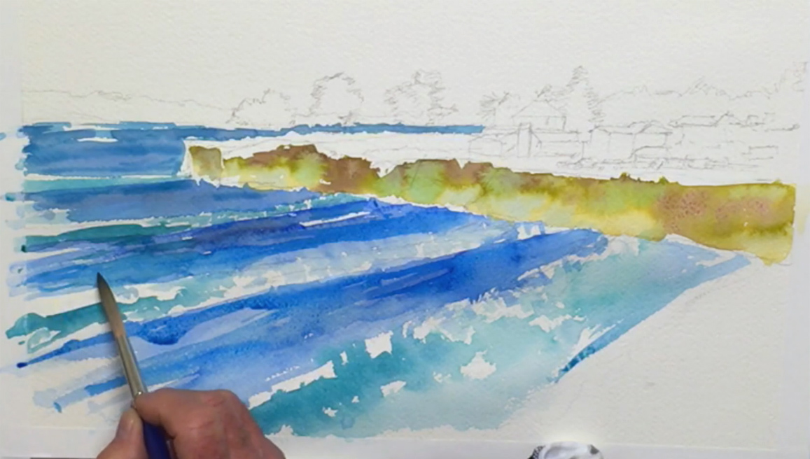 On the palette, mix Cerulean Blue with a dash of Cobalt Green for a bright Manganese Blue color; enough to paint the ocean so you don't have to keep mixing the exact color you need. The consistency of the paint should be more watery than usual so it can spread more fluidly, adding to the water effect. Start below the left side of the horizon line and paint in a horizontal direction. You can paint the area behind the trees as well (tree trunks can be added in later), making sure not to make the horizon line completely straight as it will be broken by the waves and its surroundings. Remember to leave enough space between the ocean and the painted cliff for the greenery and houses. Continue working your way down the painting. Leave strips of white for the surf and where the water is more reflective for more "sparkle". Atmospheric perspective should be applied to the area where the ocean meets the distant mountain range, which is achieved by painting the oceanic foreground a brighter shade of blue (Prussian Blue and Cobalt Green) while leaving the mountain range a dull blue. As you near the foreground of the painting, remember to vary your blues and greens to increase contrast and depth. It helps to have your painting propped at an angle as gravity will pull the paint downwards, creating natural ripples and shadows in the water. As you near the beach area, leave larger white strips to get bigger waves, since objects closer to you will look bigger (the Rules of Perspective). Use pure Cobalt Green for the water right next to the beach, stabbing your brush on the paper for the illusion of waves crashing onto the beach. Don't be afraid to roughen your brush for the sake of your painting! Poke your brush along the white stripes you left earlier with the Cobalt Green, and blend in a touch of Viridian for darker areas. While the paint is still wet, you can also create a rippling effect by mixing Neutral Tint with any blue paint, then using this to paint soft shadows created by each cresting wave and current. Switch between different blues as needed, and keep looking at the overall effect of your brushstrokes to see what needs to be added or fixed. Try to avoid painting regular patterns, as this will make the water look unnatural. Also, keep in mind that the paint will dry a lighter color than when it's wet, so each time you mix a color, train your judgement and intuition so you can accurately predict how a color will turn out, and how to make your painting look good.
Step 4: Distant Mountains
 While the ocean area is drying, move to paint the band of mountains sitting just above the horizon line. Mix Cobalt Blue Hue with Neutral Tint, and gently paint this color for the mountains. The goal is to make the distant range appear gray, so if you need to, use a clean rag or paper towel to lift out some paint before it dries. You can also add a little Sap Green paint to your indigo mixture to break up any monotony in the color. Feel free to paint over the trees along the horizon as you will come back to paint them later, but make sure to leave a tiny white strip where the ocean meets the sky to reproduce the reflective property of water. Finally, add any finishing touches to the water and fix brushstrokes that have too hard of an edge by dampening the paper with clean water before blending in paint. Don't worry if it's not extremely realistic - it's more important to capture the feeling of a seascape rather than reproducing the exact scene.
Step 5: The Colorful Sky
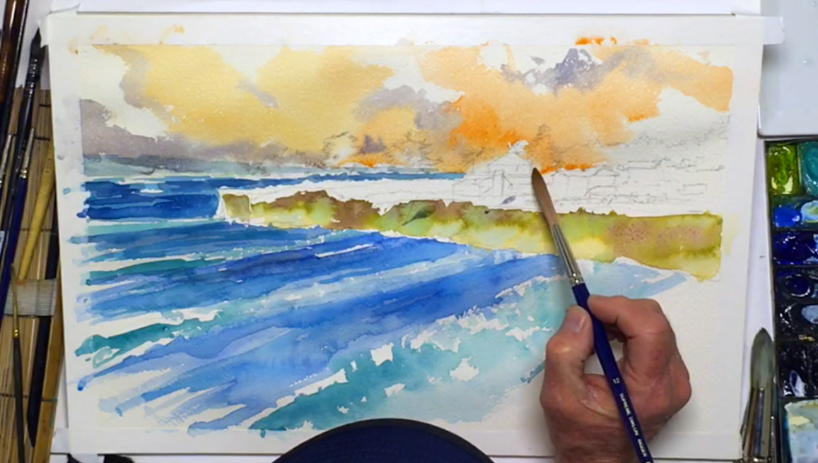 Next, you'll paint the sky. You only get one chance, so make sure you think of the design and placement of colors before you start painting! Considering Santa Cruz can be sunny or cloudy on any given day, it’s best to combine the two elements. With a clean no.12 Neef brush, brush clear water over the sky area so you can apply the wet-in-wet technique with your paint, which will help you get the soft, blended effect needed for skies and clouds. Although the ocean is blue, Bill decides to use its complementary color: Orange. Prep Cadmium Yellow Orange and Cadmium Red Light on the palette, then drop this mixture into the wet paper. Dilute the paint if it gets too dark, and apply more pressure on the brush as you get above the buildings. Make sure to leave patches of white for clouds, as this adds to the tone and dramatic contrast of the sky. While the paper is still wet, add a streak of Neutral Tint to darken the area above the mountains for a cloud bank. You can use the same color underneath the white clouds for their shadows. Allow the paints to bleed into one another and create "happy accidents", which happen often when using the wet-in-wet technique.
Step 6: Cliff (Second Layer)
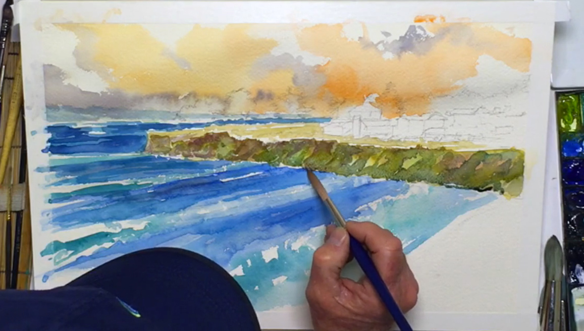 Now that the sky's finished, it's time to add another layer to the cliff. With the Yellow Ochre and a touch of Neutral Tint, paint the ground on top of the cliff. It should be a light tan. The cliff face will be in shadow, so the area on top should be a lighter value. Continue painting the area in front of the houses while leaving the houses white. Next, add more Neutral Tint into the Yellow Ochre mix, and paint more shadows on the cliff face to tone down the colors. You can even add a touch of Cobalt Blue Hue or Violet Light to vary the shadow tones. Take your time with this process - it will help establish your creative style, while being good practice for understanding color temperature (i.e. warm vs cool) and value (i.e. dark vs light).
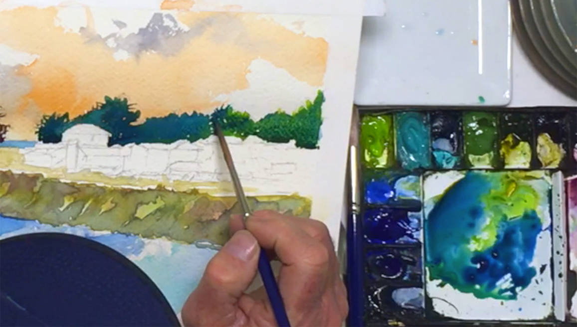
Step 7: Silhouetted Trees (Left)
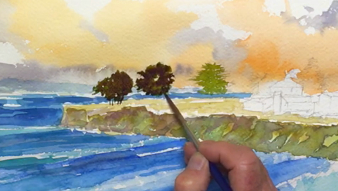 When the sky is dry, switch over to the Neef no. 8 brush, and using the tip, draw a layer of strong Olive Green to the trees by mixing less water with the paint. While it's possible to pre-mix the color of the tree silhouettes on the palette, mixing colors directly on the paper will produce a different effect. Remember that the trees can be grouped together, and that they should have different shapes and sizes. While you don't have to follow the exact shape of each tree, try to capture the feeling of its structure by leaving gaps created by the foliage, and drop in Permanent Violet in the green for darker areas while the paint is still wet. Although green should be the dominant color, the violet will mix and fill in parts of the damp areas to add more depth and contrast to the silhouette. To complete the trees, pull thin lines of violet down for tree trunks and connect them to the ground. Make sure they're not too straight or too regular, and break up any patterns that start to form.
Step 8: Silhouetted Trees (Right)
 Add some Viridian to the Olive Green mix, and paint the row of trees above the rooftops. Take your time and paint carefully, keeping crisp borders around the houses. You can gently flick paint outwards from the trees to create the tapered lines needed for branches that are sticking out, but be careful not to overdo it. Add Cobalt Green to the Viridian mix for some color variety, and for darker shadows blend in Prussian Blue. Keep leaving small holes in the paint for more "sparkle" in the trees, and with some Leaf Green, brighten the tree line as you near the right side of the painting. Add a touch of Prussian Blue for detail, and if the paint starts to pool too much, use a clean dry brush instead of the rag to lift out some paint.
Step 9: Sandy Beach
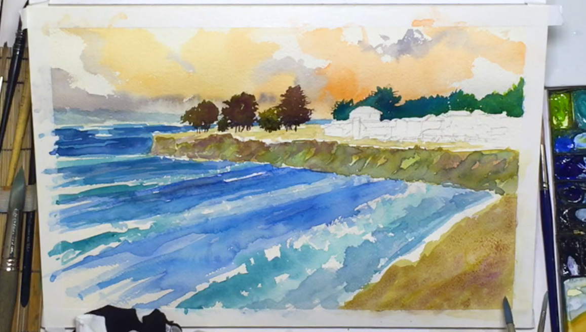 With the tree section done, it’s time to paint the beach in the bottom right corner of your painting. Switch to the Escoda round brush (no. 20), prep some Yellow Ochre and a touch of Neutral Tint on the palette, then paint the first layer of the beach, adding streaks of stronger color to vary the tones a bit. Use the wet-in-wet technique and drop in areas of Burnt Sienna and Cobalt Violet Light to add textural shadows in some parts of the beach. After cleaning your brush, stab in more Cobalt Blue Hue and Neutral Tint to the wave closest to the sand. You can be rough in order to add the texture and feeling of a wave crashing onto the beach. Be careful not to mix or overlap the blue ocean with the beach, or you'll end up with a misplaced green area. When you're done, let your painting dry. You can use a hairdryer to speed up this process if necessary.
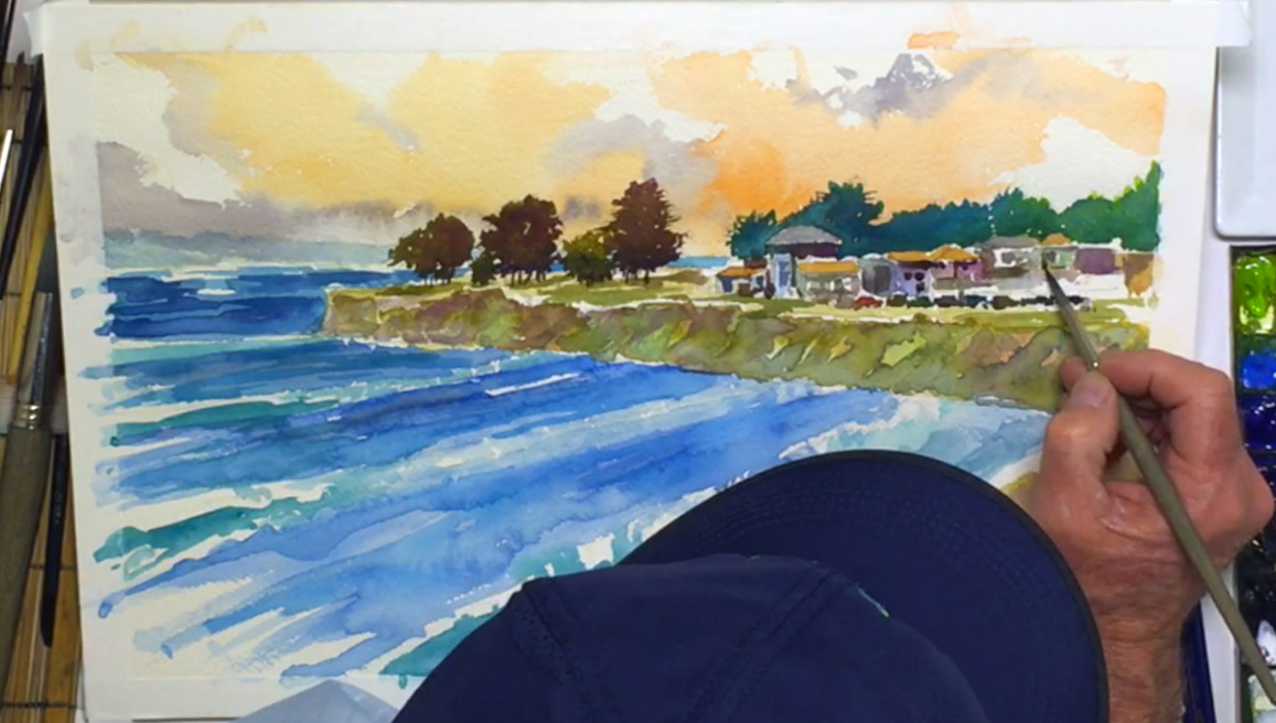
Step 10: Colorful Village Buildings
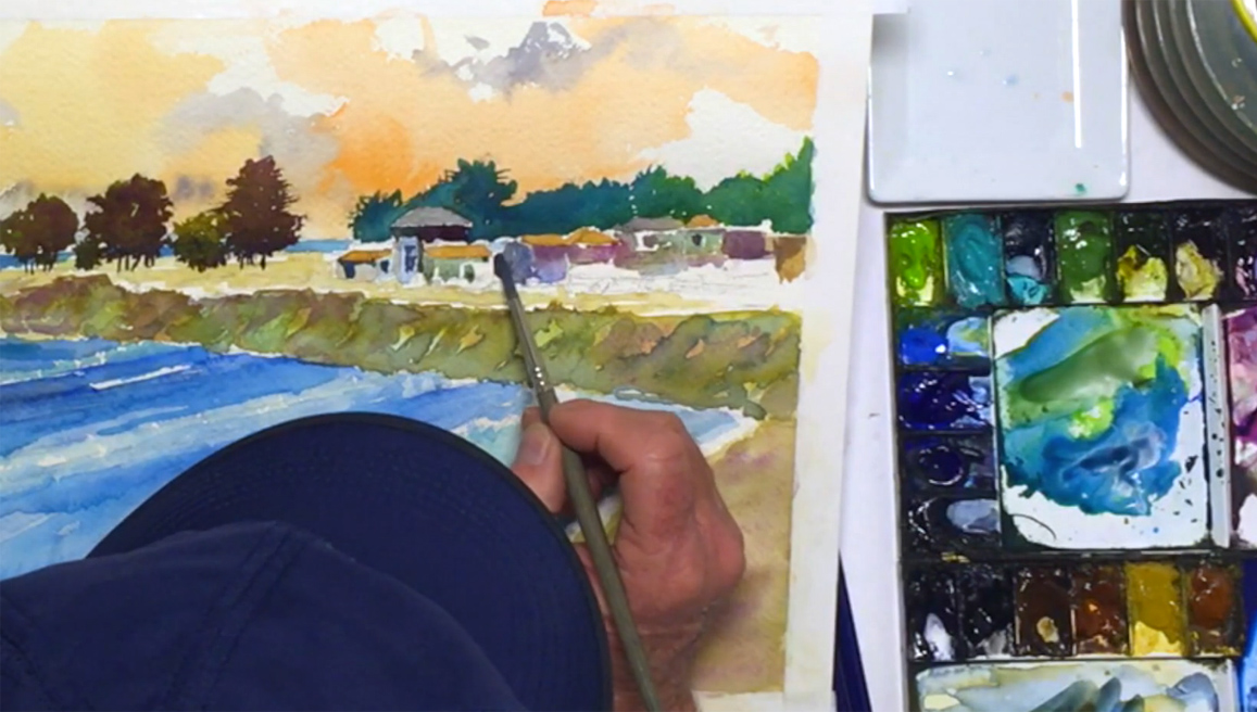 Moving on to the village, use the Escoda round brush (no. 8) and mix Yellow Ochre with Burnt Sienna. This color will help contrast the rooftops from the trees and have them pop out. Don’t paint all of them the same color though, and be mindful of the different angles and positions of the houses when painting. Have confidence in yourself when using the thin brush, and keep your brushstrokes crisp and steady to capture the structural feeling of houses. Vary the rooftop colors, such as using diluted Neutral Tint for a light gray roof. You can also use this color for the shadowed side of white houses. When you get to the buildings, you should have a darker tone for them since they are mostly in the shadows. Paint horizontally to avoid the cars and any overlap from the paint you used earlier for the ground. As for the colors, feel free to take more creative liberty: you can use Sap Green, Cobalt Violet Light, or a mixture of Cerulean Blue with Permanent Violet and Quinacridone Magenta for stronger tones and variations. Even though the reference photo shows the houses as white, the painting will look much more interesting with all these different colors being implemented. Have fun with it! But try not to overdo the different colors or else it will begin to look too fantastical. You can always refine the lines and tones later.
Step 11: Shiny Cars
 Next are the cars. Using a blend of Cadmium Yellow Orange, Cadmium Red Light, and Quinacridone Magenta, paint a simple brick-like shape that can represent a car. It should not be bigger than any of the houses. Use Neutral Tint and add another car to the right. Like you did with the buildings, feel free to mix different colors for each car, but try to use brighter colors and leave thin lines of white to give the illusion of the metallic surface of a car. This is a chance to focus on the little elements that contribute to the overall scene, and again to practice honing your artistic sense and intuition. In turn, this helps build self-confidence and trust in your own judgement, which is crucial for any aspiring artist.
Step 12: Tweaks and Details
 At this point, your painting should be mostly dry, which is the perfect time to add and tweak details. With the Escoda no. 8 round brush, shift between the buildings and cars, adding details such as lawns, bushes, and shadows under the trees using a blend of Yellow Ochre, Sap Green, Cobalt Violet Light, and previously mixed blues that should still be on your palette. Try to capture the feeling of a land mass that supports everything on top, and make parts of your painting pop out by contrasting a bright tree or bush with a dark shadow. You can also liven the village by using a diluted Cobalt Blue Hue or Violet Light and adding doors and windows to the houses. Leave some white spots and lines to keep that "sparkle" in your painting, and for the car tires, use Ivory Black, though be careful that it doesn't bleed into the cars or houses. Other tiny details will help liven the village, but again, don't overwork the painting. Once the village is done to your satisfaction, switch to the Escoda no. 20 round brush, and add a light mixture of Yellow Ochre, Burnt Sienna, and Neutral Tint for one last layer to the cliff face and beach to tone down the color in these areas. However, too many layers of color can lead to muddied paint, so try to avoid that as much as you can.
Step 13: Final Finishing Touches
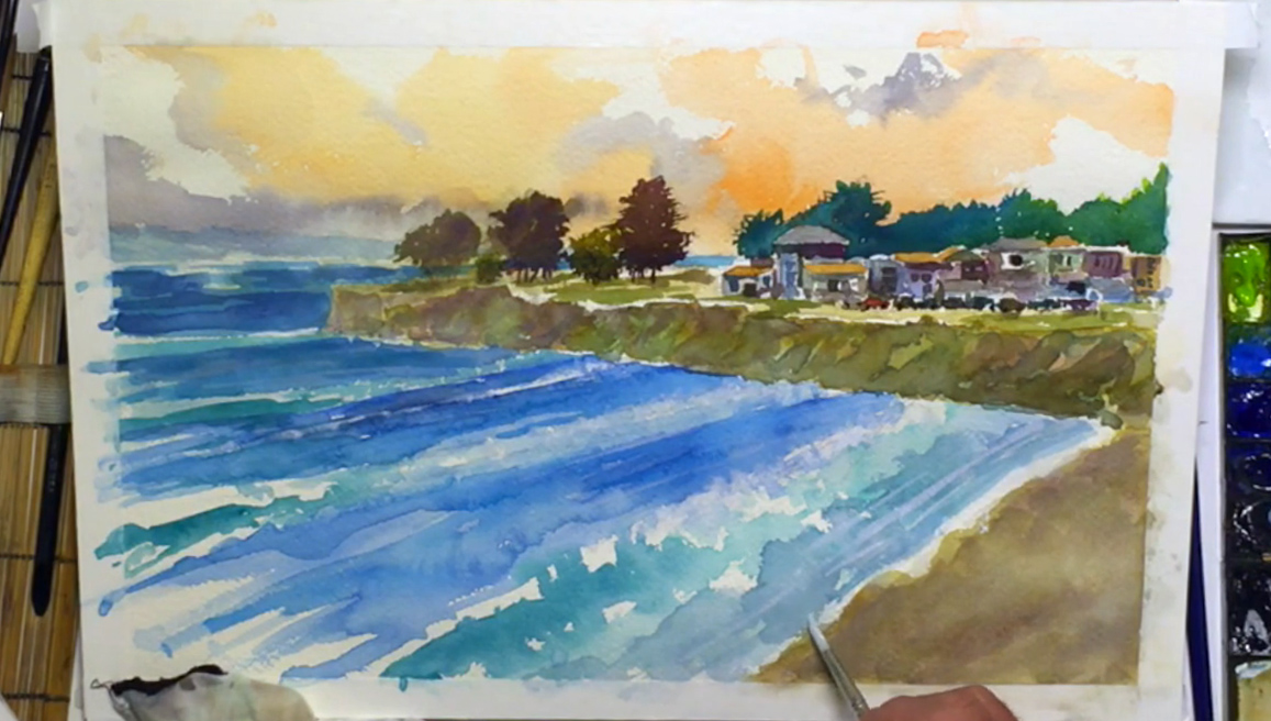 To achieve atmospheric perspective to its full potential, you have to dull down the objects in the far distance. While this method is more experimental and tricky to get right, it allows you to increase the depth of your painting once you've finished everything else instead of having to factor in the dulled colors when painting the background. To achieve this effect, use a cleaned Escoda no. 20 brush to water down the Zinc or Permanent White gouache paint (which is more opaque than watercolor) until it is quite milky. Lightly brush this on the left side of the sky, the mountain range, and the leftmost tree, and even add some on the beach to shift it back a little. If the consistency is correct, the white will blend into the paint so not too much color is lost. Switching to the Escoda brush (no. 8), stab in a thicker white to the surfs on the ocean to make the water look frothy. You can also add reflective lines and water splashes in the blue parts of the ocean to brighten and unite the body of water. Use the same thicker white paint to add reflective areas on the cars and windows, and some seagulls flying above. Add Yellow Ochre to the white for hints of lampposts among the buildings, and Neutral Tint for shadows under the cars and seagulls, thus concluding the finishing touches for the village. Lastly, like Bill, you can add your signature to the painting by using the Neef rigger brush (no. 6) and mixing the white with any color you like. You only get one shot, so make sure there's enough paint on the brush to sign in one go. Don't place it too close to the margins, or make it too conspicuous. When the whole painting is dry, carefully take off the tape. With that, you're finished!