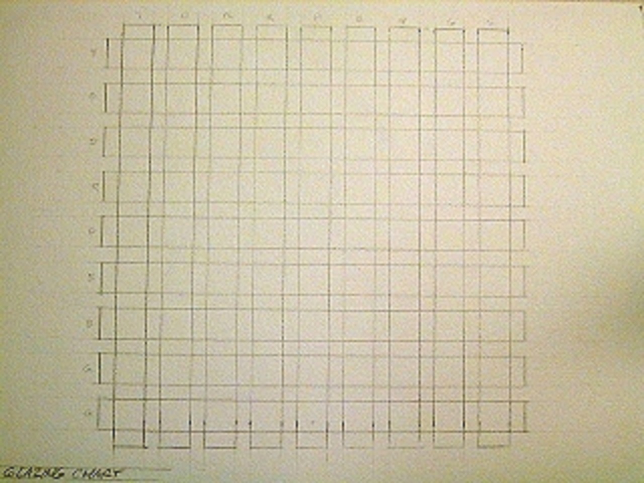
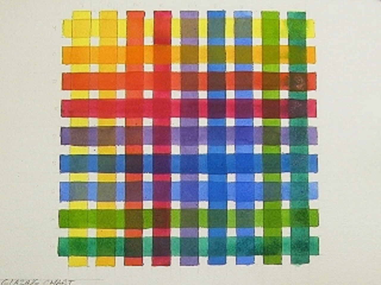
Glazed color grid: something for your reference wall
Creating a glaze grid is a watercolor technique for seeing how the colors you have interact with each other. I decided to use 9 bright colors: Cadmium Yellow Light, Cadmium Orange, Cadmium Red, Alizarin Crimson, Dioxazine Purple, Pthalocyanine Blue, Cobalt Blue, Sap Green, and Pthalocyanine Green. I drew a 9 x 9 grid of 1/2" bands. (You can skip the drawing step if you can paint a straight line without a problem) You should use your own palette of colors arranged correspondently.
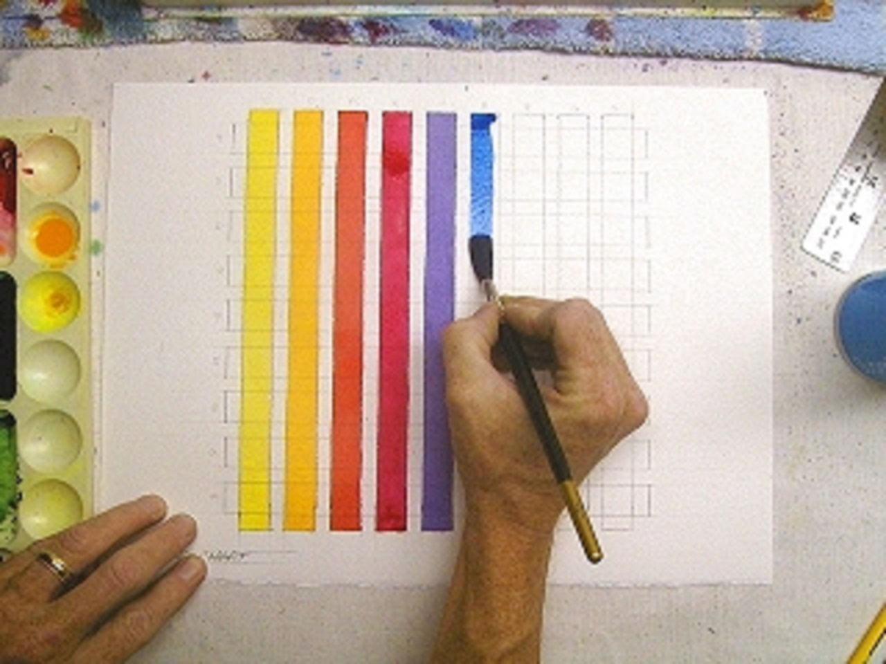
Laying some stripes
Try to mix each color to about 50% of it's hue strength. Starting with my lightest yellow I painted a full stripe of color down the paper in an even tone. I used a #10 round red sable, but you can use what works best for you. Following the rainbow of the palette I chose for this grid, I painted through the reds to blues to greens, completeing the first row of color bars. I let the piece dry thoroughly before...
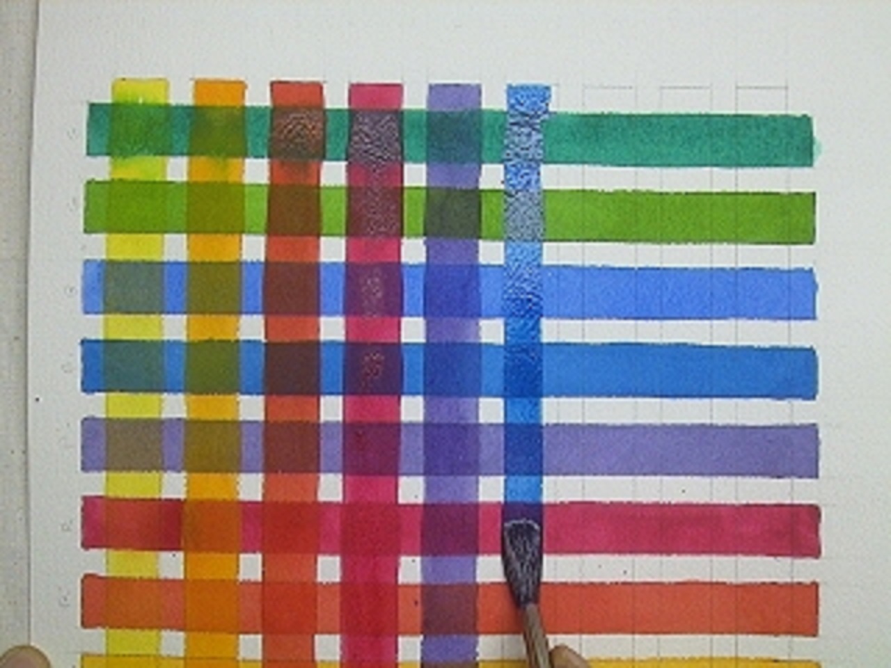
Rinse and repeat
I flipped the grid around for easier painting. Starting with my lightest yellow I proceeded to paint the same sequence of color bars across the first washes. When you lay these second color bars over the first ones lay the washes as cleanly as possible. Try not to disturb the underlying washes.
s'pretty innit?
You now have a color reference chart that shows you what? Click image to enlarge. It shows you: 1) Color transparency, semi-transparency, or opacity 2) Colors created when your colors overlay each other 3) Colors that tend to bleed or stain when glazed over Tack it up in your studio as a painting aid. Use it and others to help you determine what your personal artistic palette of colors should be. Use it to identify the troublesome pigments and their behaviors.