Explore some advanced watercolor techniques with Virgil R. Carter. Here's how to use color choices and natural light as design tools for dramatic watercolor paintings. Although this tutorial will only cover landscape subjects, the same principles are equally applicable to subjects of all types, from animals to still life paintings to portraits.
Materials used:
- Set of wooden blocks of different sizes
- Reference picture of "Spring is Just Around the Corner", or pictures of landscapes, preferably with buildings included
- Arches cold-pressed watercolor paper (140lb, size 9" x 12")
- Wooden board (at least size 9" x 12")
- A watercolor notebook or sketchbook
- Masking tape (1" width)
- HB pencil
- Skip Lawrence palette, or any watercolor palette
- A container of water
- A towel or rag to dry off the brushes
- Tissue or paper towel
- Watercolor paintbrushes of different shapes and sizes
American Journey Artists' Watercolor Paints
- Cadmium Orange
- Peachy Keen
- Quinacridone Gold
- Permanent Rose Quinacridone
- Cobalt Violet
- Ultramarine Blue
- Cobalt Blue
- Andrew's Turquoise
- Spring Green
- Payne's Gray
- Da Vinci Watercolors: Hansa Yellow Light
- Indian Yellow
- Cadmium Scarlet
- Naples Yellow
- Cadmium Orange
- Quinacridone Burnt Orange
- Phthalo Blue
- Manganese Blue (Mixture)
- Phthalo Green
Introduction to color & light watercolor techniques
Why do color and natural light matter?
- Color is one of the painter’s strongest tools for personal interpretations of a subject and for conveying emotions or personal feelings about it;
- Light illuminates what we see and influences our perceived colors, values, emotions, and even our sense of wellness and comfort;
- Together, color and light model a subject matter’s volume and solidity, while strongly affecting the mood and content of a painting.
Organization
The tutorial will be divided into three parts concluding with a demonstration painting. Thereafter, you will have the opportunity to apply the principles in your own future paintings.
Objectives:
Part 1—Introduction and application of some key principles of color and natural light in painting. Part 2—Introduction and application of some key components of illumination: 1) illuminated surfaces, 2) surfaces in shade and shadow, and 3) reflections, “light traps” and “halos”. Part 3—Painting with Color and Light: A demonstration painting employing these principles and components of using color and light in a painting.
Administrative Principles
Color
Painting with color means the imaginative and personal use of a favorite palette of colors. If you are not already a colorist painter, try to create a colorful palette of your choices and give it a try for this tutorial. Below is a picture of Virgil's personal palette:  Upper row (L to R): Ultramarine Blue, Cobalt Blue, Phathlo Blue, Manganese Blue (mixture), Andrew’s Turquoise, Phathlo Green, Spring Green, Payne’s Gray. Lower row (L to R): Hansa Yellow Light, Indian Yellow, Cadmium Scarlet, Naples Yellow, Peachy Keen, Quinacridone Gold, Cadmium Orange, Quinacridone Burnt Orange, Permanent Rose Quinacridone, Cobalt Violet
Your Approach to Making a Painting
There are as many different approaches as there are painters. Regardless of your method, try your best to develop your personal approach for this painting by first exploring composition and values with some thumbnail pencil sketches in a sketchbook. Sketchbooks are wonderful tools for becoming familiar with subjects before picking up a brush. Gaining knowledge of and confidence in a subject — any subject — allows for much looser painting, which means less worry and more fun! Using a sketchbook is also a great method for exploring alternatives to value and composition. These small studies will help get you past the first ten minutes of painting and guide you to a strong completed painting. When you have selected a sketch to be the basis of your painting, all that remains is to make your painting look like your sketch. Develop your personal color scheme to express the feelings and emotions that you wish to convey about the subject, and remember the 80/20 Rule: Make at least 80% of the painting about your idea.
Introduction to Color and Light in Painting: Part One, Step One
Key Principles for Seeing and Painting with Color and Natural Light
Color and Temperature of Light
The most important principle for painting with color and natural light is to understand that light has both color and temperature.
- Physics and Painterly Effects: The illustrations below show the color of light in degrees Kelvin.
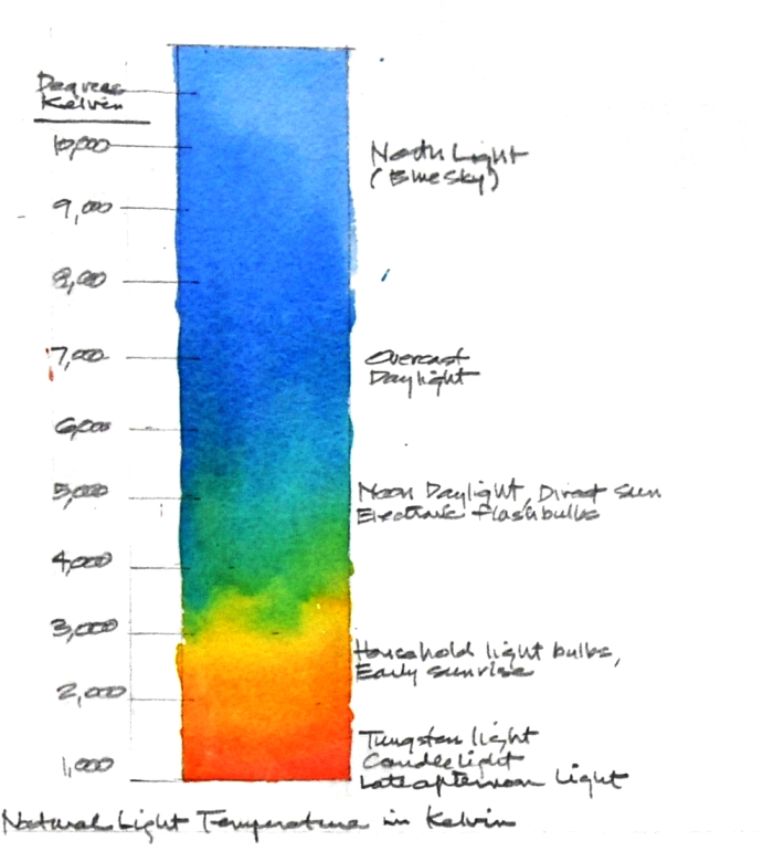
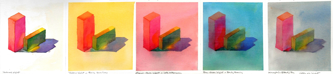
- As you can see, natural light has many colors. Light can also be represented in a painterly manner to create different emotions and effects. Virgil has illustrated some options for using color to represent different lighting effects, i.e., neutral mid-day, early morning, and late afternoon, plus atmospheric effects such as mist and fog.
 While colors may be classified as either warm or cool, it really is the color of the prevailing light and reflected light in the environment that sets the perceived color and temperature of a subject and a painting. Even local value is affected by the color and intensity of the illuminating light and the surrounding environment.
Part One, Step Two
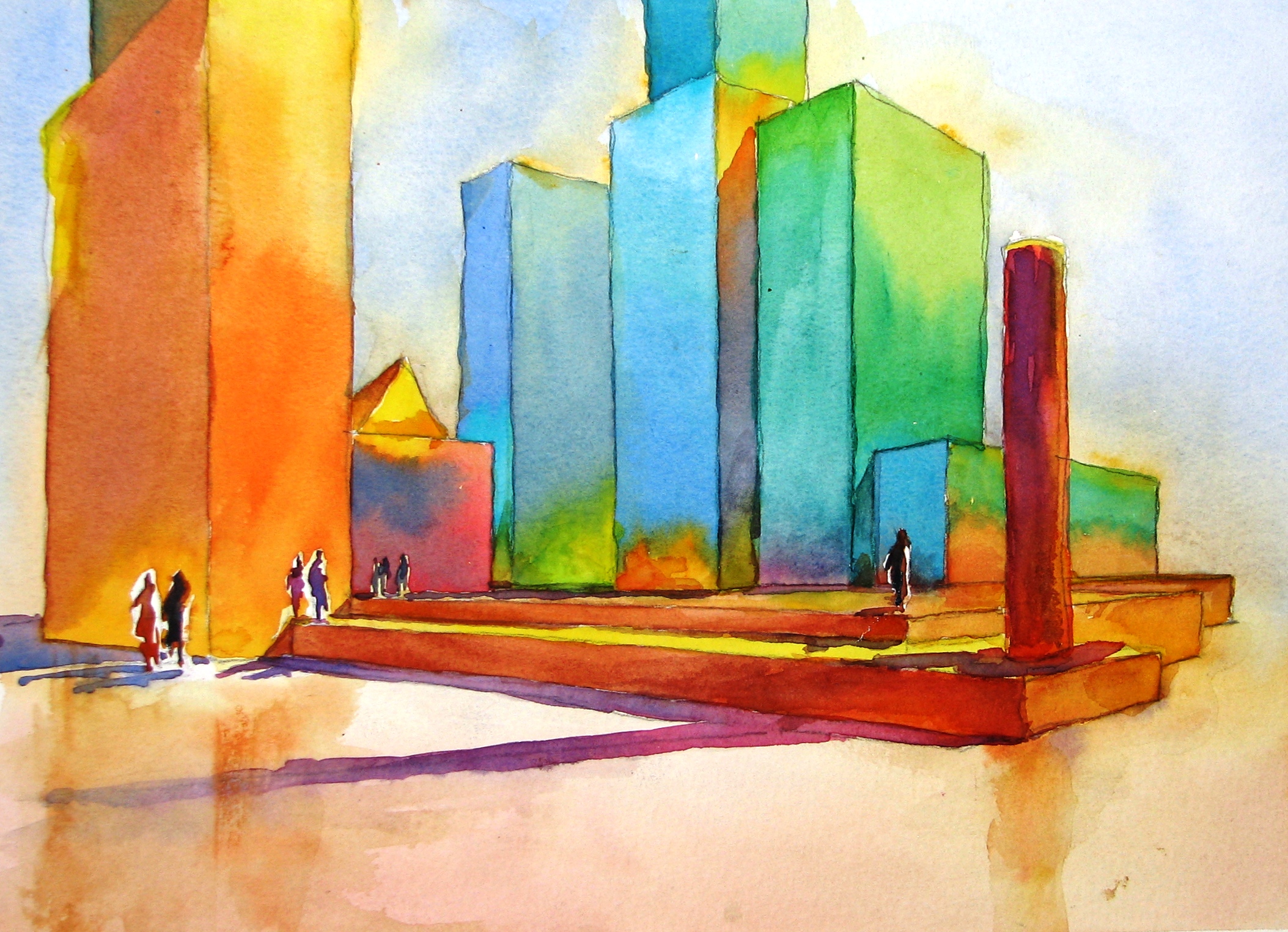
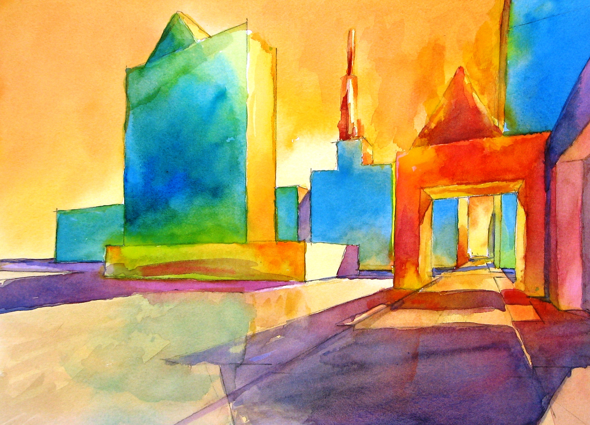
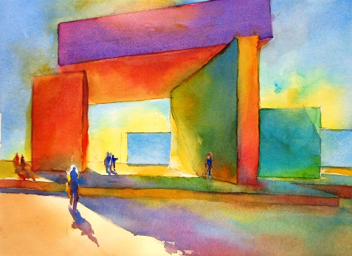
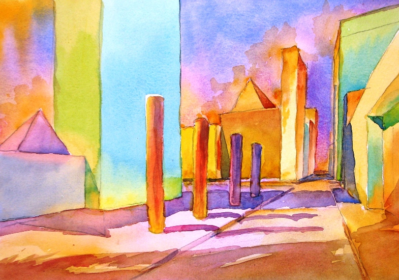
Intensity of Light: A second important principle of light deals with the intensity of the ambient light. Virgil has illustrated four options for intensity below: two ways to suggest strong illumination, a way to suggest weak illumination, and a way to suggest atmospheric effects.
- Strong illumination: Strong illumination is generally characterized by a wide range of saturated warm colors on the illuminated surfaces, accompanied by cool accents, strong contrasting shadow areas, and a strong, full range of values. Strong illumination may be rendered in various ways. Here are two examples:
- Spotlight effect: Characterized by wide and intense range of color and value contrasts. Be cautious that this approach does not place too much emphasis on isolated objects.
- Floodlight and/or “glare” effects: As opposed to the extreme spotlight effects of intense color and contrasting values, strong illumination may also be represented by close value and color contrasts suggesting “glare”. These conditions may be characterized by filtered light with softer or lost edges, together with close color and value contrasts.

- Weak illumination: Weaker illumination is caused by less warm light being present. Thus, weak illumination is characterized by employing a reduced range of cooler colors in the illuminated areas, and cool accents with moderate to limited shadows depending upon the desired effect and strength of ambient illumination. In weak illumination, there are few strong contrasts in color or value. Shapes become flatter with less modeling and reduced detail/texture.
- Atmospheric effects on illumination: Rain, mist, and fog are atmospheric effects that create special lighting conditions. Compared to weak illumination, atmospheric lighting effects have even greater reductions in color and value range. These effects are characterized by greatly reduced contrast through the use of primarily mid- to light value ranges, and muted cool colors. Shapes are almost completely flat silhouettes, with virtually no modeling, detail or texture.
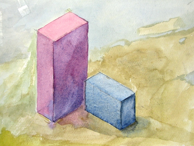
 Effect on surfaces: In normal natural light, horizontal planes collect or reflect light and tend to appear lighter, while vertical planes retain color and appear darker in color and value. This can lead to painting situations such as a black roof being lighter than a shadowed wall.
Part One, Step Three
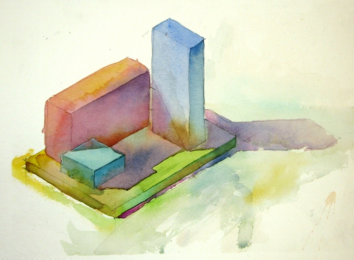
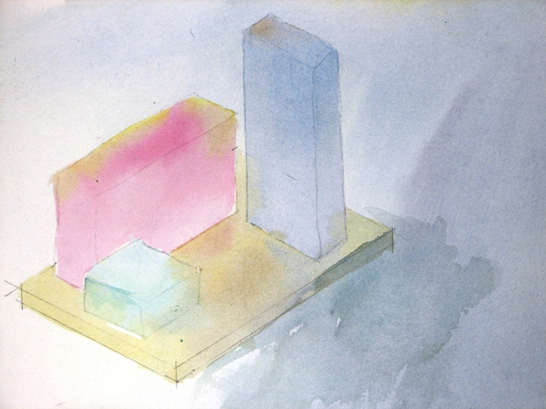
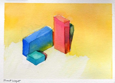
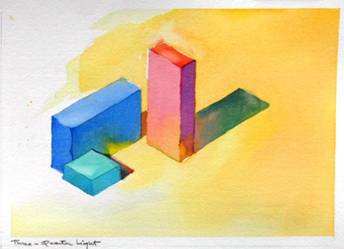
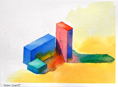
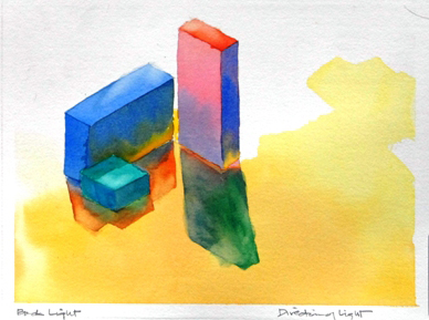
Direction of Lighting: A final principle important in painting with light is to understand the characteristics of the varying directions of lighting. The direction of the lighting affects the modeling and definition of the subject and its setting, as well as the mood and atmosphere of the painting. Four major directions for light to enter the painting are shown below: from the front, three-quarters, side, and back.
- Front lighting: Light coming directly from the front tends to reduce descriptive modeling to a minimum since most visible surfaces are equally illuminated and there is little or no visible shadow. Rich, intense colors and values are possible.
- Three-quarters lighting: At an angle of approximately 45 degrees to the subject, light, shade, and shadow are all present in significant amounts. This improves the descriptive modeling of the subject and provides opportunities for rich colors, values, and contrast.
- Side lighting: Like the three-quarters lighting, side lighting gives a strong feeling of solidity and three-dimensionality. Very dramatic cast shadows are often possible, creating opportunities for strong forms which may be very descriptive of the surfaces on which they fall. There is strong dramatic potential for design and composition purposes with side lighting.
- Back lighting: Light coming from behind the subject creates more of a silhouetted image. You can brighten and soften edges of shapes where appropriate to indicate the way light creates a “halo” or rim effect. This lighting is characterized by a narrow range of mid- to dark values. Colors should be cool and muted. Depending on lighting intensity, forms may flatten and details become vague. The overall impression may be low-key, shadowy and cool, ambiguous, or even mysterious. This type of lighting has the potential for great dramatic design and composition purposes.
Introduction to Key Components of Natural Light: Part Two, Step One
Illuminated Surfaces, Shade, Shadows, and Reflections Let’s start with some common definitions for these terms: 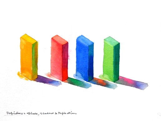
- Illuminated surfaces: The surfaces of an object that are lit by the available light source.
- Shade: The surfaces of an object that are away from and not illuminated by the light source, also known as the “form shadow”.
- Shadows: The shapes cast by an illuminated object upon adjacent forms and surfaces. Shadows are transformed by the shape of the form or surface where they appear. These are also known as the "cast shadow".
- Reflections: The reversed image, color, and value of an object that may be seen in adjacent forms and surfaces under favorable lighting conditions.
General Rules of Thumb:
- Composition: Either the illuminated areas or the shadow areas should dominate to maximize the effect of light in landscapes. When illuminated areas and shadow areas are approximately equal, the effect of lighting is reduced, and the risk of a “static” composition is increased.
- Temperature: In normal natural light, illuminated objects tend to be “warmer” and objects in shade and shadow tend to be “cooler”.
- Intensity and value: Shadows are a more intense color and darker value than shade.
Part Two, Step Two
Shape and Intensity of Shadows The first key principle of shadows is their shape and intensity. Shadows are influenced by both the intensity of the light source and the distance from the subject that is casting the shadow.
- Intense or hard shadows: Shadows closer to the light source and subject are more intense, warmer, and hard-edged.
- Muted or soft shadows: Shadows that are more distant from the light source and subject are less intense, cooler, and soft-edged.
- Little or no visible shadows: Depending on ambient lighting, shadows may be reduced or not appear to be present in weak light and atmospheric conditions.
Part Two, Step Three
The Color and Temperature of Shade and Shadows The second key principle of shadows is their color and temperature:
- Strong light: In bright full light, shadows pick up the colors around them and from the surfaces upon which they fall. Try to keep shade and shadows as luminous as possible. Do not “scrub” them into the paper! Remember the principles above and vary your shadows as they become more distant from the light source and the subject casting the shadows.
- Weak light: Weak light means there is less warm light present, i.e., the lighting temperature is cooler and the intensity of lighting is less. Thus, shadows, if present, will be substantially muted, much cooler, and greatly softened.
Part Two, Step Four
Painterly Effects For a painterly effect, shadows may include the complement of the color casting the shadow, particularly in strong light. Use of complementary colors can provide remarkable, shimmering luminosity, especially when working with intense ambient light. Alternatively, random “jewels” of dropped-in color will enliven both sunlit and shadowed areas. 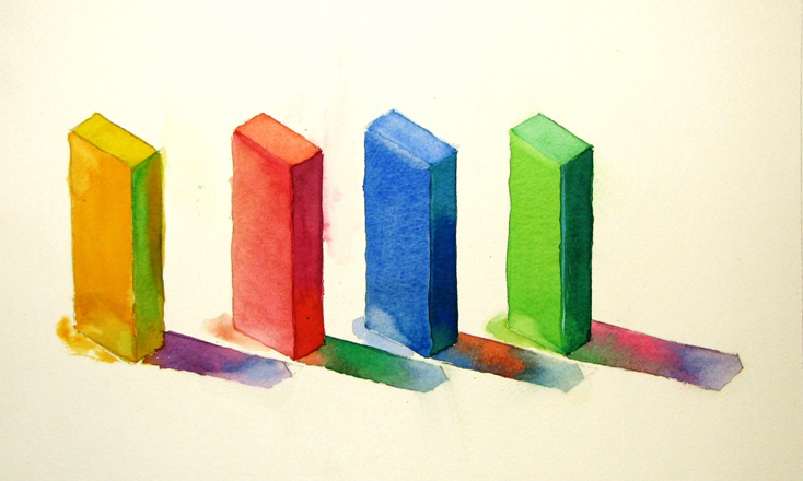
Part Two, Step Five
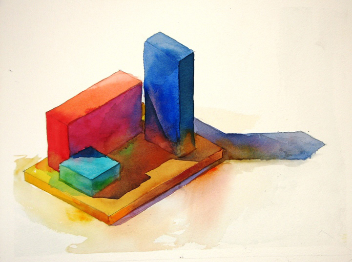
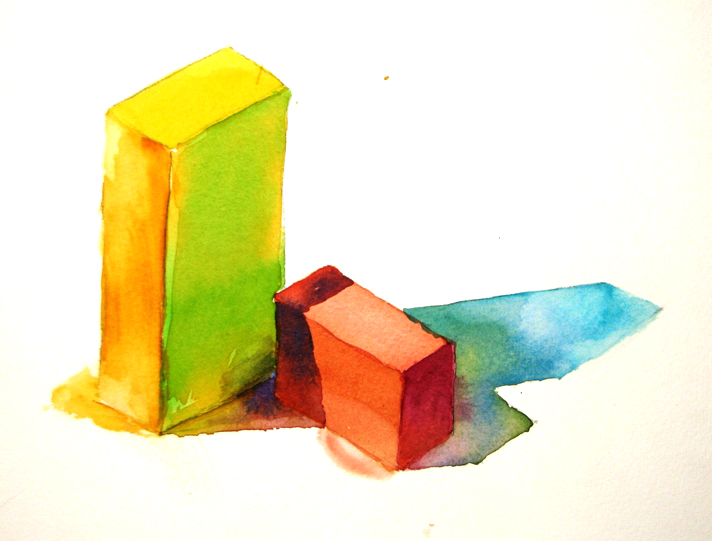
Reflections, “Light Traps”, and “Halos” The third and final principle for shade and shadows has to do with three small design elements which can add large effects when painting with light. The illustrations below variously employ all of these design elements.
- Reflections:
- Reflections add to the painterly effect of color and light by energizing the play of highlighted color and the “sparkle” effects of the ambient lighting.
- Reflections may occur in illuminated surfaces, shades, and shadows, particularly those in strong illumination.
- Reflections are most easily seen on sunny days or in bright illumination; they are less prevalent in weaker lighting, and almost non-existent in atmospheric lighting conditions.
- General rules for reflection: - They are lighter in value in any shadow area in which they fall. - They are darker in value in any light area in which they fall.
- Application techniques: Reflections may be created in vertical and horizontal surfaces using wet-on-wet applications, or they may result from “lifting” a surface color.
- “Light traps”: This is Virgil's term for the intersections of vertical and horizontal shapes or surfaces where the light may be perceived to be “trapped” and bounces or reflects from one surface to the other. Application technique is similar to that of reflections, above.
- “Halo effects”: This is Virgil's term for the edges of forms where light can reasonably be perceived to be passing or being reflected. It can also be called the “rim effect”. It is especially prevalent with back lighting, but reasonable in other directional lighting as well. Application involves use of softened or lost edges, combined with wet-on-wet or lifting a surface color to create the “halo”. Use this effect judiciously — a little goes a long way!
Part Two, Step Six
Myths About Shades and Shadows
- Shades and shadows are the “absence of light”: Shadows are not the absence of light; light is always present in shade and shadows. See for yourself; go outside and look at an object in the shade or a shadowed area. You can clearly see and differentiate between every object in the shade or shadow! If there truly were an absence of light, you wouldn't be able to see anything.
- Shade and shadow are a “universal color”: There is no “universal” shade or shadow color such as gray, violet, blue, or “shadow green”. The color of a shadow is derived from the color of the ambient illumination and the colors of the objects on which the shade and shadow fall. For example, the shadow on a brick walk is not the same as the color of the same shadow on the adjacent grass. And of course, you can also choose your own colors for your personal painterly effect.
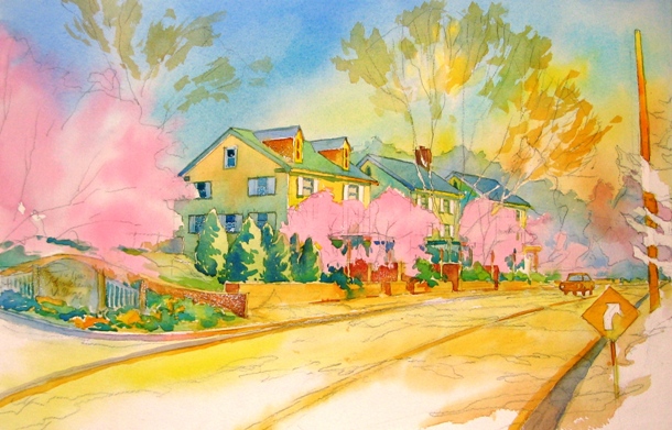
Demonstration Painting "Spring is Just Around the Corner": Part Three, Step One
The reference photo, titled “Spring Is Just Around the Corner”, illustrates a landscape that consists of both natural and man-made objects which will maximize the opportunities to use the principles of this tutorial. The actual subject is a charming inn located in Wilmington, Delaware. You can print the picture below for a larger reference. 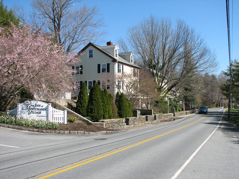 The existing lighting is from the side, creating forms with surfaces that are both illuminated and in shade. The side light also creates an opportunity for strong shadow forms. For the demonstration, Virgil has chosen to increase the existing shadows for a stronger painterly effect, and has also added a few objects and overlapping shapes to increase compositional interest.
Part Three, Step Two
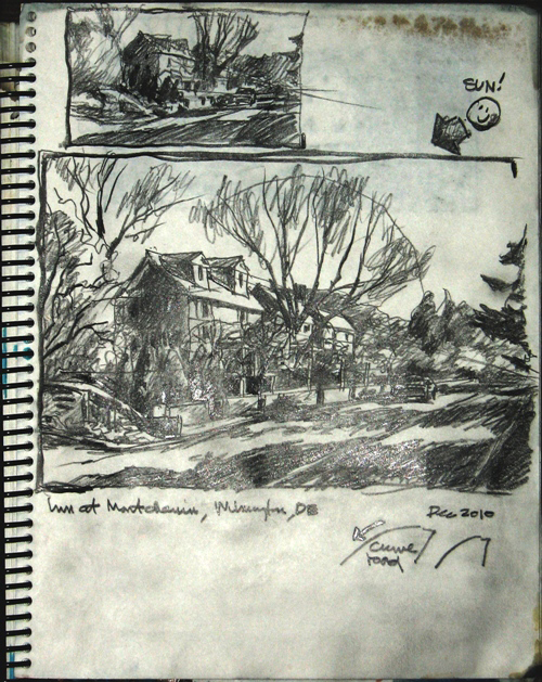 In your sketchbook, use the HB pencil to draw several thumbnail sketches to explore and confirm your composition, and to establish your value scale. Then, prep your Arches watercolor paper for the final painting by taping the edges to the wooden board using the masking tape. Prep the paint by wetting and mixing the colors you need on the palette.
Part Three, Step Three
 Lightly sketch your composition onto the Arches watercolor paper, then start by painting the sky and foreground using the wet-on-wet technique: introduce some of the light sky colors into the foreground areas for color harmony, particularly where there will be no shadows. Next, lay in the light natural objects and foliage that overlay the buildings and other man-made objects (also wet-on-wet).
Part Three, Step Four
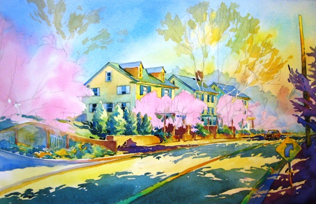 Paint buildings and man-made objects using the wet-on-dry technique, and lay in some of the early mid-value shapes.
Part Three, Step Five
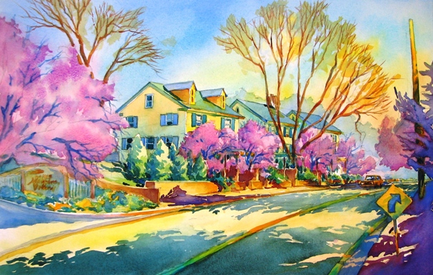 Paint the remaining mid-value natural objects. Introduce the darks: paint shadows and other dark areas using the same wet-on-dry technique. Make sure to pre-mix a sufficient quantity of the colors you need to ensure a continuous, consistent wash.
Part Three, Step Six
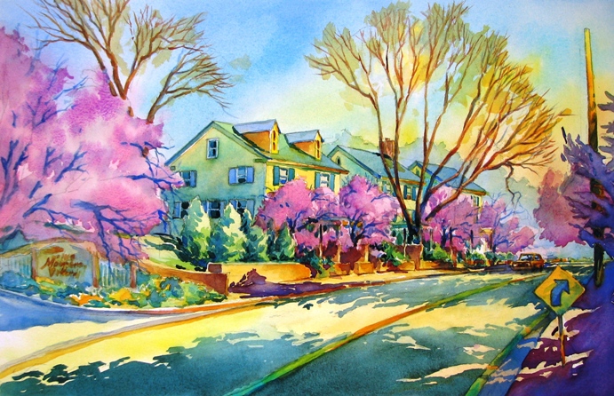 Add needed details and textures (tree trunks, limbs, etc.), and any finishing touches to your composition, including color adjustments.
Part Three, Step Seven
Overview:
- Use your sketchbook to analyze the photo, to identify and develop your design, composition and values, and to establish your overall painting plan.
- Begin by defining and laying in the lightest areas and objects.
- Major geometrical shapes and significant color areas often benefit from early placement of key color notes on clean paper.
- Remaining natural objects can be added as grouped shapes.
- Add and build mid-tone values, followed by adding dark values last to create clean shapes and edges.
- Introduce limited details and any texture needed to convey painterly intent.
- Tie colors and values together with coordinating washes where needed.
For your painting, you may use the "Spring is Just Around the Corner" picture or one of your choosing that shows the principles of this tutorial. You may paint the photo as is, or recompose it to meet your own painterly goals. And finally, don’t forget to have fun! Source credit: Virgil R. Carter
Mijello Mission Gold Class Pure Pigment Watercolor MWC-1524P, 15ml x 24 Colors (7 Milliliter x 2ea)