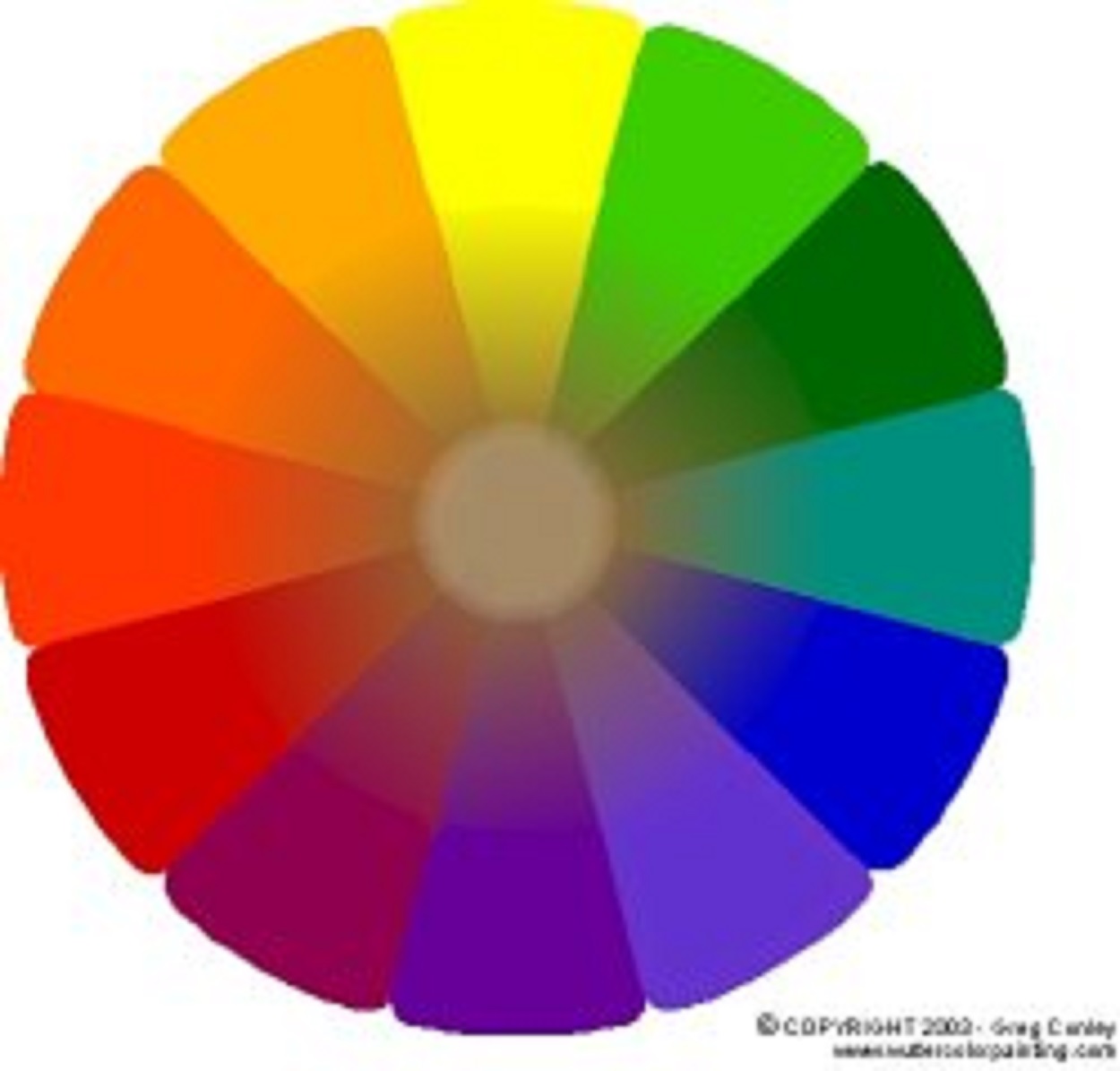
The Color Wheel
The 12-part Color wheel is a representation of the visual spectrum of light that us humans can actually see. It is the rainbow we see through the dispersion of white light through prisms and raindrops. The visible spectrum (traditional ROYGBIV) is a very small range of the whole electromagnetic spectrum that runs from radio waves on the long end to Gamma waves on the short end. Each color has a specific wave frequency that our eyes perceive as different color sensations. The basic color groupings that concern artists are the Primary colors (3), the Secondary colors (3), and the Tertiary colors (6). Hue refers to the color name, as in red, blue, and yellow are different hues. Color saturation is to the strength of color as it is presented. Chroma is the amount of grayness in a color, achieved my adding white or black. Value refers to a color's lightness or darkness on a gray scale of 1 to 10. The interaction of one color with another can achieve both highly dramatic as well as subtle glowing effects in your art. Understanding the potent interrelations of color and light on the textures of the surfaces of what we see everyday is essential to the artist. Genré, technique and subject matter do not matter. You gotta know this stuff or you're going to do some strange pieces as you explore color by hit and miss.
Primary Colors
 Red, Yellow and Blue Lightwaves travel at different frequencies: Red is longest, Yellow is middle range, Blue is close to the short end (Violet)
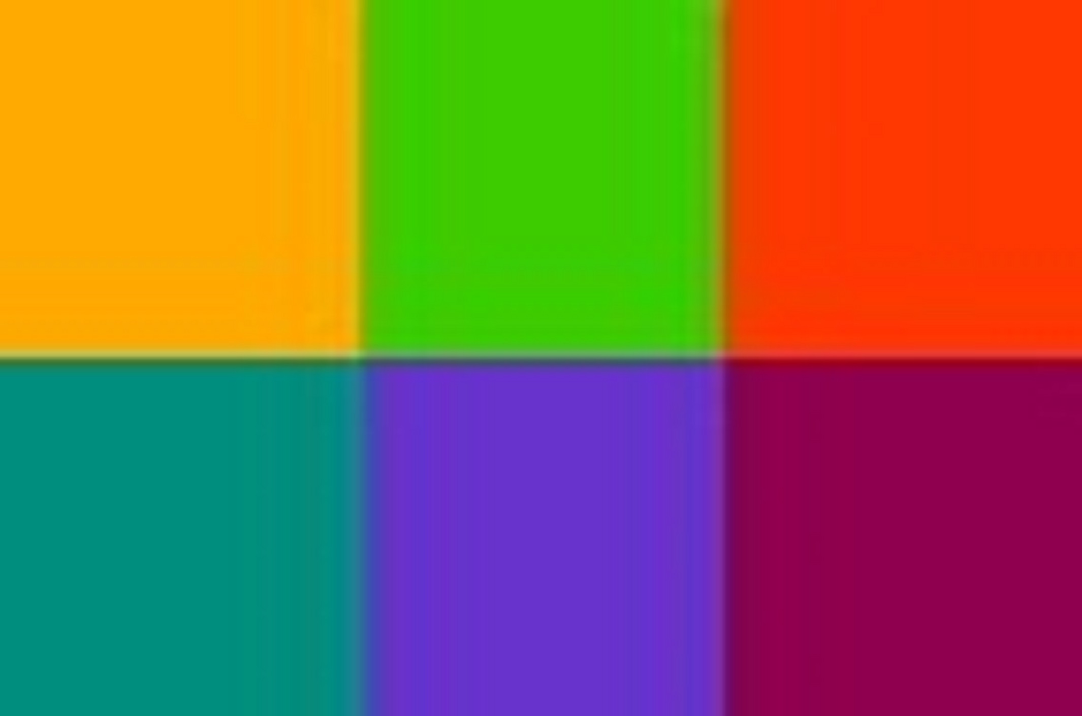
Secondary Colors
 Orange, Green and Violet Combining Primary Colors in pairs results in Secondary Colors. (Yellow + Red = Orange, Yellow + Blue = Green, Red + Blue = Violet)
Tertiary Colors
 Filling in the Gaps The colors that fall between the Primary and Secondary Color mixtures are Yellow-orange, Red-orange, Yellow-green, Blue-green, Red-violet and Blue-violet.
Complementary Colors
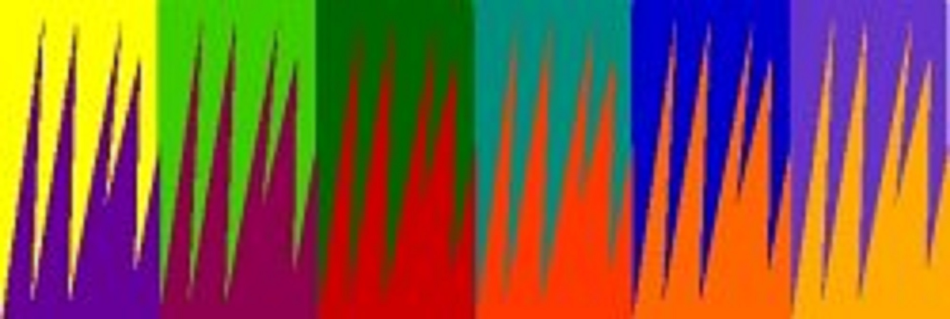 Yin and Yang Colors that are 180° opposite each each other on the Color Wheel. Complementary colors afford the highest possible color contrast and stability. Colors next to their complimentary counterparts set off a visual excitement in their contrast that jars us.
 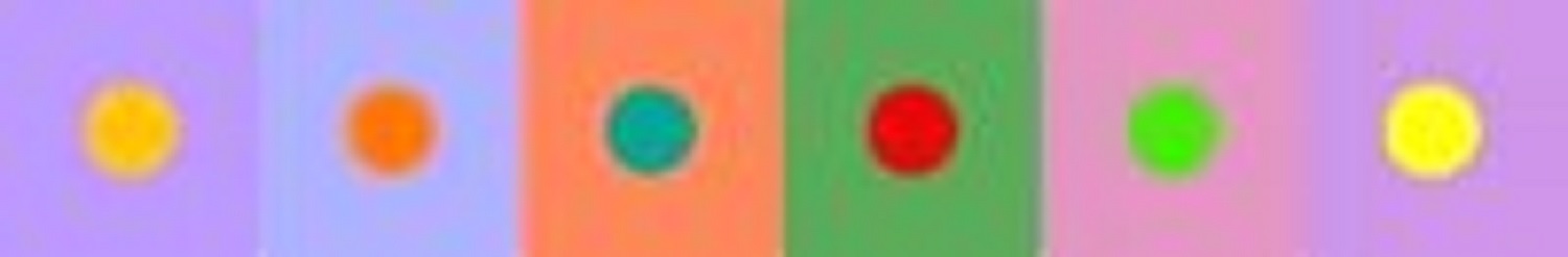 Getting that "Glow" Did you know? Using lighter shades of complementary colors can recreate a "glow" of light and color vibrancy.
Mixing Complementary colors
 If you slowly mix a color into it's complementary color it gradually loses it vibrancy and it's identity as a color. They neutralize each other and leave a variation of gray. Depending on the pigments used (see Mud) this is an essential tool for finding difficult mixes of warm and cool grays.
Split Complementaries
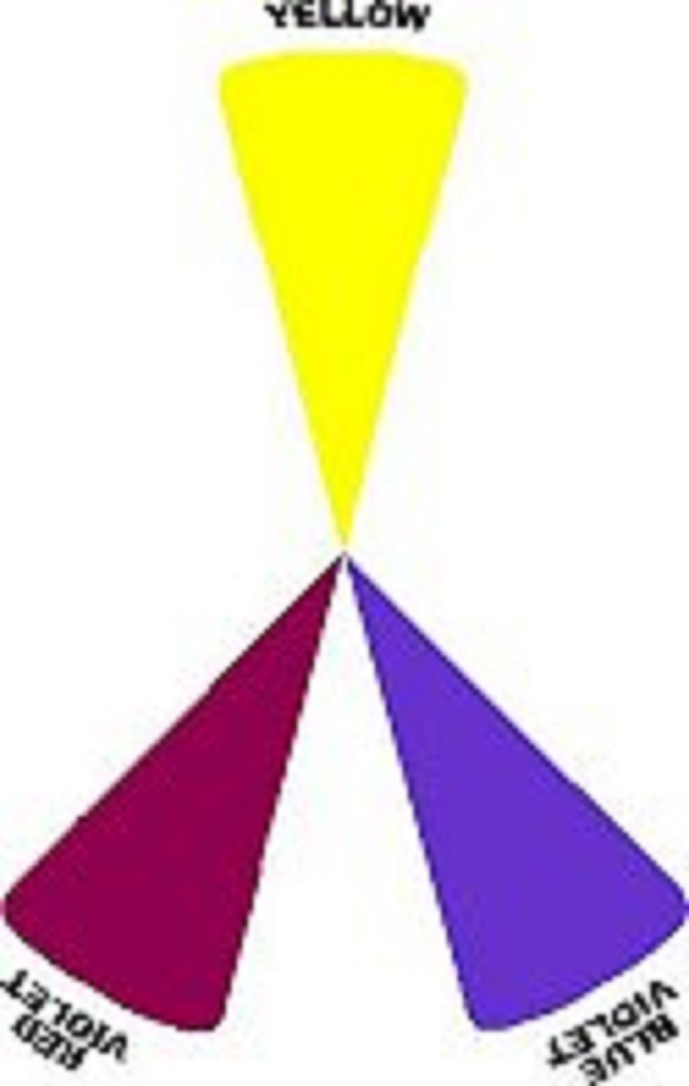 Indirect complementaries Split complementary groupings have a color and the two colors adjacent to that colors complement. Example: Yellow/Red Violet/Blue Violet.
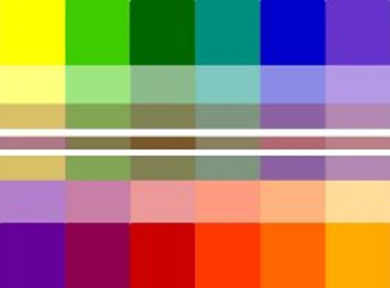
Analagous Colors
 Color Neighborhoods Groupings of 3 or 4 adjacent colors on the color wheel. Here are four groups of three analagous colors.
Color Key How light is that shadow?
Color Key is the overall brightness and chroma (color saturation) of a painting. High Key paintings are on the light end of the value scale. Low Key paintings are towards the darker end of the value scale. High and Low Key Paintings can have varying levels of color saturation. 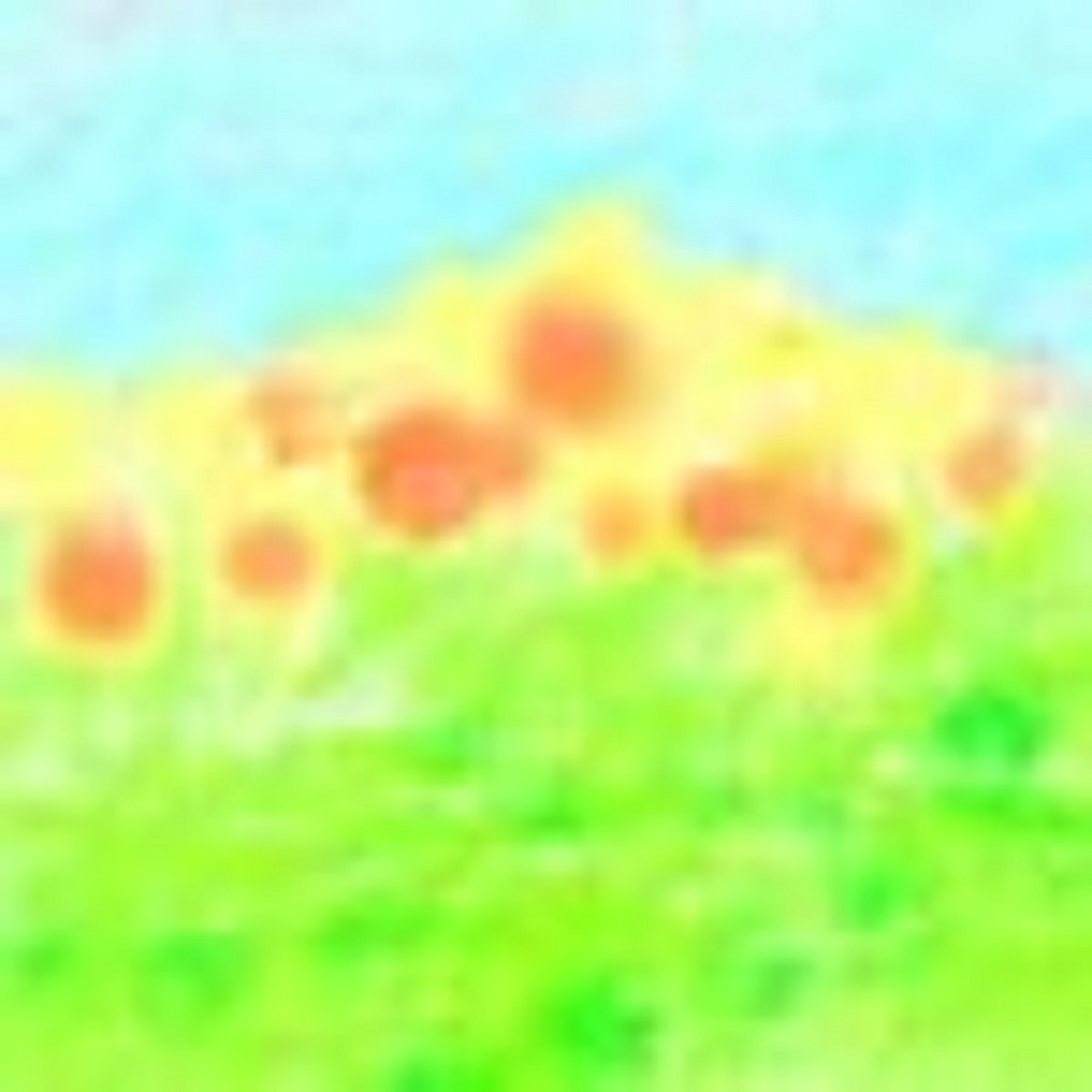 High Key
High Color Saturation 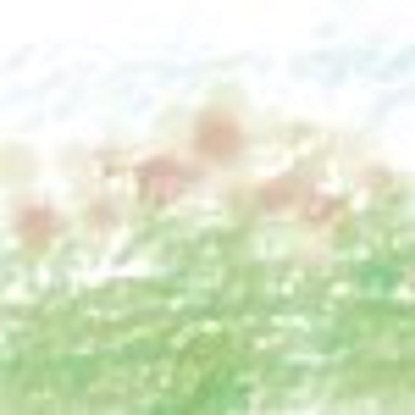 High Key
Low Color Saturation 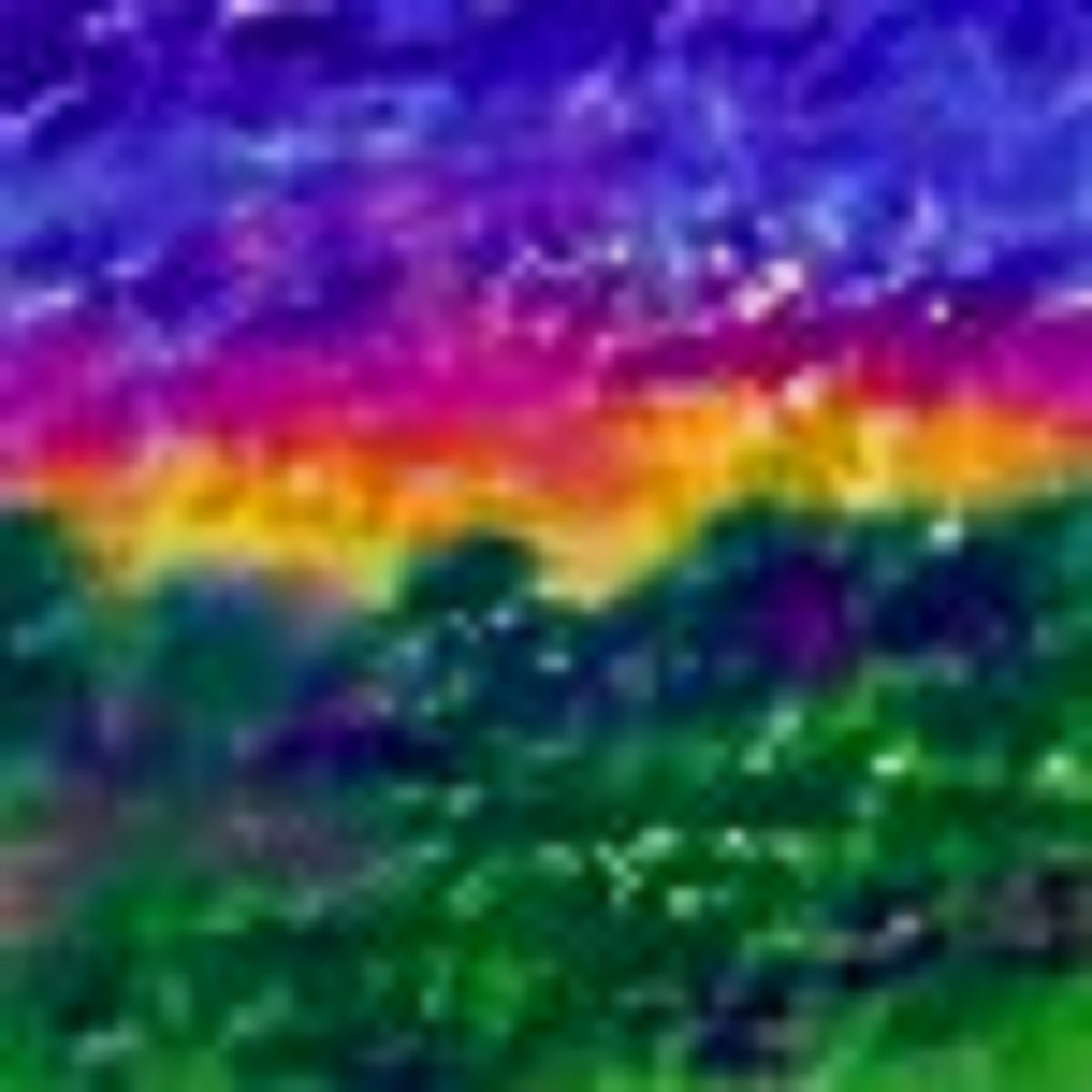 Low Key
High Color Saturation
 Low Key
Low Color Saturation
Color and emotional temperature
Primary Colors - Red, Yellow, Blue Red is the color of blood and living things, it is warm. Yellow is the color of the sun and warm gold flowers. Blue is the color of coolness and water and distant skies. Secondary Colors - Orange, Green, Violet Orange is the color of citrus on warm trees and the last warm rays touching the edges of a distant canyon. Green can be vital and growing or distant and alien. Violet can be rich with a neutral demanding presence or find itself in flashes of organic mischief. Tertiary Colors - Yellow-orange, Red-orange, Red-violet, Blue-violet, Blue-green, Yellow-green Yellow-orange is a flash of flesh and life. Red-Orange is a shouting invitation to celebrate it's presence. Red-violet is the shadows of sandstone canyons at dusk not yet cool. Blue-violet is a mystery with deepening shadows holding the night's chill. Blue-green is a cooling insistence that promises comfort in another place.
Our emotional response to color
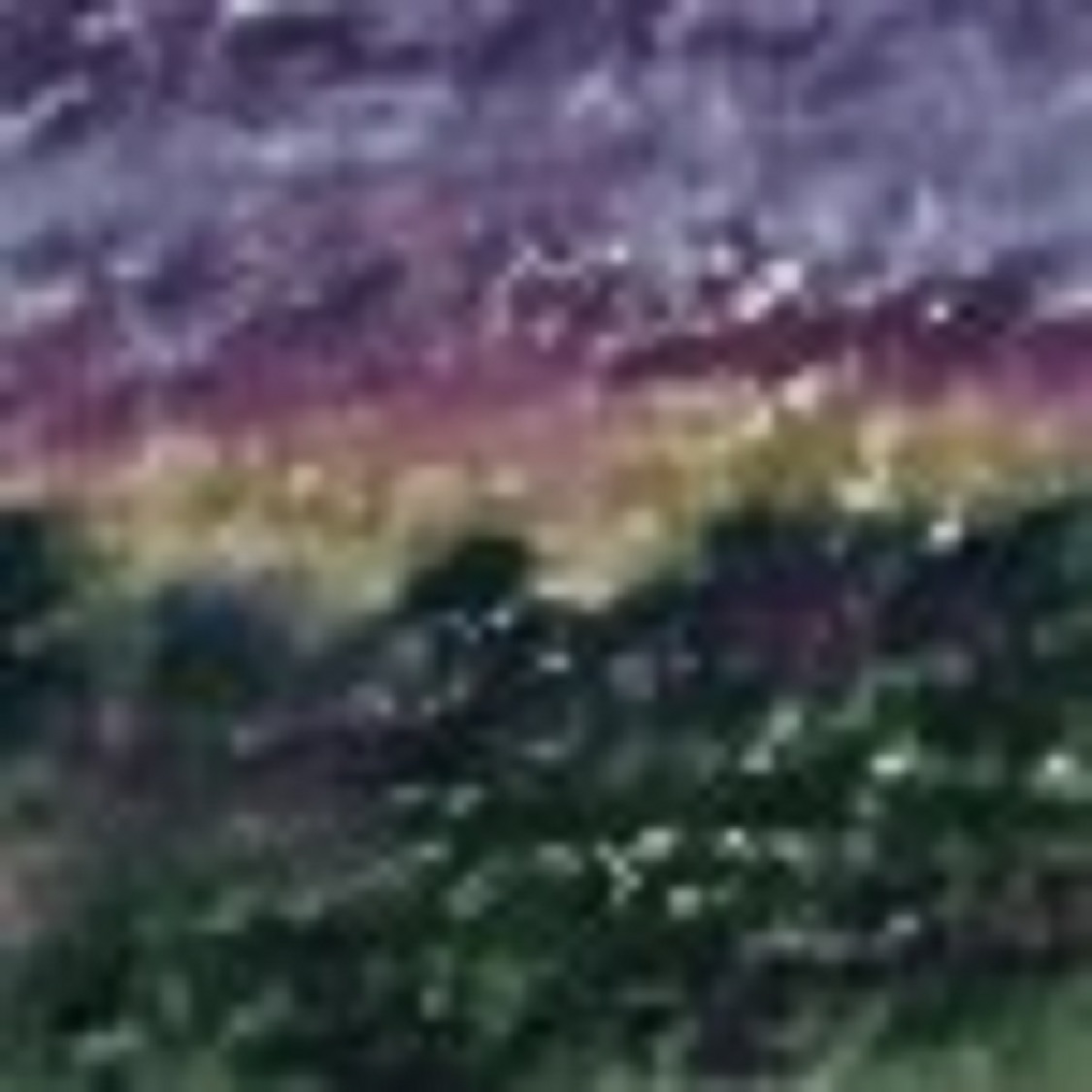
All the impressions I free-associated above, when taken as a whole, will give you a vague idea of a basic color theory concerning our emotional response to colors and how those responses actually relate to the visual reality we find ourselves in. As well as inferring some hard-wired primal response to color that we'll never likely get a handle on. 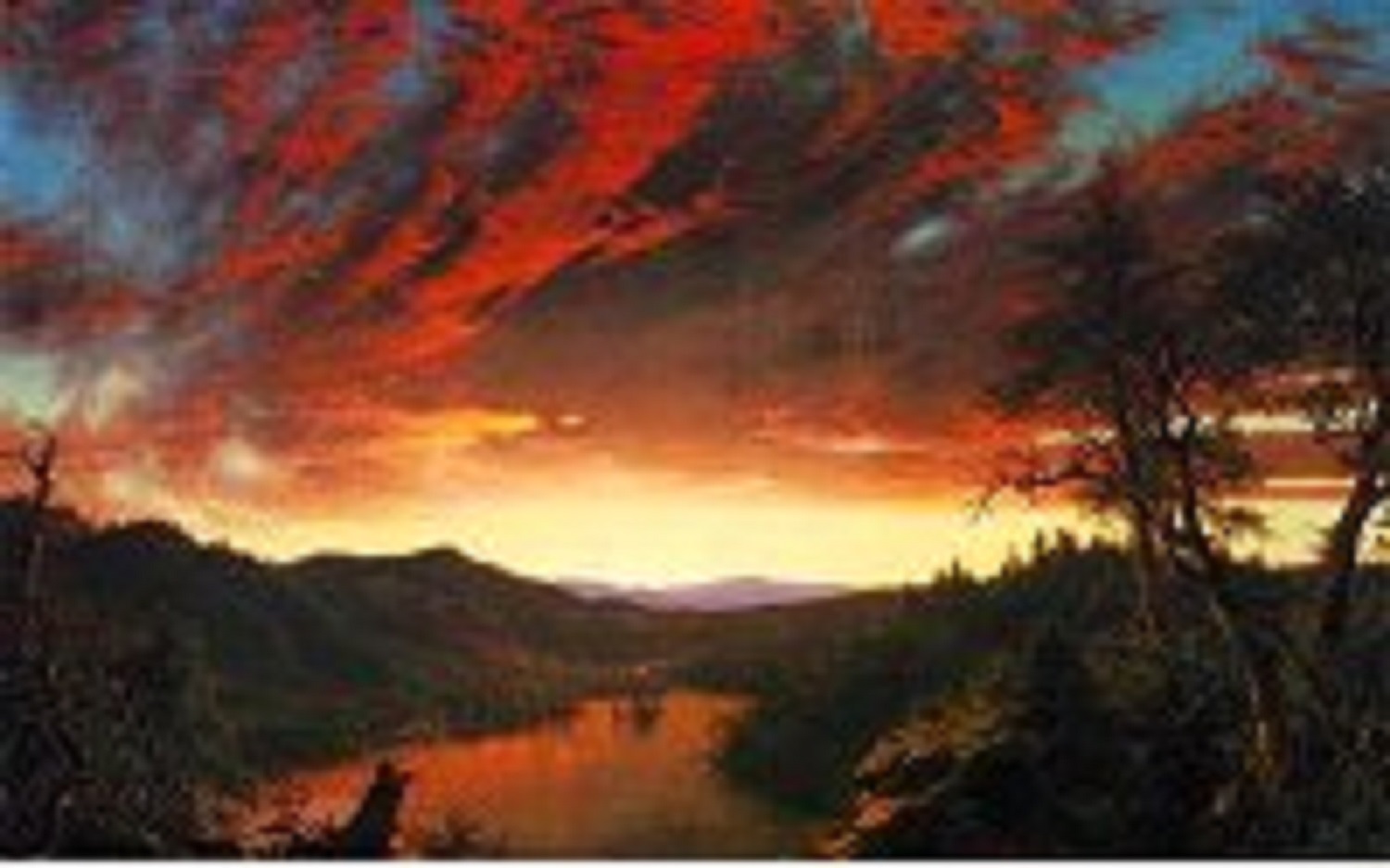 Frederick Edwin Church. "Twilight in the Wilderness", 40"x64",1860, oil, The Cleveland Museum of Art. From: Frederick Edwin Church & the National Landscape. "Color is strong stuff. It can take your breath away. The cliché of a blazing red streaked sunset is a cliché for a reason, we all share the same gut response to viewing one first hand. It's one of those moments of magic we try to rebirth to the real through our thoughts and actions as artists. We want to call notice to this experience through our creations...well don't you?" Exercise your whole brain: Make a list of colors like I did above. Write down your emotional response to the color as if it were merely a couple of attributes in a visual personality you are viewing. As in, "When you see Red, what immediately comes to mind. Then, using terms that will describe where in reality those colors are found, describe the tactile sense of temperature that color brings to you. It usually relates to time of day or season and how far away the color appears visually.
"If you were cold and, all things being equal, you had the choice of a Red or a Blue blanket, which one can you see yourself warm in?"
If you really look around you in nature and everyday life, what you see should validate any impression you may have written. If not, it may be time to adjust your poison of choice.