Design
Principles and Elements: an aesthetic tapestry
Look around you. Everything you see that is made by man is made by design. Our buildings, our transportation, our entertainment, the items we consume; everything is designed for a purpose. Some design is utilitarian, some is ergonomic, some informative, and a whole lot of design is aesthetic. Products are designed to please the eye and produce a reaction based on the "feel" the product evokes from the viewer/user. Artists do this every time a pencil is sharpened or a color is mixed. We are the designers. When you look through the catalog of new art books each year, you will find artists rediscovering, personalizing, and stressing different Principles and Elements of Design to achieve something fresh and new. Some drop and add design concepts just to stand out from the pack, some do it for a bit more marketability in tight times. I've read through many books through the years trying to understand and summarize the Principles and Elements of Design in a simple and direct way. What follows is my current distillation and take on what artists of all ilks should know. I'll give you some snappy icons and catch phrases to help you learn these concepts. (note: everything is subject to change if I get any arguments)
Ya gotta have principles
The Principles of Design deal with the more holistic and universal aspects of creating a composition, be it a drawing or a painting. Does your art hold together in a unified manner? Does your art show an understanding of balance and harmony or explore visual themes using gradation to establish dominant passages of repetition? There are eight (8) Principles of Design. Finished pieces of art can be analyzed in a somewhat intelligent manner by using the words and concepts provided by the Principles and Elements of Design. A few of the principles are concepts wrapped in or influenced by other concepts. All of the Principles of Design are evoked through the Elements of Design.
Elementary art
The Elements of Design describe the physical elements of art, where the so-called "rubber meets the road" for an artist. All the Principles of Design are in play when you are using the Elements of Design to make art. They interact directly when you pick and choose your way through your personal design process. There are eight (8) Elements of Design of concern to the visual artist. You know them already. I'll help you remember what they are. Some deal with grayscale art. Some deal with color art. Some are shared.
Meta Concepts
In the "stray concepts every artist should know" category you'll find miscellaneous essential interlocking (or "Meta") artistic concepts, some very obvious, and you'll learn some foreign language. There are four (4) Meta Principles of Design.
Special Thanks
A special thanks to the work of Tony Couch for inspiring much of my design thoughts here. Another thank you for the work of Tony van Hasselt and Judi Wagner, inspiring me to revisit the simple symbology of the circle to convey the design concepts compiled and presented here.
Principles
The 8 Principles of Design
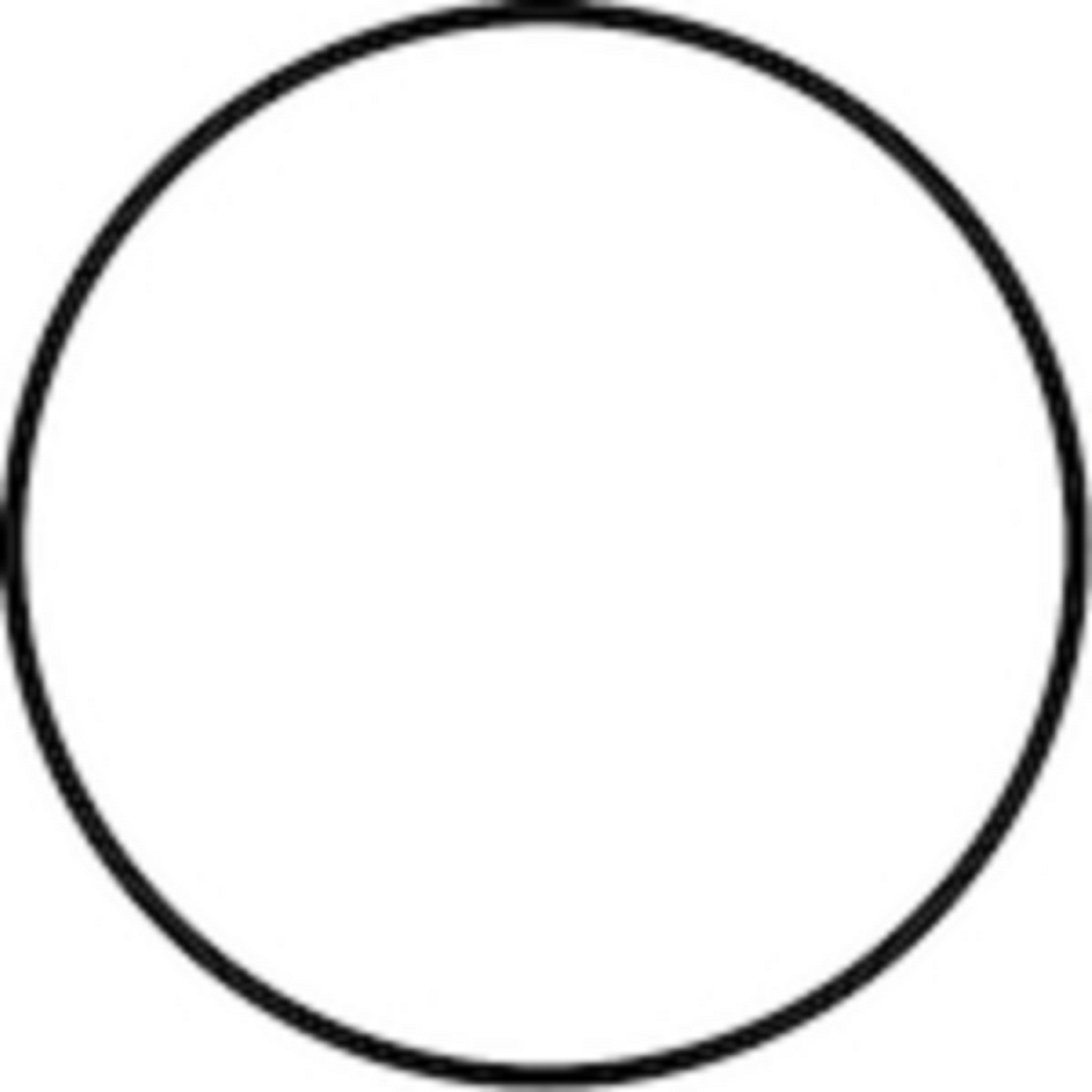 Unity Does it hold together? Elements should work together as a cohesive whole.
 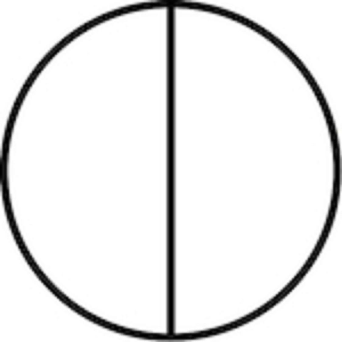 Balance Is it lopsided? An element's visual weight should weigh against other elements.
 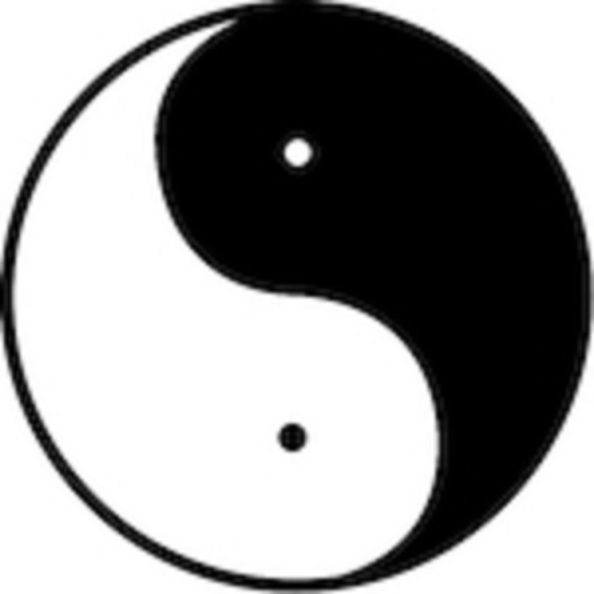 Harmony Does it sing? All elements should play well together.
  Contrast Does it stand out? Elements need contrast to be seen.
  Gradation Gradation reveals form. Light reveals gradation. Gradation implies depth.
  Dominance What sticks out? The prominent Elements or shapes.
  Alternation Do the same, only different. Mirrored or inverted elements create pattern and interest.
  Repetition Echos of elements add interest. Repeating similar elements adds interest.
Learning aids
- The three primary principles of design are the HUB; as in Harmony, Unity, and Balance.
- You can use clues such as the pest that likes to eat swiss chard, namely the CHARD BUG. Or Shakespeare enjoying a beverage, the BARD CHUG. Both are mnemonic for all the Principles of Design: contrast, harmony, alternation, repetition, dominance, balance, unity, and gradation.
Elements
The 8 Elements of Design 
Point Start Here The isolate mark. The dot. Strung together they merge into line.  Line A dragged point. Lines around shapes make contours. Expressive line is pretty.
 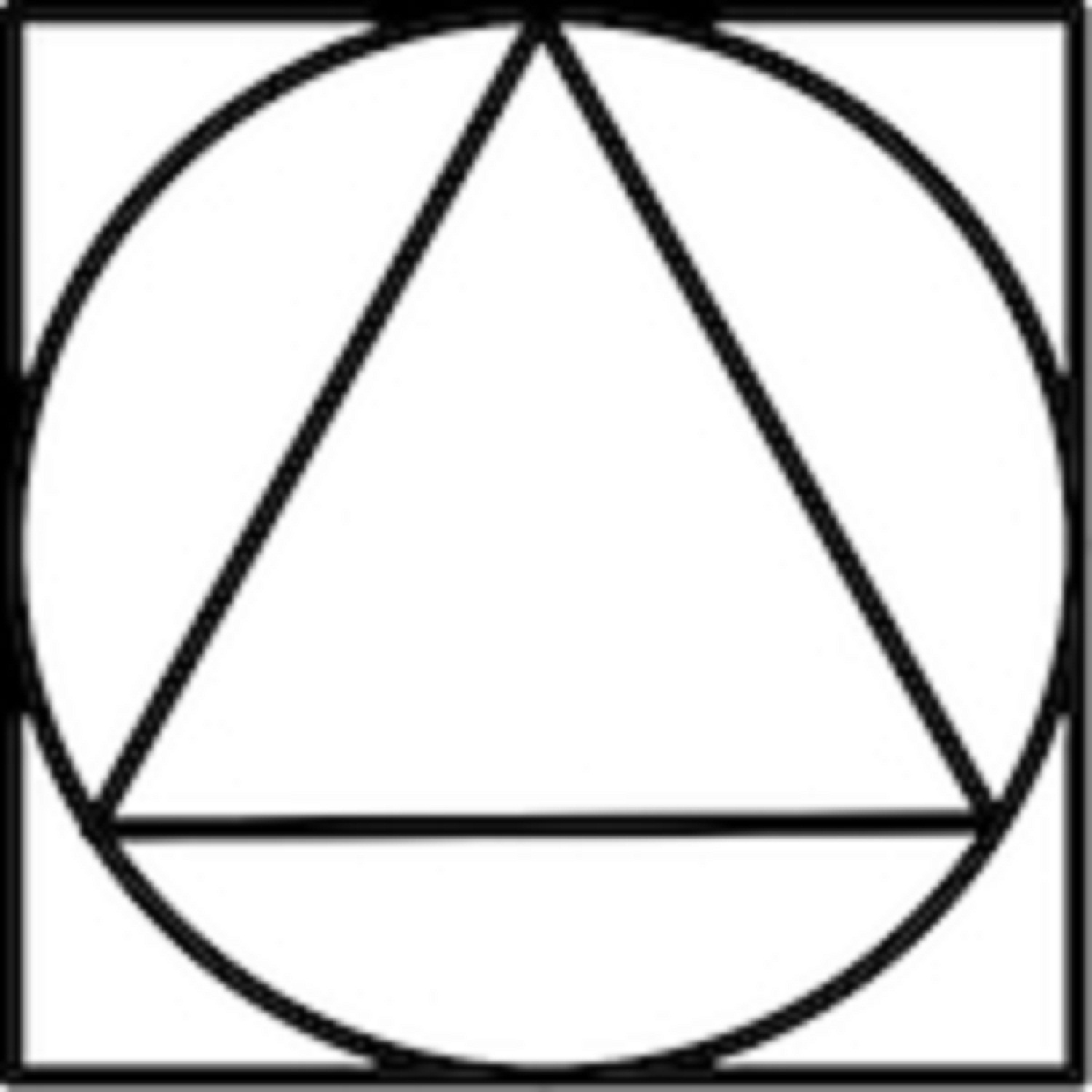 Shape What is it? Build shapes from geometry, contour, and gesture.
  Value Gray, a percentage of black There's 10 in the scale but 5 will usually do.
 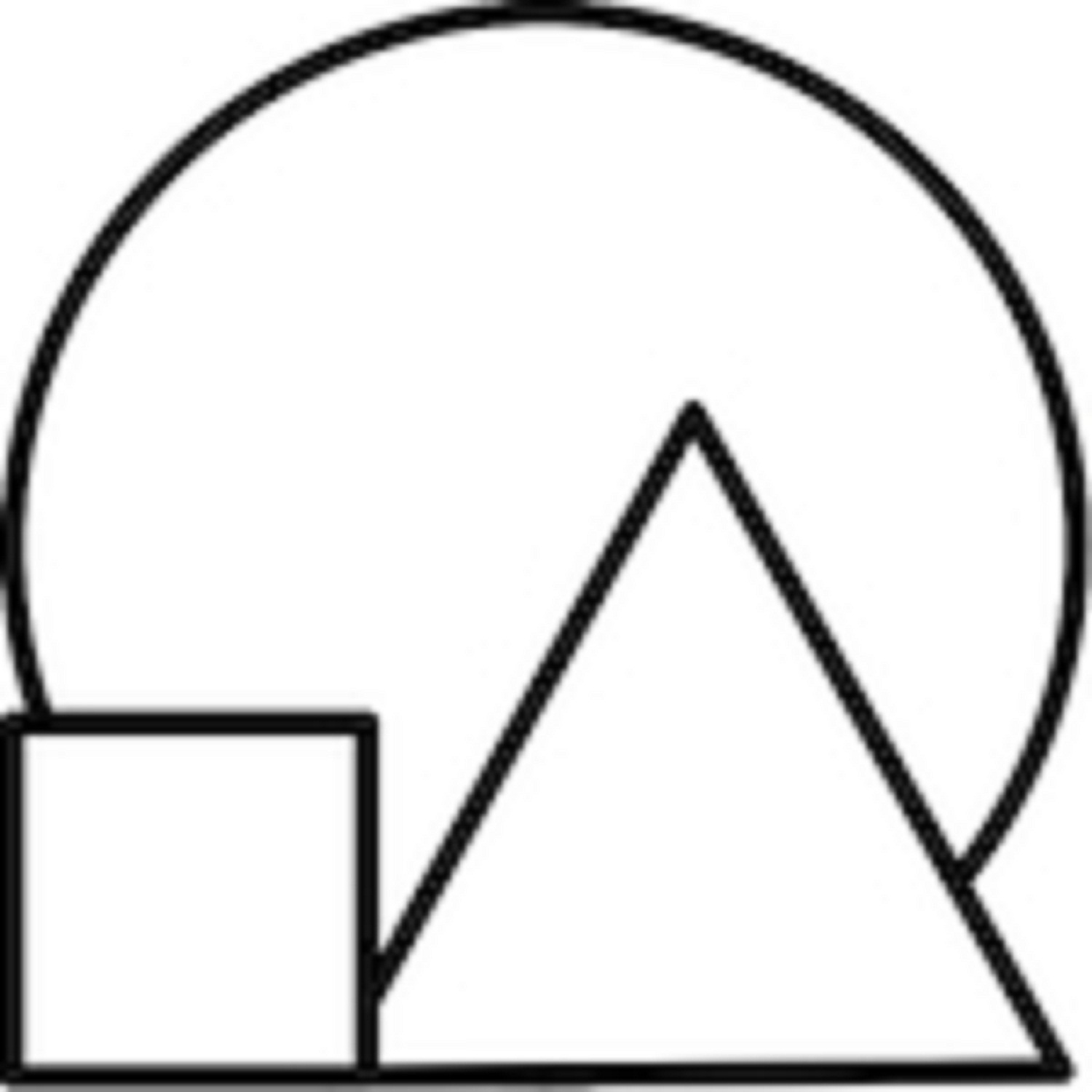 Size/Proportion How big is it? Make sure things fit together the way they actually look.
  Direction Rhythm and Flow. The flowing branches of movement in a design.
 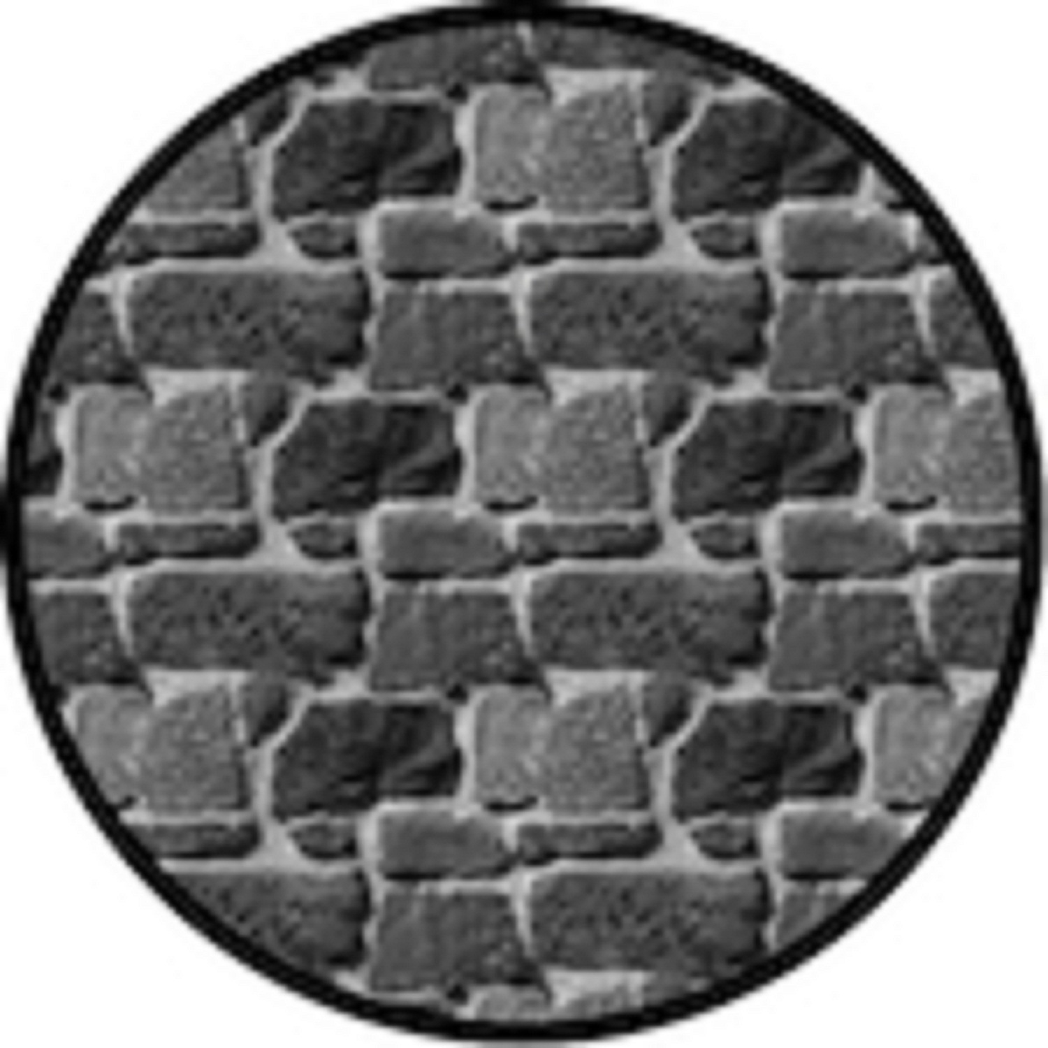 Texture Rough or Smooth? The surface bumps that show in the light.
 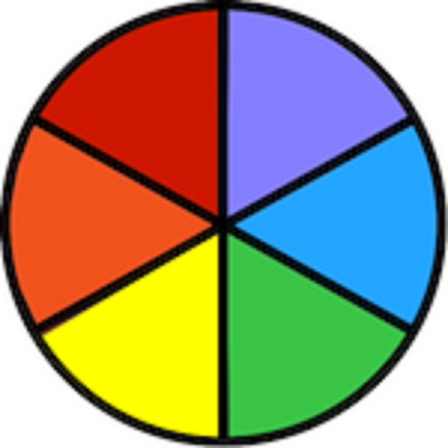 Color There are six basics. But ROY G. BIV adds indigo.
Learning aids
- To use Line and Value you must think shape, size and direction.
- Texture identifies specific objects. Texture enhances form.
- Color is a whole story unto itself: Visit the Color Section.
Meta Principles
The strays
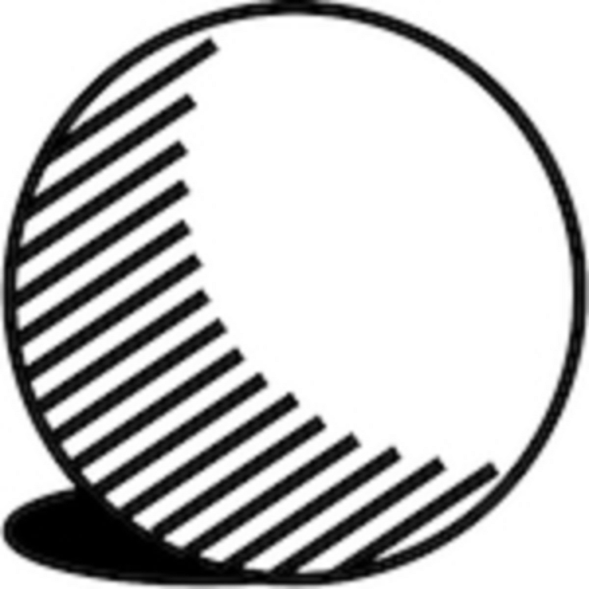 Form & Volume Masses in 3D Space Make shapes real looking by adding modeling (shading) and shadows.
 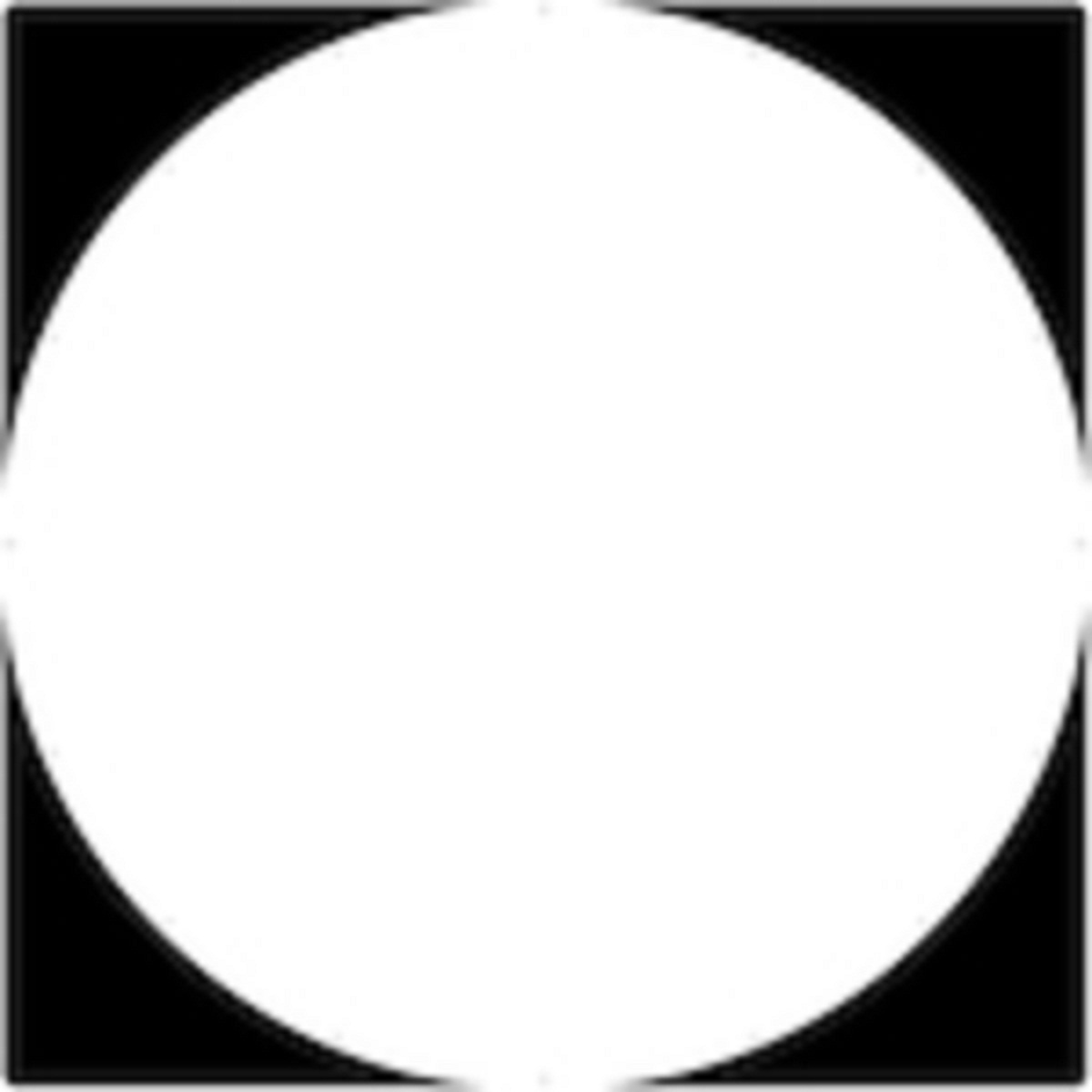 Negative Space Everywhere the object isn't The empty space between the shapes defines the shapes. (Gestalt, Notan)
That thing right there. The point your eyes are led to in a design.  Economy Your mental eraser You are allowed to leave things out if they don't help the design.


