Why Stained Glass Designs Are Ideal for Line Work Practice
Stained glass designs work especially well for watercolor practice because they reduce decisions and push your focus onto line control.
You trace clear shapes, repeat edges, and train your hand to move with intention instead of hesitation.
Stained glass–style practice helps you develop confident line work, smooth, continuous strokes, and clean color separation in watercolor painting.
You follow enclosed shapes, practice steady pressure, and learn how to guide the brush without stopping.
You start with simple outlines, repeat them until your lines feel even, and gradually increase complexity.
Bright, contrasting areas force careful edge control and reveal where lines wobble or break. Stained glass designs give you clear, intentional paths for your brush. The lines act as boundaries, so you can focus on control instead of inventing shapes as you paint.
You practice steady pressure by tracing each segment in one slow pass.
Try painting a full outline without lifting your brush, then repeat it with a lighter touch to compare results. These designs naturally separate line work from color work.
Paint only the lines first, let them dry, then add color later to see how clean edges change the final look.
The bold structure also makes mistakes easy to spot. When a line wobbles or thickens, you see it immediately and can adjust on the next section.
Stained glass patterns help you practice:
- Consistent line width across long curves
- Smooth starts and stops at intersections
- Clean joins where multiple lines meet
- Intentional variation between thick and thin lines
Because the designs repeat similar shapes, you build muscle memory quickly. Each section reinforces the same motion, which strengthens your control with every pass.
Setting Up Your Practice Session
Set a clear goal before you paint.
Choose one watercolor technique, such as controlled washes, and keep your focus there for the session.
Prepare your space so nothing interrupts your flow.
Tape down your watercolor paper and keep a scrap sheet nearby for testing strokes.
A calm setup makes it easier to notice how water and pigment behave.
Warm up your hand for five to ten minutes if needed by doing stretches and self massage.
Use a round brush to paint light-to-dark value scales, then switch to a fine brush for straight edges and even washes.
Use simple exercises that repeat on one sheet.
Paint rows of strokes, edges, or blends rather than isolated sketches.
Repetition matters more than variety during practice. Pause briefly between exercises. Look at where water pooled, where edges bloomed, and how the paper reacted.
Basic Line Exercises
These exercises build control over water flow, pressure, and timing.
You practice consistency first, then add variation to train your hand to respond predictably.
Straight lines train steadiness and brush pressure, which sit at the core of basic watercolor exercises.
Paint parallel lines across the page at a slow, even pace, keeping the spacing consistent.
Let the stroke end naturally without lifting early.
Vary one factor at a time to see cause and effect.
Change pressure while keeping speed steady, then reverse it.
This approach sharpens control faster than random practice.
These beginner watercolor exercises also reveal timing issues.
If lines bloom or fade, adjust water before the next stroke.
Practicing Curves

Curves add movement and coordination, which makes them essential watercolor exercises.
Paint long, slow arcs from the shoulder instead of the wrist.
Keep your eye ahead of the brush tip to guide the curve.
Practice repeating the same curve shape in rows.
Aim for consistent height and width, not perfection.
This repetition builds muscle memory without tension.
Add complexity once control improves.
Alternate wide curves with tight ones, then connect curves into S-shapes using a single stroke.
Maintain even pressure unless the exercise calls for change.
These beginner watercolor exercises improve rhythm and prepare you for lettering, stems, and flowing outlines.
Repeat these often. Consistency builds confidence and smoother lines over time.
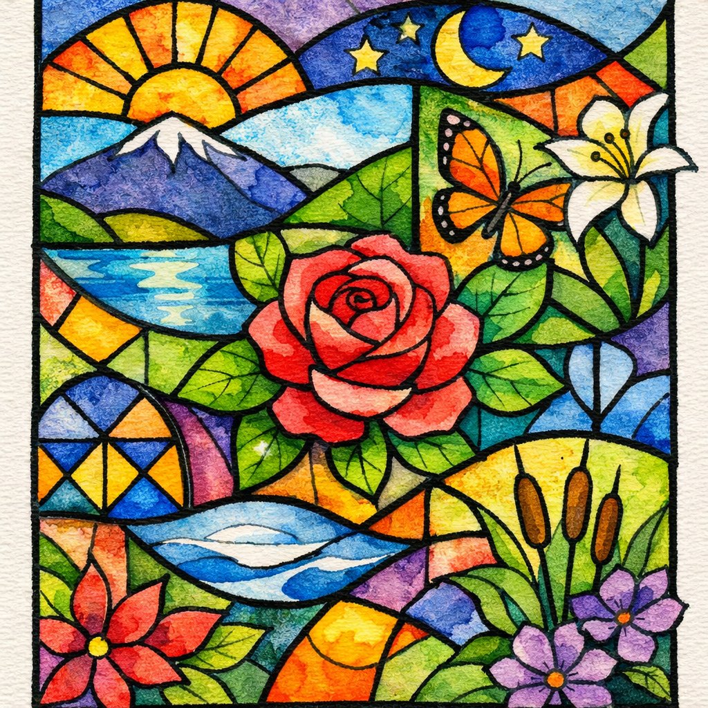
Common Design Ideas for Stained Glass Designs
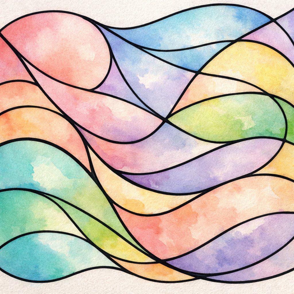
Geometric patterns work well for watercolor practice because they simplify decisions.
You divide the page into triangles, rectangles, or irregular shapes, then focus on clean edges and controlled color changes.
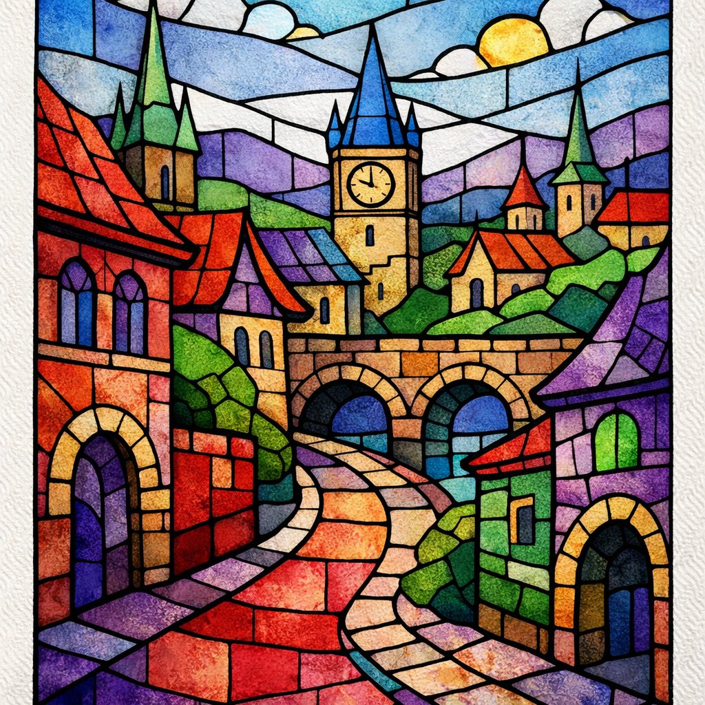
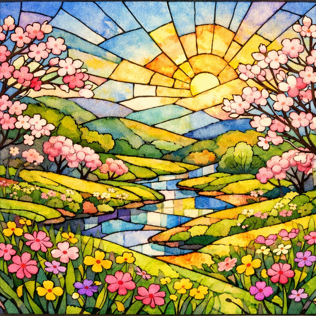
Nature-based designs offer a balance between structure and looseness.
Leaves, flowers, birds, and simple landscapes give you clear outlines while leaving room for color variation.
You can exaggerate shapes and let colors bleed slightly to keep the stained glass look.
Bold outlines define stained glass designs and train brush control.
You create a pencil outline, then then fill each section with color and follow with thick black lines once completely dry.
Limited color palettes keep the exercise focused.
Choose two or three colors and mix variations within each shape.
This strengthens color harmony and helps you see how values shift when colors sit side by side.
When choosing colors, use the color wheel as a guide.
Try using opposite (complementary) colors in adjacent shapes for vibrant contrast, or select analogous colors for a harmonious look.
Apply color in one or two thick layers to achieve the luminous effect of stained glass.
Common layout ideas you can rotate through:
- Radial designs that spread from a center point
- Mosaic-style layouts with uneven, organic shapes
- Window panel formats divided into vertical or horizontal sections
For quick studies, repeat the same design several times on one page.
Change only the color choices or value range.
Using Bright, Contrasting Colors
Bright color works best when you control contrast on purpose. Pair saturated hues with quieter areas so the eye knows where to rest.
In watercolor washes, contrast often comes from value and color temperature, not just intensity.
Start with a flat wash or graded wash in a single color. When dry, you can add a second layer in a contrasting color to create a stained glass effect.
Use the color wheel to choose complementary colors—colors that are opposite each other on the wheel, like blue and orange or red and green. Placing these side by side creates vibrant contrast.
For stained glass effects, use one or two thick layers of color. Let each layer dry before adding the next to keep the colors bright and clear.
Add texture last. You can use dry brushing or controlled wet-on-dry marks to break up smooth areas.
Building Your Practice from Easy to More Difficult
Start with simple control exercises that train your hand and eye without pressure.
Paint straight lines, curved strokes, and small squares using a single color.
Change brush pressure as you go to see how the mark responds.
Move next to water management drills.
Practice wet-on-dry washes, then try wet-on-wet and watch how pigment spreads.
Keep the shapes basic so you can focus on timing and moisture.
Once that feels steady, work on value scales and gradients.
Paint one color from light to dark in a single strip.
Then try smooth transitions between two colors.
These exercises help you build confidence with layering and avoid muddy mixes.
Add simple subjects that repeat the same motion.
Leaves, petals, clouds, and stones work well because they rely on consistent brushstrokes.
Limit yourself to a few shapes and repeat them across the page.
Increase difficulty by combining techniques in one short study.
For example, use a wet-on-wet background with wet-on-dry details on top.
If you keep the painting small, you can finish it in one session.