Do you want to paint convincing snow in watercolor? Practice using subtle color, clear value contrast, clean water, and controlled edges instead of pure white paint.
Snow is never just white. It reflects the sky, absorbs color from its surroundings, and shifts constantly with light and shadow.
When snow looks dull or chalky in watercolor, it’s usually because those subtle changes are missing. By focusing on light, temperature, and transparency, you can paint snow that feels cold, luminous, and alive.
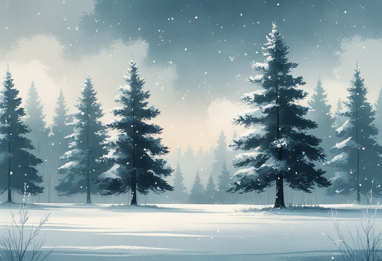
When you balance soft and hard edges, let the paper glow, and choose the right blues and grays, snow gains depth without losing freshness.
This guide breaks down how to approach snowy scenes with confidence. You learn how to build layers, manage texture, and avoid common mistakes that drain life from winter landscapes.
- Snow relies on color reflection and value, not white paint.
- Clean water and edge control keep snow bright and believable.
- Layering and texture create depth without overworking the scene.
Understanding Snow in Watercolor
Snow challenges you to observe value, color shifts, and subtle surface changes instead of relying on white paint. When you paint snow in watercolor, you rely on light, reflected color, and controlled edges to describe form in winter watercolor painting.
Why Snow Isn’t Pure White
Snow rarely reads as pure white in real life, and watercolor snow looks flat when you treat it that way. You leave areas of paper unpainted for highlights, but you still shape snow with light washes and shadows.
Shadows in snow usually lean blue, blue‑gray, or violet, not black or neutral gray. These colors keep painting winter scenes fresh and believable. Even a small color shift helps separate snow planes without heavy contrast.
Use white space as a value, not a color. Let surrounding tones define the snow instead of filling it in. This approach keeps winter watercolor clean and luminous.
How Light and Color Affect Snow
Light direction controls how snow reads in winter watercolor painting. Low winter sun creates long, cool shadows with clear edges, while overcast light softens transitions and reduces contrast.
Pay attention to value before color. Snow often holds the lightest value in the painting, which means the sky or background needs to sit slightly darker.
Common lighting effects on watercolor snow:
| Lighting condition | Typical snow color shifts |
|---|---|
| Bright sun | Cool blues, soft violets |
| Cloudy skies | Neutral grays, muted blues |
| Sunrise or sunset | Pale pinks, warm purples |
You mix these colors lightly and apply them with restraint. Overworking destroys the sense of cold light.
Role of Reflections in Winter Landscapes
Snow acts like a mirror in winter watercolor, especially on flat or icy surfaces. It reflects sky color, nearby trees, buildings, and even clothing from figures in the scene.
You should echo nearby colors inside the snow, but always at a lower intensity. A blue sky creates cooler snow, while warm buildings add faint beige or ochre notes.
Reflections also help you connect elements across the painting. Repeating colors between snow, sky, and objects creates harmony and depth in painting snow. This color relationship matters more than detail in watercolor snow scenes.
Reminder: Your materials make a difference
Snow depends on restraint, control, and timing. Paper, brushes, and color choices decide whether snow looks clean and light or muddy and overworked.
Remember how Important is Good Watercolor Paper
You already know this, but it matters more with snow than almost any other subject. 100% cotton paper handles water slowly and evenly, which gives you time to shape soft edges and smooth gradients.
Cold-pressed cotton paper works best for snow scenes. The texture helps break up washes and adds natural variation without extra effort.
Snow often relies on using the white of the paper instead of painting white. Cheap paper absorbs paint too fast and stains easily, which makes lifting and preserving highlights frustrating.
Why cotton paper helps with snow
| Feature | Why it matters |
|---|---|
| Slow absorption | Smoother skies and shadows |
| Strong surface | Lifting can help without damage |
| Clean whites | Brighter snow with less paint |
Best Brushes and Tools for Painting Snow
You do not need many brushes, but you need the right ones. A soft round brush with a good point handles washes, edges, and small shadows in snow.
Use a medium round (size 6–10) for skies and ground planes. Add a smaller round for details like branches or snow edges.
Keep a few simple tools nearby. A paper towel, tissue, or cotton swab lets you lift paint while it is still damp. Lifting can help shape snowbanks, falling snow, or light hitting a surface.
Useful tools for snow effects
- Soft round brushes (synthetic or sable)
- Old toothbrush for splatter
- Paper towel or tissue for lifting
Choose the Right Colors
Snow is rarely pure white. You suggest it with good quality paints and careful color choices, not heavy layers.
Cool blues, blue-grays, and soft violets work well for shadows. Ultramarine, cerulean, indigo, and neutral tint cover most needs when diluted properly.
Avoid overmixing. Clean color mixes keep snow fresh and readable. Let the paper show through instead of adding white paint everywhere.
Color tips for snow
- Use diluted color, not opaque mixes
- Keep shadows cooler than the surrounding light
- Save gouache for small accents, not the base layer
Fundamental Techniques for Snow Effects
Snow in watercolor depends on planning, restraint, and timing. You create convincing winter watercolor scenes by protecting light areas early and choosing methods that match the scale and softness of the snow you want to show.
Preserving the White of the Paper
The most reliable way to paint snow is to leave it unpainted. You use the white of the paper as your brightest value, which keeps snow looking clean and luminous.
Plan snow shapes before you apply any wash. Sketch lightly and decide where snowbanks, highlights, or distant snowfall will sit.
Use these approaches to protect white areas:
- Paint around snow shapes during wet-on-wet washes.
- Use softer edges for distant snow and sharper edges for foreground areas.
- Keep shadows light and cool so the paper white stays dominant.
In winter watercolor, less paint often creates more believable snow. Overworking these areas quickly dulls the effect and reduces contrast.
Using Masking Fluid or Wax Resist
Masking fluid and wax resist help you preserve white areas when painting complex snow scenes. You apply them before adding color, then remove or paint over them later.
Masking fluid creates crisp, clean snowflakes or highlights. Apply it with an old brush or toothbrush, let it dry fully, then paint freely over it. Remove it only after the paper dries to avoid tearing.
Wax resist uses a white crayon or wax-based pencil. Draw dots or lines on dry paper, then apply a wash. The wax repels paint and leaves irregular snow textures.
| Method | Best Use | Key Caution |
|---|---|---|
| Masking Fluid | Sharp snow, falling flakes | Can damage paper if rushed |
| Wax Resist | Soft, textured snow | Hard to adjust once applied |
Both tools work best when used sparingly and with clear intent.
Practicing Color and Value in Snowy Scenes
Painting snow depends on control, not guesswork. You manage color temperature, value shifts, and contrast so the snow reads as bright without turning flat or dull.
Color Mixing for Realistic Snow
You rarely paint snow with pure white paper alone. You mix very light color into your washes so the surface feels natural and responsive to light.
Start with ultramarine blue + a touch of raw sienna for neutral snow shadows. Adjust the mix until it leans cool but not gray. For reflected color near trees or ground cover, add a small amount of sap green and dilute heavily.
Drill: Snow Tint Swatches
- Paint five light washes using the same mix.
- Change only the water ratio.
- Label which reads as snow in light, shade, and overcast conditions.
Keep your water clean. Even slight contamination can dull the lightest passages and weaken the illusion of snow.
Creating Depth With Shadows
Depth in painting a snowy landscape comes from value contrast, not detail. Snow often holds the lightest value, while the sky and shadows sit darker.
Paint large shadow shapes early using wet-on-wet to keep edges soft. Use cooler mixes for shadows that recede and slightly darker values near the foreground. Let some shadows overlap to avoid a cutout look.
Drill: One-Value Shadow Study
- Paint a simple snowfield using one shadow color.
- Vary depth only by changing value, not hue.
- Leave the paper white for highlights.
Hard edges belong close to objects like fence posts or trees. Softer edges suit open ground and distant forms.
Balancing Warm and Cool Tones
Snow looks convincing when warm and cool tones stay in balance. Too much blue feels icy and artificial. Too much warmth flattens the scene.
Use raw sienna sparingly in sunlit areas, especially where light hits slopes or paths. Shift back to cooler blues and blue-violets as the surface turns away from light. Near vegetation, tint snow with diluted sap green to suggest reflected color.
Drill: Temperature Strips
- Paint three horizontal snow bands.
- Make one cool-dominant, one warm-dominant, and one balanced.
- Compare which feels most natural.
When painting snow, temperature changes often matter more than color intensity.
Painting a Snowy Landscape Layer by Layer
Painting a snowy landscape works best when you build the image in clear stages. You plan the composition first, establish light and atmosphere in the background, and then add form, texture, and contrast with careful layering.
Composing the Scene
Start by deciding where the light comes from, because snow reflects it strongly. You should leave more white paper in areas facing the light and plan shadows early so the scene feels grounded.
Keep your pencil sketch simple. Focus on large shapes like hills, tree lines, or a distant structure rather than small details.
Use overlapping forms to create depth in snowy landscapes. Place lighter, softer shapes in the distance and reserve stronger lines for the foreground.
Composition tips that matter most:
- Vary hill heights to avoid flat horizons
- Angle tree lines slightly to guide the eye
- Leave unpainted paper for the brightest snow
A strong composition makes the later layers easier and more controlled.
Painting Skies and Backgrounds
Paint the sky first so it sets the overall mood. Use wet-on-wet washes with cool blues or blue-greys, keeping the value lighter near the horizon.
Work quickly and avoid over-brushing. Soft transitions feel more natural in winter scenes.
Let the sky dry fully before adding land. This prevents color bleed and keeps edges clean.
For distant snowy ground, mix a light grey with a touch of blue. Apply it in broad, horizontal strokes and leave gaps of white paper.
| Area | Color Choice | Technique |
|---|---|---|
| Sky | Cerulean or diluted ultramarine | Wet-on-wet wash |
| Distant snow | Light grey-blue | Soft, layered strokes |
These early layers define space without adding visual noise.
Adding Details and Highlights
Once the base layers dry, add midground and foreground elements. Use darker blue-grey mixes for trees, fences, or shadowed snowbanks.
Vary pressure and paint consistency to suggest texture. Thicker paint works well for foreground details, while diluted paint keeps distant elements soft.
Define shadows carefully. Snow shadows often curve and follow the terrain rather than forming straight lines.
Add highlights last. Use white gouache or preserved paper to emphasize sunlit ridges, falling snow, or frosted branches.
Key detail priorities:
- Strongest contrast in the foreground
- Softer edges in the distance
- Highlights applied sparingly
This approach keeps your painting a snowy landscape clear, balanced, and believable.
Creating Winter Atmosphere and Texture
You create convincing winter watercolor painting by controlling edges, moisture, and contrast. Realistic snow effects depend less on white paint and more on how you manipulate the paper, brush, and timing.
Dry Brush and Lifting Techniques
Dry brush gives you crisp, broken marks that suggest frost, wind-scoured snow, and rough ground. You load the brush lightly, remove excess water, and drag it across textured paper. The paper’s tooth does the work, leaving natural gaps that read as sparkle and grain.
Use dry brush for foreground snow, fence posts, or icy branches. Keep strokes directional to support the landscape’s structure.
Lifting creates soft highlights and atmospheric depth. You lift while the wash stays damp, using a clean brush, sponge, or paper towel. This works well for shaping snowbanks or pulling light back into shaded snow.
Best uses at a glance:
- Dry brush: texture, sharp edges, surface detail
- Lifting: soft light, distance, subtle form
Techniques for Adding Falling and Settled Snow
Falling snow needs variation in size, spacing, and softness. Splatter paint from a toothbrush or stiff brush, but control it. Mask areas you want clean, and vary paint thickness so flakes don’t look uniform.
Settled snow relies on layering and contrast. You build it by painting shadows first, then preserving or lifting lighter areas. Cool blues and violets create depth without turning snow gray.
Salt can add irregular crystalline texture when dropped into damp washes. Use it sparingly and only in background or midground areas.
For final accents, add restrained touches of white gouache to define snow resting on branches or roof edges.
Common Challenges and How to Avoid Them
Snow looks simple, but watercolor exposes every weak decision. You control clean color and believable edges to make winter watercolor scenes read as snow instead of washed-out paper.
Preventing Muddy Colors
Muddy color usually comes from overmixing or working the surface too long. You avoid this by limiting your palette to two or three cool hues, such as ultramarine, cerulean, and a neutral gray.
Paint snow using diluted color, not white paint, and let the paper do the work. When you mix on the page, place strokes once and leave them alone. Reworking damp areas pushes pigments together and kills clarity.
Use this quick checklist while painting snow:
- Rinse your brush fully between colors
- Let each wash dry before glazing
- Avoid mixing more than two pigments at once
Non‑staining colors lift more easily, which helps correct mistakes without damaging the paper. That matters in winter watercolor, where subtle shifts define form.
Managing Hard and Soft Edges
Edges define structure in painting snow. Soft edges suggest drifting snow or distant forms, while hard edges describe shadows, tree lines, and compacted ground.
Create soft edges by painting wet‑into‑wet and stopping before the surface loses its sheen. For hard edges, wait until the paper dries fully, then place confident strokes with minimal water.
Pay attention to where you place each edge. Snow rarely has sharp edges everywhere, so vary them on purpose.
| Edge Type | Best Use |
|---|---|
| Soft | Falling snow, distant hills |
| Hard | Footprints, branches, cast shadows |
If edges bloom unexpectedly, you added water at the wrong time. Blot your brush first, then control moisture before touching the paper again.
Takeaways
You get better snow by treating it as a surface that reflects light, not a blank white shape. Subtle blues, grays, and violets give snowy landscapes depth and keep the paper alive.
Value control matters more than detail. When you paint the sky slightly darker than the snow, you let the snow read as light without forcing highlights.
Clean water protects your brightest areas. Fresh rinses prevent muddy washes and help your winter watercolor painting stay crisp.
Texture tells the story. Broken edges, lifted paint, and dry brush marks suggest wind, footprints, and uneven ground without overworking the scene.
Edges guide the eye. Soft transitions fit rolling drifts, while hard edges anchor shadows from trees or buildings.
Keep these habits in mind while you paint:
- Observe color shifts before mixing.
- Reserve whites instead of adding them later.
- Change brush pressure to vary texture.
Quick reference for snowy landscapes:
| Element | What You Do | Why It Works |
|---|---|---|
| Snow color | Add cool tints in layers | Avoids flat whites |
| Sky value | Paint slightly darker | Boosts contrast |
| Shadows | Use blues or purples | Feels natural |
| Edges | Mix soft and hard | Adds realism |
You connect these choices as you work, and your scenes start to feel calm, clear, and believable.