Mixing the right colors for watercolor painting is tough work, isn't it? Don't worry, Mako's got your back with some handy watercolor techniques that can help you upgrade your color-mixing skills!
Materials used:
- Hahnemühle's Watercolor Book A5 (135lbs, size 5.8 x 8.3") or any similar watercolor paper
- Palette for mixing paint
- 2 containers with clean water
- Dry rag or paper towel
Winsor & Newton Cotman watercolors
- Lemon Yellow Hue
- Cadmium Yellow Hue
- Alizarin Crimson Hue
- Cadmium Red Pale Hue
- Turquoise
- Ultramarine
Brushes
- Da Vinci Student Series 3503: Round brush (no. 6)
Tip #1: Two Separate Water Sources
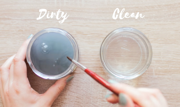
The first tip to mixing beautiful colors is to keep two water containers on hand. This may not be directly related to combining colors, but it's important to your watercolor painting process as a whole. Use the first container just for rinsing out your brushes, so expect it to get polluted and murky. The second container is where you'll get water to dilute your paints, so keep the water as pigment-free as possible to avoid contaminating your colors.
Tip #2: Color Theory Watercolor Techniques
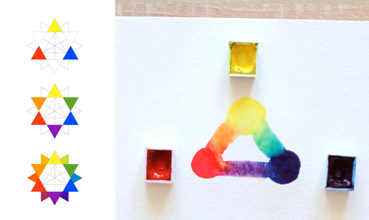
The second tip is about familiarizing yourself with basic color theory. This will form the backbone of your color mixing watercolor techniques. The primary colors are composed of Red, Yellow, and Blue. If you combine two primaries, you produce a secondary color, of which there are three: Orange, Purple, and Green. Finally, combining a secondary with the primary color beside it on the color wheel produces a tertiary color. If you mix the three primary colors together, they actually cancel each other out and produce a dark, neutral pigment! Keep this in mind because it's important in the next few tips.
Tip#3: Color Temperature and Complements
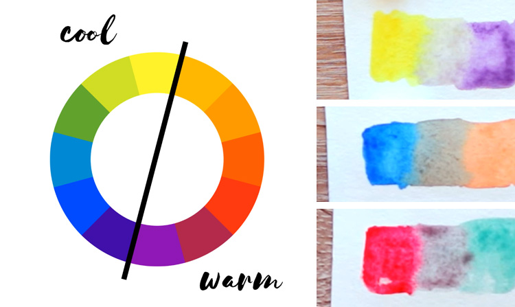
Another important tip to upgrading your color mixer skill is to consider the different ways to group colors on the color wheel. One such way is by temperature, which divides the colors into cool and warm. Cool colors tend to recede into the background, while warm colors tend to come forward.
Another way to group colors is to pair them up with their complement. Complementary colors are two colors that are directly opposite from each other on the color wheel. Typical complementary color pairs are Red and Green, Blue and Orange, and Yellow and Purple.
A neat trick to keep in mind is that if you want a color to stand out, put its complement next to it. Complementary colors make each other seem more vibrant and intense. If you mix them together, however, the opposite effect happens.
This is because you have all three primary colors present in the mixture. For example, if you mix Red and Green together, Green is made of Yellow and Blue - and like we said in the previous tip, the primary colors cancel each other out!
Tip#4: Figure Out The Color Bias
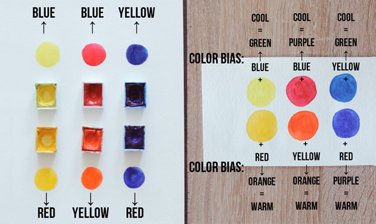
Have you tried mixing colors based on the tips we already tackled but ended with a pigment that's just plain muddy? Here's something you might not have considered: there are many kinds of watercolor paint in the world and none of them are completely pure. What does this mean?
Simply that a color tends to have a bias towards one or two of the primary colors. How do you figure out the bias of a color on your paint palette? It's simple: For a Yellow, ask yourself if it looks like it has more Green or Orange in it. Cool yellows, like Lemon Yellow Hue, lean towards Blue on the color wheel, so they appear greenish. On the other hand warm yellows, like Cadmium Yellow Hue, lean towards Red and appear more orange-ish. When it comes to a Red, ask yourself if it has more Purple or Orange.
Cool reds, like Alizarin Crimson Hue, lean towards Blue and appear purplish. Warm reds, like Cadmium Red Pale Hue, lean towards Yellow and appear orange-ish. Finally, for a Blue, ask yourself if it has more Red or Green. Cool blues, like Turquoise, lean towards Yellow on the color wheel and appear greenish. Warm blues, like Ultramarine, lean towards Red and appear purplish.
Tip#5:
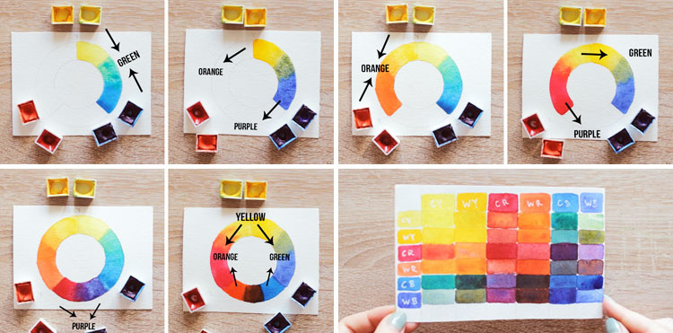
You've figured out which primaries your colors are biased to... Now what? Well, now you have all the knowledge you need to mix the colors you want! If your goal is to create a colorful painting with mixtures that are pure and bright, combine colors that have the same bias.
To mix a vibrant green, for example, combine a cool yellow (Lemon Yellow Hue) with a cool blue (Turquoise). They not only lean toward each other, but they both already "want" to mix green - so it makes sense that they combine to produce a pretty green, right? Now to create a toned down color, do the opposite and combine colors that "don't want" to mix the same color. For example, mixing a warm yellow with a warm blue creates a muddy-looking green because both colors have a Red undertone.
Remember Tip#3: a mixture with all three primary colors present tends to create a neutral color. That's it for this lesson! We hope these tips help you become a confident color mixer on your watercolor painting journey!