Get ready for famous painting number 3, where this time, we're studying the nuances of an abstract cityscape. Artist William "Bill" Dunn learns from Richard Diebenkorn's Cityscape I, a painting that focuses on shape and color. Want to watch the video version? The full tutorial is available to members of our Beeblys WatercolorPainting.com.
Materials Used In This Watercolor Study:
- Reference picture of Diebenkorn's Cityscape I
- A block of Hahnemühle's Cornwall matt watercolor paper (210lb, size 9.4″ x 12.6″)
- Pentel Graphgear 1000 automatic drafting pencil, 0.9mm lead size with 2B lead
- ½" Artist's or masking tape
- Painting palette for watercolor paints
- Auxiliary plate or palette for gouache paint
- A container of water
- Paper towels or a rag
- A tabletop easel or a box to prop your painting on
- A spray bottle with clean water
- Kneaded eraser
Paints (Holbein Artists' Watercolors)
- Cadmium Lemon Yellow
- Naples Yellow
- Gamboge Nova
- Brilliant Orange
- Brilliant Pink
- Leaf Green
- Greenish Yellow
- Olive Green
- Cobalt Green
- Cerulean Blue
- Turquoise Blue
- Cobalt Blue Hue
- Phthalo Blue
- Indigo
- Buff Titanium
- Quinacridone Gold
- Yellow Ochre
- Raw Sienna
- Burnt Sienna
- Neutral Tint
- Ivory Black
Daniel Smith's Extra Fine Watercolors
Holbein Artists' Gouache
- Zinc White
Brushes
- Escoda Perla Joseph Zbukvic Series: Round brush (no. 8)
- Neef Rigger Supreme Taklon Series: Long handle rigger brush (no. 12)
- Silver Brush Golden Natural: Liner brush (no. 2)
Step 1: A Study Of Shapes And Style
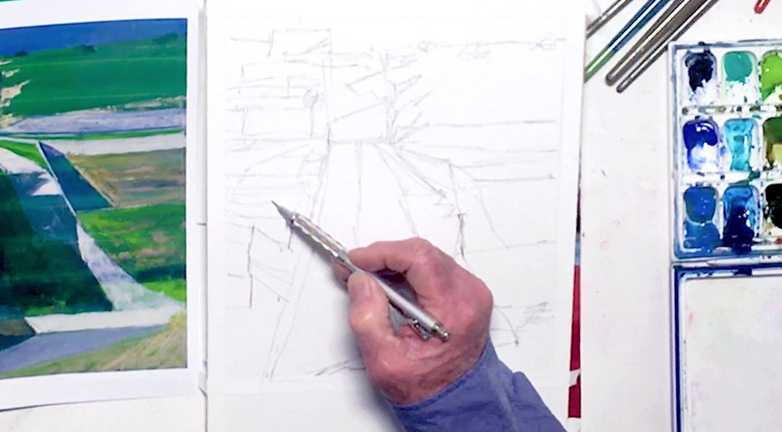 If you've ever wanted to learn more about the abstract style, this lesson will be perfect for you. Bill studies the painting Cityscape I by Richard Diebenkorn, and begins by breaking down its composition. This abstract cityscape is actually a reference to the Bay Area in California, but the simplified scene causes your focus to be drawn to the shapes and colors used. This is one of the main attractions of abstract painting - the subject is stripped away, leaving behind a feeling made up of shapes and colors. Before you start sketching, prep your paper by taping the edges with artist's tape, and cutting off 2" from the bottom to get the right size. This will help create a white border for any future framing purposes. Sketch the scene next, beginning at the horizon line at the top and working your way down. Draw in simple geometric shapes, and try to get your measurements right without having to use a ruler. Don't worry about small details, as you can also draw with your paintbrush later. Below is a close-up of Bill's sketch:
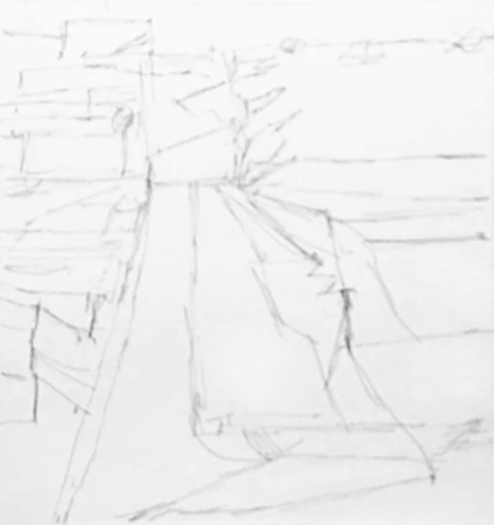
Step 2: Blocking In And Underpainting
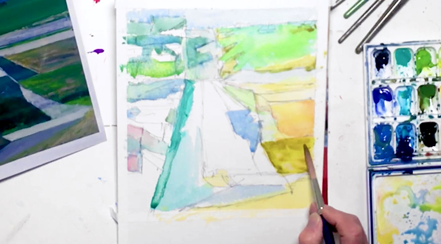
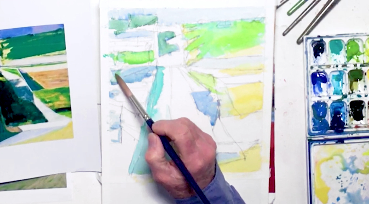 When you're satisfied with your initial sketch, you can start blocking in the larger shapes. In general, paint from light to dark, and from large to small. So with Naples Yellow and a no. 12 rigger brush, paint the yellow and light green areas. This is called "underpainting", and will add more depth to your colors once you layer more colors on top. Use Cerulean Blue for the sky, then for some of the buildings, roads, and streets. Switch to Cobalt Green, and block in any teal green areas to give the painting an iridescent quality. Then, use diluted Cobalt Blue to add to the "white" roads in the distance for the illusion of atmospheric perspective. Keep checking your reference photo to see where each color is needed where! Also, adjust the saturation of your paint as needed to get the right values in your painting. Paint with the "wet-on-dry" technique (i.e. wet paint on a dry surface) to get the hard edges you need, and try not to let the colors bleed. But it's fine if you make any mistakes here, as you're only working on the first layer. Mix Leaf Green and Cobalt Blue for the top left corner and in any green/blue areas, then mix Cadmium Lemon Yellow and Leaf Green for brighter spots. You can even start dropping in other colors "wet-in-wet" to create softer blends.
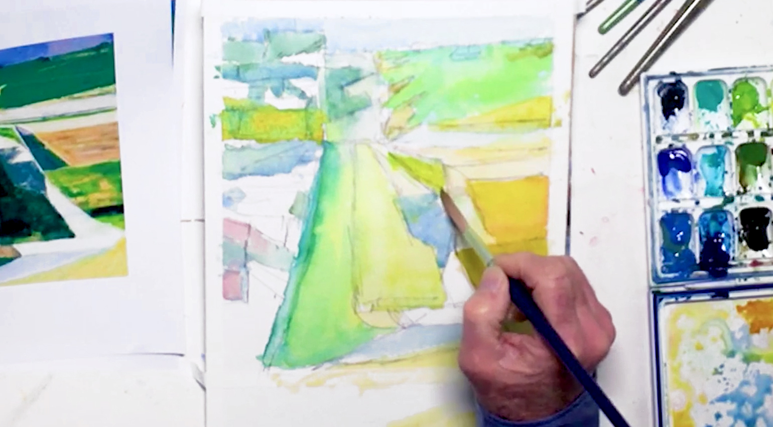
Step 3: Layering A Variety Of Greens
 Mix Phthalo Blue and the yellow mixture to create a turquoise, then layer this on top of the darker green shapes. Next, dot in some Chromium Green Oxide, lifting out puddles with a "thirsty brush" to prevent the paper from getting too wet. Add diluted Brilliant Pink to some of the left side buildings, then mix Naples Yellow and Raw Sienna for the yellow field on the right. Touch in Brilliant Orange here as well, then mix Buff Titanium and Naples for a very pale hue in the field above. Keep jumping to paint in dry areas, working your way around the abstract cityscape. You'll notice that the painting is mostly made up of yellows, greens, and blues, so mix your colors accordingly. You can even mix colors on paper, such as dropping in Yellow Ochre while the paint is still wet, or streaking in some Greenish Yellow for some of the fields.
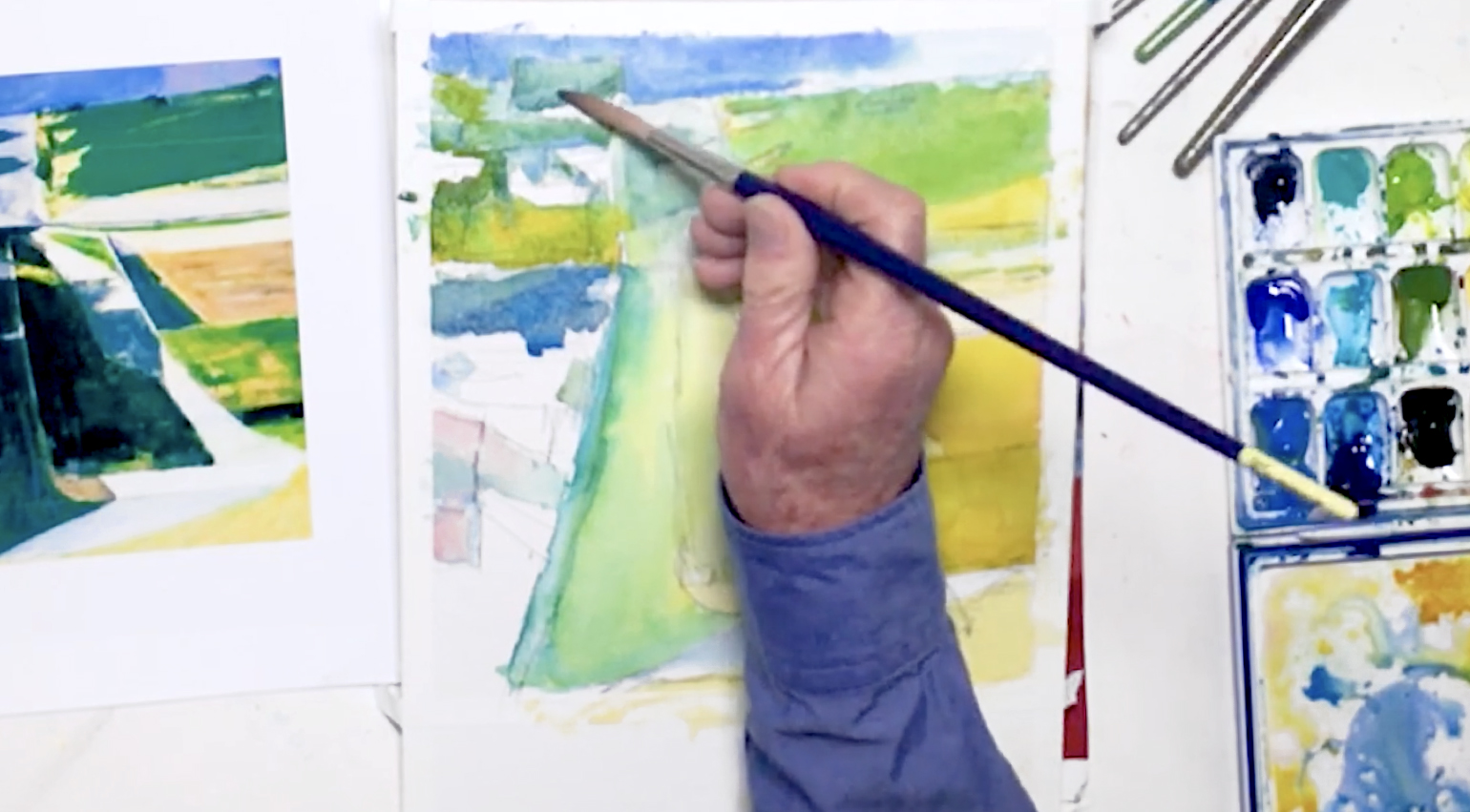
Step 4: Building Up Colors
 Use Cadmium Lemon Yellow to paint the underlying color for the middle road, then use your green mixture to paint the dividing line between the parallel roads. Switch to Naples Yellow to fill in the rest of the road, then use Gamboge Nova for the yellow/orange areas. Doing all this will help stimulate your colors when you add other colors on top later. Dilute the yellow for an ivory color, and paint some of the "white" areas that are closer to the fields. Touch in Quinacridone Gold in some of the wet areas for pockets of color, but try to avoid creating too many puddles on your paper. Slowly build up your colors in this manner, and be careful not to touch any wet paint!
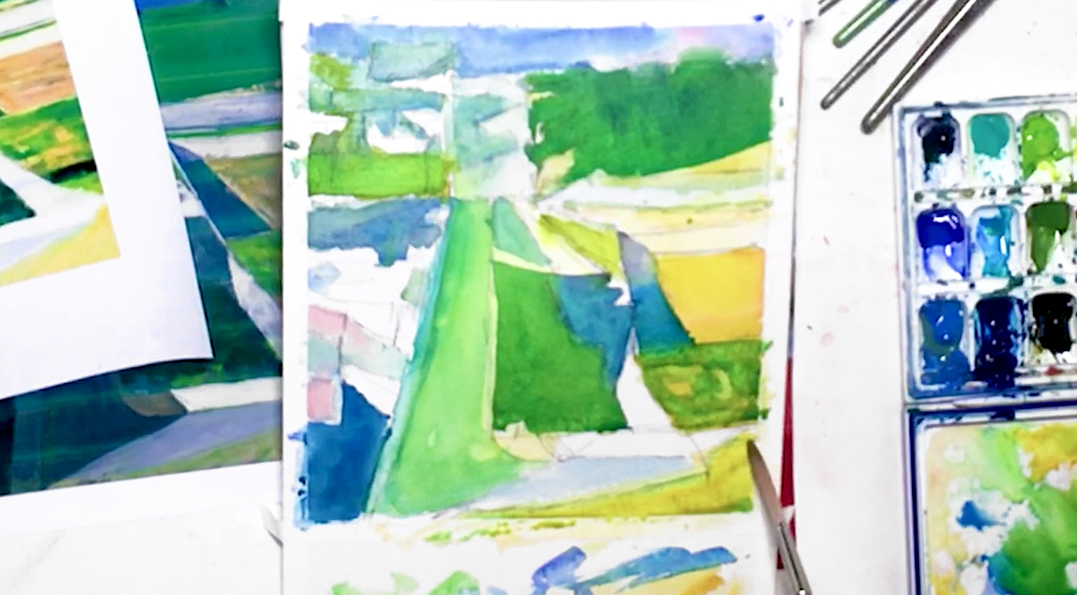
Step 5: Getting Crisp Edges With The "Wet-On-Dry" Technique
 As you paint, gradually layer more saturated colors, starting with Chromium Green Oxide in the top right field. Keep blocking in more areas and begin adding some details, like dividing boundaries between each field. Add more Greenish Yellow to the buildings on the left, and Cobalt Blue for the shadows in between. Let some of the underlying layers dry before glazing a different color on top. This will help create the hard edges you need to paint the complicated shapes in your abstract cityscape. Use Cerulean to darken other shadows and the sky, then drop in Cobalt Blue with the wet-in-wet technique.
Step 6: Mixing Colors On Paper
 Mix Phthalo Blue and Lemon Yellow for a viridian, and darken some of the green areas, especially the road on the left. Add diluted Carbazole Violet in the top area of the small blue field, and allow gravity to help you mix colors on paper. Drop a hint of Brilliant Pink in the right side of the sky, and blend it back with Cobalt Blue. Keep going with the blue to paint hills in the distance, and build up your colors as needed. Use Indigo for the darkest areas, and switch to your viridian mix for the darkest fields. Feel free to let some of the underlying colors show through, especially in the yellow-green fields. Lastly, add some Quinacridone Gold to the bottom section.
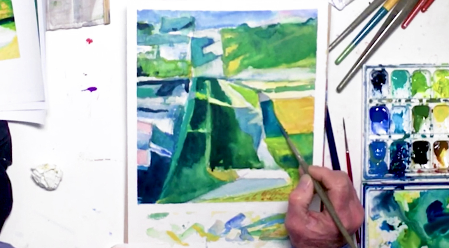
Step 7: Adding Contrast To This Abstract Cityscape
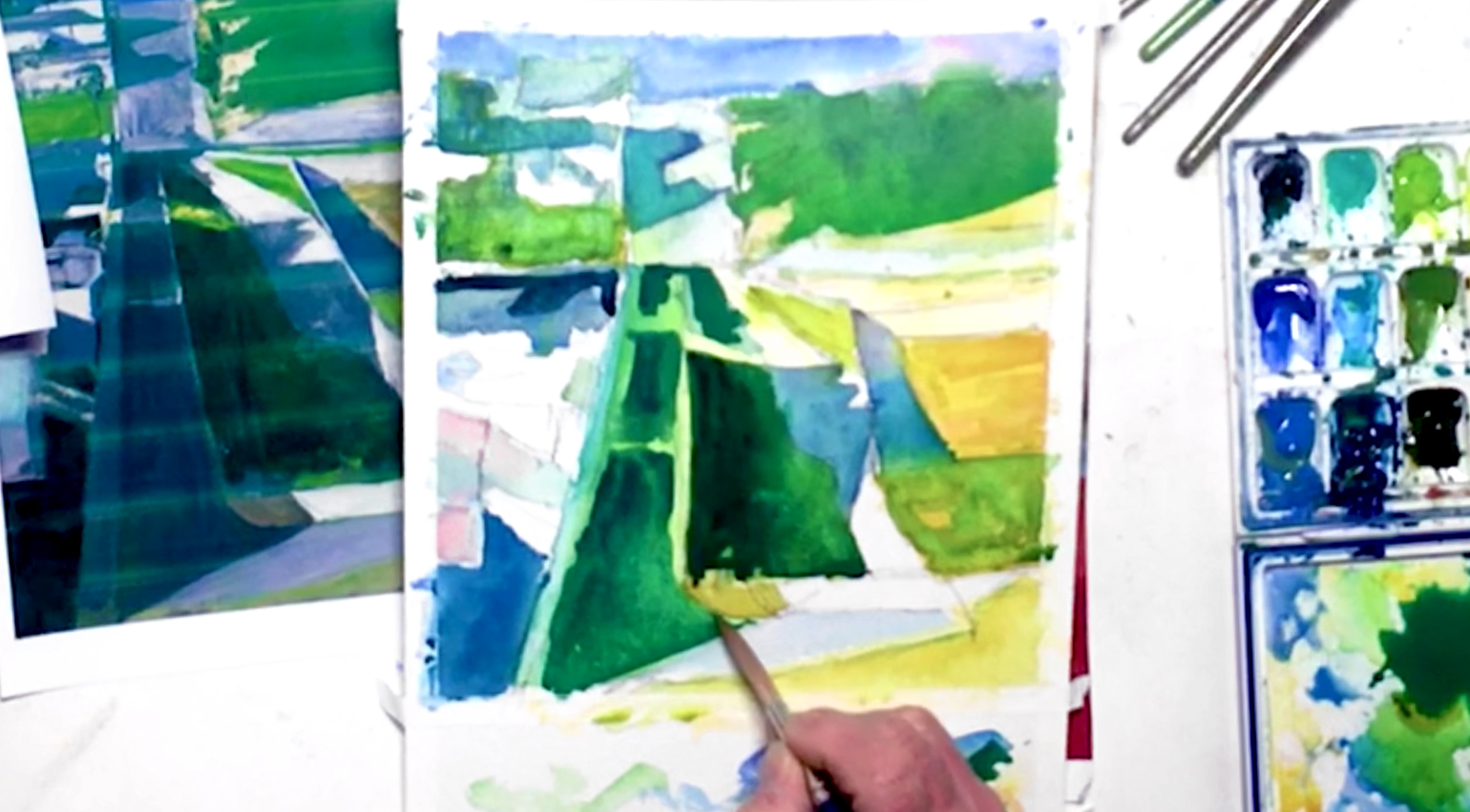 Switch back to Raw Sienna for the brown patch near the bottom, then drop in more orange in the orange field. Dull it down with Greenish Yellow, and try not to flood the paper with paint while you do so. Add more Cobalt Blue to the middle-back shadows on the road and in fields, then use Cobalt Green to brighten the road shadows. Keep strengthening areas with various blues, and use Indigo again for the darkest parts. Add your viridian mix to the middle road, and drop in Indigo and Phthalo Blue wet-in-wet to create a variation of this dark color. Try combining different colors for a more interesting painting, and to create more contrast between your darks and lights.
Step 8: Consistency Is Key
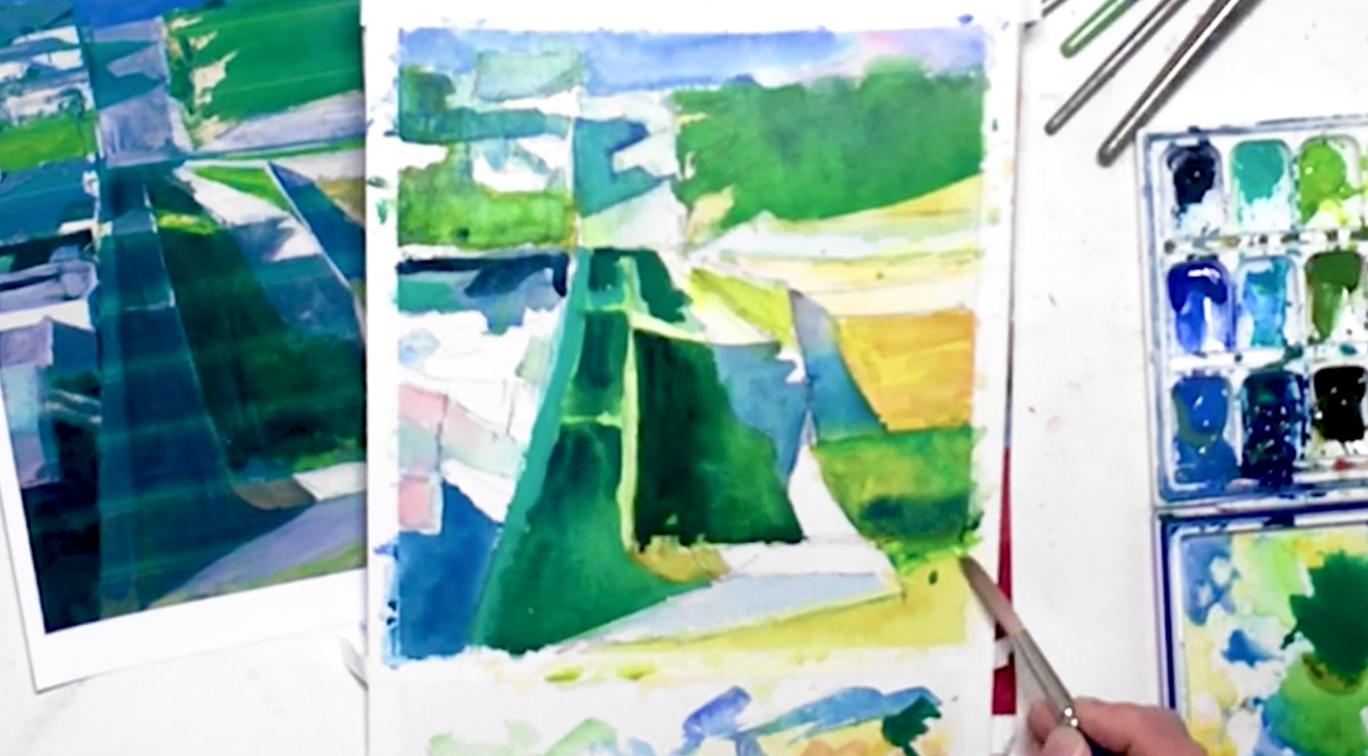 Throughout this process, keep studying the reference photo to keep your colors and values consistent! Use Cobalt Green for the front lawn area and some shadows, and in the far right fields. Next, use saturated Naples Yellow and place gently on top of the yellow areas to make them stronger. You can also add a streak of Indigo and Phthalo Blue for a variation of green.
Step 9: Adding Depth And Contrast
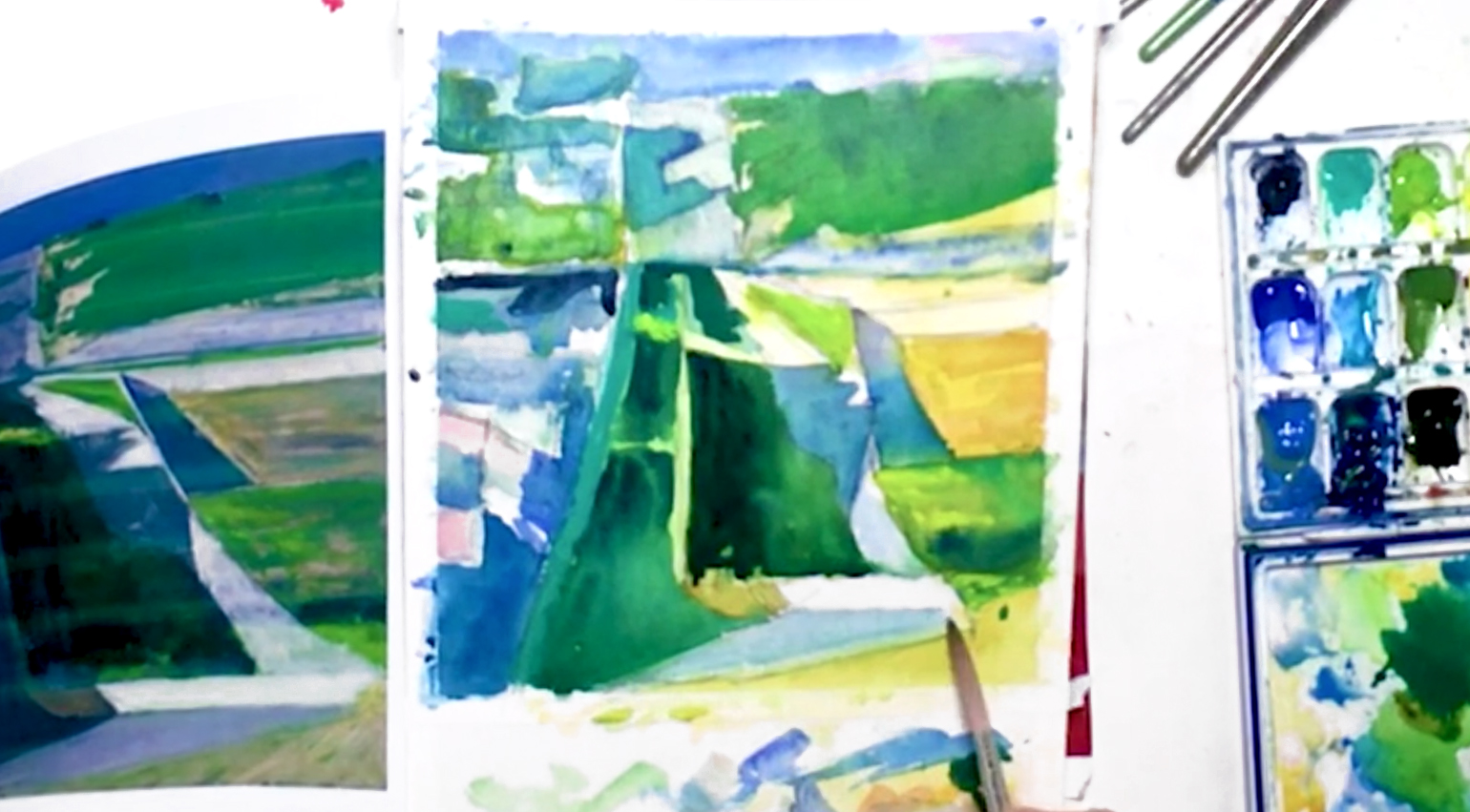 Use Cerulean to darken the area between the two pink buildings on the left, then use a light wash of Neutral Tint to do the same to a few of the other shapes as needed. This will help add more depth and contrast to the overall abstract cityscape painting. Touch in a very diluted Ivory Black over the middle strip of road across the fields for a light gray, then add Cobalt and Turquoise Blue on top so the colors mix directly on paper. Add more of your teal mix for some of the black areas, then use more Cobalt Blue for color harmony. Switch up to a saturated Lemon Yellow, and add yellow spots in the middle and bottom right areas. For the white/blue areas in the lower right quadrant, use diluted Cerulean again to tie it in with the other "white" areas. Leave your painting to dry afterwards, to prepare for some wet-in-dry painting later.
Step 10: Studying The Details
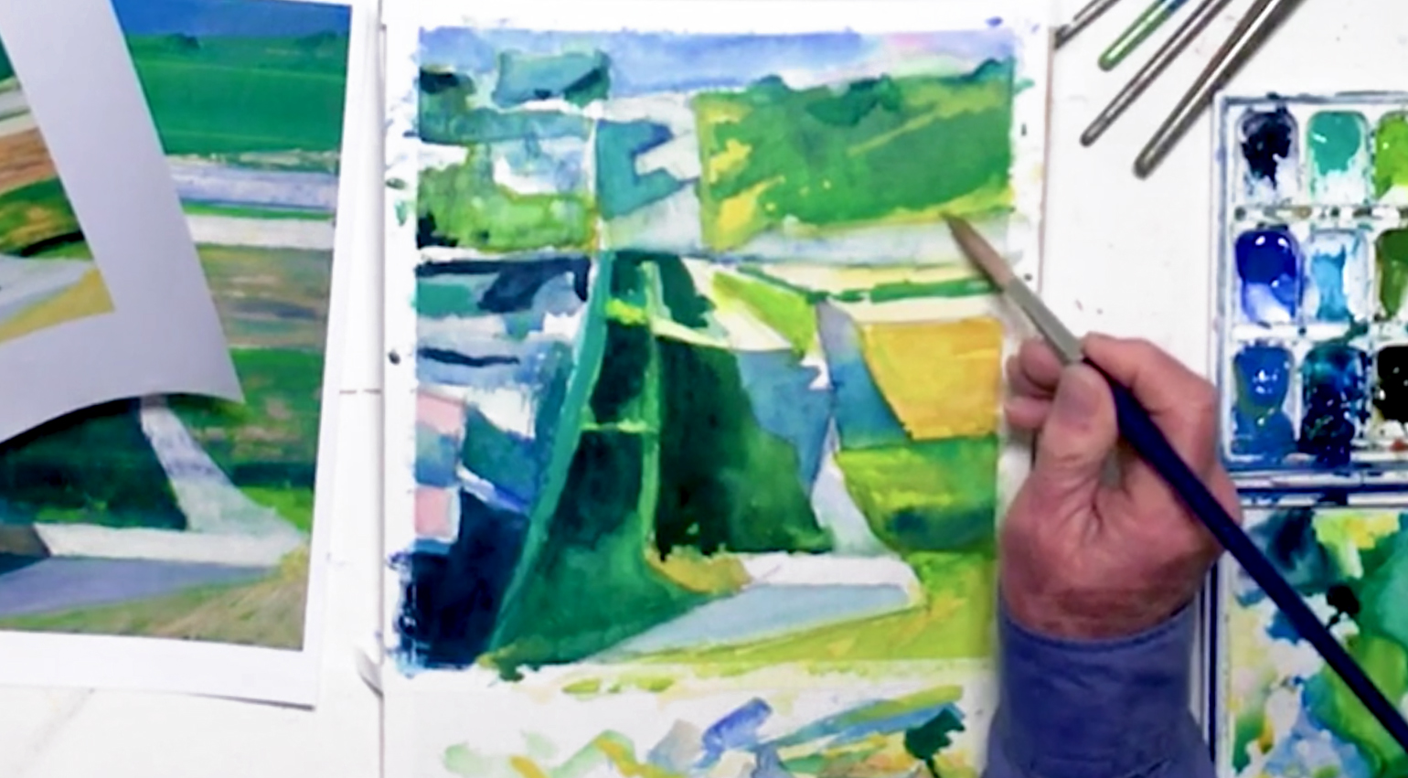 At this point, you should be ready to add some smaller details, like some darker green trees along the horizon line. Soften the edges to give them a more distant look though. Use saturated Naples Yellow again for details, especially to strengthen the yellow areas, and try to tidy up the overall look of your abstract cityscape as much as possible. Use a more saturated Indigo for the darkest areas, such as the bottom left corner and in some of the buildings. You can also dot some details in, mixing your colors as needed. Don't forget to add the green outlines that divide the different fields!
Step 11: Using White In A Subtle Way And Finalizing A Painting
 Squeeze some Zinc White gouache paint onto your auxiliary palette, then switch to the no. 8 round brush. Gouache is an opaque paint, so while it will be opaque enough to cover underlying layers, try your best to use it in a way that doesn't make it look too obvious. Also, use the wet-on-dry technique when applying to prevent unwanted bleeding. So with your smaller brush and opaque paint, add a translucent layer to the gray areas, the white strip of pavement, and anywhere that needs to be a little lighter in your abstract cityscape. Dot in spots of light in the buildings as well, and bring back the white line dividing the road/pavement. You can soften some of the edges here if needed. Mix a touch of Carbazole Violet with your white for a very light purple spot to the left of the road, and fix anything that needs fixing. During these final touches, try to capture the feeling of this painting, even if it's not exactly the same. Finally, sign your abstract cityscape with a no. 2 liner brush and saturated Burnt Sienna. Carefully pull off the artist's tape, and you're done! You can even erase some of the exposed pencil lines if you want. Otherwise, we hope you learned something from studying Diebenkorn's masterpiece!