 Techniques for Drawing Values
Drawing Lines and Values
Drawing involves the use of lines and clusters of lines called "values". Lines and values often merge spontaneously as you draw, one springing from another in the same stroke. The better you understand the range of expression and working qualities of your pencil or pen, the broader your palette of artistic options are when you create. A line is a flowing stroke of your pencil that defines an edge in the image you are drawing. Value is the gradation of grays you use to define the mass, form, light, and design of your drawing. FYI Art Talk and Semantic Bad Habits: The terms "tone" and "shade" are often used interchangeably with "value". Tone is a color term used when gray is mixed with a pure color. You then achieve a tone. Shade is another color term used when black is mixed with a pure color. You then achieve a shade. If you add white to a pure color you get a tint. You can also take any of these colors and relate their lightness or darkness to the grays found in the 10-value scale irregardless of their hue. I did use the term tone for years for describing black and white drawing. Whoops. When you strip color from the picture, you should also strip the language of color from your jargon. I'll use the term "value" when talking about a gray created by drawing in black in white. I'll even use the term "shading" to describe making the right values to bring out forms and shapes because it also means "relative darkness" and "cast shadow." Recommended brands: Daler-Rowney, Dr. PH. Martin, Higgins, Pelican, Speedball-Hunt, Rotring, Koh-I-Noor, Winsor & Newton, Montblanc, Waterman, Bic, Papermate, Pilot, Pentel.
Lines & Values: Lines
"A line is a dot that went for a walk." (Paul Klee)
"I couldn't draw a straight line if my life depended on it." You've heard that one before? Honestly, I'd be hard pressed to do the same. You don't need to know how to draw a straight line. Relatively straight is close enough most of the time and when it's not we have easy remedies called rulers. You only need to find the lines of the image you are drawing. Nothing more, or less. Here are a few things to consider as you create a drawings with lines. 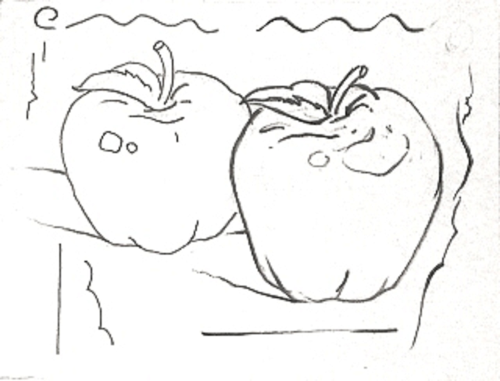
Expressive Lines
In this example, the apple and decoration above were drawn with a flat line of unvarying thickness. The foreground apple was drawn using thick and thin lines to accent its form and shape. Using expressive lines when you draw helps you anchor and accent the elements in your drawing and instills a liveliness in even the most mundane image. Pencils wear at an angle. As the point wears down, sharp side edges are constantly forming. By rolling your pencil as you draw, you can "catch an edge" and find the thickness or thinness you need to make something interesting happen in your drawing. 
Sharp vs Dull
The sharp point of a freshly sharpened pencil offers you the greatest precision with its fine line. As you draw, the point will wear down and the stroke will thicken. In the above example, the left side was drawn with a sharp #1B pencil. The right side of the drawing was done with the same pencil after it was worn down. Notice a difference? See "Sharpeners" section 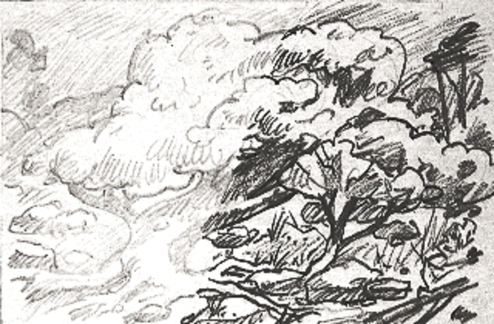
Adjusting the Contrast
The left side of this sketch was drawn with a 2H lead. The right side was drawn with a #1B pencil. The darkest tone of the 2H lead area is a light silver gray. The 1B pencil side has a more complete tonal range that includes a fuller range of medium to dark grays. Use a soft pencil to get greater variation in tone. See "Pencil Grading" section 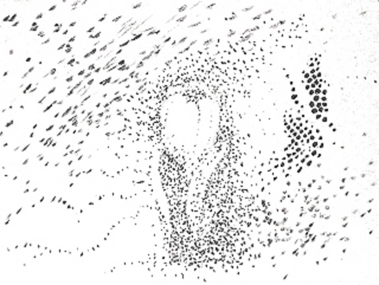
Dots
OK, technically a dot is not a line. It's not a tone either, unless it congregates with others. Consider a very small segment of line with tonal potential. Where it goes from here—line or tone—depends on your intent and the effect you actually achieve. If not part of the emphasis of line or tone, a spurious dot or dash may appear as an afterthought or a preamble to your next creative move. Don't sweat them in your sketchpad. Self expression and all. See "Pointillism in Values" section Recommended brands: Daler-Rowney, Dr. PH. Martin, Higgins, Pelican, Speedball-Hunt, Rotring, Koh-I-Noor, Winsor & Newton, Montblanc, Waterman, Bic, Papermate, Pilot, Pentel.
Values
Drawing Techniques and Styles
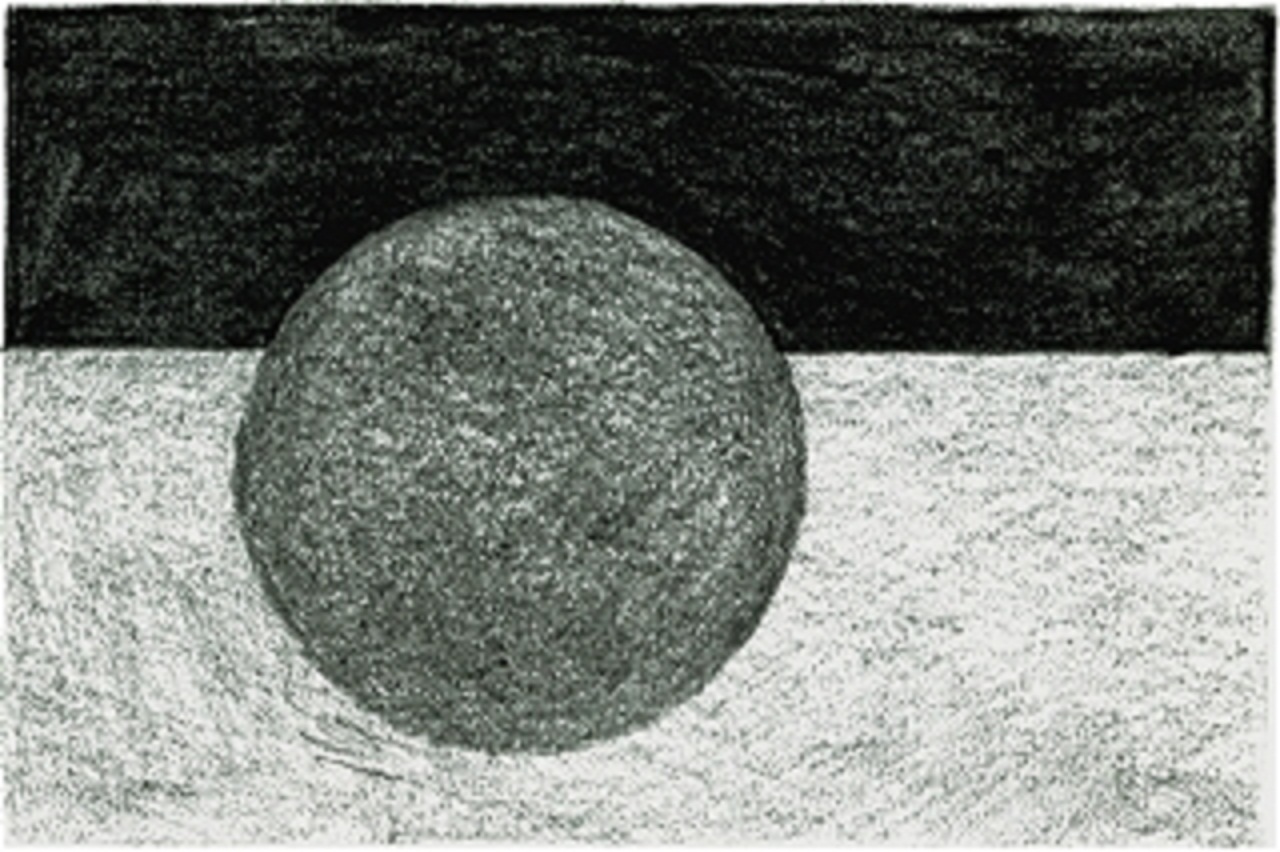
Here are eight (8) different ways of making values (grays) on your paper using a pencil or pen. After practicing the various techniques, you can start to figure out what works best for you as an artist. Be aware that the use of gimmicky techniques can be addicting. You should push beyond the technique to the purpose of the art itself. In this case, the eternal round thing. Now grab a pencil and draw a circle. You are going to learn how to draw. 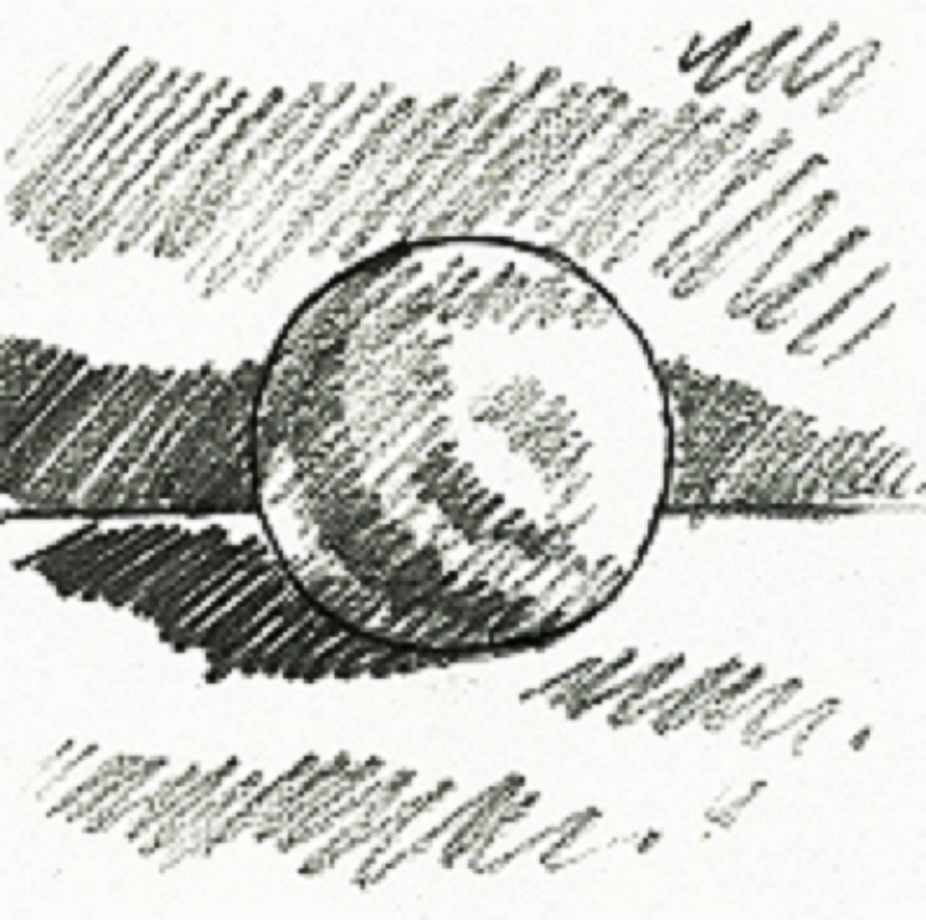
The Scribble
- A simple overlapping fill stroke This is a way to fill an area with value quickly. In a full speed frenzy, you can make over 200 strokes a minute. The direction most comfortable for right handed people is diagonally from left to right and back. Hold your pencil like you are going to write with it. The trick is controlling the pressure to achieve the tone you want, overlapping each stroke closely to have unbroken tone, and starting and stopping each stroke accurately to define the form you are drawing. Got that? 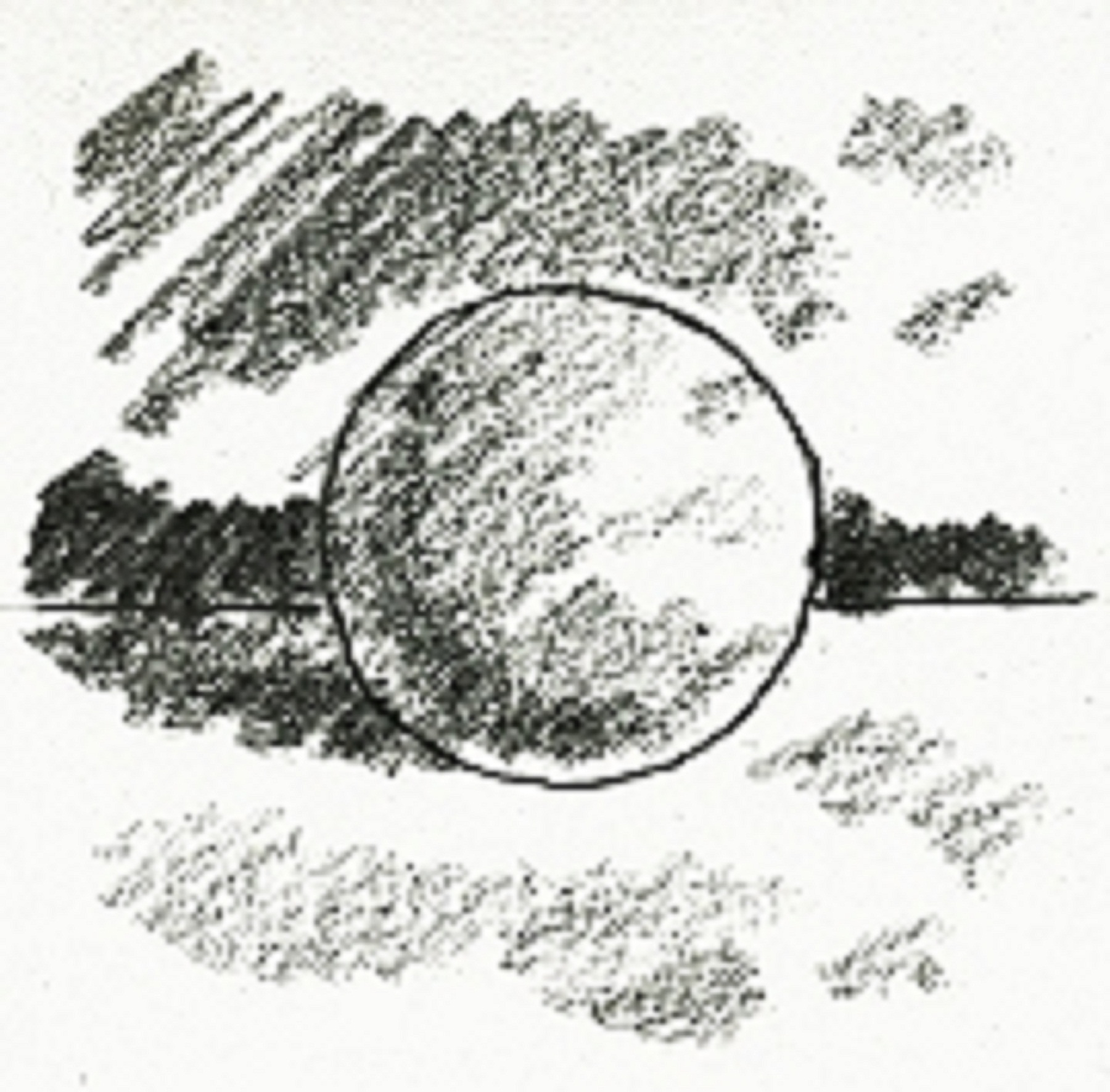
Side Stroke
- A favorite technique for sketchers Holding your pencil pinched sideways, you use the side of the lead in rhythmic back and forth strokes to lay down grays. This technique is usually executed loosely and quickly, and it helps you focus more on tonal masses than contour lines. 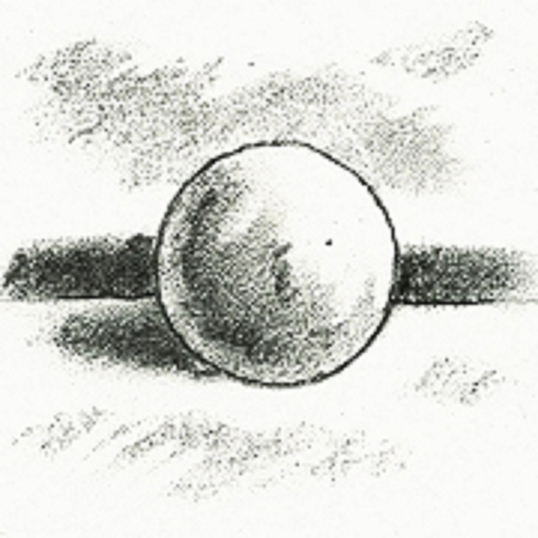
Smudge and Erase
- Getting your hands dirty If you take the scribble or sidestroke and mush it around with your fingers, the texture will smooth out and soften. The pencil is used to deposit graphite areas on the paper where they are smudged into submission. An eraser can be used to retrieve lighter values, shape areas, or add highlights. 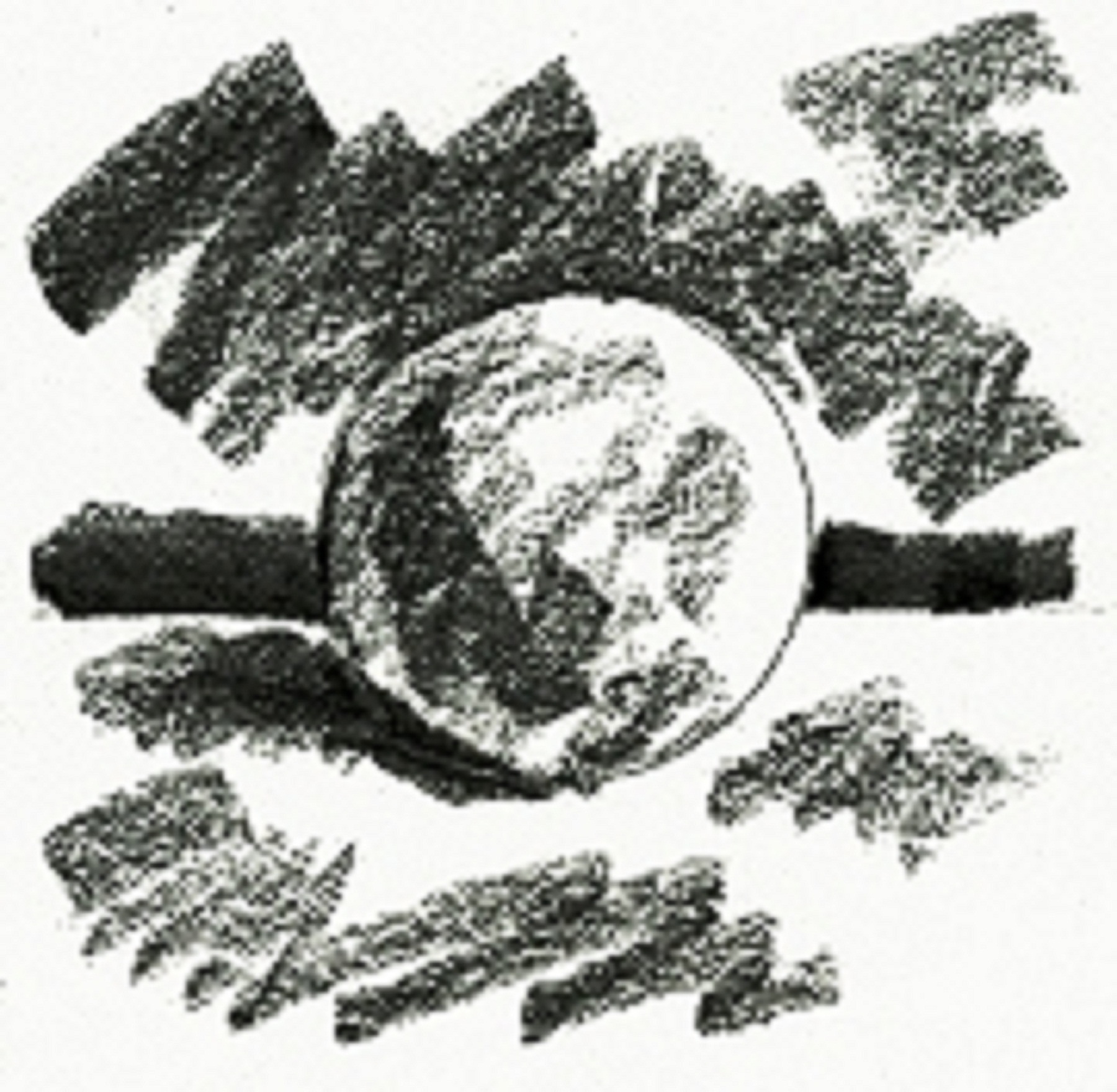
Wide Stroke
- More thought, less work If you can only pay attention long enough for quick impressions, a broader pencil line may be in order. A flat sketching pencil can work like a portable set of gray markers for drawing. Broad sweeping strokes of gray can be laid down quickly and loosely while you gather your visual information. 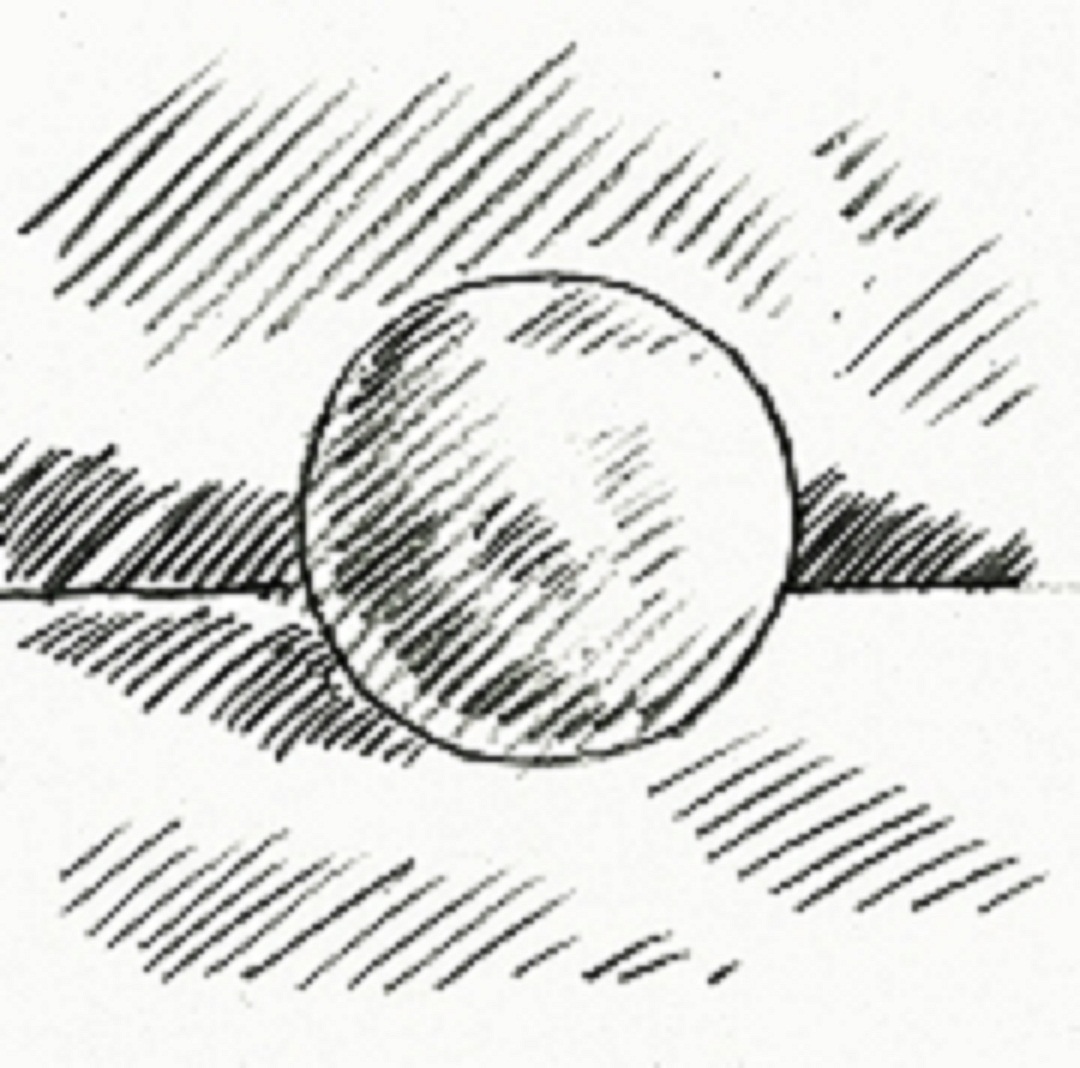
Single Strokes
- Straight lines in a row Using a sharp pencil, the area is filled in line by line. The motion is like the scribble but you lift the pencil tip before you loop back and start the adjacent line. The density of the line groupings define a value by how close or far way from each other the individual lines are. This more refined technique is usually reserved for more "studied" drawings, where you want to understand a form more fully. 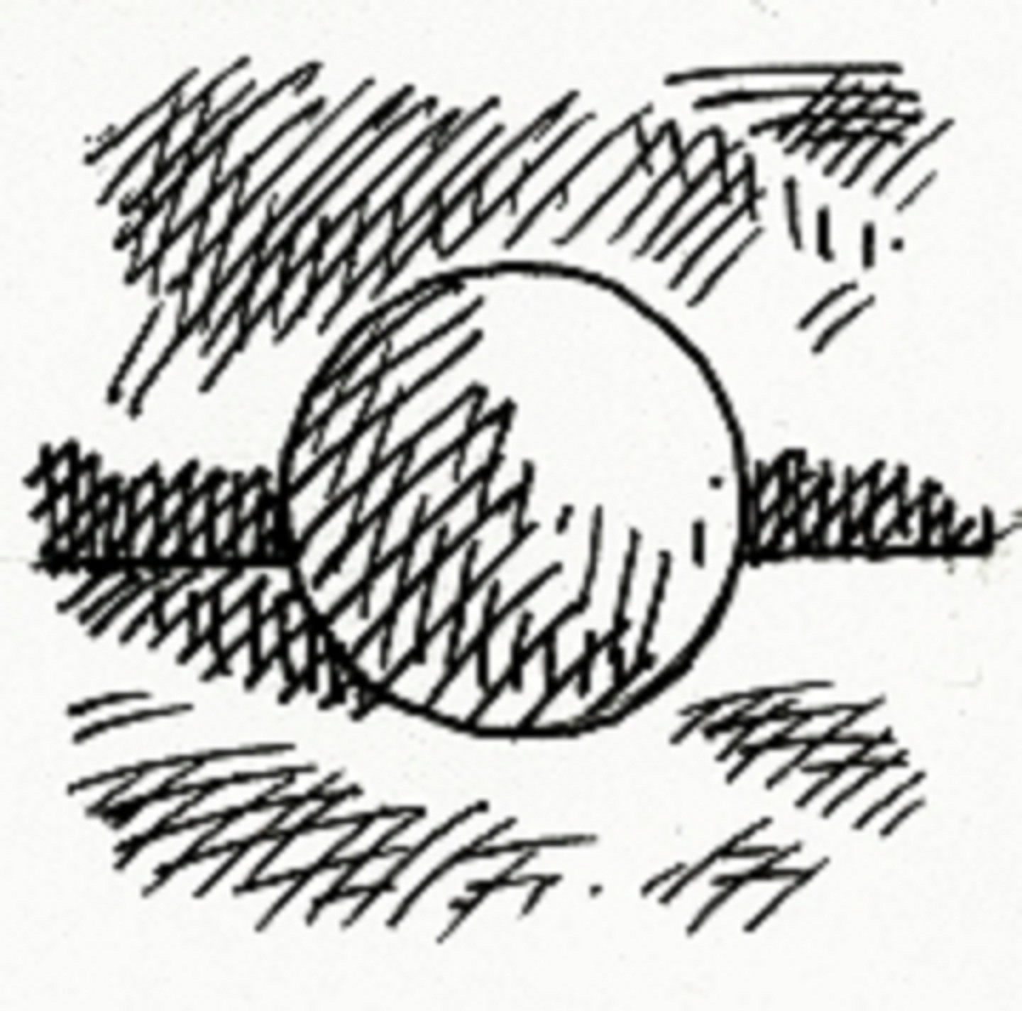
Crosshatching
- Drawing lines on lines When you overlap singlestroke gray-valued layers you create a crosshatch of lines that combine relative values into a darker value. Outlines are optional. The flow of the lines in crosshatching usually conforms to or accents the form being drawn in relation to the rest of the drawing. 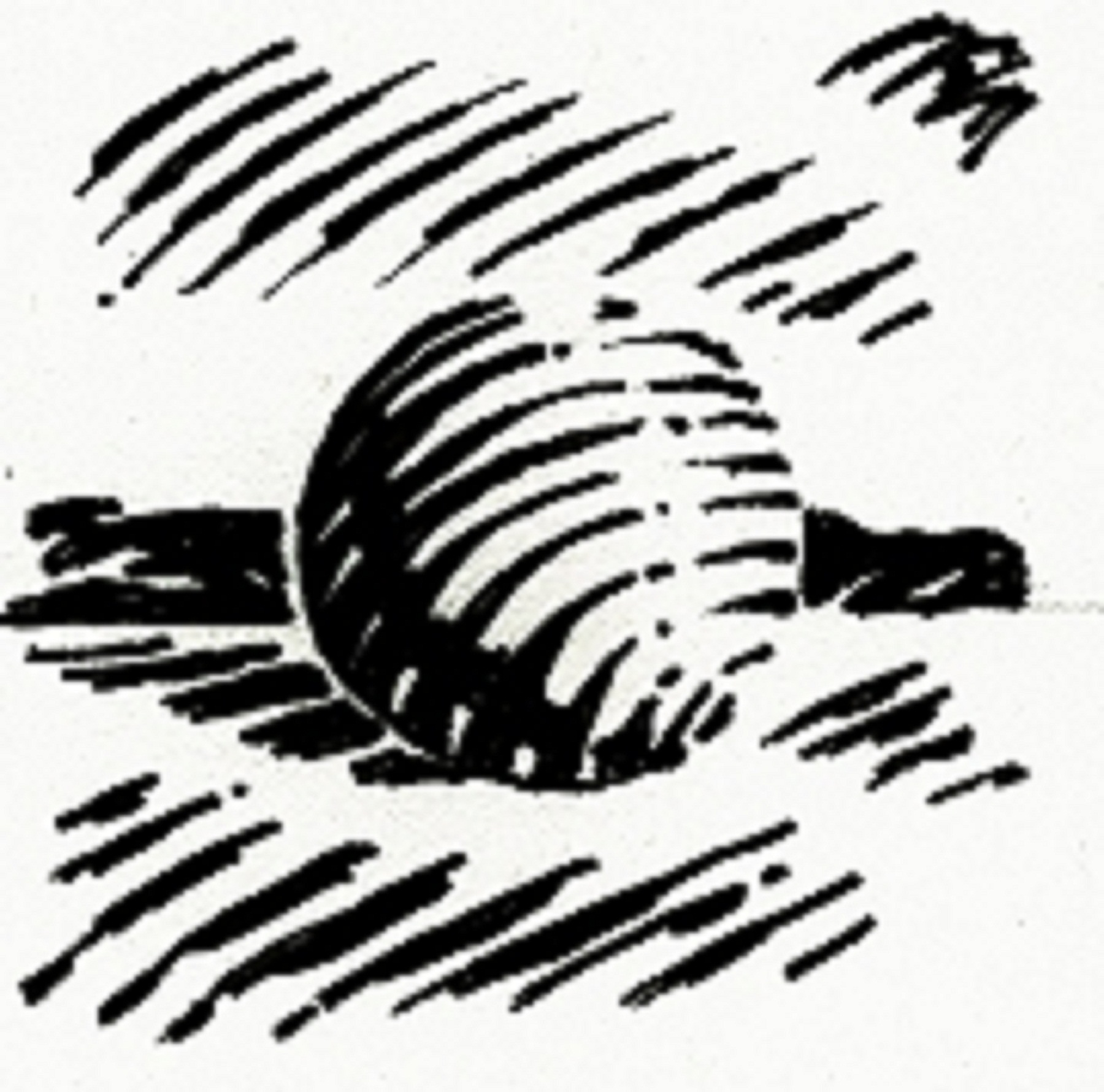
Thick 'n' Thin
- The line IS the value This manner of representing value and form is gimmicky but effective. It is a defined style of drawing based on the way engravings represent values as linear elements with width variations that reveal details in the form, texture, and lighting. See Kevin Sprouls' work; he has mastery over this technique. This is an image process. An image process is something you can execute perfectly and still have a bad result if the underlying drawing is bad. Chris Van Allsburg's book, Ben's Dream, uses a similar style of drawing. 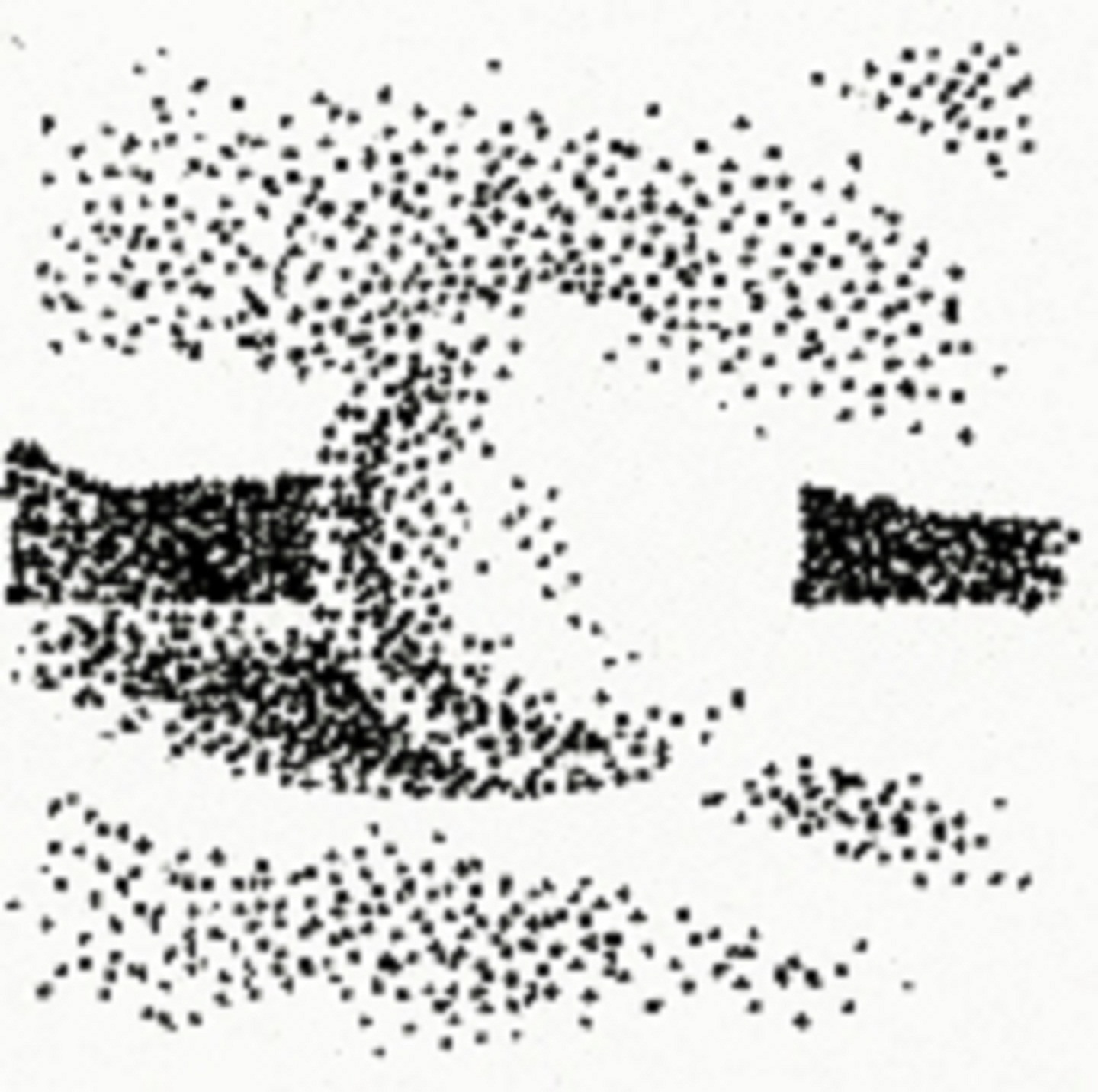
Pointillism
- Gradual controlled build up of dots Another cliched but effective technique for depicting grays is laying it down dot by dot, varying how close the dots are to each other. This style grew naturally from the mellow grays achieved on mezzotint plates, values created by manipulating great bands of printable dots. Dots, points, stipple, and halftone image processes have been popular with illustrators and in the work of fine artists such as Georges Seurat, Roy Lichtenstein, and Andy Warhol.
The 10 Value Scale
A Touch of Gray (The Grateful Dead)
Values are the shades of gray (or grey) you can create when you make a drawing. You should be able to create as large a range of grays as possible. Try practicing using this 10-valued scale of for reference.
Practice, Practice, Practice


5 Values to Success
An average composition has about 5 distinct value grades. You control the contrast, form, light and shadow, overall key, and texture with the interaction of the values you create (or take away) from your artwork. Spend a little time expanding and contracting your value range as you work.
Lines & Values: Dynamics of Values
Six Variations on a Scene
In the following examples, I've made a simple composition with a foreground, a middle-ground, and a background, and tried 6 variations using only 3 values: a dark, light, and middle value. Observe and consider each of these 6 variations. Rearranging the values of a relatively small number of visual elements changes the overall impact of your composition.
Three Planes, Three Values, Many Moods.
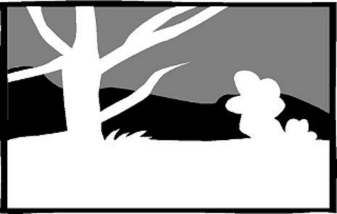 White Foreground, Black Middle-Ground, Gray Background
 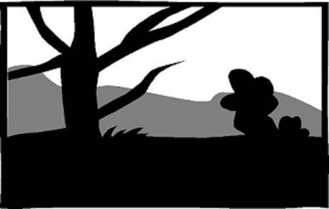 Black Foreground, Gray Middle-Ground, White Background
 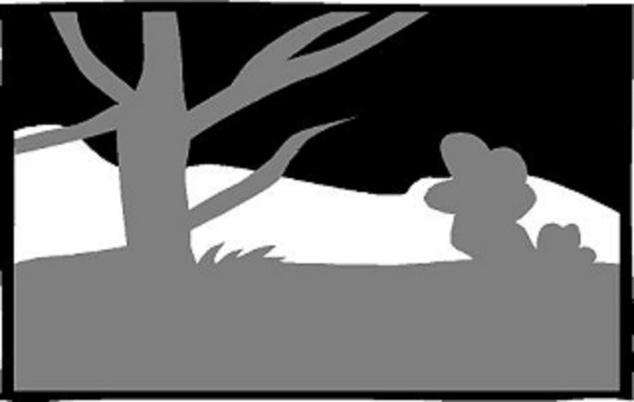 Gray Foreground, White Middle-Ground, Black Background
 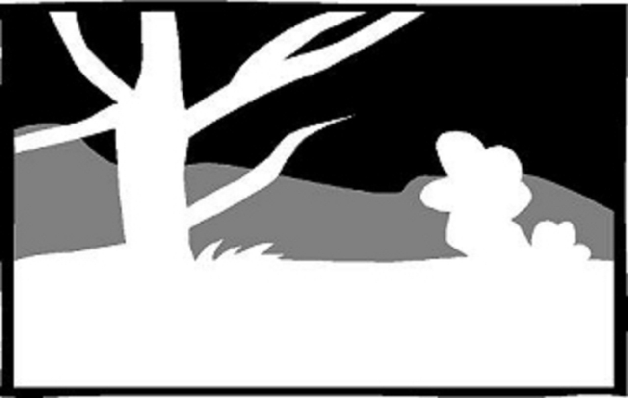 White Foreground, Gray Middle-Ground, Black Background
 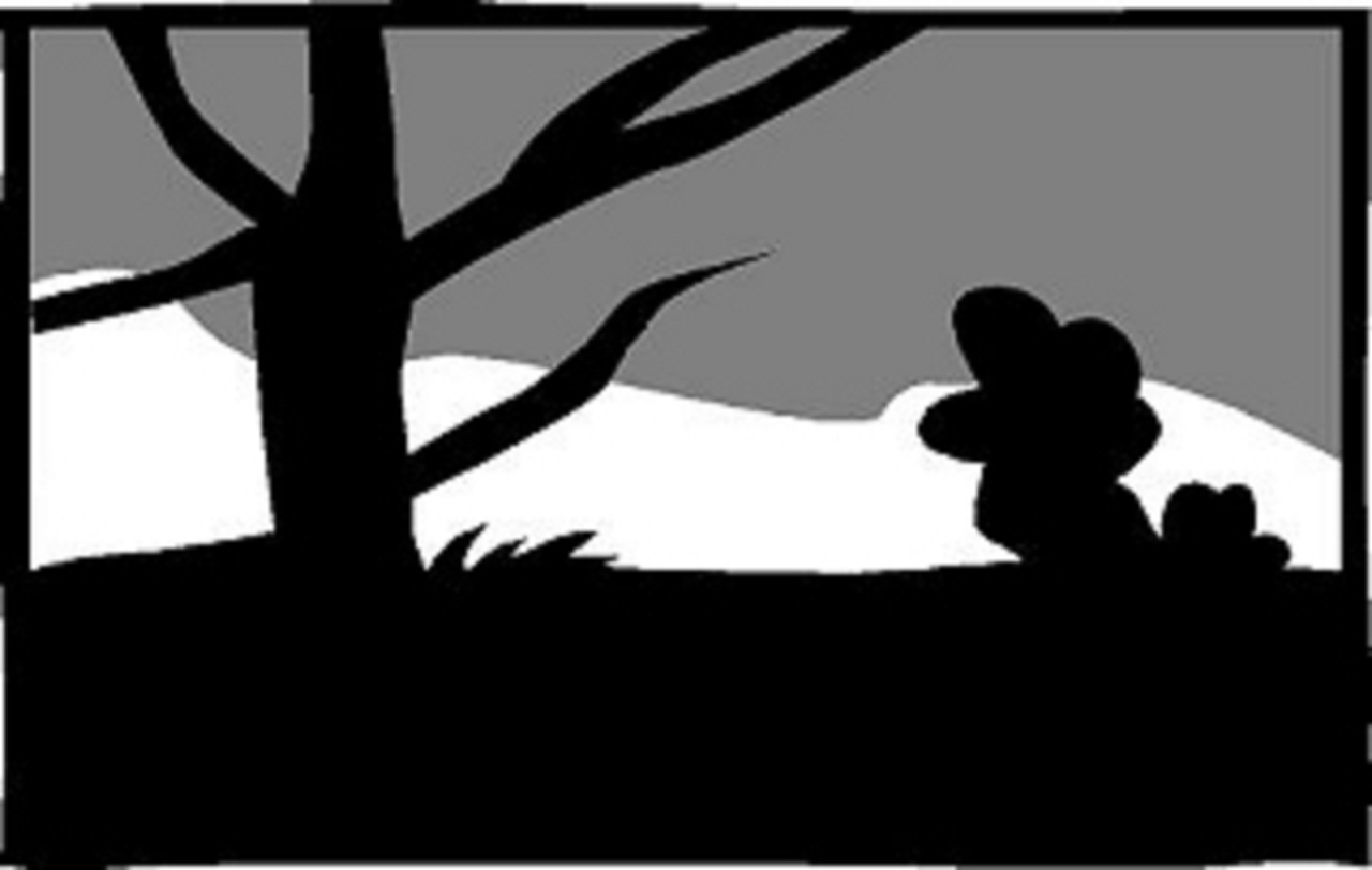 Black Foreground, White Middle-Ground, Gray Background
 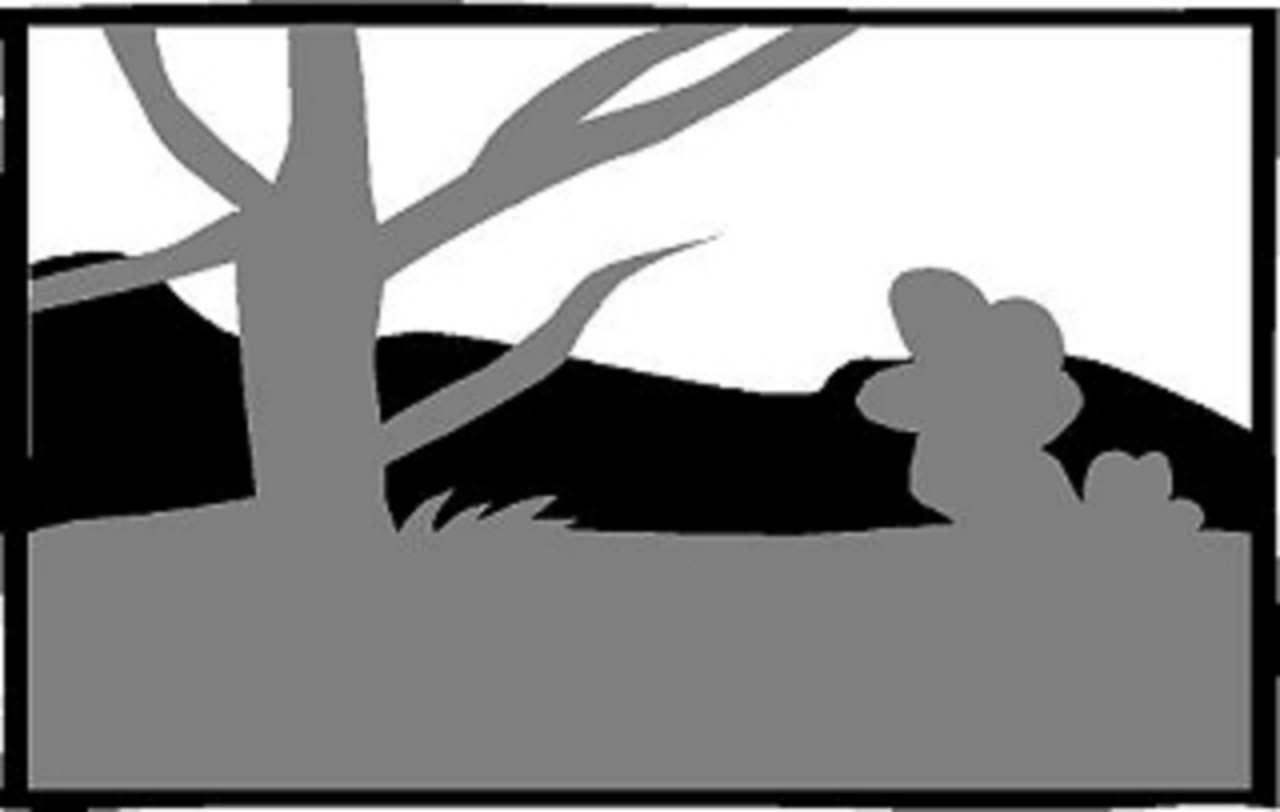 Gray Foreground, Black Middle-Ground, White Background
Drawing Lines and Values
Drawing involves the use of lines and clusters of lines called "values". Lines and values often merge spontaneously as you draw, one springing from another in the same stroke. The better you understand the range of expression and working qualities of your pencil or pen, the broader your palette of artistic options are when you create. A line is a flowing stroke of your pencil that defines an edge in the image you are drawing. Value is the gradation of grays you use to define the mass, form, light, and design of your drawing. FYI Art Talk and Semantic Bad Habits: The terms "tone" and "shade" are often used interchangeably with "value". Tone is a color term used when gray is mixed with a pure color. You then achieve a tone. Shade is another color term used when black is mixed with a pure color. You then achieve a shade. If you add white to a pure color you get a tint. You can also take any of these colors and relate their lightness or darkness to the grays found in the 10-value scale irregardless of their hue. I did use the term tone for years for describing black and white drawing. Whoops. When you strip color from the picture, you should also strip the language of color from your jargon. I'll use the term "value" when talking about a gray created by drawing in black in white. I'll even use the term "shading" to describe making the right values to bring out forms and shapes because it also means "relative darkness" and "cast shadow." Recommended brands: Daler-Rowney, Dr. PH. Martin, Higgins, Pelican, Speedball-Hunt, Rotring, Koh-I-Noor, Winsor & Newton, Montblanc, Waterman, Bic, Papermate, Pilot, Pentel.
Lines & Values: Lines
"A line is a dot that went for a walk." (Paul Klee)
"I couldn't draw a straight line if my life depended on it." You've heard that one before? Honestly, I'd be hard pressed to do the same. You don't need to know how to draw a straight line. Relatively straight is close enough most of the time and when it's not we have easy remedies called rulers. You only need to find the lines of the image you are drawing. Nothing more, or less. Here are a few things to consider as you create a drawings with lines.
Expressive Lines
In this example, the apple and decoration above were drawn with a flat line of unvarying thickness. The foreground apple was drawn using thick and thin lines to accent its form and shape. Using expressive lines when you draw helps you anchor and accent the elements in your drawing and instills a liveliness in even the most mundane image. Pencils wear at an angle. As the point wears down, sharp side edges are constantly forming. By rolling your pencil as you draw, you can "catch an edge" and find the thickness or thinness you need to make something interesting happen in your drawing.
Sharp vs Dull
The sharp point of a freshly sharpened pencil offers you the greatest precision with its fine line. As you draw, the point will wear down and the stroke will thicken. In the above example, the left side was drawn with a sharp #1B pencil. The right side of the drawing was done with the same pencil after it was worn down. Notice a difference? See "Sharpeners" section
Adjusting the Contrast
The left side of this sketch was drawn with a 2H lead. The right side was drawn with a #1B pencil. The darkest tone of the 2H lead area is a light silver gray. The 1B pencil side has a more complete tonal range that includes a fuller range of medium to dark grays. Use a soft pencil to get greater variation in tone. See "Pencil Grading" section
Dots
OK, technically a dot is not a line. It's not a tone either, unless it congregates with others. Consider a very small segment of line with tonal potential. Where it goes from here—line or tone—depends on your intent and the effect you actually achieve. If not part of the emphasis of line or tone, a spurious dot or dash may appear as an afterthought or a preamble to your next creative move. Don't sweat them in your sketchpad. Self expression and all. See "Pointillism in Values" section Recommended brands: Daler-Rowney, Dr. PH. Martin, Higgins, Pelican, Speedball-Hunt, Rotring, Koh-I-Noor, Winsor & Newton, Montblanc, Waterman, Bic, Papermate, Pilot, Pentel.
Values
Drawing Techniques and Styles
Here are eight (8) different ways of making values (grays) on your paper using a pencil or pen. After practicing the various techniques, you can start to figure out what works best for you as an artist. Be aware that the use of gimmicky techniques can be addicting. You should push beyond the technique to the purpose of the art itself. In this case, the eternal round thing. Now grab a pencil and draw a circle. You are going to learn how to draw.
The Scribble
- A simple overlapping fill stroke This is a way to fill an area with value quickly. In a full speed frenzy, you can make over 200 strokes a minute. The direction most comfortable for right handed people is diagonally from left to right and back. Hold your pencil like you are going to write with it. The trick is controlling the pressure to achieve the tone you want, overlapping each stroke closely to have unbroken tone, and starting and stopping each stroke accurately to define the form you are drawing. Got that?
Side Stroke
- A favorite technique for sketchers Holding your pencil pinched sideways, you use the side of the lead in rhythmic back and forth strokes to lay down grays. This technique is usually executed loosely and quickly, and it helps you focus more on tonal masses than contour lines.
Smudge and Erase
- Getting your hands dirty If you take the scribble or sidestroke and mush it around with your fingers, the texture will smooth out and soften. The pencil is used to deposit graphite areas on the paper where they are smudged into submission. An eraser can be used to retrieve lighter values, shape areas, or add highlights.
Wide Stroke
- More thought, less work If you can only pay attention long enough for quick impressions, a broader pencil line may be in order. A flat sketching pencil can work like a portable set of gray markers for drawing. Broad sweeping strokes of gray can be laid down quickly and loosely while you gather your visual information.
Single Strokes
- Straight lines in a row Using a sharp pencil, the area is filled in line by line. The motion is like the scribble but you lift the pencil tip before you loop back and start the adjacent line. The density of the line groupings define a value by how close or far way from each other the individual lines are. This more refined technique is usually reserved for more "studied" drawings, where you want to understand a form more fully.
Crosshatching
- Drawing lines on lines When you overlap singlestroke gray-valued layers you create a crosshatch of lines that combine relative values into a darker value. Outlines are optional. The flow of the lines in crosshatching usually conforms to or accents the form being drawn in relation to the rest of the drawing.
Thick 'n' Thin
- The line IS the value This manner of representing value and form is gimmicky but effective. It is a defined style of drawing based on the way engravings represent values as linear elements with width variations that reveal details in the form, texture, and lighting. See Kevin Sprouls' work; he has mastery over this technique. This is an image process. An image process is something you can execute perfectly and still have a bad result if the underlying drawing is bad. Chris Van Allsburg's book, Ben's Dream, uses a similar style of drawing.
Pointillism
- Gradual controlled build up of dots Another cliched but effective technique for depicting grays is laying it down dot by dot, varying how close the dots are to each other. This style grew naturally from the mellow grays achieved on mezzotint plates, values created by manipulating great bands of printable dots. Dots, points, stipple, and halftone image processes have been popular with illustrators and in the work of fine artists such as Georges Seurat, Roy Lichtenstein, and Andy Warhol.
The 10 Value Scale
A Touch of Gray (The Grateful Dead)
Values are the shades of gray (or grey) you can create when you make a drawing. You should be able to create as large a range of grays as possible. Try practicing using this 10-valued scale of for reference.
Practice, Practice, Practice
5 Values to Success
An average composition has about 5 distinct value grades. You control the contrast, form, light and shadow, overall key, and texture with the interaction of the values you create (or take away) from your artwork. Spend a little time expanding and contracting your value range as you work.
Lines & Values: Dynamics of Values
Six Variations on a Scene
In the following examples, I've made a simple composition with a foreground, a middle-ground, and a background, and tried 6 variations using only 3 values: a dark, light, and middle value. Observe and consider each of these 6 variations. Rearranging the values of a relatively small number of visual elements changes the overall impact of your composition.
Three Planes, Three Values, Many Moods.
White Foreground, Black Middle-Ground, Gray Background Black Foreground, Gray Middle-Ground, White Background Gray Foreground, White Middle-Ground, Black Background White Foreground, Gray Middle-Ground, Black Background Black Foreground, White Middle-Ground, Gray Background Gray Foreground, Black Middle-Ground, White Background