Popular Compositional Themes
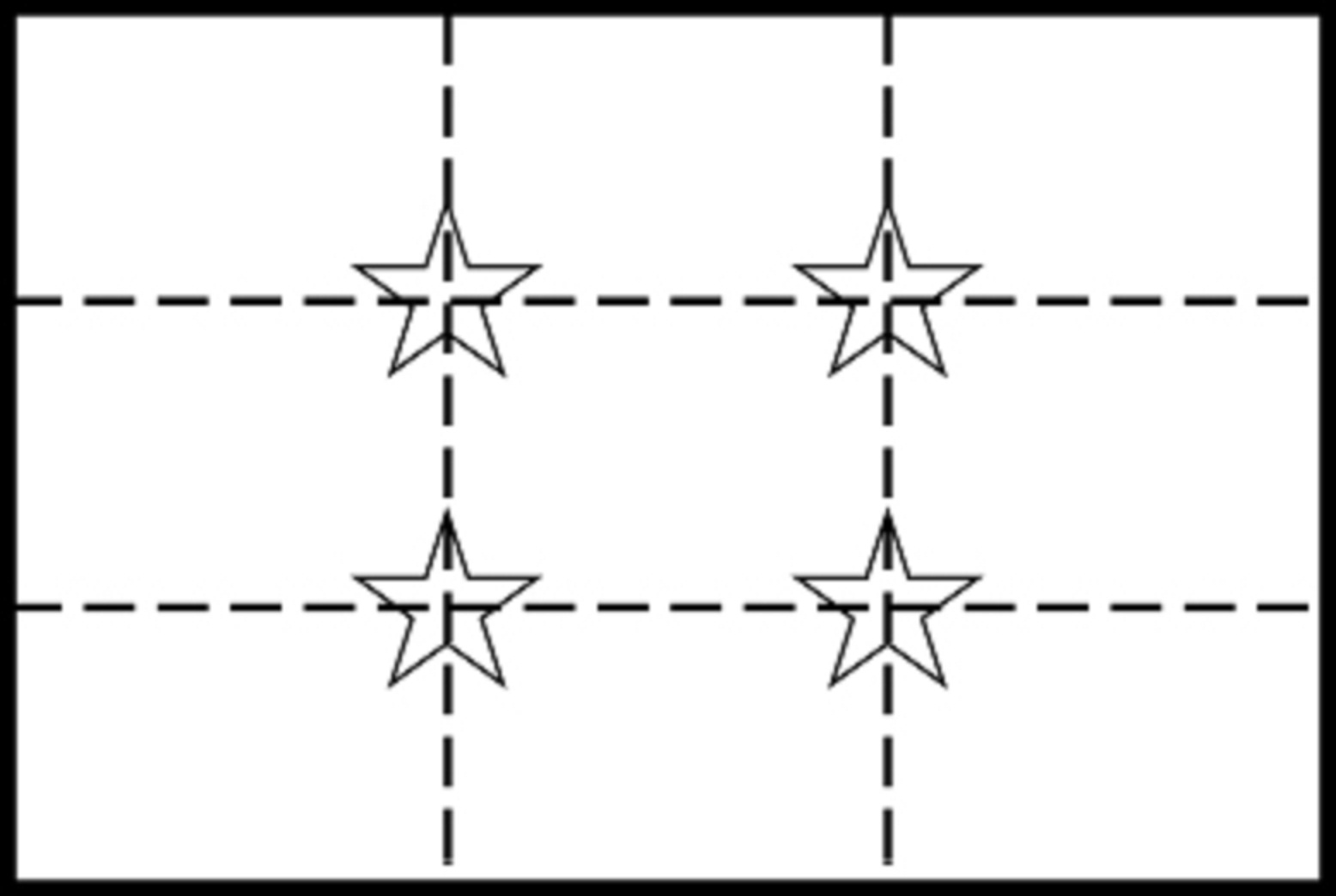
As a pastime, watercolor legend Edgar Whitney inventoried and cataloged successful painting compositions. He weighed the primary visual masses by size and value as well as arrangement and came up with six visual themes that most successful paintings appear to fall into. As an aid for composing paintings, these themes were passed on to his students, including Tony Couch, who wrote about them in his book: Watecolor: You Can Do It!. What we have here are the symbols of first impressions of paintings. The vague shapes and values that first attract your eyes to interesting paintings have no subject matter. Here I've represented the six compositional themes geometrically, but the hundreds of paintings Mr. Whitney analyzed to get these compositional hints covered diverse subject matter and genres. These are the themes, the arrangements of masses and shapes, that are popular attention getters for artists. They can be applied to plein air painting as well as figure painting. Take them into consideration for possible inspiration when you pick up a pencil, brush, stylus, or mouse.
Six Popular Compositional Themes
 Dark Shape on a Light Background
  Light Shape on a Dark Background
  Large Dark Shape, Small Light Shape on Middle Value Background
  Large Light Shape, Small Dark Shape on Middle Value Background
  Overall Gradation
 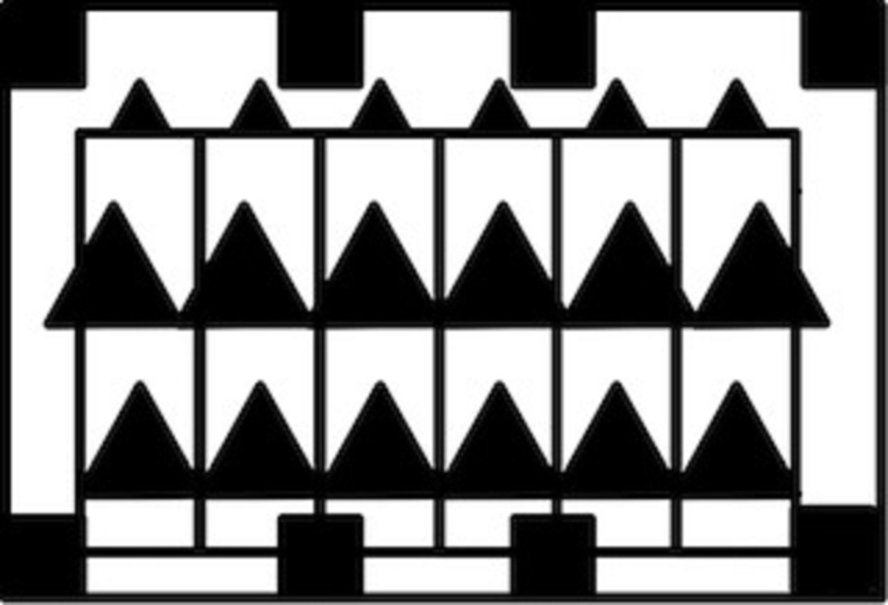 Overall Patterns
Now Go Explore!
Tony Couch Edgar Whitney Tribute Blog
Composition: The Rule of Thirds Finding the visual sweet spots
It just so happens that when you divide your horizontal and vertical planes into thirds using two parallel lines each way some interesting things happen to your artistic field of play. The use of this 9 paneled grid dates back to the times of the Renaissance. In 1797, J.T. Smith wrote of the rule of thirds for landscape painting in his book "Remarks on Rural Scenery." He requires that 1/3 (one third) of the painting be reserved for land and water and the upper 2/3 (two thirds) are to be used for air and sky. The land and water bottom third is again divided into thirds, reserving the lower 1/3 (one-third) for land and the remaining 2/3 (two thirds) for water. J.T. "Antiquity" Smith was a contemporary of English watercolourist John Constable (1776-1837).
- The proportions of the rule of thirds echo the proportions of the Golden Ratio and give a quick approximation of its mathematical divisions.
- The resulting "sweet spots" are generally good places to put a focal point, a change in compositional direction, a point of dark contrast or highlight, or other point of interest.
Dividing things up
Using only 4 lines, the 9 celled grid before you defines the rule of thirds. The four intersecting points the lines have created have a peculiar importance and impact on a person's visual experience. Building a composition with this underlying geometry in mind seems to evoke a universal response of visual pleasure, dramatic interest, and a certain "rightness". The rule requires that you place your center of interest on one of these intersecting points, I'll call them sweet spots, and arrange a pleasing composition based on that focal point. If you are drawing exploratory sketches and learning how to draw things, you can draw in the middle of your page as much as you want, otherwise... 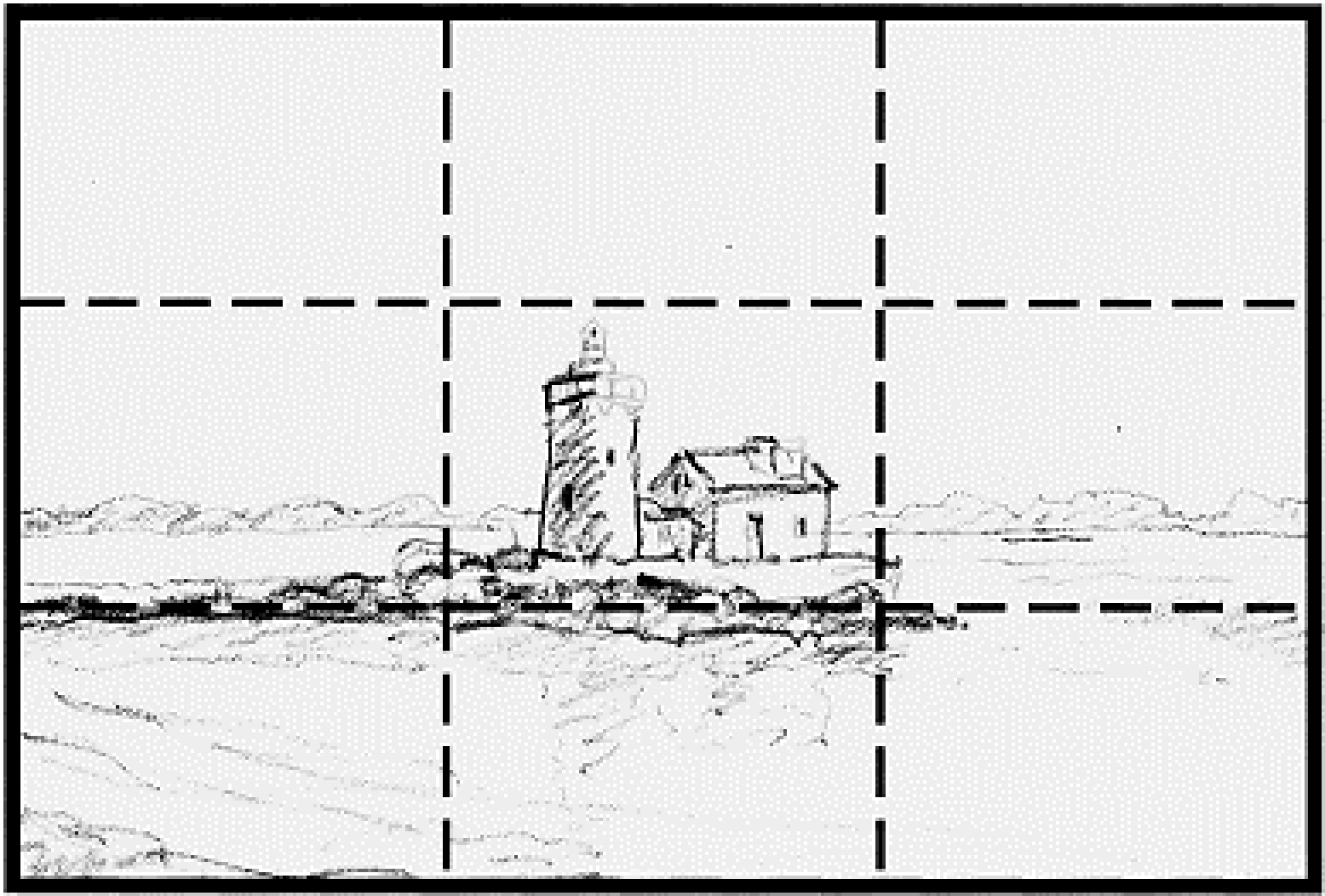
Middle? No.
If you are designing the composition of a drawing or painting you have to make it interesting and at least mildy challenging for the viewer. Try not to place your focal point in the very middle of your painting. The composition is very static with not much visual challenge. Note: Some of you will see this "rule" as a personal affront to your artistic license and try to prove me wrong. I did that too. 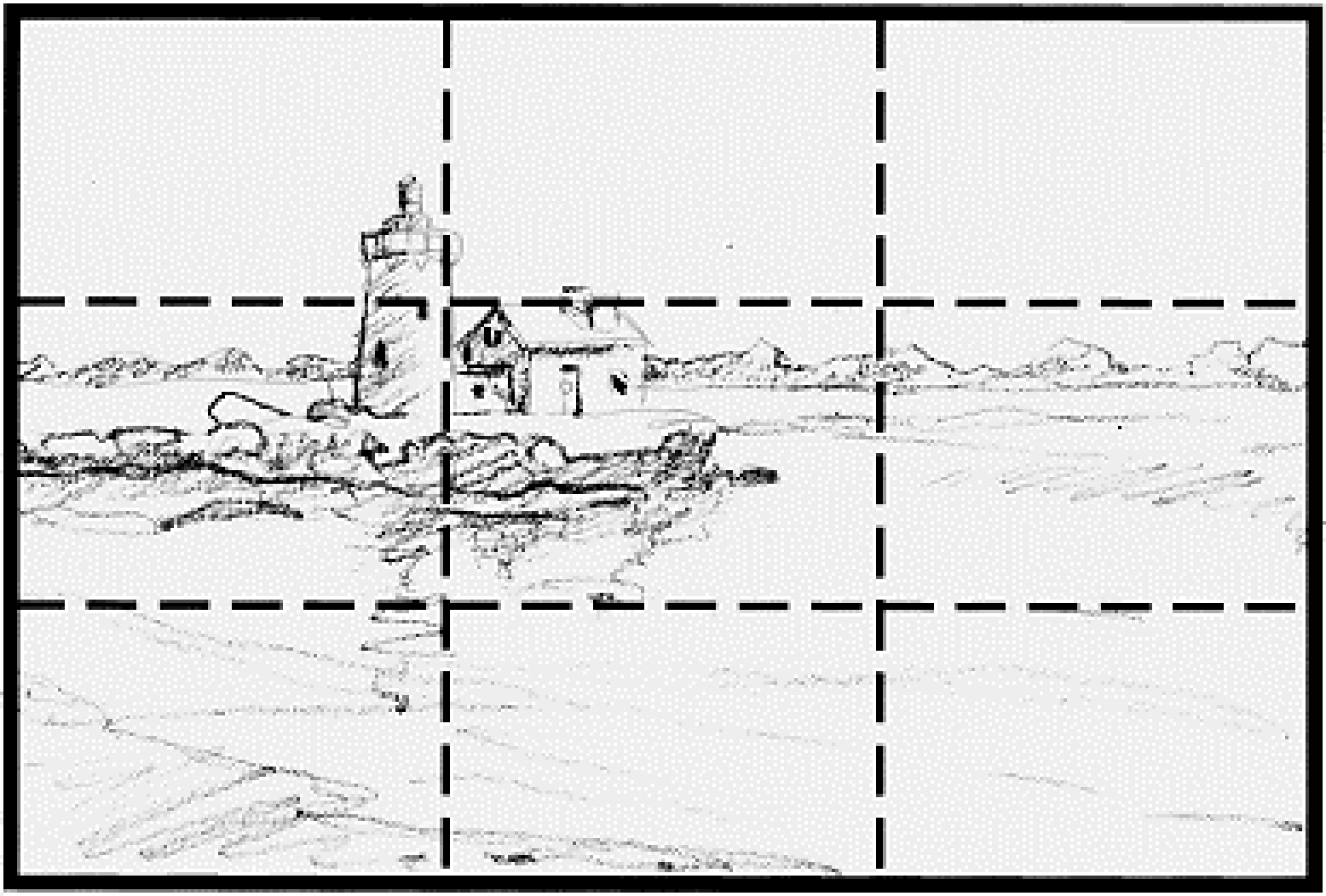
A little better
An immediate change happens when the focus hits a rule of thirds sweet spot. This variation offers more interest by offsetting the focal point up and left. This opens up the foreground for considering some secondary points of interest with the waves. But it's not quite there. The horizon line is too close to the true horizontal center. 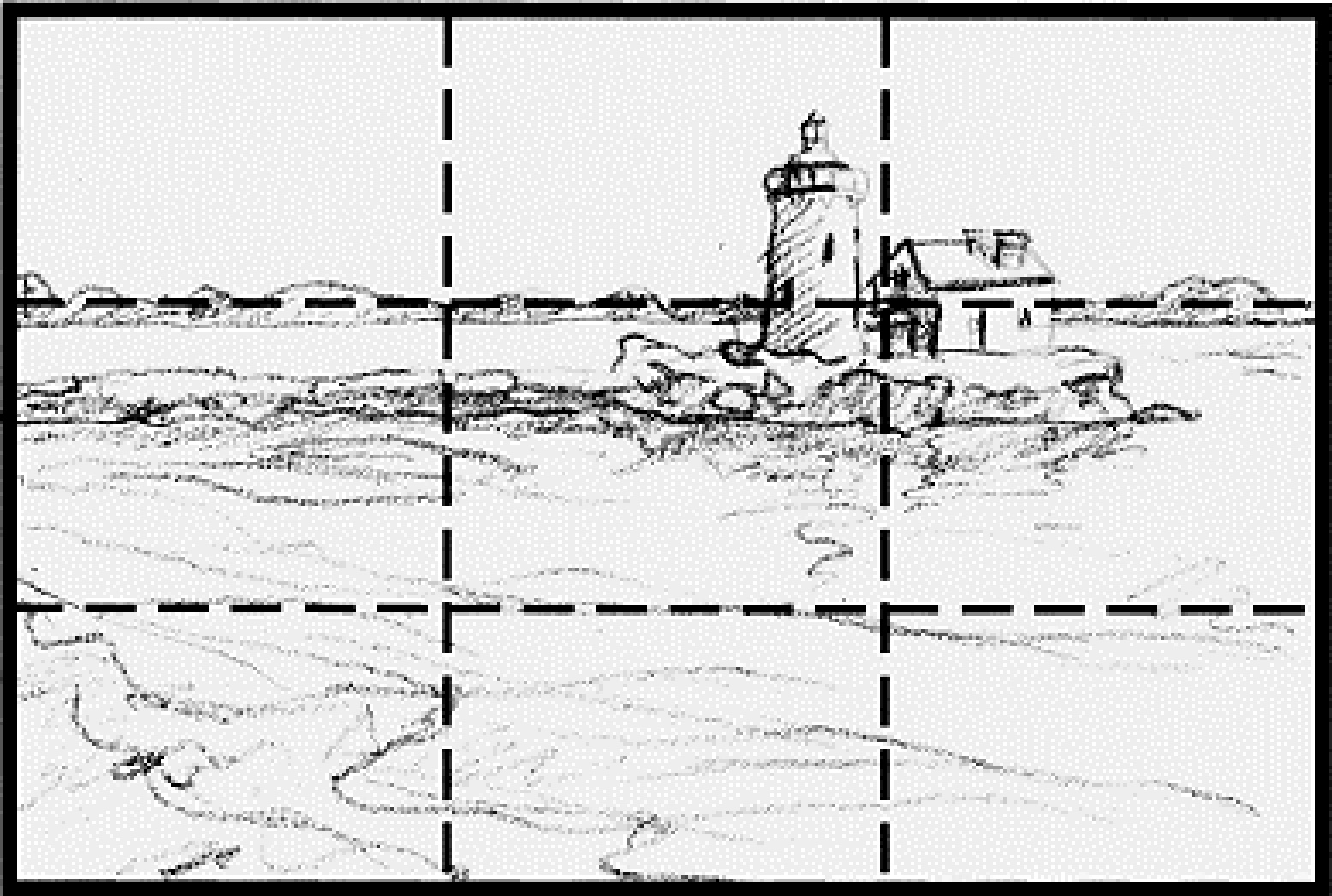
The keeper
An immediate change... wait I said that already. I've aligned the far shoreline with the first horizontal division and shifted the image left and up. This offers a pleasing balance while being more dynamic than version number 2. In this example I have inverted J.T. Smith's classic landscape divisions by using the lower 2/3 (two thirds) for land and water while using the upper 1/3 (one third) for the air and sky. Implementing the rule of thirds when designing your compositions can help you overcome the most glaring and obvious design flaws.
Now Go Explore!
Composition: The "S" Rule The Long and Winding Road
The elegant curve is one of the most reliable ways to add interest and depth to a landscape composition. When we see an "S" shape in our line of view it is usually in the form of a winding road, or a garden path or a trail through the woods. When we see the edges of the curve, they lead us forward into the body of the picture. Roads, paths, rivers, streams, and trails invite us to follow them. They are places people go. 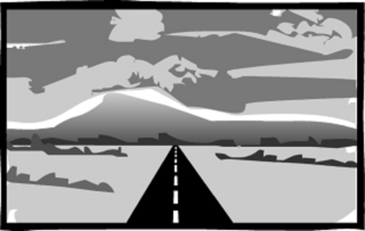
Straight ahead? (yawn)
It may be the quickest route between two points, but a straight ribbon of highway is not very interesting. It is static and does not invite the viewer into the whole composition. Your eyes go right where the orthogonal rays of the road pull you. A point of no interest. Very direct but not inticing. It can be done this way of course. You have to slow down the trip down the street with elements impeding your eyes urge. Or you can orchestrate a huge payoff at the end of that road, like a cowboy riding off into a blazing sunset. 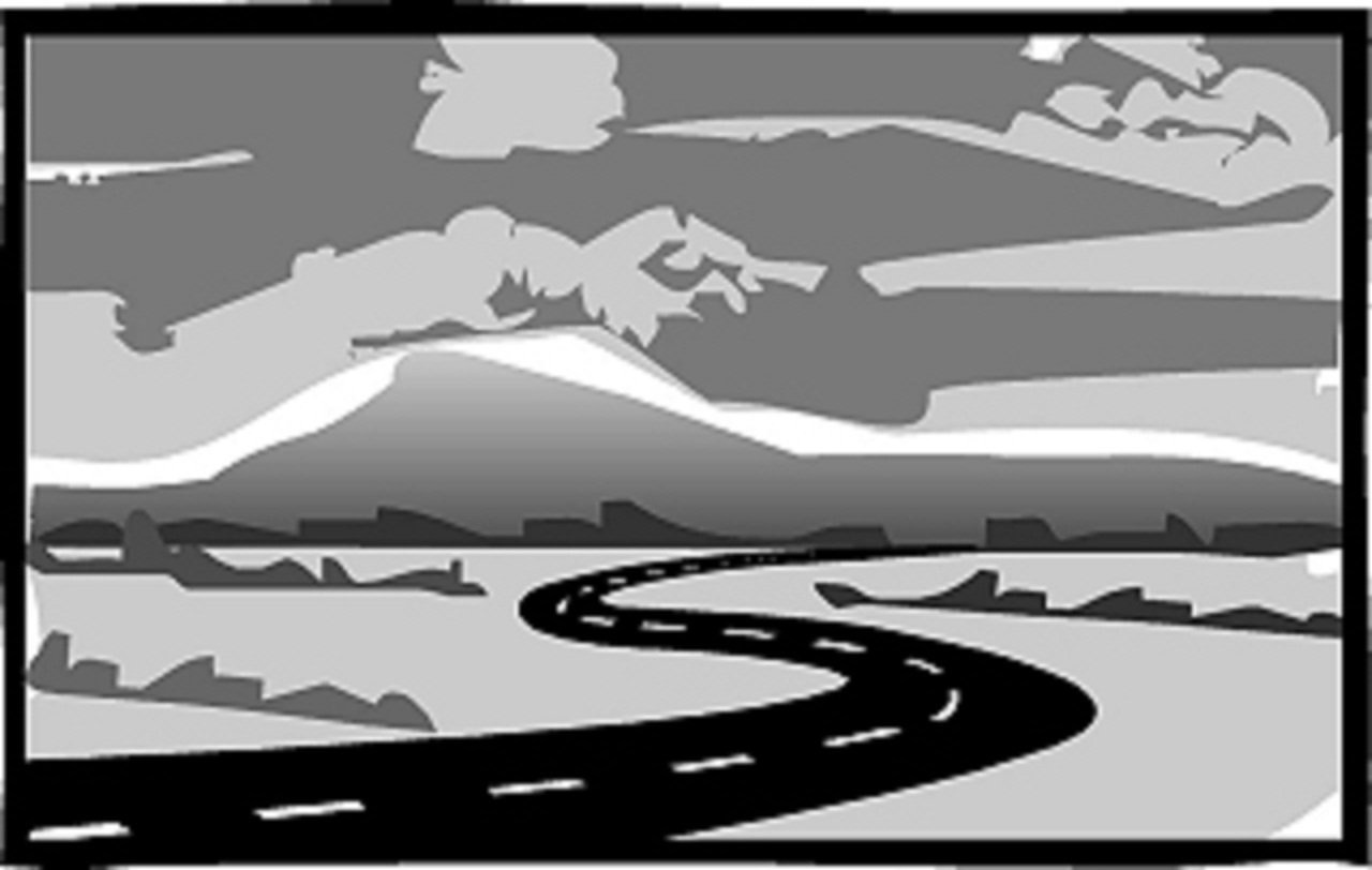
A Sunday drive
The sinuous swirling "S" shape pulls you along its length in an undulating fashion. A path worn or freshly paved invites at least a visual walk, a peek up the way a bit. A winding road takes you on a sightseeing tour of the rest of the composition, inviting you enjoy the interplay of shapes and elements found in the movement of the composition. 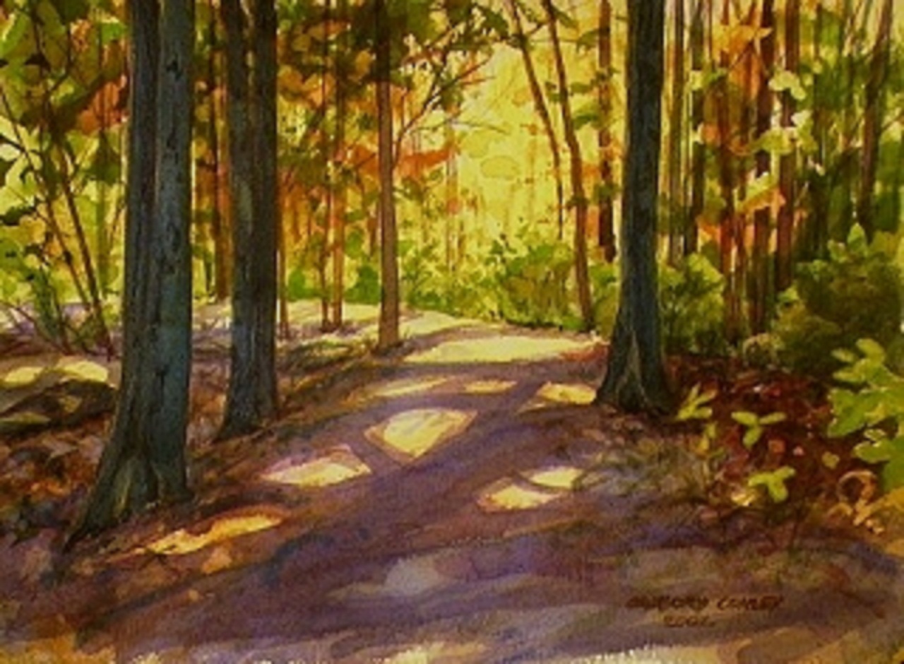
The Path
Here is an example of a path leading you into a painting. I often like to use a partial S "up around the bend" compositional tool like I did in this watercolor. The path materializes from the heavy shadows of the trees. It leads you into the painting and wraps you around the edge of the path where you find the glowing foliage beyond, further up the path.
Now Go Explore!