After underpainting in bright basic hues, I develop a field and the tree line in high silhouette. This was a fun experiment.
Materials used:
Brushes
- 1 1/2" (381mm) Flat Winsor & Newton Series 965
- #10 Winsor & Newton 820 round red sable
- #5 Scripto Red Sable Rigger #8 Winsor & Newton 820 round red sable
- #6 Grumbacher Watercolor Classic Red Sable
Paints
- Sap Green
- Hooker's Green Dark
- Cerulean Blue
- Cobalt Blue
- Dioxazine Purple
- Alizarin Crimson
- Permanent Rose
- Raw Sienna
- Burnt Umber
- Indian Yellow
- Pthalocyanine Green
Paper
- Watercolor Block (12" x 16") Arches #140 cold pressed
Miscellaneous
- #2 Pencil
- Kneaded Eraser
- Palette - Your choice. Mine is an old Robert E. Wood model.
- Water container (2) and water
- Hair dryer (optional)
Step 1: Sketch it in
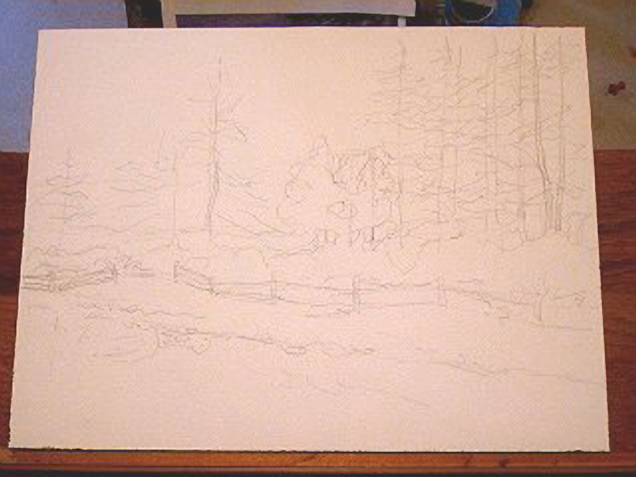 Grab your pencil and kneaded eraser and draw. Remember that you are laying down a rough map of where you are going in this painting. There were certain arrangements of shapes, lights, darks, and colors that tricked your imagination and emotions into thinking "I must paint this..." The whole process of painting is focused on getting that same "feeling" across to your audience, which is anyone other than you. I liked the way the trees lined up in a row against a hazy light background.
Step 2: Working way back
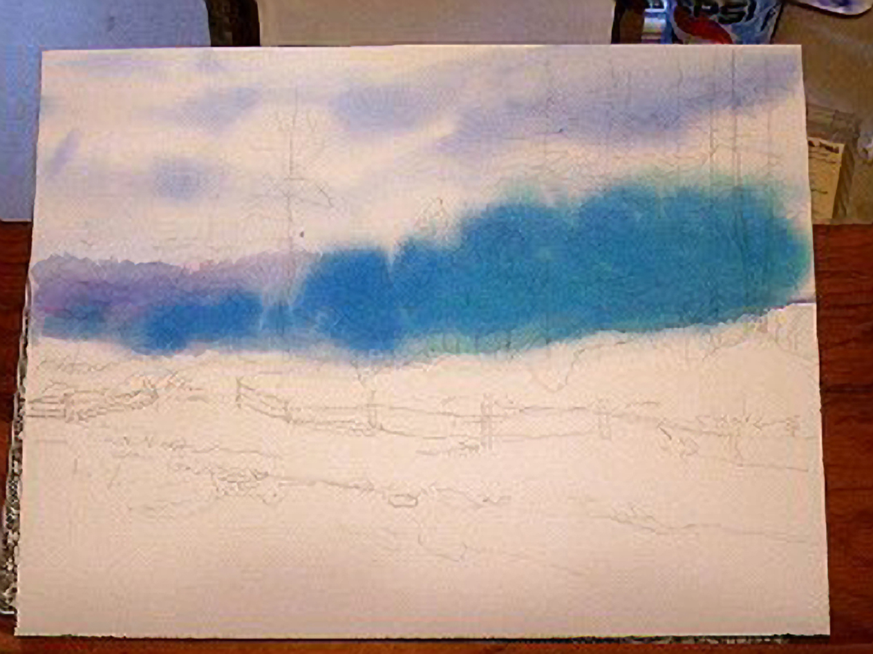 My reference photo was lit strangely with the background very blurry and bright with morning haze. I dampened the paper from mid horizon up with clean water using a 1 1/2" flat wash brush. Using a mixture of cerulean blue and dioxazine purple I used the same brush to lay in the cloud forms in the sky. Switching to a #10 round I brought in a darker purple/blue tree line about a third of they way in at the horizon. I mixed a heavily pigmented wash of cobalt blue and drew in the remaining darker tree line.
Step 3: Don't ask
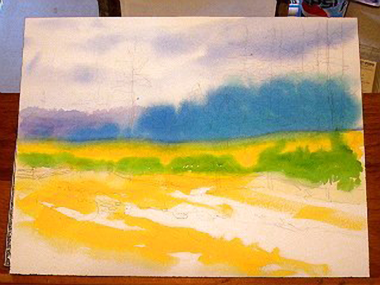 Maybe it was the intensity of the pure blue and purple of the previous wash. Maybe I was playing. I mixed a clean intense yellow using indian yellow. An odd color, it reminds me of the yellow you get with food coloring sets. A light wash is lemon and a dark wash can look yellow orange. I painted the middle and foreground areas using a 1" flat sable. While it was still damp I dipped my #8 round into some sap green and floated in some fuzzy bush shapes.
Step 4: Do I see a pattern here?
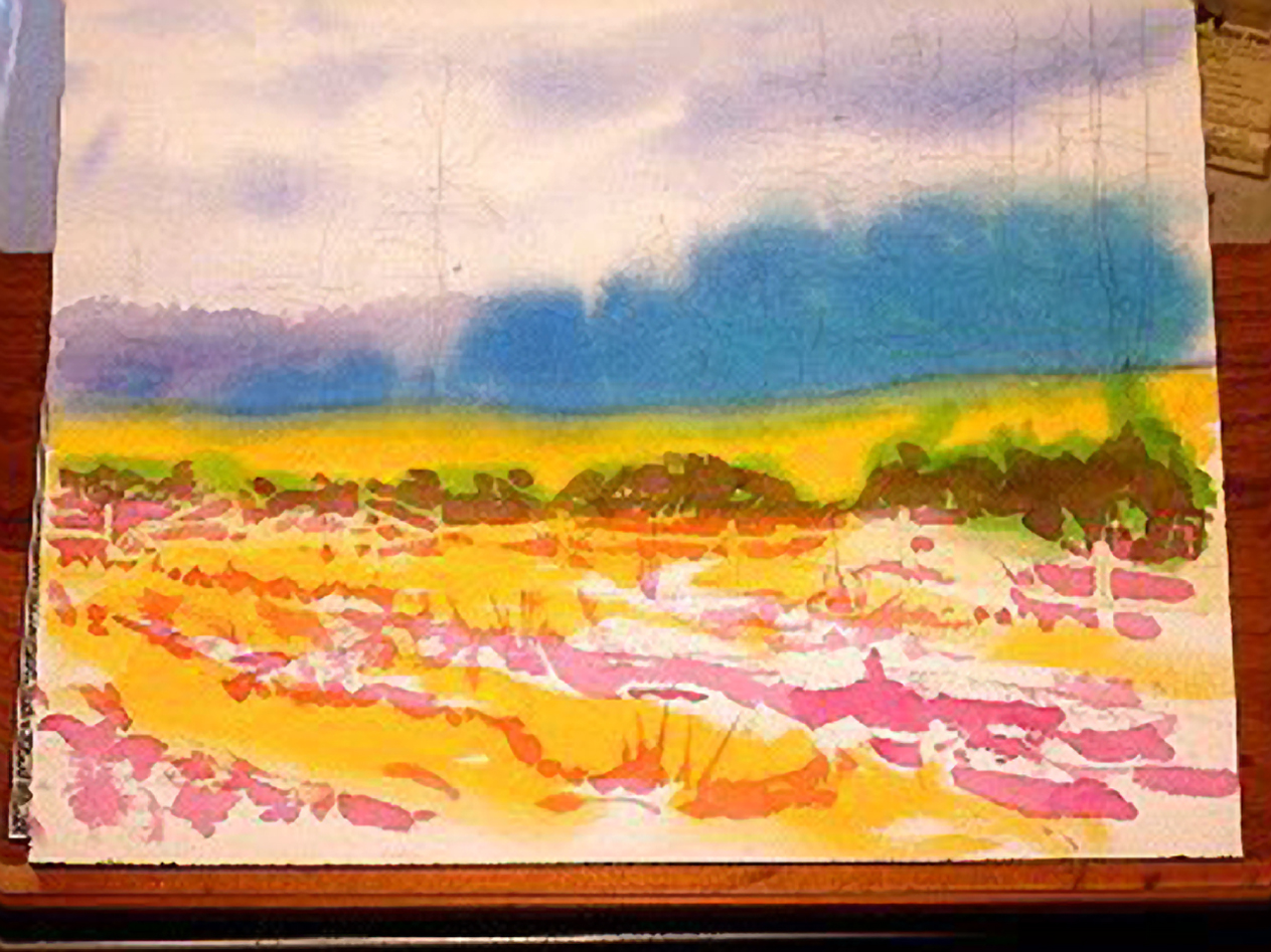 With some vague thoughts of 4-color process printing, I mixed a rich wash of permanent rose and painted in the foreground rills and furrows with a #10 round. Using the same magenta wash I drew in the bushes at the base of the pines. You'll note that I had to cut in the wooden fence shapes as I painted. Had I used a liquid frisket I could have saved about 20 minutes during the painting. At this step I have a rather vibrant primary color underpainting. As I add the local colors I will try to leave some of this underpainting exposed as highlights of color. The rest will show through subsequent washes as new colors.
Step 5: Trees are green, right?
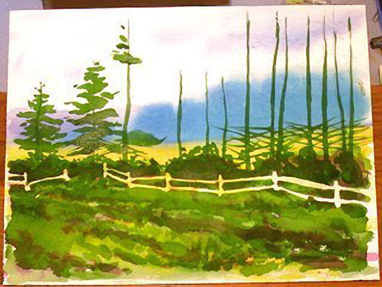 I mixed a large amount of green. I mean a lot. Using sap green and hooker green dark I looked at the middle and foregound areas and decided to treat the whole of the two as a single plane of color. I then washed the same intensity of wash across the foreground field, up through the bushes and over the fence and into the details of the tree forms. I split the work between a #10 and a #6 round red sable. I stopped at this stage so you could see how I was constructing the actual tree shapes. There are certain symbolic brush strokes you find for different kinds of trees. Study different trees and how other artists handle tree shapes. Develop your own internal artistic symbol library for those times when you don't have the real thing in front of you. Stare at nature.
Step 6: Bough break is over
 I finished painting the basic tree shapes in the single color, all the while using my reference photo (or sketch) to see what shapes made these trees hold together. Note that the larger trees on the right had more of their lower branches bare. I switched to a #5 rigger and added more branch detail to this area.
Step 7: Yangin' out
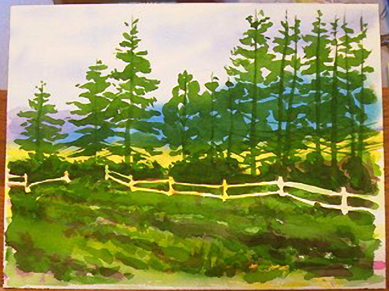
 When I started this painting I decided to have fun and try some new techniques. At this step I mixed a very, very dark wash of hooker's green dark and alizarin crimson and using a cut-out approach I painted all the darkest darks in the painting, solid. This enhanced the silhouette of the treeline.
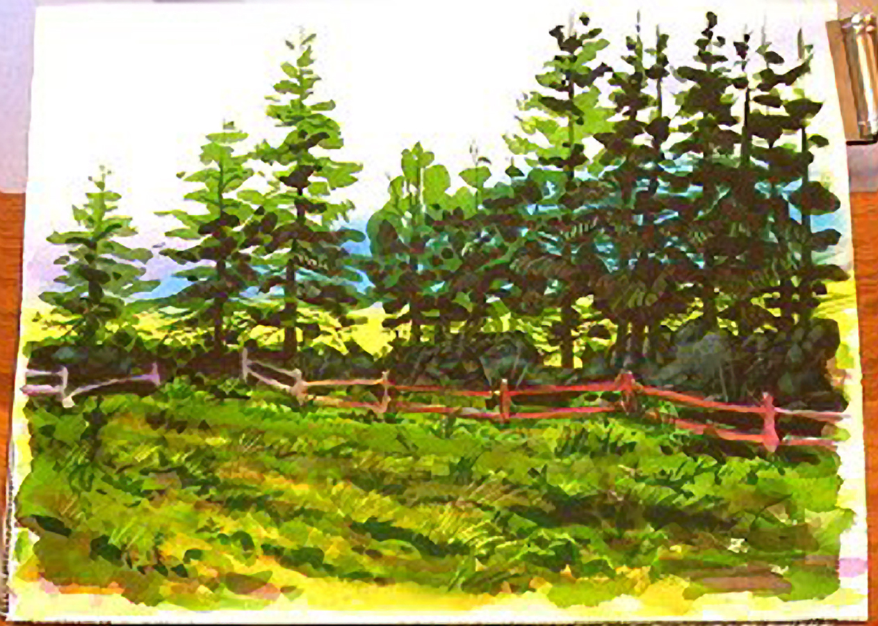
Step 8: A little landscaping
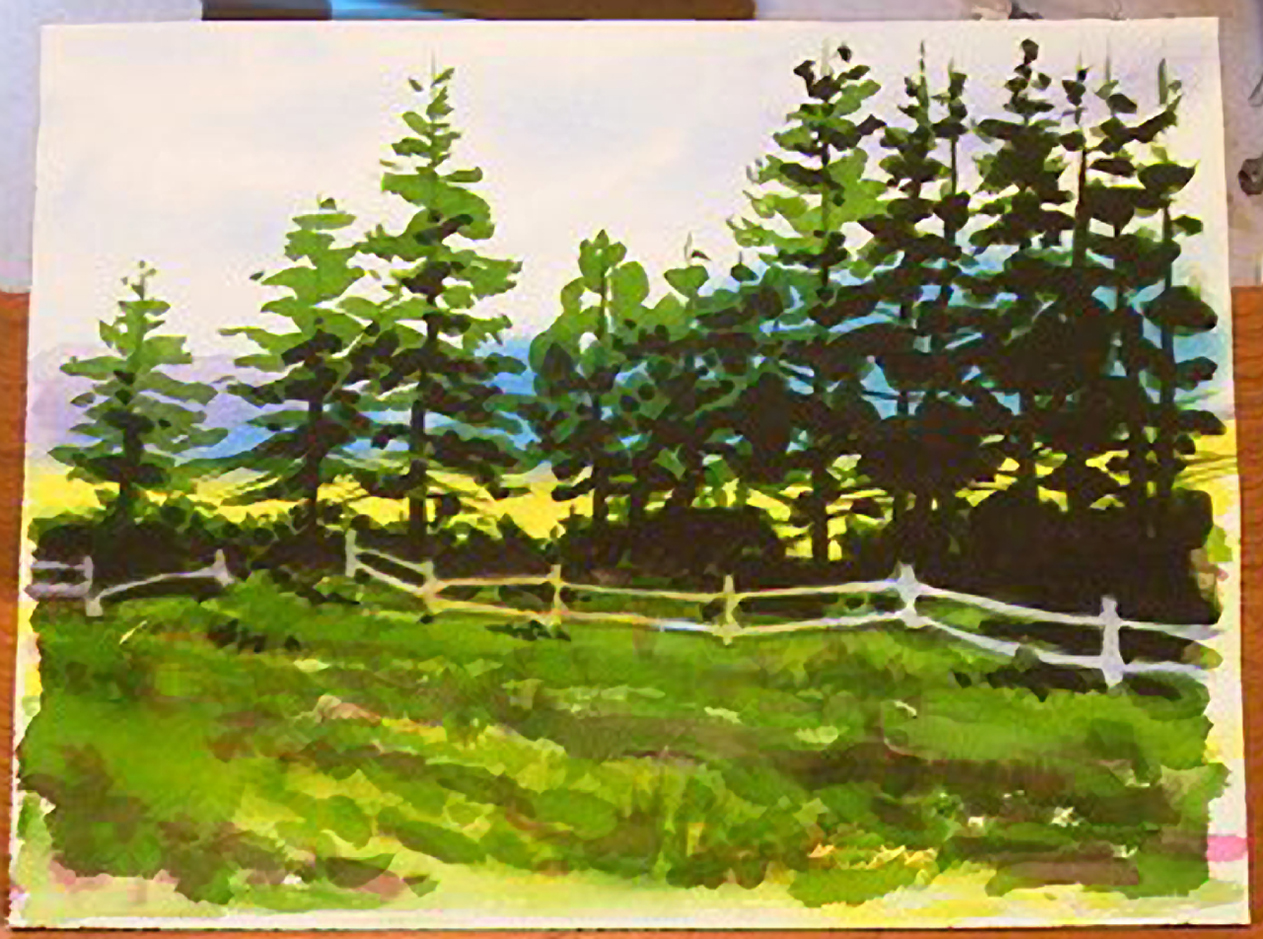
 I grabbed the #8 round sable and dipped into the sap green and hooker's green dark, painting the details in the foregound field. Using my #6 round I mixed several different wells of medium strength washes. In one was cobalt blue, followed by a dioxazine purple, burnt sienna, and permanent rose puddle. I first dipped into the cobalt blue and started painting the fence from left to right. I rinsed and dipped into the purple, and flowed it out of the last color. I continued to pull connecting washes like a rainbow across the whole fence area. The color sequence was chosen to reinforce the place of the fence in the middleground. The cooler colors on the left push the fence further into the plane and the warmer tones to the right pull it forward. Don't they?
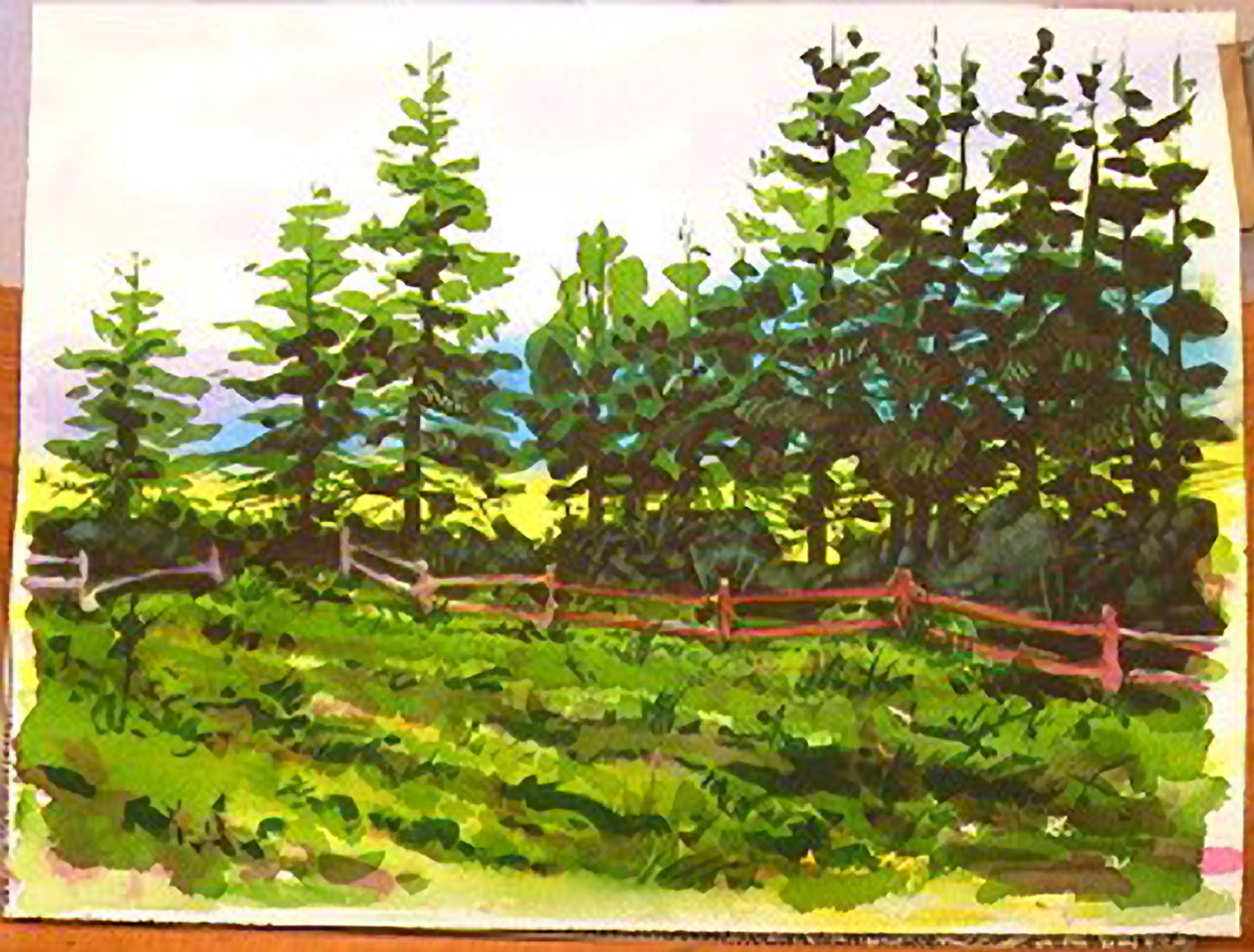
Step 9: Making it busier
 I used a #5 rigger and the same dark green/red and played around with the criss-crossing branches at the bottoms of the pines, looking for interesting shapes.
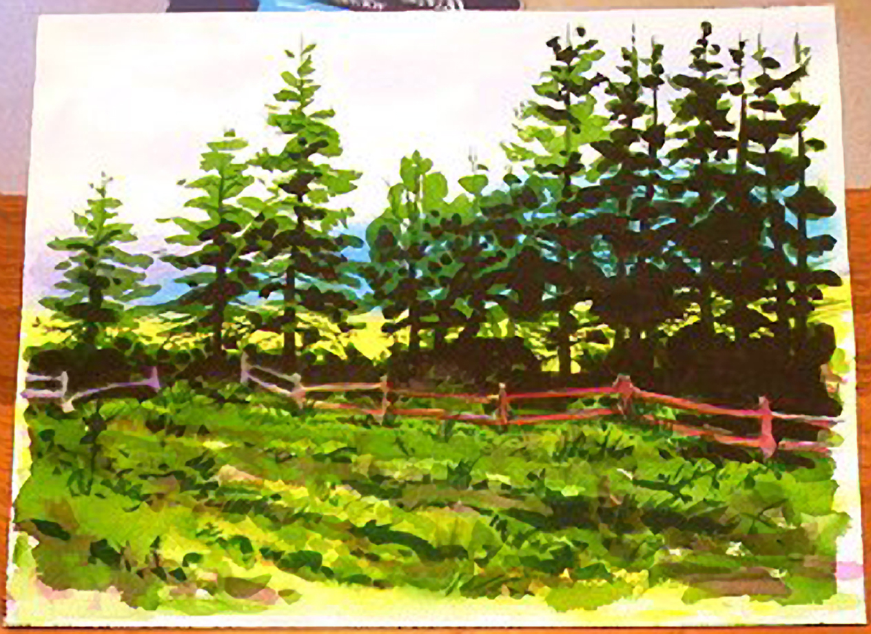
Step 10: Itchy and Scratchy
 When I saw how boring the shadows were, being all one color and tone, I resigned myself to my fate. With the painting perfectly dry (use a blow dryer) I flowed clean water over top of all the shadow areas using the 1 1/2" brush. You have to coat it heavily, quickly, and evenly. One stroke a pass, two strokes could disturbed the colors softened from the first pass. It will run so hold a tissue or paper towel in your other hand and dab any spills or splatters. I watched the surface drying and when it had a satin half-dry look I used the beveled end of another brush and scratched branches and textures into the shadowed area. The bushes underneath were scrubbed with a soft brush and blotted to add highlights.
Step 11: Back to the front
 Using a 1" bevel handled flat sable I refreshed the indian yellow and laid a glaze of yellow over the foreground to pull it together a bit. While it was still damp I scraped some lighter weed detail over some of the darker areas.
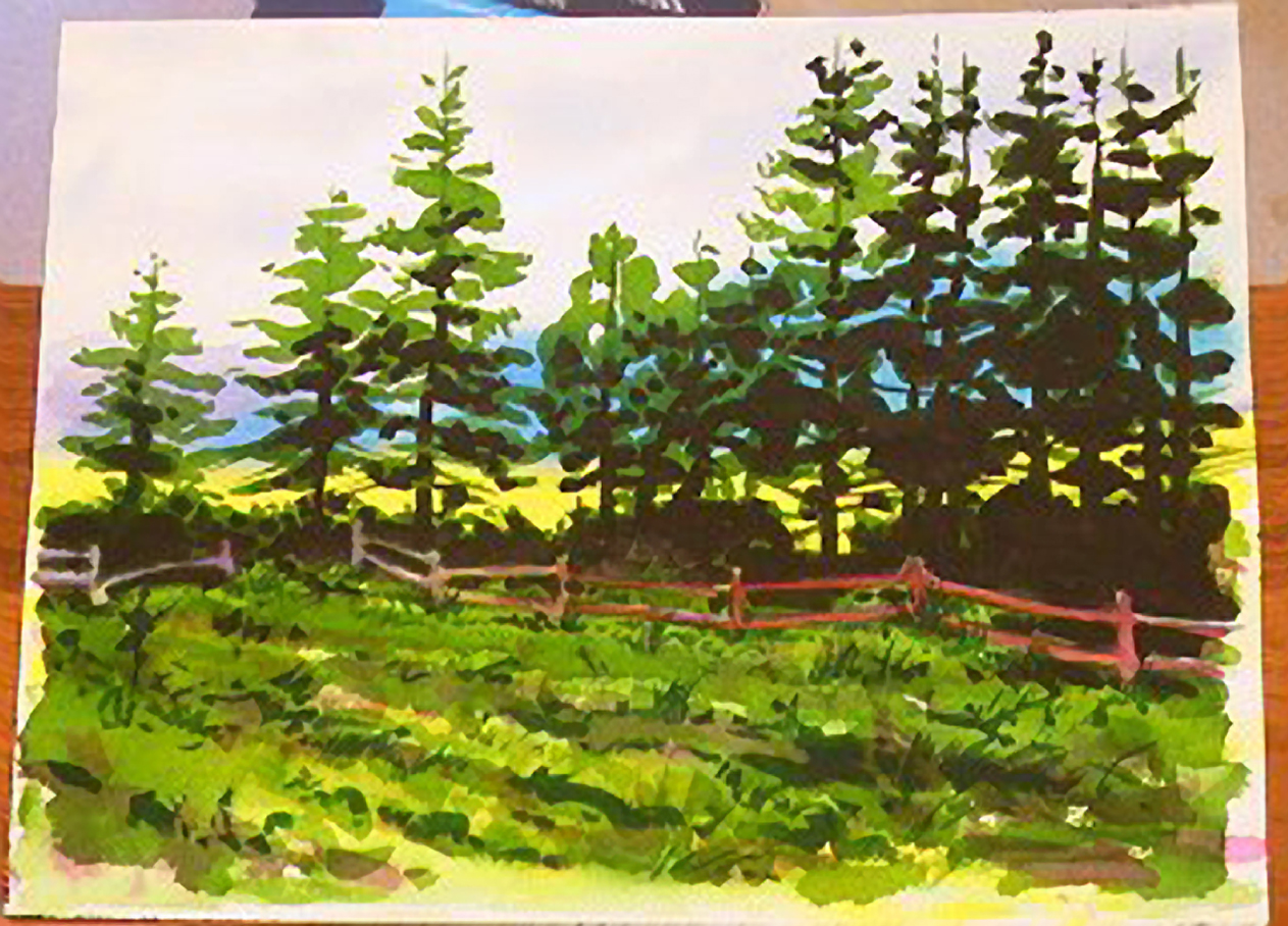
Step 12: All Done!
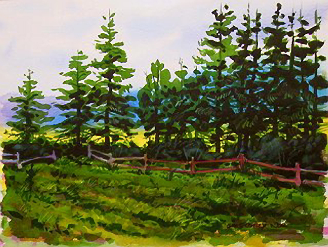 To wrap it up I used the 1" brush to lay another darker green wash over the foreground. I thought it was too light and detracted from the silhouette effect of the middleground, where all the important details are...then I signed it with a #4 round. It wasn't what I had in mind, but that was the point of this lesson. Try some new approaches and see where they take you, dealing with each crisis as they arise. Show the average or good ones. No one has to know about your personal "reject bin" that holds the ones that missed the mark but you don't have the heart to throw away.